Explore and analyze Citi Bike trip data using Tableau. Discover unexpected phenomena, create visualizations, dashboards, and a Tableau story. Informative insights for city officials and administrators. Drive programmatic changes.
This README provides a summary of a case study and the steps taken to build a Tableau presentation for analyzing Citi Bike trip data. The objective of this project was to aggregate the Citi Bike Trip History Logs and discover two unexpected phenomena and showcase visualization skills in Tableau. The analysis includes the creation of visualizations, dashboards, and a Tableau story to present the findings to city officials.
-
Data Exploration and Preparation
- Obtained the Citi Bike Trip History Logs dataset.
- Explored the dataset to understand its structure and variables.
- Performed data cleaning and preprocessing tasks, such as handling missing values, formatting data types, and merging multiple datasets if applicable.
-
Identifying Unexpected Phenomena
- Analyzed the Citi Bike trip data to identify two unexpected phenomena.
- Considered different time spans and variables within the dataset to uncover interesting patterns or trends.
-
Visualization Design
- Designed visualizations for each discovered phenomenon.
- Chose appropriate chart types, such as bar charts, line graphs, scatter plots, or maps, to effectively represent the data and highlight the phenomena.
- Ensured that the visualizations are visually appealing, easy to understand, and relevant to the target audience of city officials and administrators.
-
Dashboard Creation
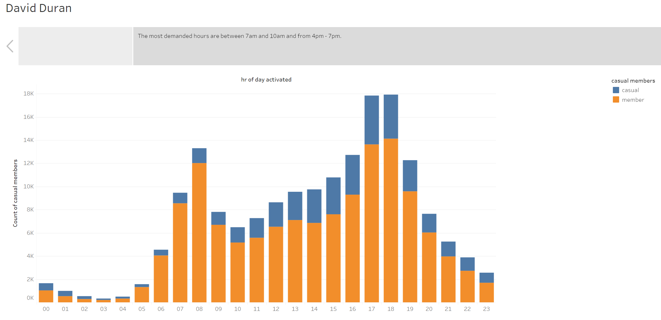
- Created a dashboard for each discovered phenomenon, utilizing the visualizations designed in the previous step.
- Designed the layout of the dashboards, arranging the visualizations in a logical and cohesive manner.
- Incorporated interactive elements, such as filters or parameter controls, to enable exploration and analysis of the data.
- Accompanied each dashboard with a thorough analysis explaining why the phenomenon may be occurring, providing insights and potential implications for programmatic changes.
-
Creating the Maps
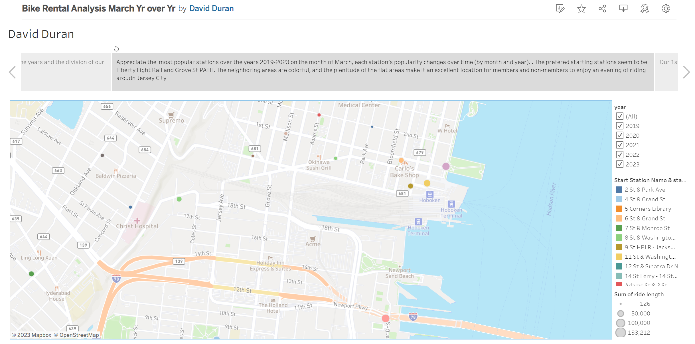
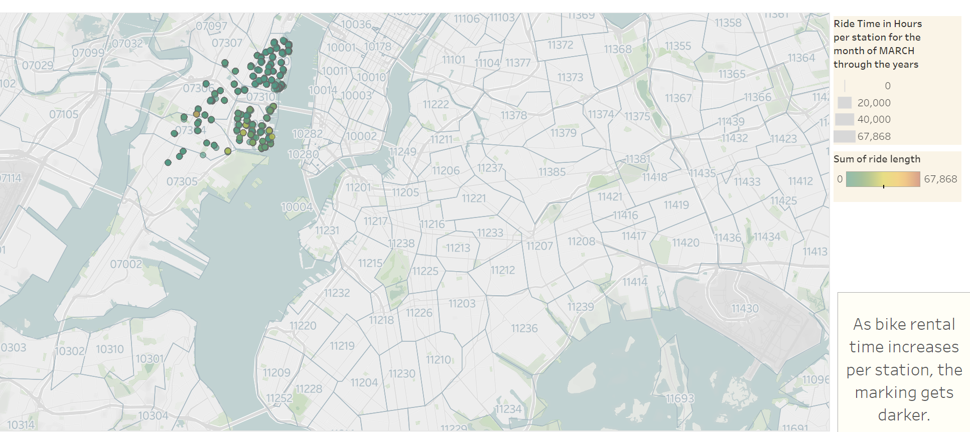
- Developed a static map plotting all bike stations, indicating the most popular locations to start and end a journey.
- Incorporated zip code data as an overlay on the map to provide additional context.
- Created a dynamic map showing the changes in popularity of each station over time, segmented by month and year.
- Accompanied the maps with a write-up highlighting any trends observed during the analysis and their potential implications.
-
Tableau Storytelling
- Created a Tableau story that brings together the visualizations, maps, and dashboards.
- Ensured the presentation flow is logical, starting with an introduction, followed by the analysis of each discovered phenomenon, and concluding with a summary and recommendations.
- Made the presentation visually appealing by using appropriate colors, fonts, and layout.
-
Review and Finalization
- Reviewed the Tableau presentation to ensure it meets the needs of the target audience, which includes city officials, public administrators, and heads of New York City municipal departments.
- Ensured the analysis is focused, concise, easy to understand, and visually compelling.
- Made necessary refinements, such as adjusting visualization properties, improving storytelling flow, or enhancing the overall aesthetics.
This case study involved the analysis of Citi Bike trip data to discover unexpected phenomena and present the findings to city officials. By following the outlined steps, a comprehensive Tableau presentation was created, including visualizations, dashboards, and a Tableau story. The analysis and visualizations are designed to be easily understandable by a non-technical audience and provide insights to inform programmatic changes.
I invite you to check out the different visualizations on Tableau Public.


