If you want to see a live example/forecast go to the bottom of the documentation.
- Python 3
- Pandas
- Quandl
- Numpy
- Matplotlib
- SQLite3
- HTML
- CSS
- JS
The inspiration came from "Paul Tudor Jones - Trader Documentary 1987", where they run correlations between the bull market they had at the time and the one in the 1920s. The correlation turned out to be over 90% and they indeed predicted the 1987 Crash.
The goal of this project was to automate what they did in the documentary.
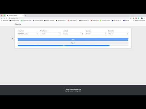
In the app we can find:
- Instrument: the instrument to run the scanner on.
- Time frame: the size of the data you want to scan.
- Lookback: the number of days you want to scan through.
- Accuracy: the step of the scanner. A 1-week step means the scanner will loop with more frequency than with a 1-month step. A shorter step makes the scanner run slower but could result in more occurrences.
- Correlation: to filter highly correlated occurrences.
Example:
--Instrument----Time frame----Lookback----Accuracy--Correlation
S&P 500 Futures---1 month------2 years-----1 week-----Over 0.5
This means --> Scan a time frame of 1 month through 2 years of data with a step of 1 week. Show me the occurrences with a correlation higher than 0.5.
The app starts when we click the "Send" button. We can stop the scanner at any time by clicking on "Reset" and it will show us all the occurrences found since it started.
Once the "Send" button is clicked, the app checks if today is a new day, if so it downloads new data from Quandl and updates our database. I used SQLite because of its simplicity.
Data is normalized and then the app calculates the %Change of the selected instrument.
For the correlations I chose the Pearson correlation coefficient formula:
The scanner calculates correlations and the ones that make the cut with the correlation filter are sent to a function that takes the data and builds a chart. Plotting the current time frame, occurrence, and followup of each occurrence.
- Black line: Last month of activity.
- Blue line: Correlated occurrence.
- Green line: Follow-up of the correlated occurrence.
This chart shows a 61% correlated occurrence between the current month of price activity and its occurrence found in Dec 2018. The follow-up of this occurrence resulted in a 6.88% performance in the next month.
We want to find occurrences in the S&P500 futures with a correlation of over 50% between this current month and any other month in the last 10 years of data. We want to scan using a step of 1 week.
The scanner found 5 occurrences. The oldest one is from 2006. All of these occurrences resulted in a positive gain ranging from 2.22% up to 6.88% as we can see in the follow-up month of each occurrence.
By the time we ran the scanner -- 10/23/2019 -- S&P500 Futures (ES) was trading at 3006.
It's been a bit over 1 month -- 12/03/2019 -- and the S&P500 Futures (ES) is trading at 3106 (+3.3%)
The peak was 3155, +5% since we ran the scanner 1 month ago.
This means our forecast was successful
The scanner found 5 occurrences. The oldest one is from 2006. All of these occurrences resulted in a positive gain ranging from 2.22% up to 6.88% as we can see in the follow-up month of each occurrence.
Live test video: https://youtu.be/9CBFMtaiaX4


