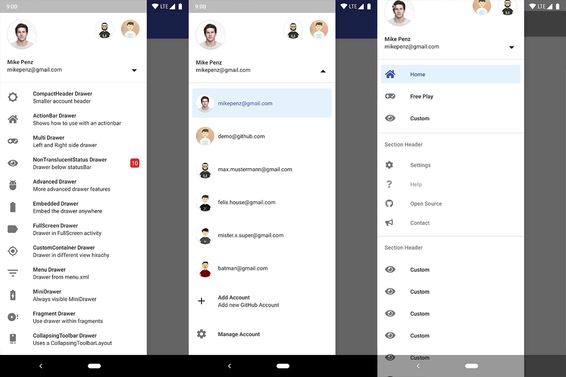
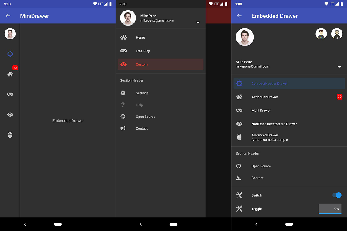
Does your application contain a Drawer? Do you want to have it up and running in less than 5 minutes? Do you want your drawer to follow the Android Design Guidelines? Do you have profiles? Do you need flexibility? Is Google's navigation Drawer of the design support not enough for you? Do you want a simple and easy to understand api?
If any (or all) of these questions seem familiar, the MaterialDrawer is the perfect library for you all.
Never waste your time again. It provides you with the easiest possible implementation of a navigation drawer for your application. There is a Header with profiles (AccountHeader), a MiniDrawer for Tablets (like Gmail), provide custom DrawerItems, custom colors, custom themes, ... No limits for customizations.
- the easiest possible integration
- integrate in less than 5 minutes
- uses the androidX support libraries
- compatible down to API Level 14
- includes an AccountSwitcher
- quick and simple api
- follows the NEW Google Material Design Guidelines
- use vector (.svg) icons and icon fonts via the Android-Iconics integration
- Google Material Design Icons, Google Material Community Design Icons, FontAwesome and more
- comes with various themes which help to get your own themes clean
- modify the colors on the go
- comes with multiple default drawer items
- based on a RecyclerView
- RTL support
- Gmail like MiniDrawer
- expandable items
- badge support
- define custom drawer items
- tested and stable
- sticky footer or headers
- absolutely NO limits
- NavController support by @petretiandrea
If you upgrade from < 6.1.0 follow the MIGRATION GUIDE
You can try it out here Sample Application
You can find some frequently asked questions and other resources in the WIKI / FAQ site.
- Kotlin | v7.0.0-rc04
- Java && AndroidX | v6.1.2
- Java && AppCompat |v6.0.9
implementation "com.mikepenz:materialdrawer:${lastestMaterialDrawerRelease}"

//required support lib modules
implementation "androidx.appcompat:appcompat:${versions.appcompat}"
implementation "androidx.recyclerview:recyclerview:${versions.recyclerView}"
implementation "androidx.annotation:annotation:${versions.annotation}"
implementation "com.google.android.material:material:${versions.material}"
implementation "androidx.constraintlayout:constraintlayout:${versions.constraintLayout}"

// Add for NavController support
implementation "com.mikepenz:materialdrawer-nav:${lastestMaterialDrawerRelease}"Major release, migrates to use the FastAdapter v4 which was fully migrated to Kotlin. Check out the changelog or the MIGRATION GUIDE for more details
DrawerBuilder().withActivity(this).build()Great. Your drawer is now ready to use.
//if you want to update the items at a later time it is recommended to keep it in a variable
val item1 = PrimaryDrawerItem().withIdentifier(1).withName(R.string.drawer_item_home)
val item2 = SecondaryDrawerItem().withIdentifier(2).withName(R.string.drawer_item_settings)

//create the drawer and remember the `Drawer` result object
val result = DrawerBuilder()
    .withActivity(this)
    .withToolbar(toolbar)
    .addDrawerItems(
	    item1,
	    DividerDrawerItem(),
	    item2,
	    SecondaryDrawerItem().withName(R.string.drawer_item_settings)
    )
    .withOnDrawerItemClickListener(object : Drawer.OnDrawerItemClickListener {
        override fun onItemClick(view: View?, position: Int, drawerItem: IDrawerItem<*>): Boolean {
    	    // do something with the clicked item :D
            return false
        }
    })
.build()//set the selection to the item with the identifier 1
result.setSelection(1)
//set the selection to the item with the identifier 2
result.setSelection(item2)
//set the selection and also fire the `onItemClick`-listener
result.setSelection(1, true)By default, when a drawer item is clicked, it becomes the new selected item. If this isn't the expected behavior,
you can disable it for this item using withSelectable(false):
SecondaryDrawerItem().withName(R.string.drawer_item_dialog).withSelectable(false)//modify an item of the drawer
item1.withName("A new name for this drawerItem").withBadge("19").withBadgeStyle(new BadgeStyle().withTextColor(Color.WHITE).withColorRes(R.color.md_red_700))
//notify the drawer about the updated element. it will take care about everything else
result.updateItem(item1)
//to update only the name, badge, icon you can also use one of the quick methods
result.updateName(1, "A new name")
//the result object also allows you to add new items, remove items, add footer, sticky footer, ..
result.addItem(DividerDrawerItem())
result.addStickyFooterItem(PrimaryDrawerItem().withName("StickyFooterItem"))
//remove items with an identifier
result.removeItem(2)
//open / close the drawer
result.openDrawer()
result.closeDrawer()
//get the reference to the `DrawerLayout` itself
result.getDrawerLayout()// Create the AccountHeader
val headerResult = AccountHeaderBuilder()
.withActivity(this)
.withHeaderBackground(R.drawable.header)
.addProfiles(
ProfileDrawerItem().withName("Mike Penz").withEmail("mikepenz@gmail.com").withIcon(getResources().getDrawable(R.drawable.profile))
)
.withOnAccountHeaderListener(object : AccountHeader.OnAccountHeaderListener {
override fun onProfileChanged(view: View?, profile: IProfile<*>, current: Boolean): Boolean {
return false
}
})
.build()
//Now create your drawer and pass the AccountHeader.Result
DrawerBuilder()
.withAccountHeader(headerResult)
//additional Drawer setup as shown above
...
.build()The MaterialDrawer comes with the core of the Android-Iconics library. This allows you to create your DrawerItems with an icon from any font.
Choose the fonts you need. Available Fonts build.gradle
compile 'com.mikepenz:google-material-typeface:x.y.z@aar' //Google Material Icons
compile 'com.mikepenz:fontawesome-typeface:x.y.z@aar'     //FontAwesome
kotlin
//now you can simply use any icon of the Google Material Icons font
PrimaryDrawerItem().withIcon(GoogleMaterial.Icon.gmd_wb_sunny)
//Or an icon from FontAwesome
SecondaryDrawerItem().withIcon(FontAwesome.Icon.faw_github)DrawerBuilder()
.withActivity(this)
.withTranslucentStatusBar(false)
.withActionBarDrawerToggle(false)
.addDrawerItems(
//pass your items here
)
.build()val result = DrawerBuilder()
.withActivity(this)
.withToolbar(toolbar)
.addDrawerItems(
//pass your items here
)
.build()
DrawerBuilder()
.withActivity(this)
.addDrawerItems(
//pass your items here
)
.withDrawerGravity(Gravity.END)
.append(result)The MaterialDrawer supports fetching images from URLs and setting them for the Profile icons. As the MaterialDrawer does not contain an ImageLoading library the dev can choose his own implementation (Picasso, Glide, ...). This has to be done, before the first image should be loaded via URL. (Should be done in the Application, but any other spot before loading the first image is working too)
//initialize and create the image loader logic
DrawerImageLoader.init(object : AbstractDrawerImageLoader() {
    override fun set(imageView: ImageView, uri: Uri, placeholder: Drawable) {
        Picasso.get().load(uri).placeholder(placeholder).into(imageView)
    }

    override fun cancel(imageView: ImageView) {
        Picasso.get().cancelRequest(imageView)
    }

    /*
    override fun set(imageView: ImageView, uri: Uri, placeholder: Drawable, tag: String?) {
        super.set(imageView, uri, placeholder, tag)
    }

    override fun placeholder(ctx: Context): Drawable {
        return super.placeholder(ctx)
    }

    override fun placeholder(ctx: Context, tag: String?): Drawable {
        return super.placeholder(ctx, tag)
    }
    */
})
An implementation with GLIDE v4 (See tag v6.1.1 for glide v3 sample) can be found in the sample application
If you use the included ActionBarDrawerToggle you can switch between back-arrow or hamburger-icon with the following code snippet. (Please note that the order of these lines matter)
result.getActionBarDrawerToggle().setDrawerIndicatorEnabled(false);
getSupportActionBar().setDisplayHomeAsUpEnabled(true);getSupportActionBar().setDisplayHomeAsUpEnabled(false);
result.getActionBarDrawerToggle().setDrawerIndicatorEnabled(true);The MaterialDrawer requires an AppCompat theme or a derivative theme like the MaterialDrawerThemes as base. It is highly recommended to use one of the provided themes. They all use the AppCompat theme as parent and define the color values for the drawer.
NOTE: The theme states ActionBar and not NoActionBar like the Appcompat style
- MaterialDrawerTheme (extends Theme.AppCompat.NoActionBar)
- MaterialDrawerTheme.TranslucentStatus
- MaterialDrawerTheme.ActionBar (extends Theme.AppCompat)
- MaterialDrawerTheme.ActionBar.TranslucentStatus
- MaterialDrawerTheme.Light (extends Theme.AppCompat.Light.NoActionBar)
- MaterialDrawerTheme.Light.TranslucentStatus
- MaterialDrawerTheme.Light.ActionBar (extends Theme.AppCompat.Light)
- MaterialDrawerTheme.Light.ActionBar.TranslucentStatus
- MaterialDrawerTheme.Light.DarkToolbar (extends Theme.AppCompat.DarkActionBar) (disabled the ActionBar)
- MaterialDrawerTheme.Light.DarkToolbar.TranslucentStatus
- MaterialDrawerTheme.Light.DarkToolbar.ActionBar (extends Theme.AppCompat.DarkActionBar)
- MaterialDrawerTheme.Light.DarkToolbar.ActionBar.TranslucentStatus
If you don't use one of the provided styles you have to add the style values to your style. Here's a simple sample.
This is the same as the Custom style just with a parent like parent="Theme.AppCompat.Light.DarkActionBar"
Create your custom style and use one of the provided themes as parent. If you don't need a custom theme see the next section, how you can set the colors just by overwriting the original colors.
<style name="CustomTheme" parent="MaterialDrawerTheme">
    <!-- ...and here we setting appcompat’s color theming attrs -->
    <item name="colorPrimary">@color/material_drawer_primary</item>
    <item name="colorPrimaryDark">@color/material_drawer_primary_dark</item>
    <item name="colorAccent">@color/material_drawer_accent</item>

    <!-- MaterialDrawer specific values -->
    <item name="material_drawer_background">@color/material_drawer_background</item>
    <item name="material_drawer_primary_text">@color/material_drawer_primary_text</item>
    <item name="material_drawer_primary_icon">@color/material_drawer_primary_icon</item>
    <item name="material_drawer_secondary_text">@color/material_drawer_secondary_text</item>
    <item name="material_drawer_hint_text">@color/material_drawer_hint_text</item>
    <item name="material_drawer_divider">@color/material_drawer_divider</item>
    <item name="material_drawer_selected">@color/material_drawer_selected</item> <!-- Material 2 defines 12% alpha, primary color -->
    <item name="material_drawer_selected_legacy">@color/material_drawer_selected</item> <!-- Defines the color if legacy style (Material 1, is enabled) -->
    <item name="material_drawer_selected_text">@color/material_drawer_selected_text</item>
    <item name="material_drawer_header_selection_text">@color/material_drawer_header_selection_text</item>
    <item name="material_drawer_header_selection_subtext">@color/material_drawer_dark_header_selection_subtext</item>
    <item name="material_drawer_legacy_style">false</item> <!-- Enables legacy Material 1 style -->
</style>Overwrite the Style of the BezelImageView for the whole MaterialDrawer
<style name="BezelImageView">
    <item name="biv_maskDrawable">@drawable/material_drawer_rectangle_mask</item>
    <item name="biv_drawCircularShadow">false</item>
    <item name="biv_selectorOnPress">@color/material_drawer_primary</item>
    <item name="android:scaleType">centerInside</item>
</style>No need to create a custom theme. Just set these colors (or some of them) and you have your own style.
<!-- Material DEFAULT colors -->
<color name="material_drawer_primary">#2196F3</color>
<color name="material_drawer_primary_dark">#1976D2</color>
<color name="material_drawer_primary_light">#BBDEFB</color>
<color name="material_drawer_accent">#FF4081</color>

<!-- OVERWRITE THESE COLORS FOR A LIGHT THEME -->
<!-- MaterialDrawer DEFAULT colors -->
<color name="material_drawer_background">#F9F9F9</color>
<!-- Material DEFAULT text / items colors -->
<color name="material_drawer_primary_text">#DE000000</color>
<color name="material_drawer_primary_icon">#8A000000</color>
<color name="material_drawer_secondary_text">#8A000000</color>
<color name="material_drawer_hint_text">#42000000</color>
<color name="material_drawer_divider">#1F000000</color>
<!-- Material DEFAULT drawer colors -->
<color name="material_drawer_selected">#1F2196F3</color>
<color name="material_drawer_selected_legacy">#E8E8E8</color>
<color name="material_drawer_selected_text">#2196F3</color>
<color name="material_drawer_header_selection_text">#DE000000</color>
<color name="material_drawer_header_selection_subtext">#8A000000</color>

<!-- OVERWRITE THESE COLORS FOR A DARK THEME -->
<!-- MaterialDrawer DEFAULT DARK colors -->
<color name="material_drawer_dark_background">#303030</color>
<!-- MaterialDrawer DEFAULT DARK text / items colors -->
<color name="material_drawer_dark_primary_text">#DEFFFFFF</color>
<color name="material_drawer_dark_primary_icon">#8AFFFFFF</color>
<color name="material_drawer_dark_secondary_text">#8AFFFFFF</color>
<color name="material_drawer_dark_hint_text">#42FFFFFF</color>
<color name="material_drawer_dark_divider">#1FFFFFFF</color>
<!-- MaterialDrawer DEFAULT DARK drawer colors -->
<color name="material_drawer_dark_selected">#1F2196F3</color>
<color name="material_drawer_dark_selected_legacy">#202020</color>
<color name="material_drawer_dark_selected_text">@color/material_drawer_primary</color>
<color name="material_drawer_dark_header_selection_text">#FFFFFFFF</color>
<color name="material_drawer_dark_header_selection_subtext">#B3FFFFFF</color>//just use this with the Drawer
.withSelectedItem(-1)The MaterialDrawer will display your activity as FullScreen. Starting with API 19
the adjustResize works different then. This is default Android behavior.
This is a big issue for a lot of devs so i've created a helper which "fixes" this issue.
(It is recommend to just enable it for activities / fragments which need it)
.keyboardSupportEnabled(activity, enabled)A additional workaround is to disable the translucent StatusBar (This will break the
drawer to be displayed under the StatusBar). .withTranslucentStatusBar(false)
You can read about this here: mikepenz#95, mikepenz#183, mikepenz#196
As the MaterialDrawer will just create a normal DrawerLayout (with some magic around it) everything a normal DrawerLayout can do is also available in the MaterialDrawer.
//get the DrawerLayout from the Drawer
DrawerLayout drawerLayout = result.getDrawerLayout();
//do whatever you want with the Drawer. Like locking it.
drawerLayout.setDrawerLockMode(int lockMode); //or (int lockMode, int edgeGravity)MaterialDrawer allows you to use a compatible implementation of MaterialDrawer.
Please note that the provided layout must follow the same structure as the MaterialDrawer internal one.
Start by copying the material_drawer.xml
file inside your project, and replace android.support.v4.widget.DrawerLayout with the fully qualified name of your class
(com.yourapp.com.ui.CustomDrawerLayout for example). Please note that your class must extend the original DrawerLayout.
You'll then be able to use this custom class:
builder.withDrawerLayout(R.layout.material_drawer);Thanks to @zsmb13 there's now an (in)official Kotlin DSL wrapper for the MaterialDrawer https://github.com/zsmb13/MaterialDrawerKt
(feel free to send me new projects)
- wall:splash
- GitSkarios
- Screener
- Meldmail
- Academic Schedule
- Strength
- Sprit Club
- FitHub
- StickyNotes
- Smartphone Italia
- MLManager
- Hold'Em Poker Manager
- Fimpl
- +UEA
- PixCell8
- TS3 Viewer for TeamSpeak 3
- Teacher Gradebook
- Tabe3 News Reader
- Facepunch Droid
- World Tourist Attractions
- HipCar
- AS Sales Management
- Sporza Voetbal
- Atmosphere
- Slidechat
- Fitness Challenge
- European Capital of Culture - Pafos2017 official app
- I'm Reading Quran - Kur'an Okuyorum
- Makota Money Manager
- Companion for Band
- Chisme for Sensu
- Recipedia
- Right Сourse - ruble course
- Gameru
- Boost for reddit
- Touch for Facebook
- Calendula
- MyTimes
- VoIP By Antisip
- MBox - One Place for Entertainment
- D Notes - Smart and Material Note Taking
- Moviebase
- MyFuelLog2
- MECSol
- 3D Geeks: Thingiverse Browser for 3D Printing
-
Mirosław Stanek - GitHub
- For his InstaMaterial concept and the idea of inflating the drawerLayout InstaMaterial Concept
-
Lunae Luman - Behance for the Header Image
- Mike Penz
- mikepenz.com - mikepenz@gmail.com
- paypal.me/mikepenz
Copyright 2018 Mike Penz

Licensed under the Apache License, Version 2.0 (the "License");
you may not use this file except in compliance with the License.
You may obtain a copy of the License at

   http://www.apache.org/licenses/LICENSE-2.0

Unless required by applicable law or agreed to in writing, software
distributed under the License is distributed on an "AS IS" BASIS,
WITHOUT WARRANTIES OR CONDITIONS OF ANY KIND, either express or implied.
See the License for the specific language governing permissions and
limitations under the License.


