A4 Final Submission
Link: https://6859-sp21.github.io/a4-education-in-korea-and-united-states/
Updated Project Title : Adult Education Levels in different Countries
- Brandon Chen (brandonc@mit.edu)
- ByeongJo Kong (kongb@mit.edu)
Dataset: OECD Data Library
https://data.oecd.org/eduatt/adult-education-level.htm#indicator-chart
Design Decision
Overview
When we start the assignment, we want to explore the education level in different countries. In the beginning, we were evaluating two encodings, line chart and bar chart, because we wanted to convey both "trend" and "comparison" to our reader. We finally decided to focus on "comparison," so we choose Bar Chart as our primary encoding type. After the MVP demo, inspired by other teams, we also adopted the circle as the other encoding methods. The circle chart can show the "distribution", allowing users to "compare" between countries. Lastly, the data comes from OECD. We excluded the countries with missing data and joined the education data with geographic data for continental information.
- Bar Chart
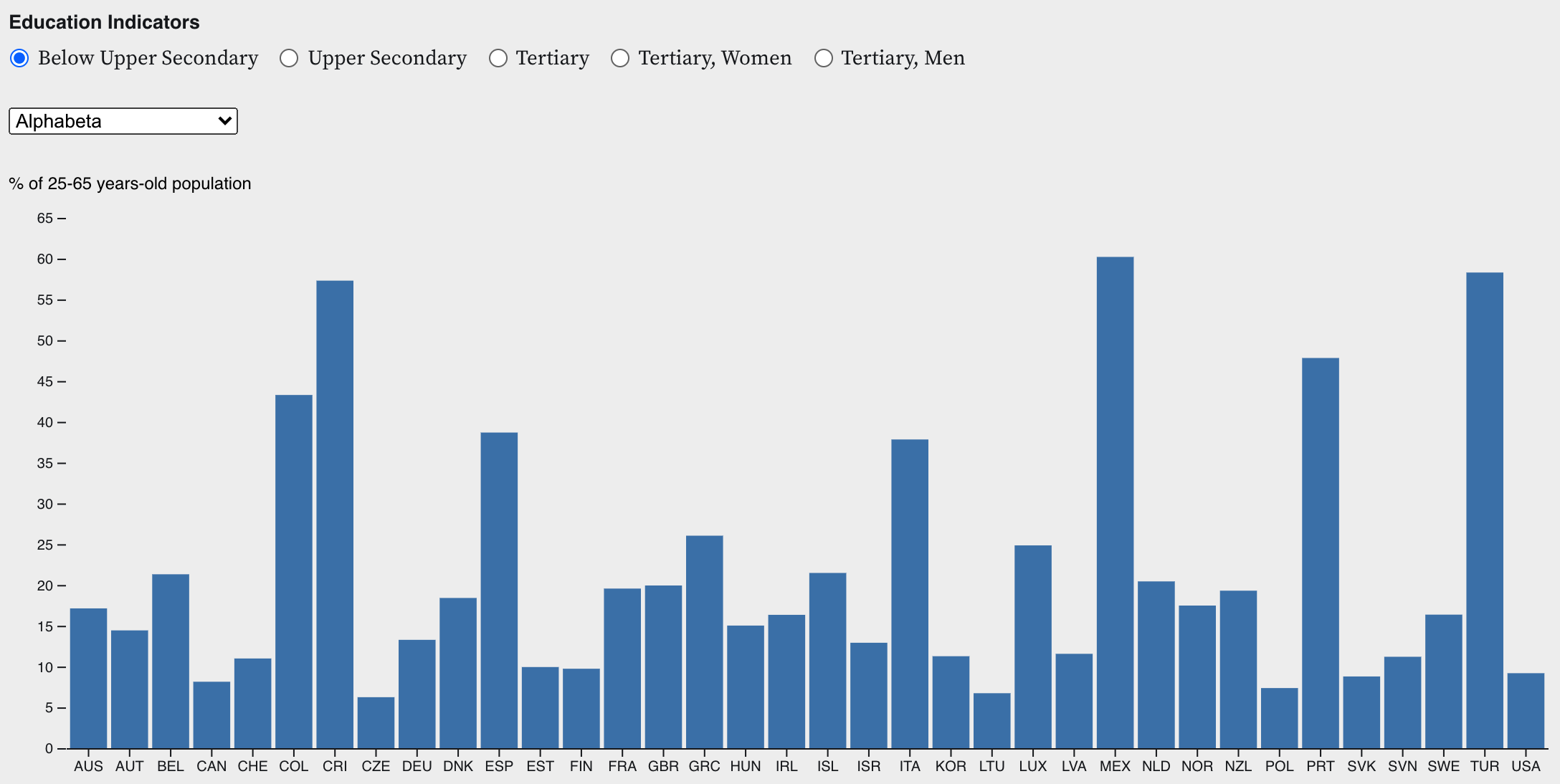
For this specific chart, we want to show the drill-down function for readers interested in understanding a specific year's data. We hope by providing the drill-down function, users can explore more insights and build trust in our data! We decided to allow "Year" and "Indicator" to be selectable to give the user some freedom to explore data. We also provide a "sort" function so that users can quickly gain some insights, such as max and min values in the country, from the chart. Lastly, since our chart has more than 20 bars, we decided to use three digit country ISO codes as labels to avoid overlapping labels on the user screen.
- Bar Chart Race
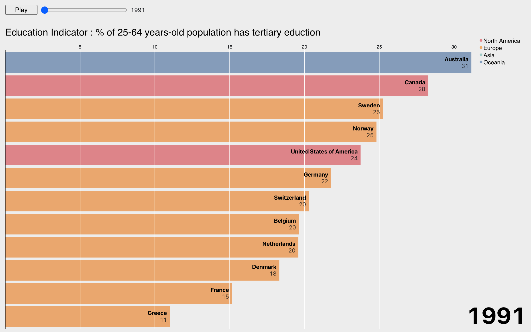
From the research stage, we found that the bar chart race can quickly catch users' attention because its animation visualizes the figures' changes. We decided to make a bar chart race because we want users to be interested in our data. We added geographic attribute, continent to color the bar chars to use color encodings to convey more information effectively. We decided on a play/pause button to give users more interaction modalities. We also make the year selectable in case users want to roll back to a specific year. Lastly, learning from the peer critique feedback, we slow down the animation a bit so that users can see the progress.
- Gapminder Chart
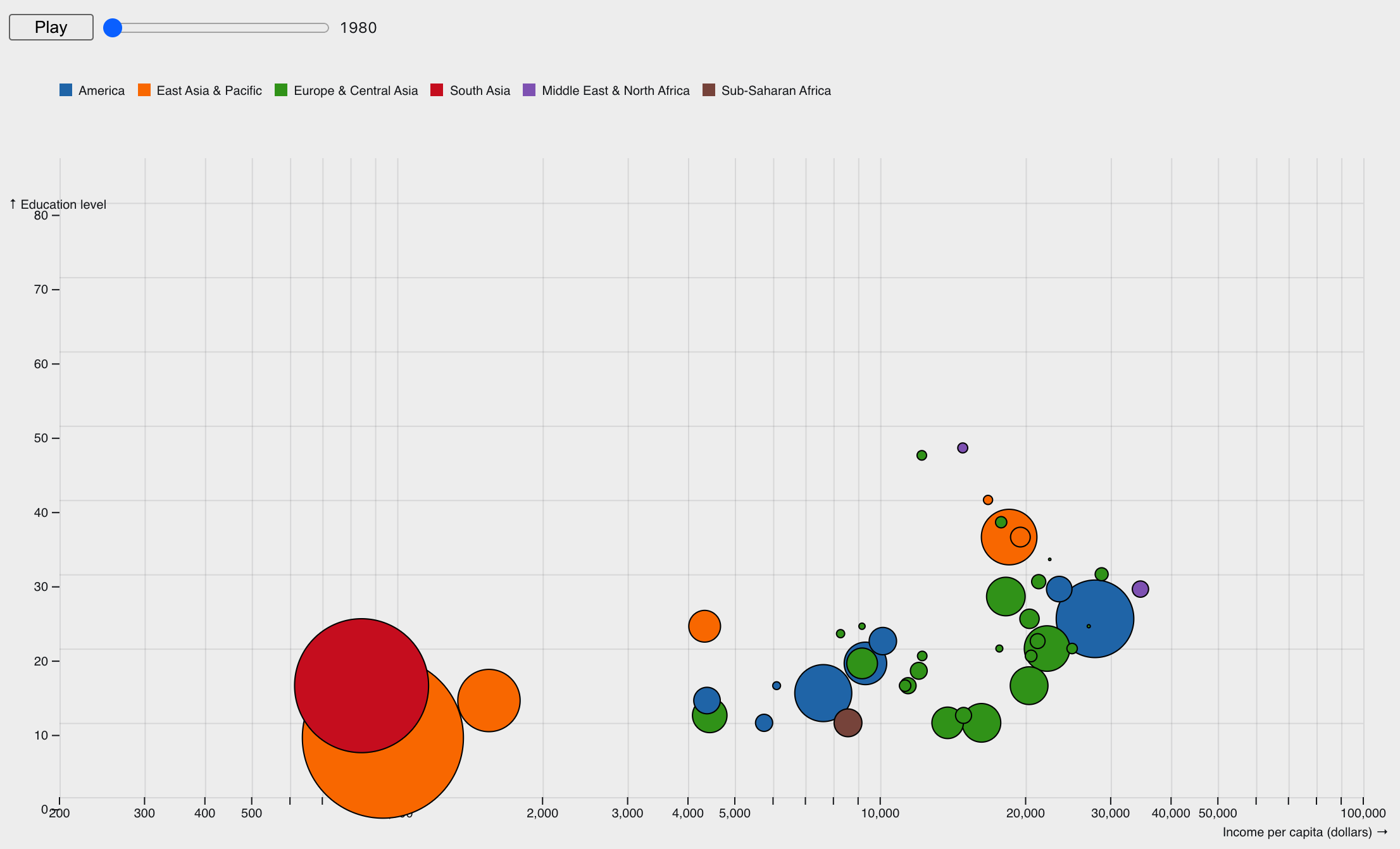
We thought it would be interesting to see whether education levels and income levels are correlated. For that, we decided to recreate a Gapminder visualization made famous by Hans Rosling. It illustrates the movement of circles, which represent each country, in a chart space of per-capita income (x), education levels (y) and population (area) of 43 OECD member states over the last 30 years, colored by region. We placed a Play/Pause button to give more control to the audience in sliding through particular years as they wish.
Development Process
Overview
In the first meeting, we decided to use D3 as a prototyping tool and convert D3 to github website after we finish. We also decided to adopt a multi-milestone stage for our A4 assignment. Details as below
- 1st Milestone
ByeongJo finished the research on how to embed D3 on the webpage and built the bone-structure of the website (5 hours); Brandon finished the bar chart ( 8 hours ). - 2nd Milestone
ByeongJo finished the Gapminder (circle animation) chart animation (11 hours); Brandon finish the bar chart race visualization (8 hours); Prepare for the MVP demo ( 2 hours * 2) - 3rd Milestone
Both of us digest the feedback from peer critiques and enhance the charts ( 8 hours * 2); Prepare write up for the final submission( 4 hours * 2 ) - Total Effort
ByeongJo ( 30 hours )
Brandon ( 30 hours )
Challenges
-
Bar Chart
Bar Chart is the first chart we made. The challenge we met is how to load and filter the data in D3. It took me a while to understand the data manipulation in D3. In addition, the chaining style in D3 is difficult to read and grasp. -
Bar Chart Race
When developing the Bar Chart Race, the challenging part for me is the color code. It is difficult to understand the logic at the beginning. Also, as we tried to control the speed of animation, we also spent some time to understand the keyframe concept. -
Gapminder Chart
Implementing the D3 codes was relatively easy thanks to well annotated codes from the original author. The most challenging part was the data wrangling. We had to merge data from different sources (education levels, income, and population) and transform into a format that can be fed into the D3 data pipeline. We also had to remove irrelevant data and fill in the missing data. We used bisection (https://en.wikipedia.org/wiki/Binary_search_algorithm) and linear interpolation to fill in the missing data. Some issues we experienced also include: there are countries like China and India (two biggest circles in the chart) who had very scare data in education that their movements in the chart in terms of education level are very limited. Moreover, there are drastic drops in income levels among european countries around 2015-2019, which we initially thought was a data quality issue, but later we concluded that it shows the actual drops in income levels caused by an economic recession in Europe. -
Website
We used a basic HTML-based website to deploy our visualization. We wanted to minimize the navigation burden of users, so we decided to place all the visualizations on the landing page. The users can either scroll-down to sequentially view the different charts or use the buttons on the left panel which are linked to the bookmarks placed at each chart to jump between the charts. Observable allows users to embed charts on different platforms using iframe, javascript, or react. For our implementation, we used the iframe. This is a very useful way of deploying the charts, because all the deployed charts are synchronized to Observable, so the updates you make on the original chart will be simultaneously reflected on the charts that are deployed on different platforms.
Acknowledgement
- Data Source: https://data.oecd.org/eduatt/adult-education-level.htm#indicator-chart
- Bar Chart Race: https://observablehq.com/@d3/bar-chart-race-explained
- Bar Chart: https://observablehq.com/@d3/bar-chart
- Bar Chart Sortable: https://observablehq.com/@d3/sortable-bar-chart
- Gapminder Chart: https://observablehq.com/@mbostock/the-wealth-health-of-nations


