Project Title: 360 Degrees Analysis on the Most Beloved Football Club in English Premier League: Manchester United
Visualization Link: https://6859-sp21.github.io/final-project-epl-fans/index.html
Video link: https://youtu.be/4JlkE2x6xQs
- Brandon Chen (brandonc@mit.edu)
- ByeongJo Kong (kongb@mit.edu)
Manchester United is considered the most popular soccer club in the world. Its worldwide fan base reaches a 1.1 billion milestone in 2019. There are several reasons that make Manchester United so popular. Firstly, its team performance is among the top tier in the league. It has won 20 League titles, 12 FA Cups, five League Cups and a record 21 FA Community Shields.
Secondly, Manchester United has successfully created individual wonder players over several generations. For example, Best, Beckham, and Ronaldo. Fans support not only the club but these players too. Thirdly, Manchester United has a long and last relationship with non-European countries. It often tours to Asia countries and the United States, interacting with existing fans and attracting new ones.
Use browser to access : https://6859-sp21.github.io/final-project-epl-fans/index.html
Overview
In the first meeting, we decided the topic for doing a project with English Premier League data. The reason is that both of us are big fans of soccer games. We decided to leverage the knowledge we have in A4 and use D3 and Javascript as our main tool.
Both started to explore the different datasets. After the first week, we decided to make visualizations for three highlevel directions, Player Static, Team Performance, and Social Media Analysis. ( Both of us spent around 8 hours this week )
We received feedback from the Professor and decided to spend one more week to brainstorm the idea. We went to the office hour and explored more datasets. ( Both of us spent 8 hours this week )
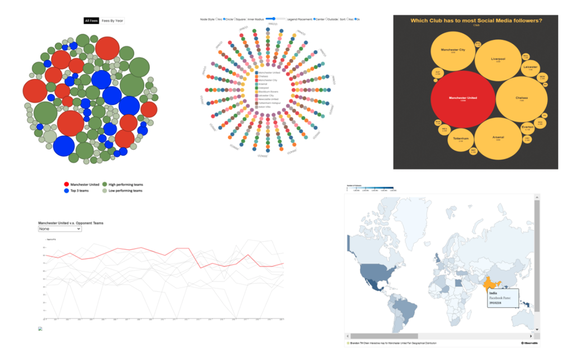
Based on the avaialbe dataset, we finalized the scope of visualizations, a bubble chart for transfer fee, a radar chart for team performance, a line chart for attack points, bubble chart for social media number comparison and a map chart for social media followers . ( Both of us spent 8 hours this week )
- Jo : Bubble chart for transfer fee ( ~ 12 hours )
- Brandon : Map chart for social media follower have completed ( ~ 12 hours )
- Jo : Radar chart for team performance was completed ( ~ 12 hours )
- Brandon : Line chart for attacking point was completed ( ~ 12 hours )
- Jo : bubble chart for social media number comparison and Integrate the website ( ~ 24 hours )
- Brandon : Fine tune the map chart and line chart and prepare the write up ( ~ 24 hours )
- ByeongJo ( ~ 72 hours )
- Brandon ( ~ 72 hours )
