This repository contains a quick technical demonstration that we prepared to support our idea submission for the Siemens sustainability challenge. Information about the challenge can be found here.
Required modules: numpy, pandas, scikit-learn, matplotlib, seaborn.
Dataset: kaggle link
PJM Interconnection LLC (PJM) is a regional transmission organization (RTO) in the United States. It is part of the Eastern Interconnection grid operating an electric transmission system serving all or parts of Delaware, Illinois, Indiana, Kentucky, Maryland, Michigan, New Jersey, North Carolina, Ohio, Pennsylvania, Tennessee, Virginia, West Virginia, and the District of Columbia.
Hourly power consumption data are obtained from PJM's website, and they are shown in megawatts (MW).
The structure of the repository is as follows:
utils.py- contains functions used in the project to prepare data and train models1-exporation.ipynb- a notebook with data exploration and visualization.2-outliers-demo.ipynb- a notebook with a demo of our model and search for discrepancies between the model and the data.3-outliers-demo-no-lags.ipynb- a notebook with a demo of our model and search for discrepancies between the model and the data, without using lags as a predictor.4-other-datasets.ipynb- a notebook with a demonstration of other datasets we found interesting.
The content of the notebooks is shown below. Visit the notebooks for the code and change it to your liking.
The following data are from DEOK power company (data/DEOK_hourly.csv), which is in the Kentucky-Ohio region of the PJM grid.
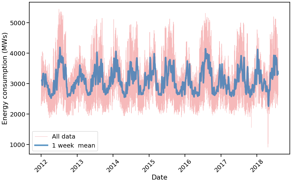
Let's have a look at the low-frequency variation in the data, related to the seasons.
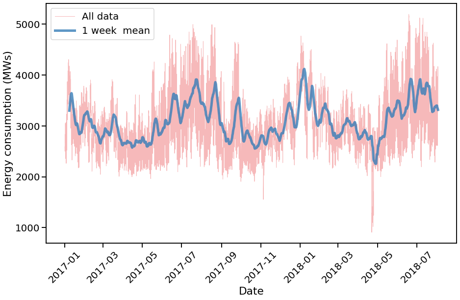
and its zoomed-in version
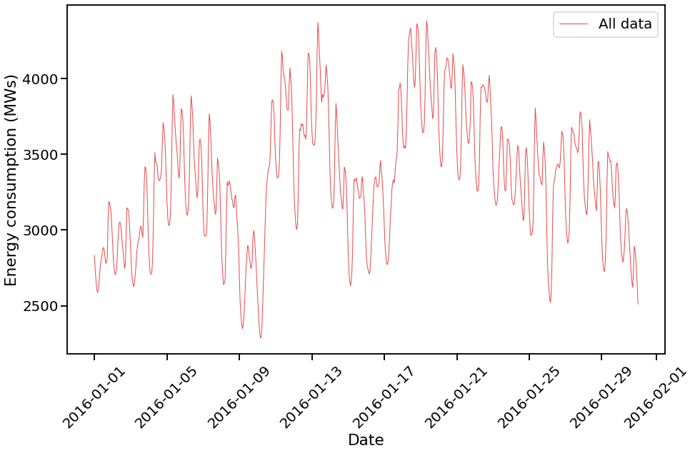
Obviously the low-frequency variations are related to the seasons while the high-frequency variations are based on daily cycle.
Let's now look at the high-frequency variation in the data (daily cycle)
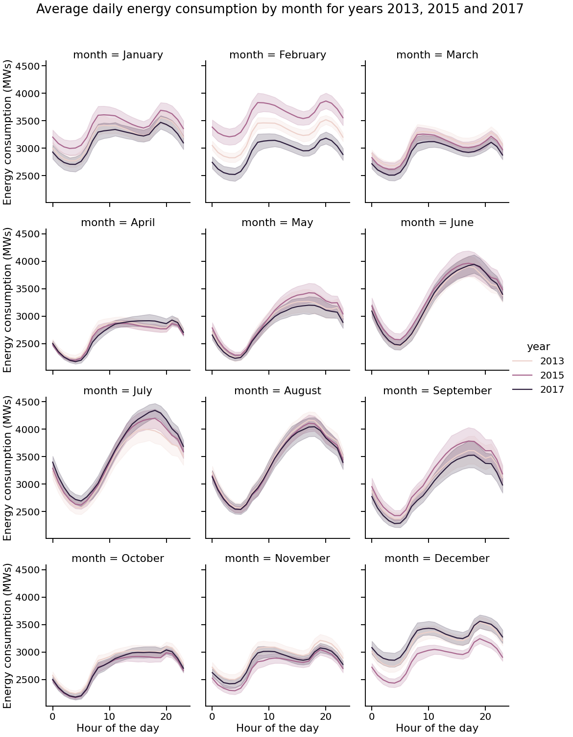
To elaborate, let's explore the average of many days in a few particular years (2013, 2015 and 2017) grouped by month:
A significant difference between the daily patterns in February and December can be seen. The day-to-day variance is large. This is an example of unexpected behavior.
We will try to find such events in the data. We will proceed to the next notebook to build a simple model for this kind of data and find differences between our expectations and the data.
We build a simple model for energy consumption using random forest regression from sklearn:
RandomForestRegressor(n_estimators=700, max_depth=10)with which we profit from the fact that the data is highly seasonal and has a daily cycle without much feature-engineering.
We use the following features:
- hour of the day
- day of the week
- day of the year
- energy consumption in the previous hour
- rolling mean of energy consumption in the previous 24 hours
all those parameters may be changed in the notebook, see utils.py.
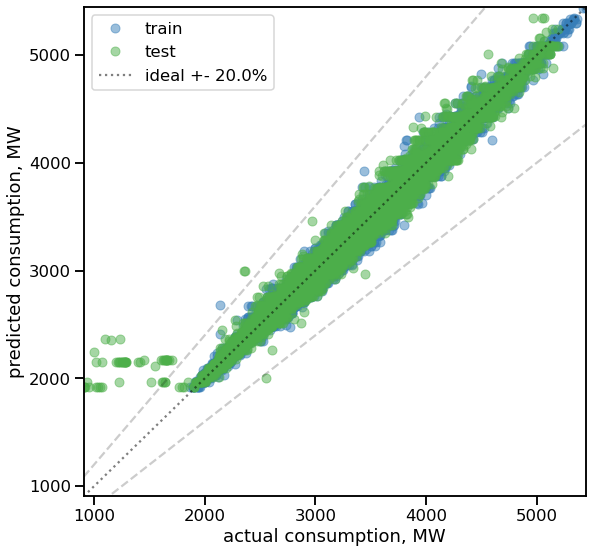
We train the model using the first 80% of the data and test it using the last 20% of the data. The plot below shows the predictions of the model as a function of true values. The model is not completely accurate, but it is adequate enough to find discrepancies between the model and the data.
We monitor the goodness of the model by calculating the mean absolute percentage error (MAPE) using the test set. The MAPE is therefore 0.014 for the test set and 0.017 for the train set. This means that the model is not overfitting much. Note that we do not do hyperparameter tuning at this stage, so the model can be improved later in the future.
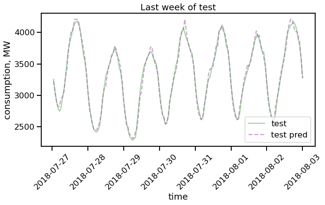
The last week of test data is shown below (test is a actual data, test pred is the prediction of our model):
this shows that the model is good enough to grasp the main patterns in the data.
As the next step, we run a function to find the discrepancies between the model and the data. The function is defined in utils.py and is called find_outliers. The function returns a list of days with discrepancies larger than the given threshold.
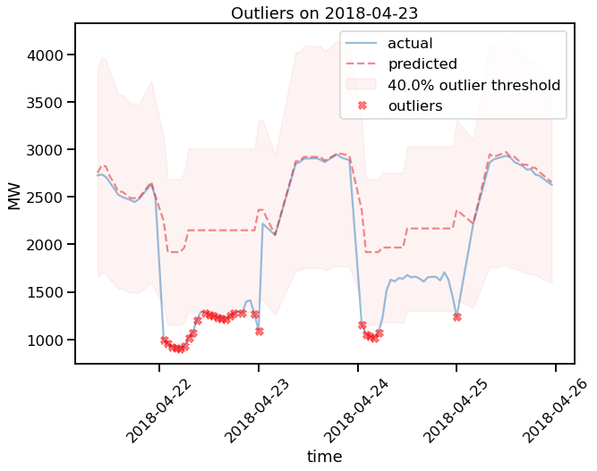
An example of the output of the function is shown below:
in which it is apparent that the prediction of our model overshoots the data on 2018-04-22 significantly (>40%).
First, it is worth mentioning that we did find interesting discrepancies between the model and the data in light of our model. Second, as we have already pointed out, the calibration of the model and thresholds is not perfect, and it can certainly be improved in the future.
We tried to find a particular local event (e.g. sports, bad weather, conference) in the region, but did not succeed. Besides, the shape of the consumption curve for that day suggests that this may be a data fluke (e.g. energy grid producer turned off the sensors) rather than a real event. The fact is that we can start searching for events in the data with the help of our model.
We also searched for and found the discrepancies without using lag(s) as a predictor. This is demonstrated in notebook 3-outliers-demo-no-lags.ipynb.
The reasoning behind this is straightforward: we are only interested in fitting a trend in time series data using historical data and not taking recent events into account. This would help us to detect long-term changes in the data due to, e.g., geopolitical events.
We show an example load curve from the dataset used in this project, which is based on the data from US load profiles OEDI.
The (cleaned) data file energy-consumption.csv.tar.bz2 can be found in the mentioned repository and it is not included in this project.
One major advantage of the dataset is that it contains data from many different regions in the US which are segregated according to the building type. This would allow us to compare the load curves of different regions and consumer types (e.g. residential vs. commercial).
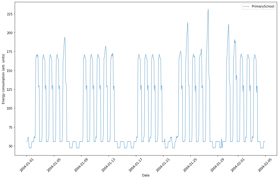
An example of the load curve of a primary school in Houston, TX is shown below:
It shows the weekly cycle and the daily cycle clearly. In the year-long plot, one can see the seasonal variation including school vacation in summertime (see 4-other-datasets.ipynb).
We have shown that it is possible to find interesting events in the data with the help of a simple model. The model is not flawless, but it is good enough to find discrepancies between the model and the data. Making a catalog of such events would be a worthwhile starting point for further research into the causes and effects of different types of happenings on energy consumption for more sustainable energy usage.
We have shown that the model can be used to find discrepancies in the data without using lags as a predictor. This would help to detect long-lasting changes in the data due to, e.g., weather conditions.
We provide an example of the load curve for a particular type of building in Houston, TX. This would allow us to compare (and predict) the energy curves of different regions and districts, further helping to make more efficient grid management.
