
I build an interactive dashboard to explore the Belly Button Biodiversity dataset, which catalogs the microbes that colonize human navels.
The dataset reveals that a small handful of microbial species (also called operational taxonomic units, or OTUs, in the study) were present in more than 70% of people, while the rest were relatively rare.
apt the Gauge Chart from https://plot.ly/javascript/gauge-charts/ to plot the weekly washing frequency of the individual.
Use Plotly.js to build interactive charts for dashboard.
-
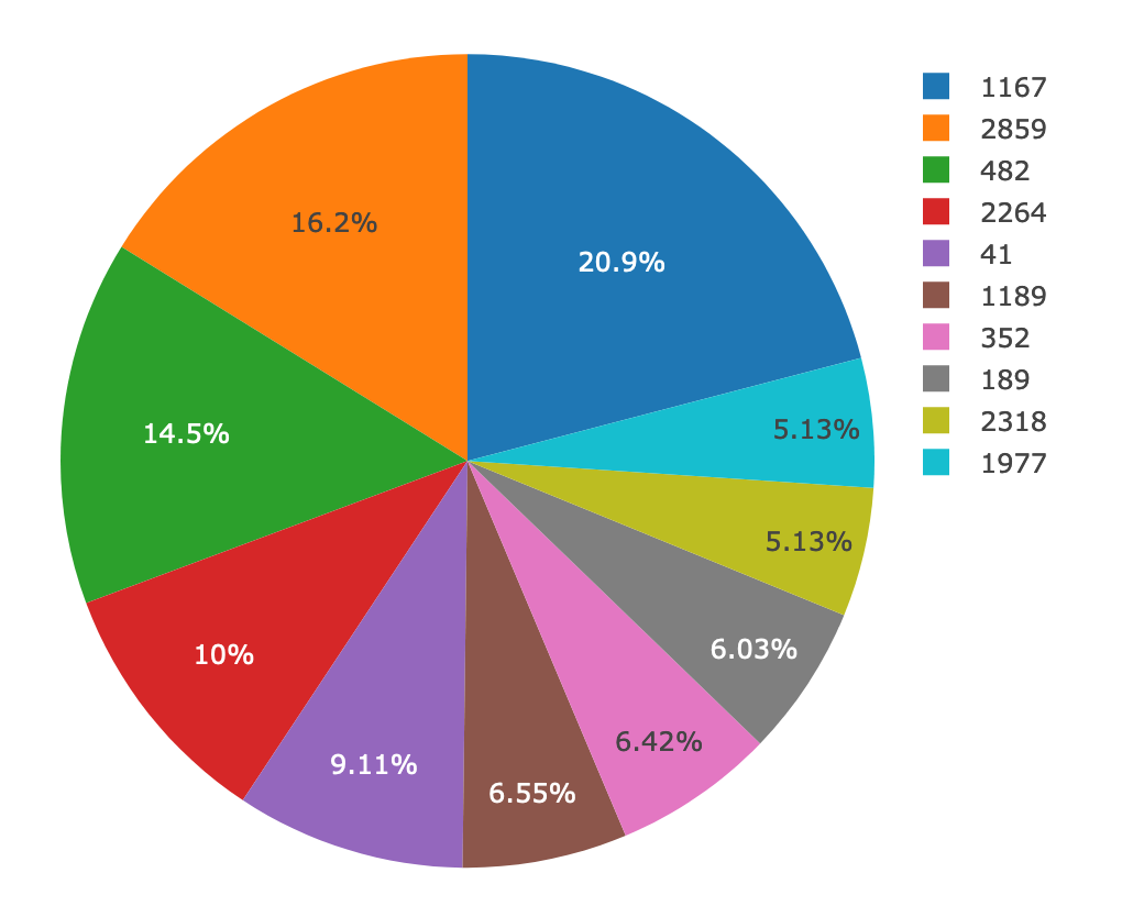
Create a PIE chart that uses data from samples route (
/samples/<sample>) to display the top 10 samples.-
Use
sample_valuesas the values for the PIE chart -
Use
otu_idsas the labels for the pie chart -
Use
otu_labelsas the hovertext for the chart
-
-
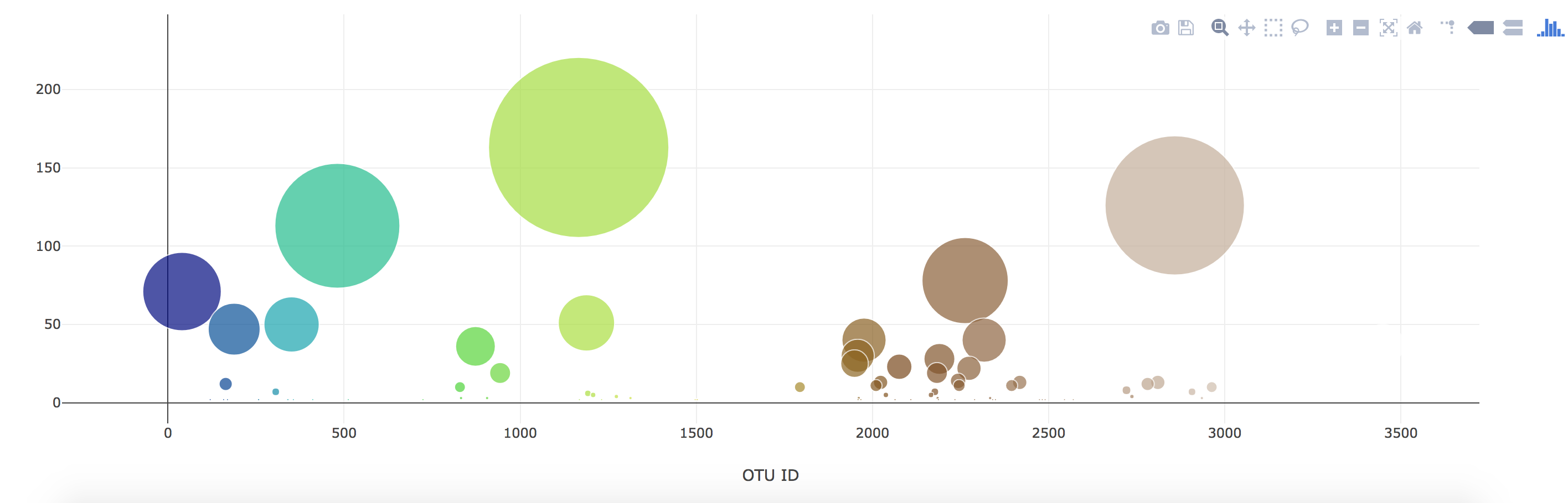
Create a Bubble Chart that uses data from samples route (
/samples/<sample>) to display each sample.-
Use
otu_idsfor the x values -
Use
sample_valuesfor the y values -
Use
sample_valuesfor the marker size -
Use
otu_idsfor the marker colors -
Use
otu_labelsfor the text values
-
-
Display the sample metadata from the route
/metadata/<sample>- Display each key/value pair from the metadata JSON object somewhere on the page
-
Update all of the plots any time that a new sample is selected.


Deploy Flask app to Heroku.
- Use the provided sqlite file for the database.
Flask API starter code to serve the data needed for your plots.
- Test routes by visiting each one in the browser.