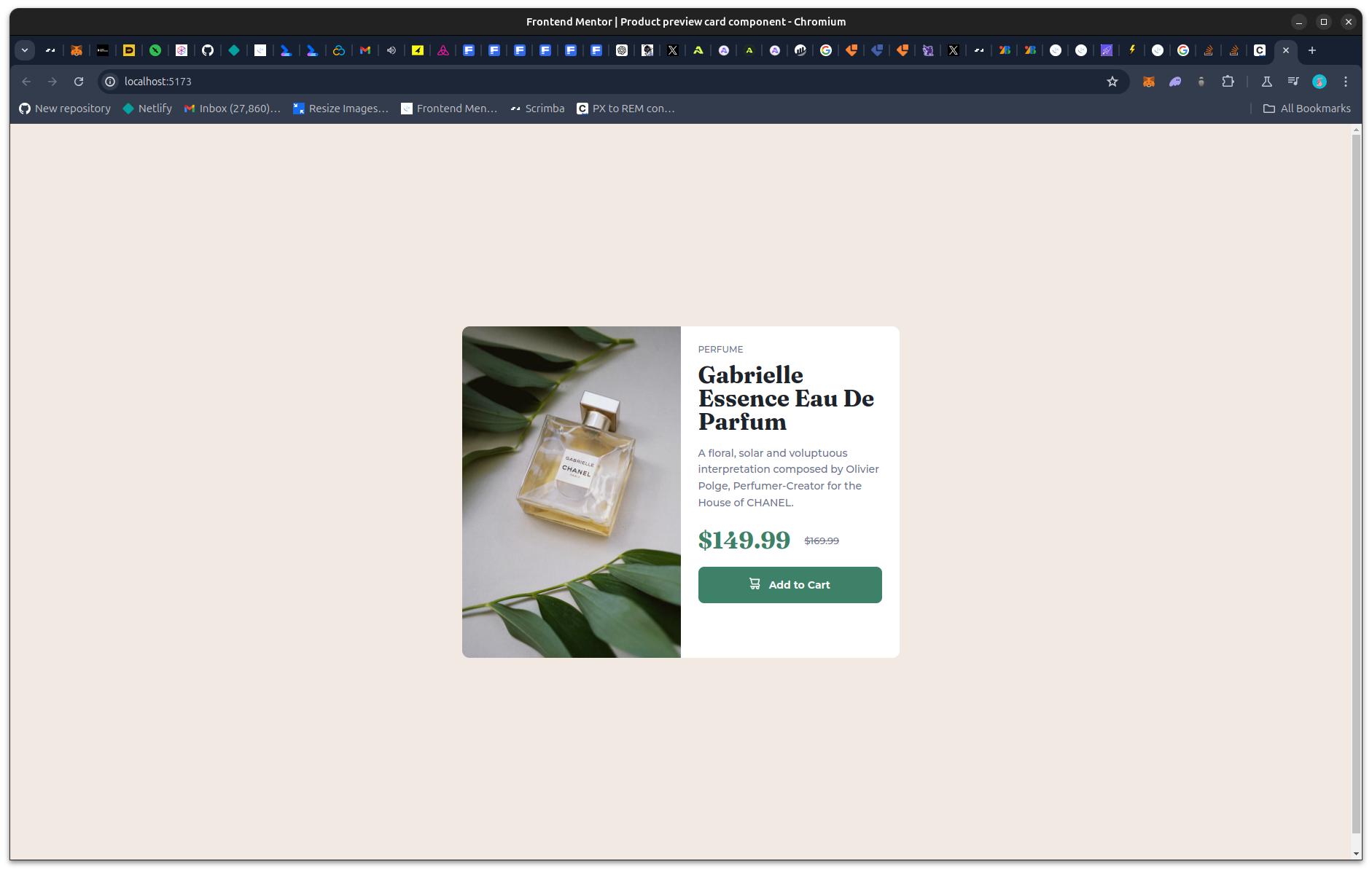
This is a solution to the Product preview card component challenge on Frontend Mentor. Frontend Mentor challenges help you improve your coding skills by building realistic projects.
Users should be able to:
- View the optimal layout depending on their device's screen size
- See hover and focus states for interactive elements
- Solution URL: Live Site
- Live Site URL: Github Repo
- Semantic HTML5 markup
- CSS custom properties
- Flexbox
- Mobile-first workflow
- React - JS library
I learned a lot about responsive design while doing this challenge and was able to implement code that is more responsive through the use of css properties such as inline-size, block-size, and margin-block-end. Here are some examples of their usage:
.product_preview_type {
  color: #6c7289;
  font-size: 0.75rem;
  line-height: 1.25;
  margin-block-end: 0.75rem;
  text-transform: uppercase;
}

.product_preview_img_container,
.product_preview_details {
  inline-size: 50%;
}

.product_preview_img_desktop {
  display: inline-block;
  border-radius: 0.625rem 0 0 0.625rem;
  block-size: 100%;
}I will continue to learn and implement more responsive and accesible designs in my websites
- Web(.)dev Course on responsive Design - This helped me to understand how important it is to use responsive design.
- Website - Achigyus
- Frontend Mentor - @Achigyus
- Twitter - @ElUchihaAnbu
