- HTML
- SCSS
- CSS Subgrid
- Typescript
- Angular v17
- RxJs
I've implemented all the features required by the original challenge, thus the user can:
- View each page and be able to toggle between the tabs to see new information
- View the optimal layout for each of the website's pages depending on their device's screen size
- See hover states for all interactive elements on the page
In addition, I've implemented all the functionality required for the Tabs Pattern including WAI-ARIA roles, states, and properties, and keyboard interaction
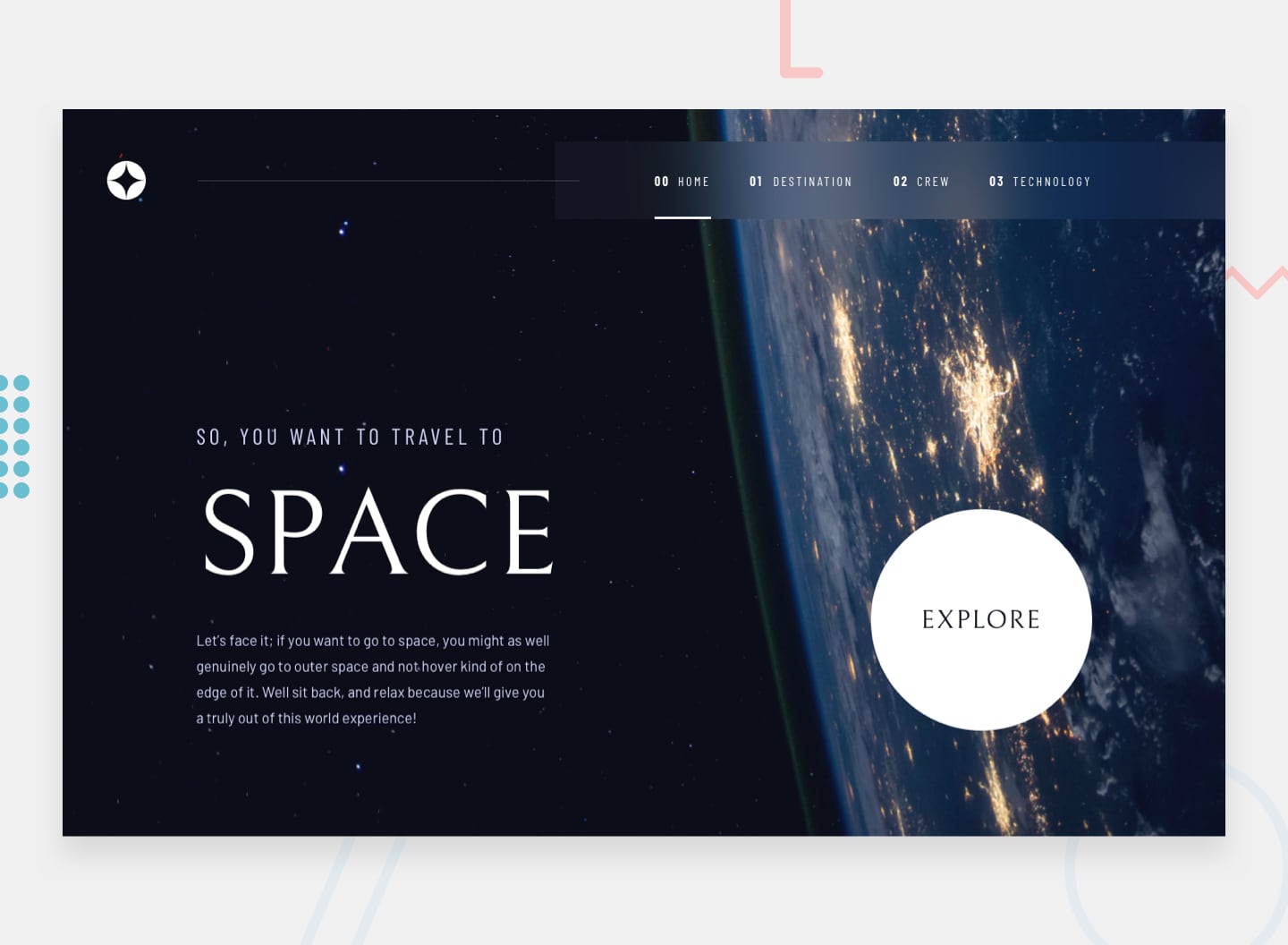
Space Tourism Website is one of the most difficult challenges on Frontend Mentor concerning the layout of each page. The layout varies remarkbly when navigating through pages or changing screen size. This is not the first time I take that challenge though. I've build the same project before using Vanilla JS. You can check the previous solution here.
-
What is the best way to align the content exactly like the original design?
The challenge has a lot of deceptively simple requirements when it comes to the layout of the page. For instance, the navigation's background bleeds to the end of the screen while its content should be aligned with the page's main content. But that's not always the case. For instance the navigation doesn't bleed at small screens in the
Home Page. The content itself sometimes bleed like in theTechnology Page. The logo isn't aligned with content and the header's top offset varies across screen sizes. To handle this chaos, I couldn't depend on fixed sizes and values. Instead, I used CSS Subgrid whereas implementing a simple layout for browsers that don't support this new feature. -
How to build the interactive tabs?
I was going to use Angular Material to do the whole thing for me. But each tab pattern in the project has different structure and styling. In addition, there hasn't been an implementation for the tabs pattern in Angular Material CDK yet. Long story short, I had to build it on my own, which took me a while. That wasn't a big problem though as I've build it before.
In order to create such a complex layout and functionality, I learned the following:
- Using route data to change page heading dynamically in addition to building the whole navigation bar using my existing routes.
- Using Angular directives to create something that resembles Angular Material CDK for my tabs.
- Using CSS Subgrid to handle page layout across different screen sizes.
If you want to make any suggestions, feel free to do that in the discussions section. Also, feel free to clone the repo and play around with the source could.
