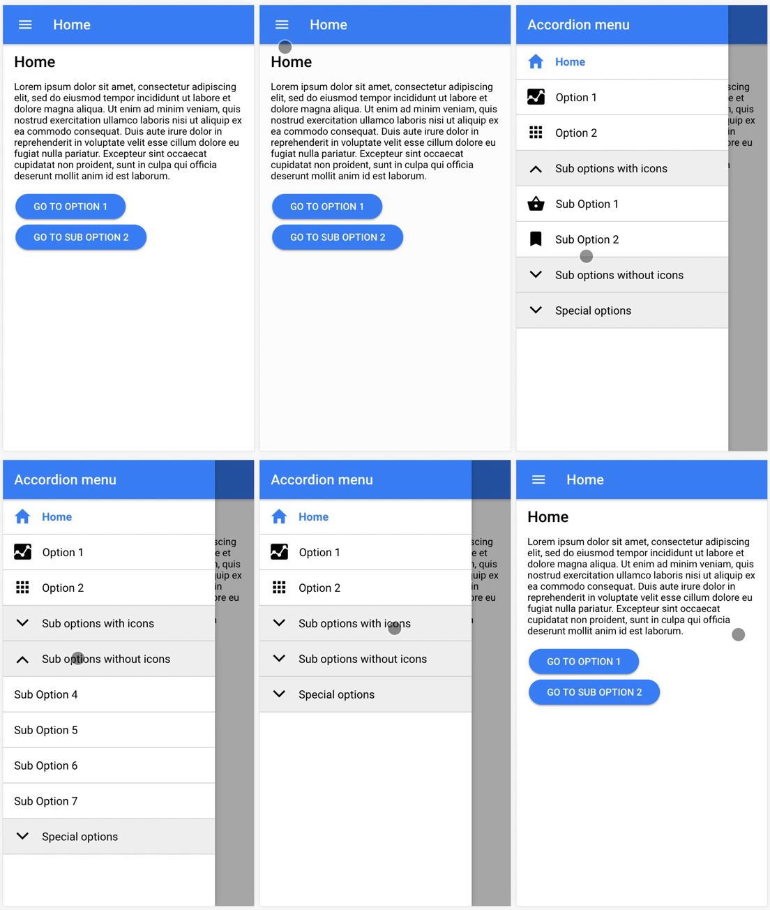
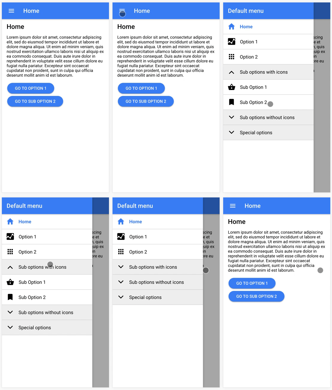
Ionic 2/3 demo of a two-level side menu. The component currently supports only two levels of items. If more levels are needed, maybe using tabs layout for the other levels would be a better approach.
The component also supports two different modes: default and accordion.
Cli packages: (/usr/local/lib/node_modules)

    @ionic/cli-utils  : 1.19.0
    ionic (Ionic CLI) : 3.19.0

Local packages:

    @ionic/app-scripts : 3.1.7
    Ionic Framework    : ionic-angular 3.9.2
Inside of the project folder, run npm install and then to run the demo in the browser ionic serve [-t android/ios]
Just copy the side-menu-content folder (inculding the html, ts and scss files) in your project. Then include the SideMenuContentComponent in the declarations array from your @NgModule.
Header options and sub menu items should have the following format:
// MenuOptionModel interface
export interface MenuOptionModel {

    // If the option has sub items and the iconName is null,
    // the default icon will be 'ios-arrow-down'.
    iconName?: string;

    // The name to display in the menu
    displayName: string;

    // The badge option expects an Observable that allows the application to dynamically update the value of the badge.
    badge?: Observable<any>;

    // Target component (or null if it's a "special option")
    component?: any;

    // Here you can pass whatever you need. That way you can
    // handle login/logout options, changing the language, and so on...
    custom?: any;

    // Set if this option is selected by default
    selected?: boolean;

    // List of sub items if any
    subItems?: Array<MenuOptionModel>;
}
So an item with nested sub items would look like this:
let menuOption: MenuOptionModel = {
    displayName: 'Option Name',
    subItems: [
        {
            // With icon
            iconName: 'ios-basket',
            displayName: 'Sub Option 1',
            component: SomePage
        },
        {
            // Without icon
            displayName: 'Sub Option 2',
            component: SomeOtherPage
        },
        {
            // Special option with icon
            iconName: 'log-in',
            displayName: 'Login',
            custom: {
                isLogin: true
            }
        },
        {
            // Another special option but without icon
            displayName: 'Spanish',
            custom: {
                shouldChangeLanguage: true,
                targetLanguage: 'ES'
            }
        }
    ]
};
When an option is selected, the MenuOptionModel object is returned to the caller by the selectOption event. The MenuOptionModel returned object can then be used to check if we need to push/set as root a new page, or if we need to handle that option as a special option.
<side-menu-content [options]="options" (selectOption)="selectOption($event)"></side-menu-content>
And then in the App component code:
@Component({
    templateUrl: 'app.html'
})
export class MyApp {
    // ...

    public selectOption(option: MenuOptionModel): void {
        if (option.custom && option.custom.isLogin) {
            // Handle the login...
        } else if (option.custom && option.custom.isLogout) {
            // Handle the logout...
        } else if(option.component) {
            // Push or set as root the option.component page
        }
    }
}
The component also defines the SideMenuSettings interface, to customize the behaviour of the component.
// SideMenuSettings interface
export interface SideMenuSettings {
    accordionMode?: boolean;
    itemHeight?: {
        ios?: number,
        md?: number,
        wp?: number
    };
    arrowIcon?: string;
    showSelectedOption?: boolean;
    selectedOptionClass?: string;

    indentSubOptionsWithoutIcons?: boolean;
    subOptionIndentation?: {
        ios?: string,
        md?: string,
        wp?: string
    };
}
The settings should be send to the component using the settings property:
@Component({
    templateUrl: 'app.html'
})
export class MyApp {

    //...

    // Settings for the SideMenuComponent
    public sideMenuSettings: SideMenuSettings = {
        accordionMode: true,
        showSelectedOption: true,
        selectedOptionClass: 'my-selected-option'
    };

    // ...

}
And in the view:
<side-menu-content [settings]="sideMenuSettings" [options]="options" (selectOption)="selectOption($event)"></side-menu-content>
| Param | Description | Default |
|---|---|---|
accordionMode |
Collapses any opened option when a new option is expanded. | false |
itemHeight |
The height of the items is used to animate the side menu changes when hidding and showing the sub menu items. You can set a custom height for the items for each mode. | 50 for all md, ios and wp |
arrowIcon |
The Ionic icon name to be used as the arrow in the header options | ios-arrow-down |
showSelectedOption |
If the selected option should be highlighted (if it is a sub item, its parent will also be highlighted). If set to true and the selected option is a sub item, its parent will be always shown expanded when opening the side menu |
false |
selectedOptionClass |
Name of the class to be added to the selected option. Only used when showSelectedOption is true |
selected-option |
indentSubOptionsWithoutIcons |
Vertically aligns the sub options without icons to the parent option | false |
subOptionIndentation |
The padding-left of the sub options, so you can indent them if needed |
'16px' for all md, ios and wp |
The component also exposes a collapseAllOptions() method to reset the state of the options when needed (after selecting an option, or when closing the side menu for example):
@Component({
    templateUrl: 'app.html'
})
export class MyApp {
    // Get the instance to call the public methods
    @ViewChild(SideMenuContentComponent) sideMenu: SideMenuContentComponent;

    // ...

    public selectOption(option: MenuOptionModel): void {
        this.menuCtrl.close().then(() => {

            // Collapse all the options
            this.sideMenu.collapseAllOptions();

            // ...

        });
    }
}
You can use some simple css rules to change the styles of the menu items. If you set the showSelectedOption setting to true, you can also set the styles of the items when they are marked as selected.
| Target | Class name |
|---|---|
| Single option (items without sub-options) | option |
| Header option | header |
| Sub option | sub-option |
So for instance, you can use the following css rules (by adding it in the app.scss file) to change the color of the menu items, both when they are selected and when they're not:
side-menu-content {

    // In this example, we have used the following name
    // for the selected option in the settings object:
    // selectedOptionClass: 'active-side-menu-option'

    $active-color: map-get($colors, primary);
    $font-color: #222;
    $background-light-color: #fff;
    $background-dark-color: #eee;

    // Single option
    // ------------------
    ion-item.item.item-block.option {
        background-color: $background-light-color;
        color: $font-color;

        &.active-side-menu-option {
            color: $active-color;
            font-weight: 700;
        }
    }

    // Header
    // ------------------
    ion-item.item.item-block.header {
        background-color: $background-dark-color;
        color: $font-color;

        &.active-side-menu-option {
            color: $active-color;
            font-weight: 700;
        }
    }

    // Sub option
    // ------------------
    ion-item.item.item-block.sub-option {
        background-color: $background-light-color;
        color: $font-color;

        &.active-side-menu-option {
            color: $active-color;
            font-weight: 700;
        }
    }
}
If you set the showSelectedOption setting to true, and try to navigate to a given page using a button on the content on the page instead of clicking on that option from the side menu, that page won't be shown as selected in the menu. In order to avoid this, the component also exposes an event and its payload:
// SideMenuRedirectEvent constant
export const SideMenuRedirectEvent: string = 'sidemenu:redirect';

// SideMenuRedirectEventData interface
export interface SideMenuRedirectEventData {
	displayName?: string;
}
So in your page, you just need to publish that event using Ionic Events:
import { SideMenuRedirectEvent, SideMenuRedirectEventData } from './../../shared/side-menu-content/side-menu-content.component';

// ...

public goToSubOption(): void {
    // Since we're redirecting to a page without clicking the option from the
    // side menu, we need to use events to tell the side menu component
    // which option should be marked as selected.
    let redirectData: SideMenuRedirectEventData = {
        displayName: 'Sub Option 2'
    };

    // Send the event to the side menu component
    this.eventCtrl.publish(SideMenuRedirectEvent, redirectData);

    // Now we can set that page as root
    this.navCtrl.setRoot(DetailsPage, { title: 'Sub Option 2' });
}
06/01/2018: Added support for ion-badge in the items/sub-items. The badge option expects an Observable that allows the application to dynamically update the value of the badge (thanks @ralscha!!). Updated Ionic to the 3.9.2 version (thanks @peterennis!!)
04/11/2017: Added option, header and sub-option classes to style the options (see Theming section for more details). Improved overall performance by removing direct access to the DOM.
30/08/2017: Added showSelectedOption and selectedOptionClass to highlight the currently selected option. Added custom subproperty in the MenuOptionModel model to allow the user to add any custom property on the items.
16/09/2017: Added indentSubOptionsWithoutIcons and subOptionIndentation settings to allow the user to customize the indentation of the sub items. Improved inner logic so now if the showSelectedOption setting is true and the currently selected option is a sub item, its parent will be shown expanded when opening the side menu.
- Convert this demo into an npm package
- Add unit testing
- Add e2e testing
- Having an issue or looking for support? Open an issue and I'll do my best to help you out.
- Got a new feature or a bug fix? Fork the repo, make your changes, and submit a pull request.
If you find this project useful, please star the repo to let people know that it's reliable. Also, share it with friends and colleagues that might find this useful as well. Thank you! :)

