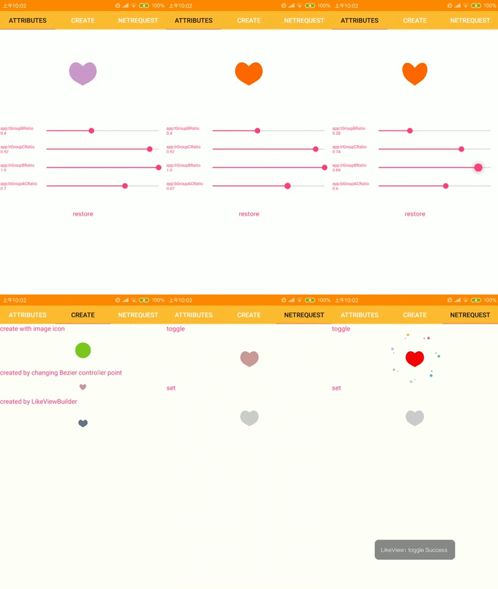
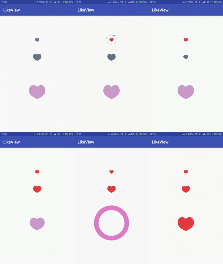
add the dependency to the the build.gradle file
compile 'com.jaren:likeview:1.2.2' <com.jaren.lib.view.LikeView
android:id="@+id/lv"
android:layout_width="wrap_content"
android:layout_height="wrap_content"
app:cirRadius="10dp"
app:cycleTime="2000"
app:defaultColor="#ff657487" /> <com.jaren.lib.view.LikeView
android:id="@+id/lv_icon"
android:layout_width="wrap_content"
android:layout_height="wrap_content"
android:layout_gravity="center_horizontal"
app:ringColor="#ff44ff00"
app:checkedColor="#ff44ff00"
app:defaultColor="#ffcccccc"
app:checkedLikeIconRes="@mipmap/btn_checked"
app:defaultLikeIconRes="@mipmap/btn_check_default"
app:cirRadius="14dp"
app:cycleTime="2000"/> final LikeView likeView=new LikeViewBuilder(getContext())
.setRadius(getResources().getDimension(R.dimen.lv_radius))
.setDefaultColor(Color.GRAY)
.setCheckedColor(Color.RED)
.setCycleTime(1600)
.setUnSelectCycleTime(200)
.setTGroupBRatio(0.37f)
.setBGroupACRatio(0.54f)
.setDotColors(DOT_COLORS)
.setLrGroupBRatio(1)
.setInnerShapeScale(3)
.setDotSizeScale(10)
.setAllowRandomDotColor(false)
.create(); lv = (LikeView) findViewById(R.id.lv);
lv.setOnClickListener(new View.OnClickListener() {
@Override
public void onClick(View v) {
lv.toggle();
}
}); //Change the checked state of the view
lv.setChecked(true);
lv.setCheckedWithoutAnimator(true);
//Change the checked state of the view to the inverse of its current state
lv.toggle();
lv.toggleWithoutAnimator();You can customize the look and behavior of the LikeView in xml. Use the following attributes in xml.
| attribute | description |
|---|---|
| defaultColor | the default color for the heart shape |
| checkedColor | the checked color for the heart shape |
| ringColor | the ring color |
| cirRadius | the only attributes that can determine the LikeView size |
| cycleTime | select animation-duration(ms) |
| unSelectCycleTime | the unselect animation-duration(ms) |
| defaultLikeIconRes | the default icon,using icon instead of heart shape |
| checkedLikeIconRes | the checked icon,using icon instead of heart shape |
| lrGroupCRatio | sets controller point ratio to change left and right of the bottom part of heart shape view |
| lrGroupBRatio | sets controller point ratio to change left and right of the center of heart shape view |
| bGroupACRatio | sets controller point ratio to change the bottom of heart shape view |
| tGroupBRatio | sets controller point ratio to change the top of heart shape view |
| innerShapeScale | the inner shape size , there is positive correlation between inner shape size and innerShapeScale.value range in [2,10] is suggested. |
| dotSizeScale | the dot size , there is negative correlation between dot size and dotSizeScale.value range in [7,14] is suggested. |
| allowRandomDotColor | whether random dot color is allowed,default is true |
- fix state
onDetachedFromWindow
- fix icon state
- add attribute to adjust the heart shape view
- support using icon instead of heart shape
- no longer change checked state within the LikeView itself
- add
setCheckedWithoutAnimator(boolean checked) - add
toggleWithoutAnimator()
Copyright 2017~2018 jaren

Licensed under the Apache License, Version 2.0 (the "License");
you may not use this file except in compliance with the License.
You may obtain a copy of the License at

   http://www.apache.org/licenses/LICENSE-2.0

Unless required by applicable law or agreed to in writing, software
distributed under the License is distributed on an "AS IS" BASIS,
WITHOUT WARRANTIES OR CONDITIONS OF ANY KIND, either express or implied.
See the License for the specific language governing permissions and
limitations under the License.


