English | 简体中文
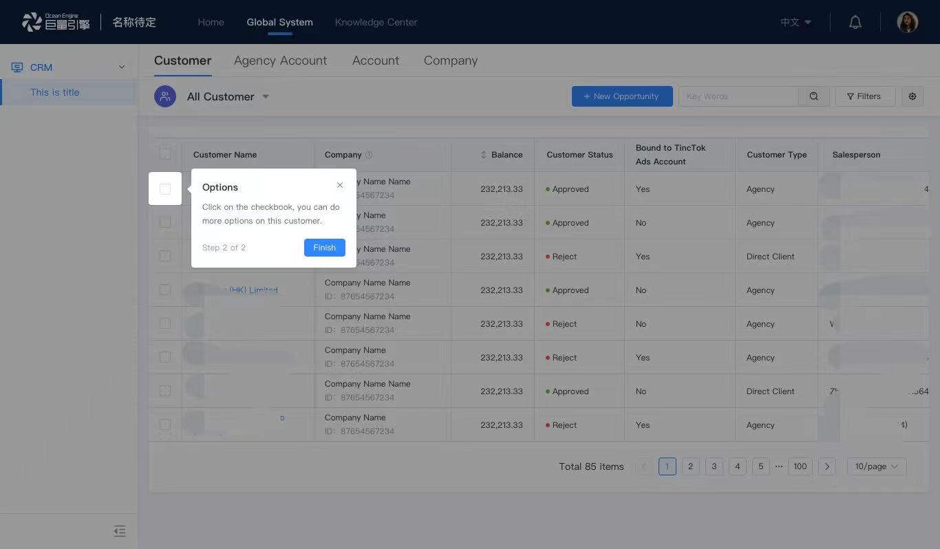
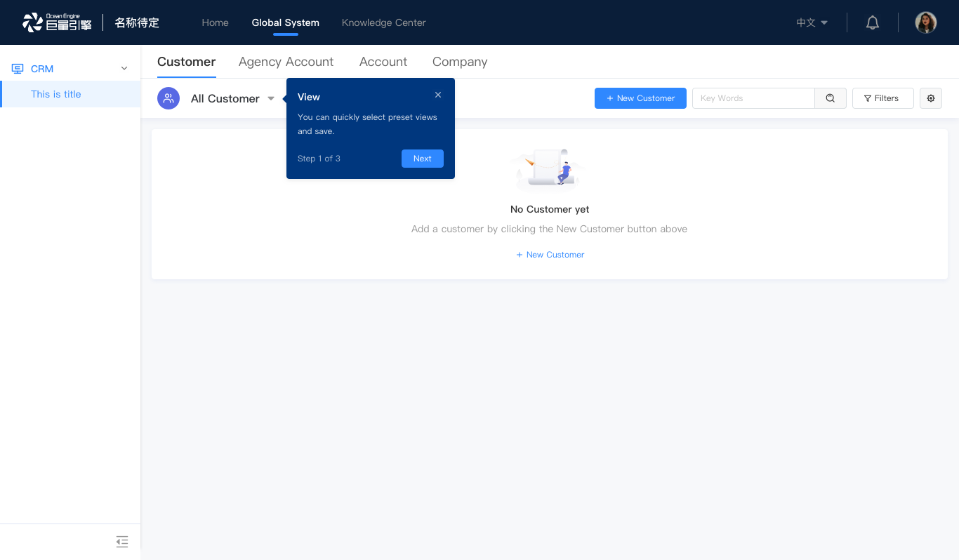
When we onboard new users or ship new features, how do we make sure that our audience knows what's in it and get them excited to use our apps? That's where an onboarding sequence comes into play. This React library guide offers an effective way to construct a smooth onboarding experience.


/* install via npm or yarn */
npm i byte-guide
yarn add byte-guide

/* load via umd */
<script src='https://unpkg.com/byte-guide/dist/index.umd.min.js'></script>
/* load via umd and specified version */
<script src='https://unpkg.com/byte-guide@version/dist/index.umd.min.js'></script>import Guide from 'byte-guide';
<Guide
steps={[]}
localKey="uni-key"
/* customize styles */
hotspot
modalClassName="my-guide-modal"
maskClassName="my-guide-arrow"
/* customize callbacks */
onClose={() => {
/* do sth */
}}
beforeStepChange={(nextIndex, nextStep) => {
/* do sth */
}}
afterStepChange={(nextIndex, nextStep) => {
/* do sth */
}}
/* customize footers */
stepText={(stepIndex, stepCount) => `Step ${stepIndex} of ${stepCount}`}
nextText="Next"
okText="Finish"
/>;| props | definition | type | required | defalut value |
|---|---|---|---|---|
| steps | An array of info of each step of the onboarding sequence | IStep[] | ✓ | -- |
| localKey | A unique key that will be stored in localStorage to indicate if the guide has finished | string | ✓ | -- |
| expireDate | The expire date of the guide when it will not be displayed anymore | string,YYYY-mm-hh | -- | |
| closable | If the guide can be closed before the last step. If false, the close button x will not be displayed on each modal. |
bool | true | |
| modalClassName | The class name of the modal | string | -- | |
| maskClassName | The class name of the mask | string | -- | |
| mask | Whether or not to display the mask | bool | false | |
| arrow | Whether or not to display the arrow | bool | true | |
| hotspot | Whether or not to display the hotspot | bool | false | |
| stepText | The custom text for the step info | (stepIndex, stepCount): string => {} | (stepIndex, stepCount) => Step ${stepIndex} of ${stepCount} |
|
| nextText | The custom text for the Next Step button |
string | Next | |
| okText | The custom text for the confirm button at the last step | string | I know | |
| visible | If the guide is visible | bool | true | |
| lang | The language of use | 'zh' | 'en' | 'ja' | 'zh' | |
| step | The first step's number | number | 0 | |
| afterStepChange | The callback function when the step changes | (nextIndex, nextStep): void=>{} | -- | |
| beforeStepChange | The callback function when the user is about to move to the next step | (stepIndex: number, step: IStep) => void | -- | |
| onClose | The callback function when the guide closes */ | |||
| onClose?: () => void; | ():void=> {} | -- |
| key | definition | type | required | defalut value |
|---|---|---|---|---|
| selector | The CSS Selector of the anchor element or the anchor element itself | string | () => reactNode, reactNode | -- | |
| targetPos | If you don't want the modal to be displayed relative to an anchor element, you can pass a targetPos object to indicate the modal's position relative to the document body | { top, left, width, height } | Required when selector is not defined |
-- |
| title | The title of the modal | string | -- | |
| content | The content of the modal | string | reactNode | -- | |
| placement | The placement of the modal relative to the selector | 'top' | 'bottom' | 'left' | 'right' | 'top-left' | 'top-right' | 'bottom-left' | 'bottom-right' | 'left-top' | 'left-bottom' | 'right-top' | 'right-bottom' | 'bottom' | |
| offset | The offset of the modal relative to the selector. x indicates the horizontal offset, y the vertical offset |
{ x, y } | -- | |
| parent | The parent component to mount | 'body'or null | -- | |
| visible | If this step is visible | bool | true | |
| skip | If this step should be skipped | bool | false | |
| beforeStepChange | The function called when user click "next" and BEFORE going to the next step | (curStep: IStep, curStepIndex: number, steps: IStep[]) => void; | -- | |
| afterStepChange | The function called when user click "next" and AFTER going to the next step | (curStep: IStep, curStepIndex: number, steps: IStep[]) => void; | -- |
An example of steps
const steps = [
  {
    selector: '#search',
    title: 'Search',
    content: <div>You can now search for your customers using ID or name</div>,
    placement: 'bottom-left',
    offset: {
      x: 20,
    }
    beforeStepChange: () => {
      window.open('https://my.web.net')
    }
  },
  {
    selector: () => {
        const tabs = Array.from(
          document.querySelectorAll('.nav-scroll > div > div > .tab')
        );
        return tabs?.[2];
      },
    title: 'Customer Detail',
    content: 'In this tab, you can read and update customer details.'
    visible: location.pathname === 'customer/detail'
  }
];