A knowit tribute
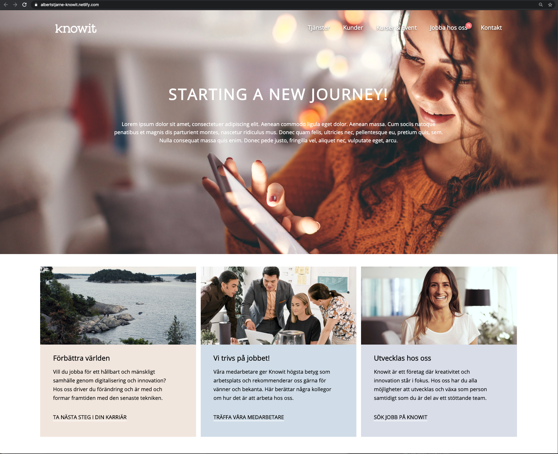
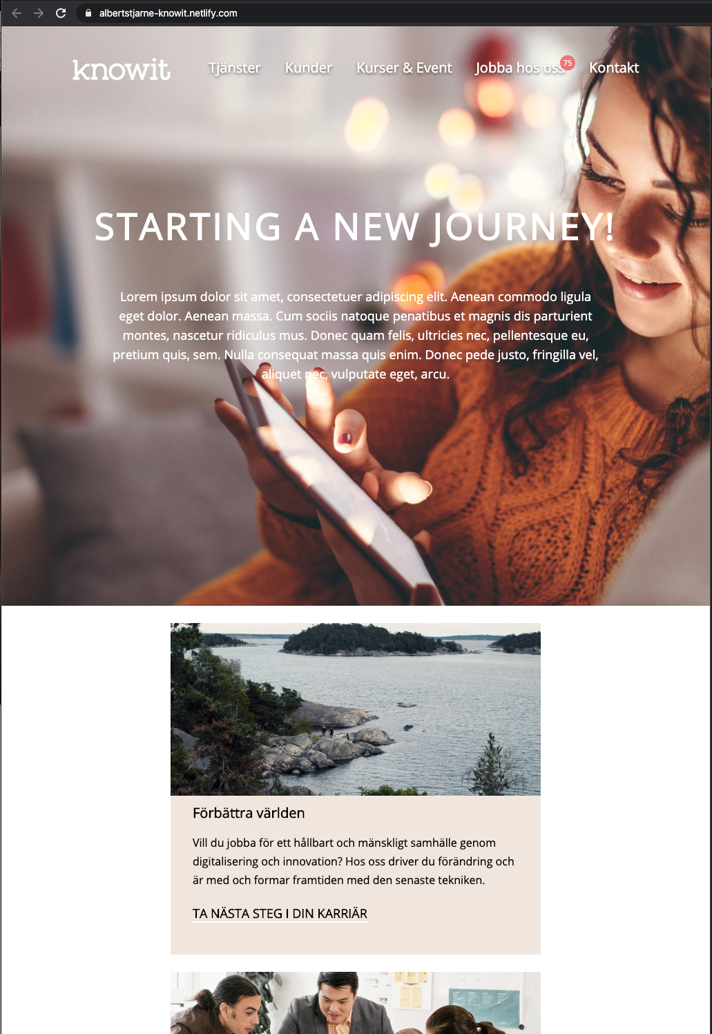
A tribute to knowit built with HTML and CSS. Focus has been to make it appealing and to be fully responsive.
Screenshots
Screenshots to reflect the breakpoints for media queries.
1920px width
1350px width
1200px width
1000px width, here showing iPhone 6/7/8 Plus width of 414px
Author
- Albert Stjärne (https://github.com/AlbertStjarne)


