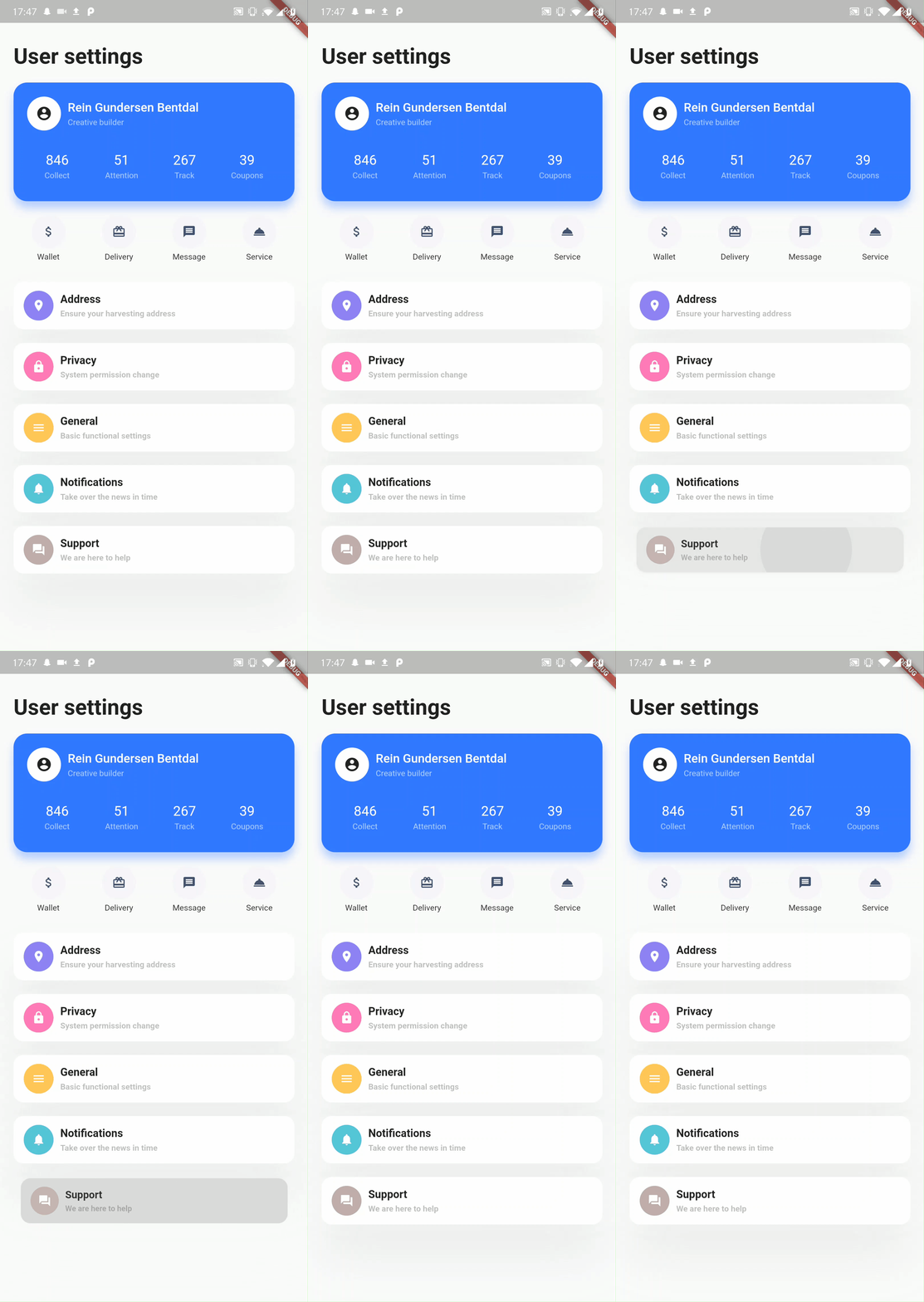
A simple to use yet powerfull styling widget with syntax inspired by CSS.
The Division widget has 3 properties. A style property, a gesture property and a child property. As simple as that!
Division(
  style: StyleClass,
  gesture: GestureClass,
  child: Widget,
);
Having all style gathered at one place has alot of advantages. For example
- It is easy to outsource the style into variables or to a completely different place.
- It is easy to read and understand
- Easy to learn if you already know CSS
- Much more
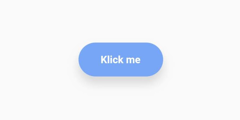
import 'package:division/division.dart';Division(
style: StyleClass()
..padding(horizontal: 30, vertical: 15)
..backgroundColor('#77A6F7')
..borderRadius(all: 30)
..align('center')
..elevation(10, color: rgb(150,150,150)),
gesture: GestureClass()
..onTap(() => print('Button pressed')),
child: Text('Klick me', style: myTextStyle),
)The style property expects a StyleClass which is a class holding all the styling for the widget.
To add a style to the StyleClass, use the ..[style] syntax. The two dots is used to not return [style], but the StyleClass.
On construction, choose to use radians or not when giving circular values.
Styleclass({bool useRadians = false})..align(dynamic alignment)alignment parameters support [String] value ('center', 'left', 'bottomRight'...), ([dx, dy]) value, [double] value (same value for dx and dy) and [Alignment].
..alignChild(dynamic alignment)alignment parameters support [String] value ('center', 'left', 'bottomRight'...), ([dx, dy]) value, [double] value (same value for dx and dy) and [Alignment].
..padding({double all,
      double horizontal,
      double vertical,
      double top,
      double bottom,
      double left,
      double right})
All properties work together. padding(all: 10, top: 30) is valid
..margin({double all,
      double horizontal,
      double vertical,
      double top,
      double bottom,
      double left,
      double right})
All properties work together. margin(all: 10, top: 30) is valid
..backgroundColor(dynamic color)color parameter supports HEX '#xxxxxx', rgb(int, int, int), rgba(int, int, int, double) and [Color].
..backgroundImage(
      {String url,
      String path,
      ColorFilter colorFilter,
      BoxFit fit,
      dynamic alignment = Alignment.center,
      ImageRepeat repeat = ImageRepeat.noRepeat})
Eighter the [url] or the [path] has to be specified.
[url] is for network images and [path] is for local images.
alignment parameters support [String] value ('center', 'left', 'bottomRight'...), ([dx, dy]) value, [double] value (same value for dx and dy) and [Alignment].
..backgroundBlur(double blur)Blurs the background. Can be used for example to achieve a "frosted glass" effect:
StyleClass()
  ..backgroundBlur(10)
  ..backgroundColor(rgba(255,255,255,0.15))
Does not work together with ..rotate().
..linearGradient({dynamic beginAlign = 'left',
      dynamic endAlign = 'right',
      @required List<dynamic> colors,
      TileMode tileMode = TileMode.clamp,
      List<double> stops})

..radialGradient(
      {dynamic centerAlign = 'center',
      double radius = 0.5,
      @required List<dynamic> colors,
      TileMode tileMode = TileMode.clamp,
      List<double> stops})

..sweepGradient(
      {dynamic centerAlign = 'center',
      double startAngle = 0.0,
      double endAngle, // default to 1.0 or 2 * pi, depending on if radians is enabled or not
      @required List<dynamic> colors,
      TileMode tileMode = TileMode.clamp,
      List<double> stops})
Choose between 3 gradient variants.
sweepGradient() by default does not use radians for the startAngle and the endAngle. By default 0.25 equals 45 degrees, 1 equals one full turn etc.
To change to use radians do: StyleClass(useRadians: true)...
color parameter supports HEX '#xxxxxx', rgb(int, int, int), rgba(int, int, int, double) and [Color].
alignment parameters support [String] value ('center', 'left', 'bottomRight'...), ([dx, dy]) value, [double] value (same value for dx and dy) and [Alignment].
..opacity(double opacity)Opacity applied on the whole widget.
Value must not be negative.
..border(
      {double all,
      double left,
      double right,
      double top,
      double bottom,
      dynamic color = const Color(0xFF000000),
      BorderStyle style = BorderStyle.solid})
Choose between all, left, right, top and bottom. all works together with the other properties.
color parameter supports HEX '#xxxxxx', rgb(int, int, int), rgba(int, int, int, double) and [Color].
..borderRadius(
      {double all,
      double topLeft,
      double topRight,
      double bottomLeft,
      double bottomRight})
It is valid to use all together with single sided properties. Single sided properties will trump over the all property.
..boxShadow(
      {dynamic color = const Color(0x33000000),
      double blur,
      List<double> offset,
      double spread})
color parameter supports HEX '#xxxxxx', rgb(int, int, int), rgba(int, int, int, double) and [Color].
If defined while the elevation property is defined, the last one defined will be the style applied.
offset is given in the format [double dx, double dy]
..elevation(
      double elevation,
      {bool angled = false,
      dynamic color = const Color(0x33000000)})
Elevates the widget with a boxShadow.
If the elevation property is used at the same time as the boxShadow property, the last one
defined will be the applied style.
color parameter supports HEX '#xxxxxx', rgb(int, int, int), rgba(int, int, int, double) and [Color].
If the angled property is true, the shadow will be att 45 degrees.
..scale(double ratio)Scale the widget
..offset([double dx, double dy])Offsets the widget
..rotate(double angle)Rotates the widget.
By default one turn equals the value 1.0. To change to radians: StyleClass(useRadians: true)...
..ripple(bool enable, {dynamic splashColor, dynamic highlightColor})Material ripple effect.
onTap does not work if ripple is defined. You may use onTapDown, onTapUp or onTapCancel instead.
..animate([int duration, Curve curve = Curves.linear])Animates the widget when one of its style properties changes.
duration is given in milliseconds.
..add(StyleClass styleClass, {bool override = false})Adds a StyleClass to a StyleClass.
By default the added StyleClass does not override already set style. Change override to true, to override already set style.
..[type](double length)The gesture property expects a GestureClass which is a class containing all the gestures for the widget.
To add a style to the GestureClass, use the ..[gesture] syntax. The two dots is used to not return the [gesture], but the GestureClass
The GestureClass takes all the same parameters as the GestureDetector widget.
..[gesture](function)Widget child

