⚠ These are my notes on how CSS works behind the scene. If you find them helpful, great fork it, copy it whatever but don't fully rely on it because some info may not be complete or explained clearly. These are NOT official docs!
Before we move on with how CSS works there are some thing to keep in mind while designing a website. Keeping these things in mind will help you understand why you need to know about the behind the scene and vice versa.
The important pillars of a modern web design are:
- Responsive Design
- Maintainable and scalable code
- Performance
Responsive design is the modern standard. Every modern website is responsive and there is a good reason for it. Many people visit websites on smart phones and websites have to adapt. Following are the fundamentals of a responsive design:
- Fluid layouts
- Media queries
- Responsive images
- Correct units
- Desktop-first or mobile-first approach
You should write your code in a way so it can be easily read, maintained and scaled also your code should be reusable. To write maintainable and scalable code your code should have following characteristics:
- Clean
- Easy to understand
- Easy to grow
- Reusable
- Organisable
- Correct naming - understandable classes names
- Good HTML structure
Performance is very important. Nobody wants to wait for a website to load especially when they are on a smart phone. Fundamentals of making a website faster:
- Less HTTP request
- Less code
- Compress your code
- Use a CSS preprocessors
- Less images
- Compress images
The Cascade is an algorithm that defines how to combine property values originating from different sources. It lies at the core of CSS, as emphasized by the name: Cascading Style Sheets. Source
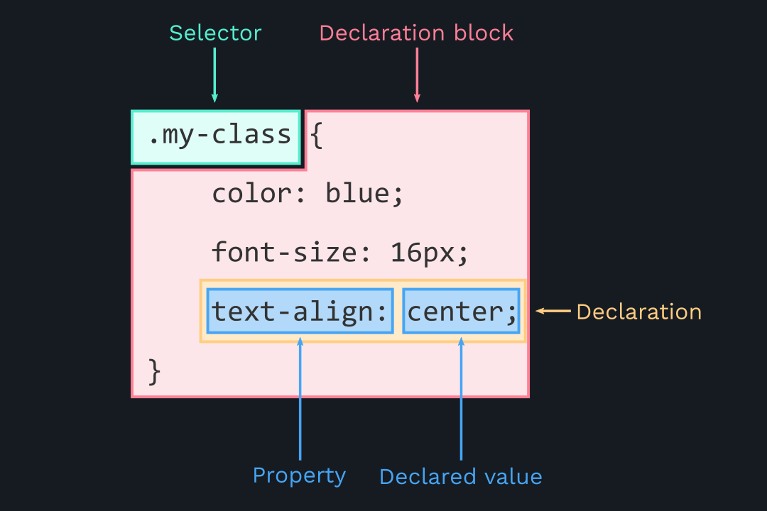
Basically the Cascade combines different stylesheets and resolves conflicts between different CSS rules and declarations when more than one rule applies to a certain element. It simply selects CSS declarations and determines correct values for CSS properties. CSS declarations originates from different origins/sources:
- Author stylesheets -> Declared by the designer, the code you write. The most common type style sheet.
- User stylesheets -> The user (or reader) of the website can choose to override styles through browser.
- User-agent stylesheets -> The browser has a basic style sheet that gives a default style to any document.
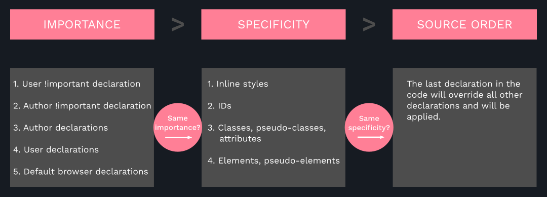
In order to resolve conflicts the Cascade looks at importance (!important),
selectors specificity, and source order of conflicting declarations.
If the importance was the same for all selectors the Cascade will look at specificity to apply the styles of the most specific selectors. If all the selectors had the same specificity then it will look at source order and apply the last declared styles.
.button {
    color: #fff;
    font-size: 16px;
    background-color: #333 !important;
}

#nav .button {
    background-color: #999;
}
/* #333 will be applied NOT #999 */.button {
color: #fff;
font-size: 16px;
background-color: #333;
} /* (inline, IDs, Classes, Elements) */
/* ( 0 , 0 , 1 , 0 ) */
nav#nav div.pull-right .button {
background-color: #999;
} /* (inline, IDs, Classes, Elements) */
/* ( 0 , 1 , 2 , 2 ) */
a {
background-color: #666;
} /* (inline, IDs, Classes, Elements) */
/* ( 0 , 0 , 0 , 1 ) */
/* :hover is pseudo-class therefore it counts as a class*/
#nav a.button:hover {
background-color: #999;
} /* (inline, IDs, Classes, Elements) */
/* ( 0 , 1 , 2 , 1 ) */Now to determine the specificity we first look at inline styles if there are
any. For all the above cases there are no inline styles therefore it's 0 for
all. Then we look IDs if there are any. Then we look at classes and lastly the
elements. In the example above (0, 0, 1, 0) and (0, 0, 0, 1) can be
thrown out because they're the least specific. But (0, 1, 2, 1) and
(0, 1, 2, 2) are the ones to look at. So (0, 1, 2, 1) has one ID,
two classes and one element which makes it very specific but (0, 1, 2, 2)
has one ID, two classes and 2 elements which is the most specific one.
Therefore the styles of the second selector will be applied and other styles will
be ignored.
If the specificity from all the selectors was the same then 'source order' rule will be applied. Which means the last declared styles will be applied.
nav#nav div.pull-right .button {
    background-color: #666;
}                               /* (inline, IDs, Classes, Elements) */
                                /* (  0   ,  1 ,    2   ,    2    ) */

#nav a.button:hover {
    background-color: #999;
}                               /* (inline, IDs, Classes, Elements) */
                                /* (  0   ,  1 ,    2   ,    1    ) */

/*
hover will not work because it's specificity is lower than the selector
above. To make the hover work we will have to use the same specificity like so:
*/
nav#nav div.pull-right .button:hover {
    background-color: #999;
}- CSS declarations marked with
!importanthave the highest priority. - But using
!importantis bad practice. It's better to rely on specificities than to just use!important. The code should be maintainable! - Inline styles will always have priority over styles in external stylesheets.
- A selector that contains 1 ID is more specific than one with 1000 classes.
- A selector that contains 1 class is more specific than one with 1000 element selectors.
- The universal selector
*has no specificity value(0, 0, 0, 0). - Rely more on specificity than on the order of selectors.
- But, use source order when working with 3rd-party styles -- always put author stylesheets last.
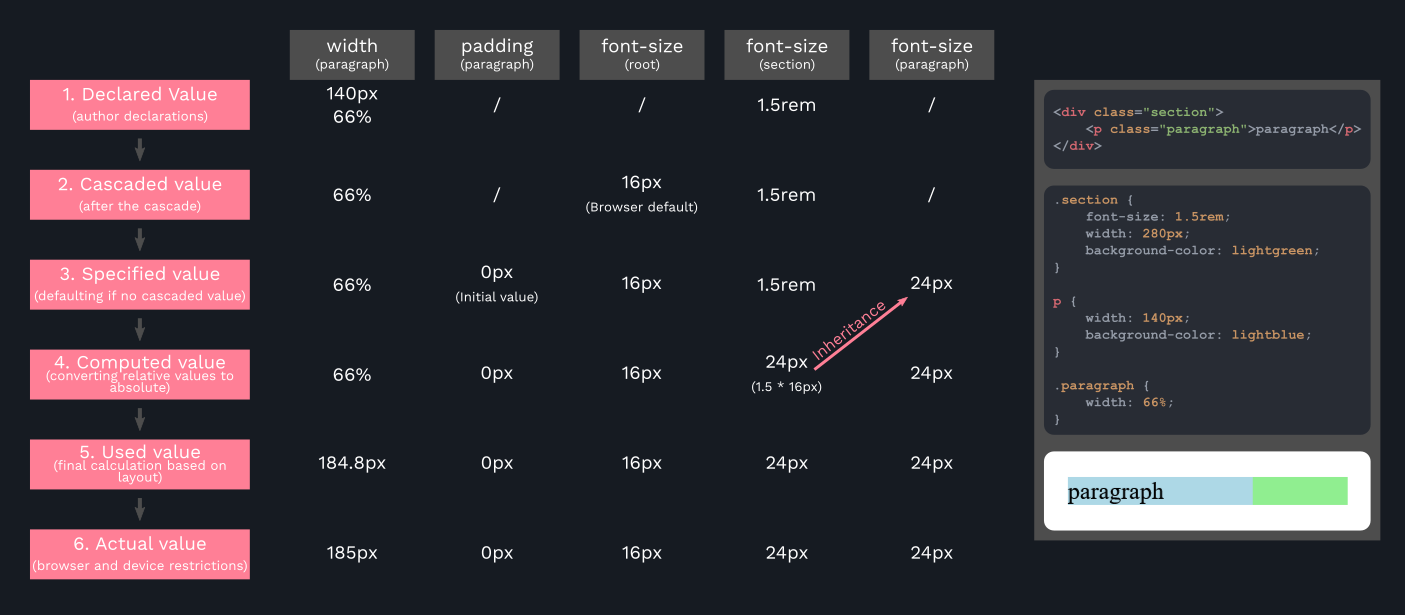
- Each property has an initial value, used if no specific value is declared (and if there is no inheritance).
- Browsers specify a root font-size for each page (usually 16px).
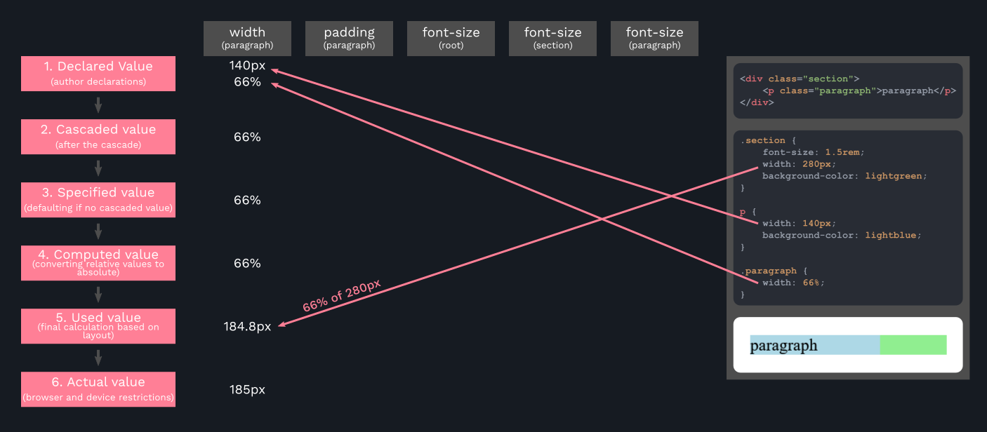
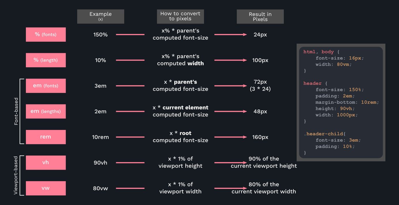
- Percentages and relative values always converted to pixels.
- Percentages are measured relative to their parent's font-size, if used to specify font-size.
- Percentages are measured relative to their parent's width, if used to specify lengths.
- em are measured relative to their parent font-size, if used to specify font-size.
- em are measured relative to the current font-size, if used to specify lengths.
- rem are always measured relative to the document's root font-size.
- vh and vw are simply percentage measurements of the viewport's height and width.
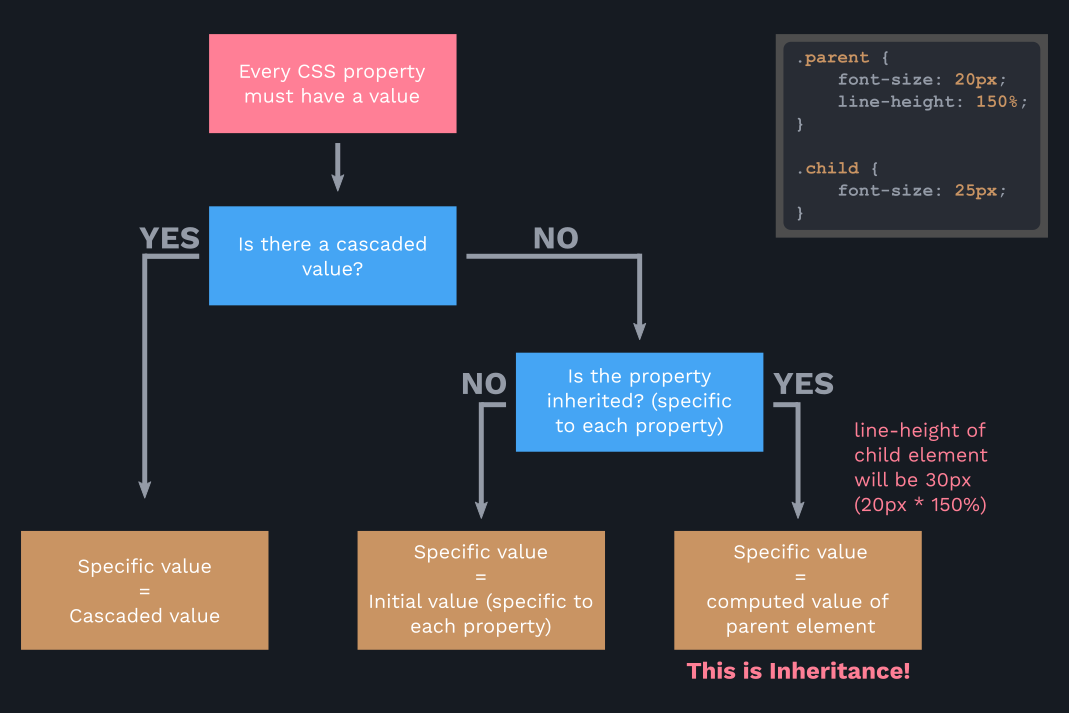
- Inheritance passes the values for some specific properties from parents to children. Should be used to write maintainable code.
- Properties related to text are inherited:
font-family,font-size,coloretc. - Computed values of a property are inherited, NOT the declared value.
- Inheritance of a property only works if no value is declared for that property.
- The
initialkeyword resets a property to its initial value. - The
inheritkeyword forces inheritance on a certain property. Example:* { margin: 0; padding: 0; box-sizing: inherit; /* Will be inherited from body */ } body { box-sizing: border-box; }
The most important thing for us to do is to write our CSS in a way that is clean, maintainable and scalable -- somewhat dynamic. To achieve that we have to use relative units to avoid writing lots of CSS. Repetitively using same selectors with different properties and value declarations leads to messy and unstable code. Also if we don't use correct units then it'll lead to using unnecessary media queries, thus messy and unmaintainable code. Correct units are crucial to responsive design.
To make things easy we'll use rem units. Which means relative to the
root. The root font-size is set in the html selector. We will use
font size to be 10px instead of 16px. It'll make things super easy
for us. What root font size 10px means is that 1rem = 10px. Because
10 is a round number what we can do is to divide each pixels values by 10px
and it'll give us nice rounded rem values e.g 16px / 10px = 1.6rem.
html {
    font-size: 10px;
}

body {
    padding: 3rem; /* 30px / 10px = 3rem */
}

.logo-box {
    position: absolute;
    top: 4rem; /* 40px / 10px = 4rem */
    left: 4rem; /* 40px / 10px = 4rem */
}

.logo {
    height: 3.5rem;  /* 35px / 10px = 3.5rem */
}

.heading-primary {
    margin-bottom: 6rem; /* 60px / 10px = 6rem */
}

.heading-primary-main {
    font-weight: 400;
    font-size: 6rem; /* 60px / 10px = 6rem */
    letter-spacing: 3.5rem;  /* 35px / 10px = 3.5rem */
}

.heading-primary-sub {
    font-weight: 700;
    font-size: 2rem; /* 20px / 10px = 2rem */
    letter-spacing: 1.75rem;  /* 17.5px / 10px = 1.75rem */
}

.button {
    padding: 1.5rem 4rem; /* 15px / 10 = 1.5rem - 40px / 10px = 4rem */
}
As you can see we can declare everything in rem relative to the root
font-size. If we want to make them bigger or smaller the only thing we
have to do is to change the root font-size and that's it. We don't have
to write thousands of media queries, change every value by hand pixel by pixel,
rewrite each selector and redeclare values. rem makes our lives easier.
BUT there is still one problem and that is our font-size is set to
10px which is an absolute value. That means is that our values are still
relative to an absolute value. If you've heard of "Web Accessibility" we are
excluding people with disabilities with our font-size set to 10px
which is a poor design choice. If there's someone with limited eyesight and
want to change the default font size of the browser or zoom-in or out then
they'll not be able to do that.
Web accessibility means that websites, tools, and technologies are designed and developed so that people with disabilities can use them. More specifically, people can: perceive, understand, navigate, and interact with the Web. Source
We can set the font-size to percentage. 100% would mean 16px as it's default.
But we want our font-size to be 10px. That can be easily calculated.
10/16 = 0.625 * 100 = 62.5%. So we set our root font size to be 62.5%.
Now when the user changes the default font size of the browser to for example
16px that would be 0.625*16 = 10px likewise 20px would be 0.625*20 = 12.5px so
it will change accordingly and our website will be accessible to everyone.
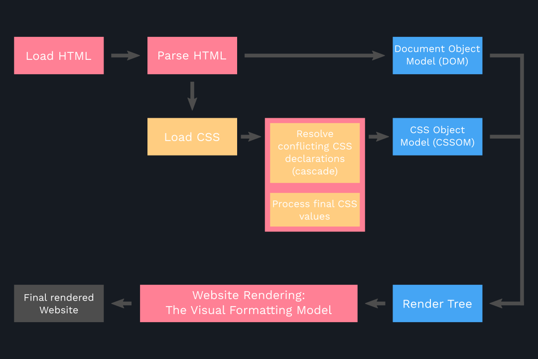
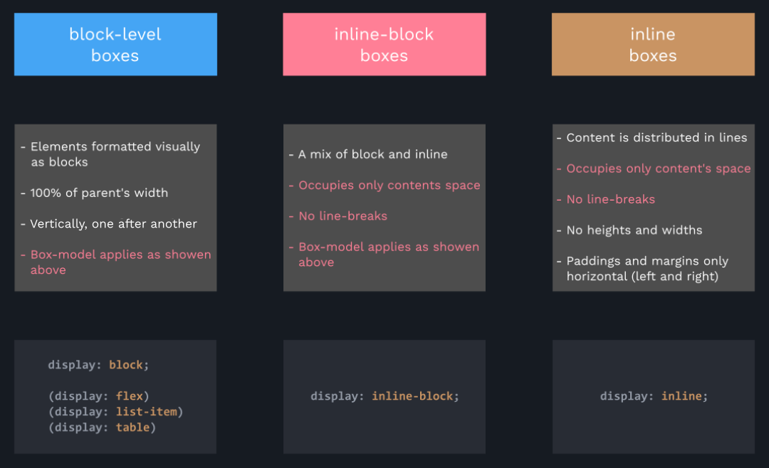
The CSS visual formatting model is an algorithm that processes a document and displays it on visual media. This model is a basic concept of CSS. The visual formatting model transforms each element of the document and generates zero, one, or several boxes that conform to the CSS box model. The layout of each box is defined by:
- The dimensions of the box: precisely defined or constrained, or not
- The type of box: inline, inline-level, atomic inline-level, block
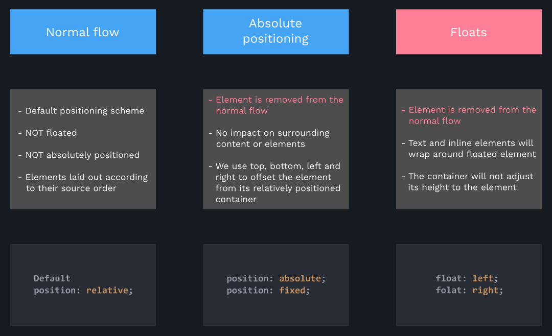
- The positioning scheme: in the normal flow, a float, or absolute positioning
- The other elements in the tree: its children or neighbors
- The viewport size and position
- Intrinsic dimensions of contained images
- Other external information
The model renders a box in relation to the edge of its containing block. Usually, a box establishes the containing block for its descendants. However, a box is not constrained by its containing block; when a box's layout goes outside the containing block, it is said to overflow. Source
To understand what Containing Block is and how it's determined read this article.
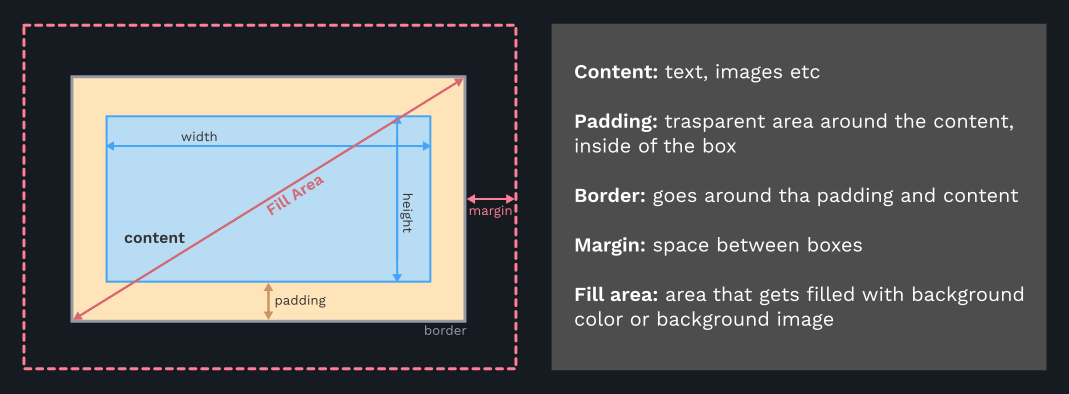
So basically the visual formatting model algorithm calculates boxes and determines the layout of these boxes, for each element in the render tree (divs, paragraphs, images etc), in order to determine the final layout of the page. Every element is represented by a box on the page. So the whole layout/ the fully rendered page is made up of boxes. When a box is generated each box is divided into four areas:
- Content area
- Padding area
- Border area
- Margin area
Total width = right border + right padding + specified width + left padding +
left border

Total height = top border + top padding + specified height + bottom padding +
bottom border

Example: height = 0 + 20px + 100px + 20px + 0 = 140px
When we set box-sizing to border-box the height and width will be declared
for the entire box including padding and the border, not just for the content
area. In other words the border and padding will not be added to the total
width and total height but rather reduced to declared width and height.
Total width = right border + right padding + specified width + left padding +
left border
Total height = top border + top padding + specified height + bottom padding +
bottom border
Example: height = 0 + 20px + 100px + 20px + 0 = 100px
As you can see in the above example the total height is not 140px but
rather 100px because padding is not added to the height but reduced in order
to be included in the height.
Stacking context determines in which order elements are rendered on the page.
Stacking context can be created by various properties but the most common
property is z-index. Stacking context are simply layers bottom layers are
painted first and other appear on top of each other. Elements with lower
z-index appear at the bottom and elements with higher z-indexappear on the
top.
_______________ -> z-index: 3; position: relative;

_______________ -> z-index: 2; position: absolute;

_______________ -> z-index: 1; position: relative;
Not only z-index creates stacking context but also opacity of values different
from one another, transforms and filters also create stacking context.
sass/
|
|– base/
|   |– _reset.scss       # Reset/normalize
|   |– _typography.scss  # Typography rules
|   ...                  # Etc…
|
|– components/
|   |– _buttons.scss     # Buttons
|   |– _carousel.scss    # Carousel
|   |– _cover.scss       # Cover
|   |– _dropdown.scss    # Dropdown
|   ...                  # Etc…
|
|– layout/
|   |– _navigation.scss  # Navigation
|   |– _grid.scss        # Grid system
|   |– _header.scss      # Header
|   |– _footer.scss      # Footer
|   |– _sidebar.scss     # Sidebar
|   |– _forms.scss       # Forms
|   ...                  # Etc…
|
|– pages/
|   |– _home.scss        # Home specific styles
|   |– _contact.scss     # Contact specific styles
|   ...                  # Etc…
|
|– themes/
|   |– _theme.scss       # Default theme
|   |– _admin.scss       # Admin theme
|   ...                  # Etc…
|
|– abstracts/
|   |– _variables.scss   # Sass Variables
|   |– _functions.scss   # Sass Functions
|   |– _mixins.scss      # Sass Mixins
|   |– _helpers.scss     # Class & placeholders helpers
|
|– vendors/
|   |– _bootstrap.scss   # Bootstrap
|   |– _jquery-ui.scss   # jQuery UI
|   ...                  # Etc…
|
|
`– main.scss             # Main Sass file
