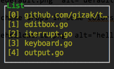
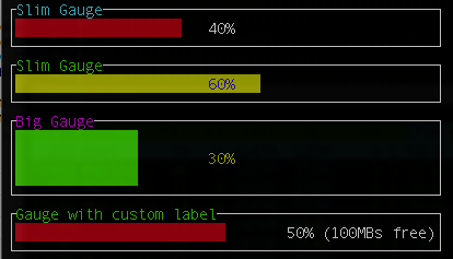
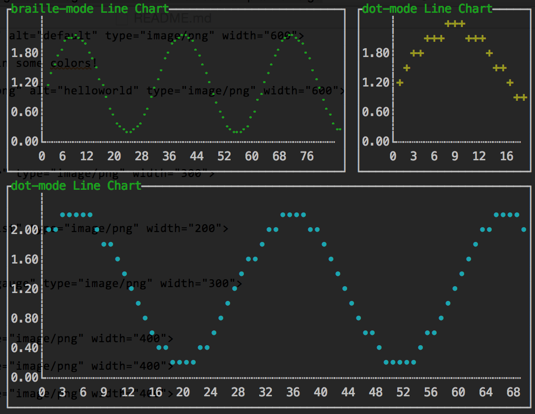
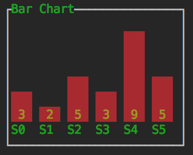
Pull requests and master branch are freezing, waiting for merging from refactoring branch.
termui comes with ABSOLUTELY NO WARRANTY, and there is a breaking change coming up (see refactoring branch) which will change the Bufferer interface and many others. These changes reduce calculation overhead and introduce a new drawing buffer with better capacibilities. We will step into the next stage (call it beta) after merging these changes.
Go terminal dashboard. Inspired by blessed-contrib, but purely in Go.
Cross-platform, easy to compile, and fully-customizable.
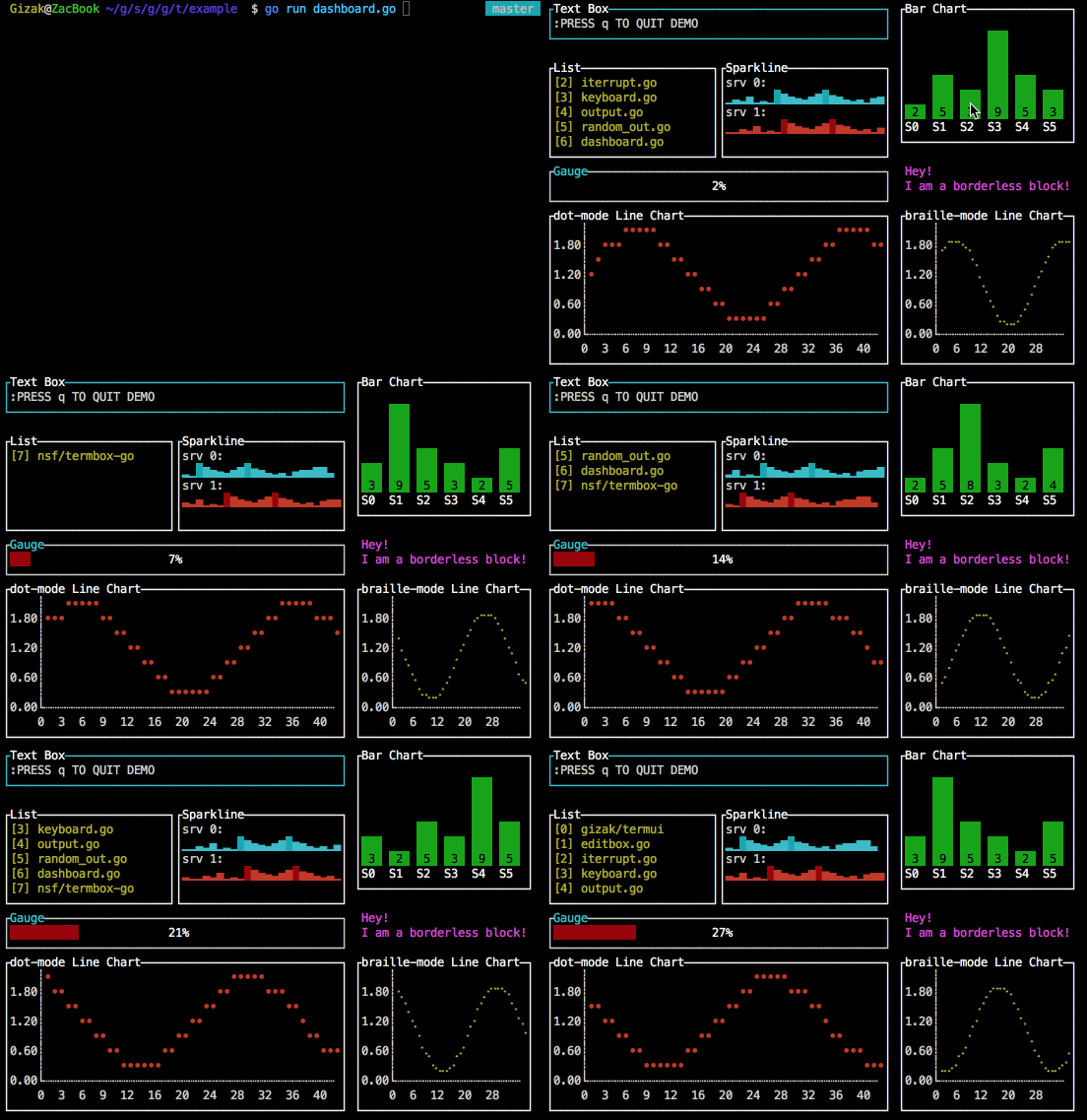
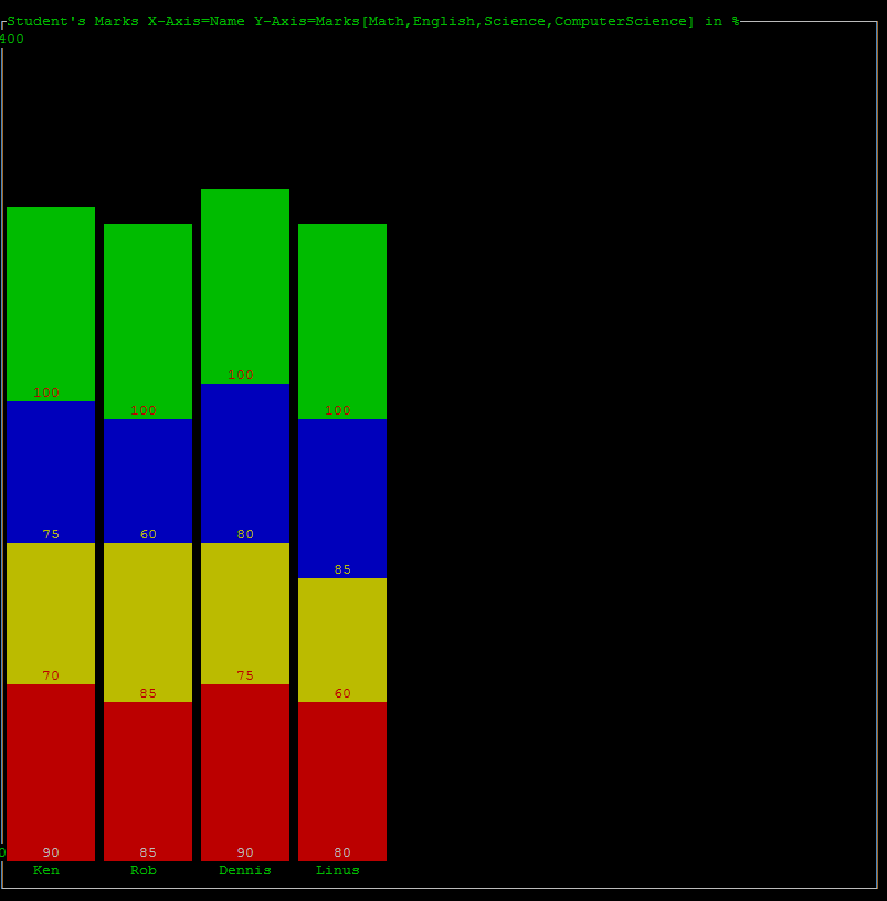
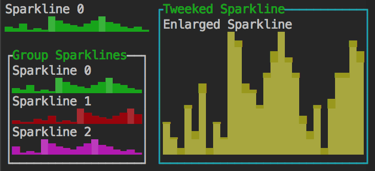
Demo: (cast under osx 10.10; Terminal.app; Menlo Regular 12pt.)
Grid layout:
Expressive syntax, using 12 columns grid system
	import ui "github.com/gizak/termui"
	// init and create widgets...

	// build
	ui.Body.AddRows(
		ui.NewRow(
			ui.NewCol(6, 0, widget0),
			ui.NewCol(6, 0, widget1)),
		ui.NewRow(
			ui.NewCol(3, 0, widget2),
			ui.NewCol(3, 0, widget30, widget31, widget32),
			ui.NewCol(6, 0, widget4)))

	// calculate layout
	ui.Body.Align()

ui.Render(ui.Body)go get -u github.com/gizak/termui
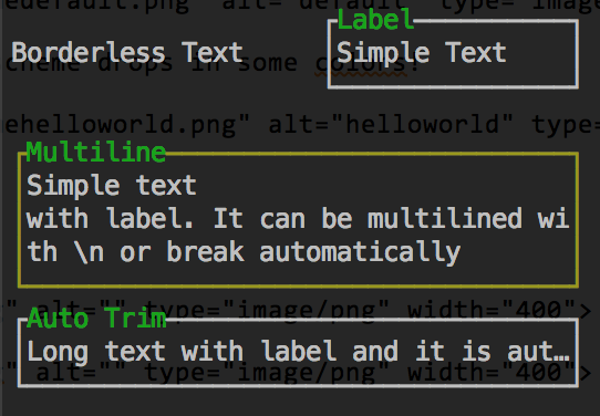
Each component's layout is a bit like HTML block (box model), which has border and padding.
The Border property can be chosen to hide or display (with its border label), when it comes to display, the label takes 1 padding space (i.e. in css: padding: 1;, innerHeight and innerWidth therefore shrunk by 1).
	import ui "github.com/gizak/termui" // <- ui shortcut, optional

	func main() {
		err := ui.Init()
		if err != nil {
			panic(err)
		}
		defer ui.Close()

		p := ui.NewPar(":PRESS q TO QUIT DEMO")
		p.Height = 3
		p.Width = 50
		p.TextFgColor = ui.ColorWhite
		p.Border.Label = "Text Box"
		p.Border.FgColor = ui.ColorCyan

		g := ui.NewGauge()
		g.Percent = 50
		g.Width = 50
		g.Height = 3
		g.Y = 11
		g.Border.Label = "Gauge"
		g.BarColor = ui.ColorRed
		g.Border.FgColor = ui.ColorWhite
		g.Border.LabelFgColor = ui.ColorCyan

		ui.Render(p, g)

		// event handler...
	}
Note that components can be overlapped (I'd rather call this a feature...), Render(rs ...Renderer) renders its args from left to right (i.e. each component's weight is arising from left to right).
All colors in all components can be changed at any time, while there provides some predefined color schemes:
// for now there are only two themes: default and helloworld
termui.UseTheme("helloworld")

// create components...
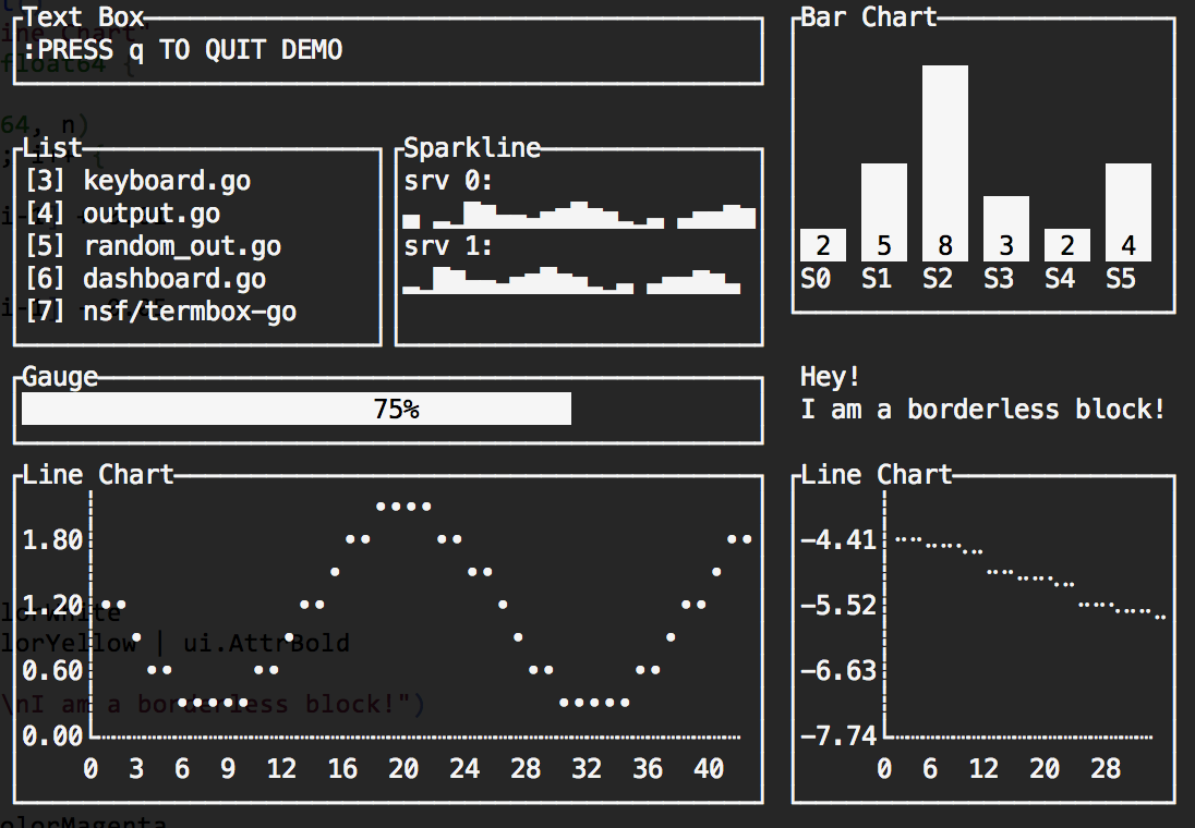
The default theme's settings depend on the user's terminal color scheme, which is saying if your terminal default font color is white and background is white, it will be like:
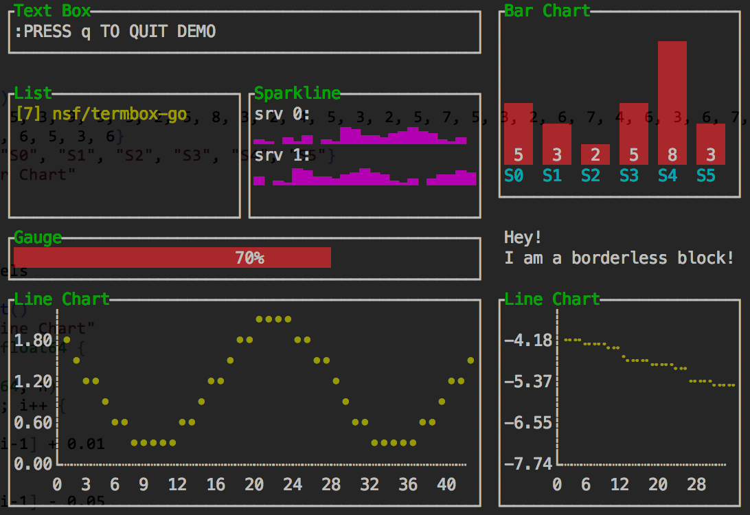
The helloworld color scheme drops in some colors!
- Grid layout
- Event system
- Canvas widget
- Refine APIs
- Focusable widgets
This library is under the MIT License

