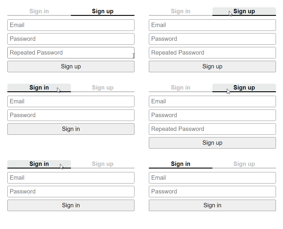
A minimalist, accessible React tabs component. The rendered content is fully accessible. The implementation, styling, and configuration has purposely been kept as simple as possible.
The storybook demonstrating some common usage examples can be found at https://almostbearded-react-tabs.netlify.app.
This package has only a dependency on React. The easiest way to install is via npm:
npm install @almostbearded/react-tabs
Import the Tabs component from the @almostbearded/react-tabs package:
import { Tabs } from '@almostbearded/react-tabs'
The currently selected tab could itself be stored in a state variable or derived from one. For example, to store the selected tab in state:
const [selectedTab, setSelectedTab] = useState('default-tab-id')
Afterwards, the Tabs component can simply be used in other components:
<Tabs
    tabs={[
        { id: 'tab-1', title: 'Tab 1', content: 'Content of Tab 1' },
        { id: 'tab-2', title: 'Tab 2', content: 'Content of Tab 2' },
    ]}
    selectedTab={selectedTab}
    onSelectTab={setSelectedTab} />
It is also possible to pass more complex nodes to the title and content props:
<Tabs
    tabs={[
        {
            id: 'tab-1',
            title: <h3>Tab 1</h3>,
            content: <p>Complex content of tab 1</p>
        },
        {
            id: 'tab-2',
            title: <h3>Tab 2</h3>,
            content: <p>Complex content of tab 2</p>
        },
    ]}
    selectedTab={selectedTab}
    onSelectTab={setSelectedTab} />
The Tabs component can be configured via a number of props:
- The
tabsprop is an array containing the configuration of the titles and contents of tabs. Every tab consists of an uniqueid, atitleshown in the tab, andcontentshown in the panel linked to a tab. - The
selectedTabprop defines which tab is currently selected and therefore which content is currently shown. - The
onSelectTabprop takes a callback that is invoked with theidof the newly selected tab, whenever a user clicks one of the tabs.
The following demos show the Tabs component being used with different configurations.
No known issues at the moment.


