The Lava is a small set of UI components to be used in Blazor-based views. By default, this tool is dependent on Font Awesome 5.* and Bootstrap 4.*, but I will remove these dependencies in the next versions.
To get started with the Lava, install the following Nuget package in any Blazor project you want:
PM> Install-Package LavaThis component is a simple collapsible container that helps to show and hide parts of the application in UI.
Header with a simple text
<LavaCollapsible Header="Simple text goes here">
   <!-- Content of the LavaCollapsible -->
</LavaCollapsible>
Header with template
<LavaCollapsible>
    <HeaderTemplate>
        <!-- The header template goes here -->
    </HeaderTemplate>
    <ChildContent>
        <!-- Content of the LavaCollapsible -->
    </ChildContent>
</LavaCollapsible>- Expanded
This property is for setting and getting the expanded state of the LavaCollapsible. This property is bindable and can be invoked whenever needed.
LavaBaseInput is a simple Text Input control that has some simple properties too. In the initial state, it doesn't have a style, because it is mainly for getting used in other components, but you can change its styles and graphical UI using CSS.
<LavaBaseInput/>- Enabled
This property is for determining the ability of the input. Its default value is true.
- HasClearButton
This property determines the Clear Button to be shown or not. The default value of this property is true.
- IsFocused
Shows the focus status of the component
- IsPassword
To have a Password Box, this property should be set to true. The default value of this property is false.
- ReadOnly
To protect an anabled input from the user change, this property can be set to true. Its default value is false.
- Value
This property stores the text value of the control.
LavaInput is the stylish version of the LavaBaseInput and comes with some additional features and properties. This component uses a floating label as its placeholder by default, but it can be hidden by the properties.
Simple usage
<LavaInput @bind-Value=@bindedVariable>
    <PlaceHolder>
        <!-- Content of the placeholder. It can be a simple text or composite UI -->
    </PlaceHolder>
</LavaInput>
Password
<LavaInput IsPassword="true" @bind-Value=@bindedVariable>
    <PlaceHolder>
        <!-- Content of the placeholder. It can be a simple text or composite UI -->
    </PlaceHolder>
</LavaInput>
Composite placeholder
<LavaInput @bind-Value=@textValue>
    <PlaceHolder>
        <div><img src="/res/chat.png" /> It can be very long placeholder content with a <a href="https://github.com/AminEsmaeily/lava">hyperlink</a></div>
    </PlaceHolder>
</LavaInput>- Enabled
This property is for determining the ability of the input. Its default value is true.
- HasClearButton
This property determines the Clear Button to be shown or not. The default value of this property is true.
- IsFocused Shows the focus status of the component
- IsPassword
To have a Password Box, this property should be set to true. The default value of this property is false.
- PlaceHolder
A RenderFragment to represent the content as a floating placeholder.
- ReadOnly
To protect an anabled input from the user change, this property can be set to true. Its default value is false.
- Value
This property stores the text value of the control.
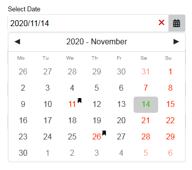
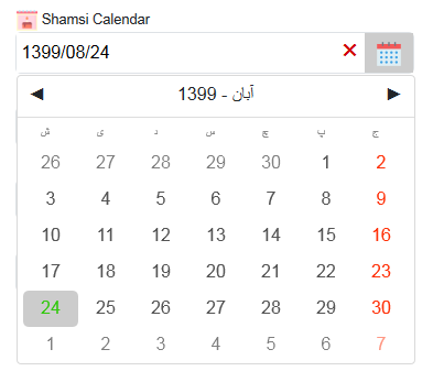
LavaDatePicker is a multi-locale DatePicker component that can be used to represent 5 popular calendars. The following calendars are currently supported by LavaDatePicker:
- Gregorian Calendar (Weekends and holidays of the selected country - default United States)
- Persian / Shamsi Calendar (Weekends and holidays of Iran)
- Hijri / UmAlQura Calendar (Weekends and holidays of the Saudi Arabia, Iraq, Qatar, Oman, United Arabic Emirates, Egypt, Morocco, and Tunisia besed on the selection)
- Japanese Calendar (Weekends and holidays of the Japan -
Heisei era) - Chinese Calendar (Weekends and holidays of the China -
Chinese Lunisolar Calendar)
This component uses the Nager.Date to show the holidays and weekends of the countries. If the country code found in the above list, the LavaDatePicker will show the specified calendar, else it will use the Gregorian Calendar with the weekends and holidays of the selected country.
Simple usage
<LavaDatePicker>
    <PlaceHolder>
        <!-- Title of the DatePicker -->
    </PlaceHolder>
</LavaDatePicker>
With country code
<LavaDatePicker CountryCode="Nager.Date.CountryCode.TR">
    <PlaceHolder>
        Turkish Calendar
    </PlaceHolder>
</LavaDatePicker>
With icon and composite placeholder
<LavaDatePicker CountryCode="Nager.Date.CountryCode.IR">
	 <PlaceHolder>
	     <div><img src="/res/birthday.png" /> Birth date in Shamsi Calendar</div>
	 </PlaceHolder>
	 <Icon>
	     <img src="/res/calendar.png" width="24" height="24" />
	 </Icon>
</LavaDatePicker>- CloseWhenSelected
By setting this propertes' value to false the DropDown stays open when the use selects a date. default true.
- CountryCode
This property is to determine the country to handle the calendar type, weekends, and holidays. default US.
- Enabled
This property is for determining the ability of the input. Its default value is true.
- Icon
A RenderFragment to demonstrate the icon of the dropdown button. The best size of the icon is 24px × 24px. default null.
- IsDropdownOpen
A bindable property to control and check the dropdown state. default false.
- IsFocused
Shows the focus status of the component. default
false. - PlaceHolder
A RenderFragment to demonstrate the placeholder of the DatePicker. default null.
- ReadOnly
To protect an anabled input from the user change, this property can be set to true. Its default value is false.
- SelectedDate
This property holds the user selected value. default null.
- Value
The string representation of the selected date. default empty string.


