Responsive Web Design - Last Challenge
Last challenge from Kevin Powell's free course Conquering Responsive Layouts
Languages
Table of contents
Overview
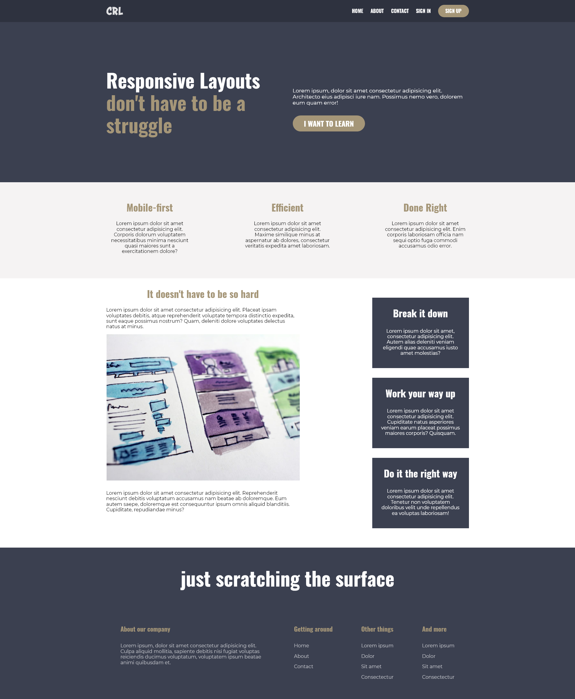
The challenge
- Responsive webpage made through mobile first approach
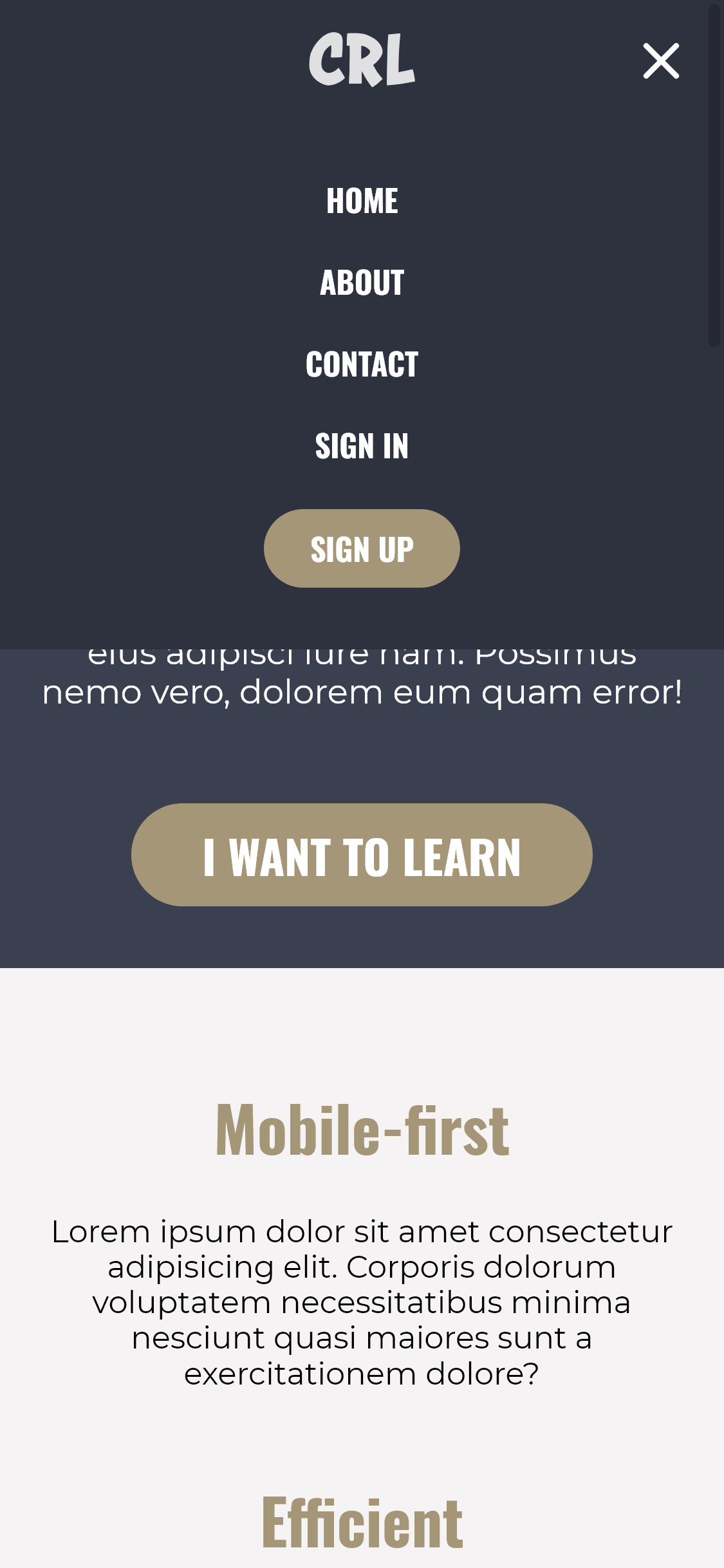
- Mobile dropdown menu
Screenshots
| Desktop View (1280px) | iPad View (768px) | iPhone View (375px) | Others |
|---|---|---|---|
 |
 |
 |
 |
Links
- Live Site URL: Github Pages
My process
Built with
- Semantic HTML5 markup
- CSS custom properties
- Flexbox
- Mobile-first workflow
- Vanilla Javascript
What I learned
It was my first time making a dropdown/hamburger menu, so it was challenging and exciting. It was considerably difficult, but just as satisfying as it could be to see it working and, honestly, beautifuly animated, considering it was my first try!
I also learn how to make a ripple effect only using HTML and CSS. It isn't a 100% functional, in case it's used with a mouse — since it utilizes hover state — however it's suficiently functional, specially to give a tactile feeling on mobile.