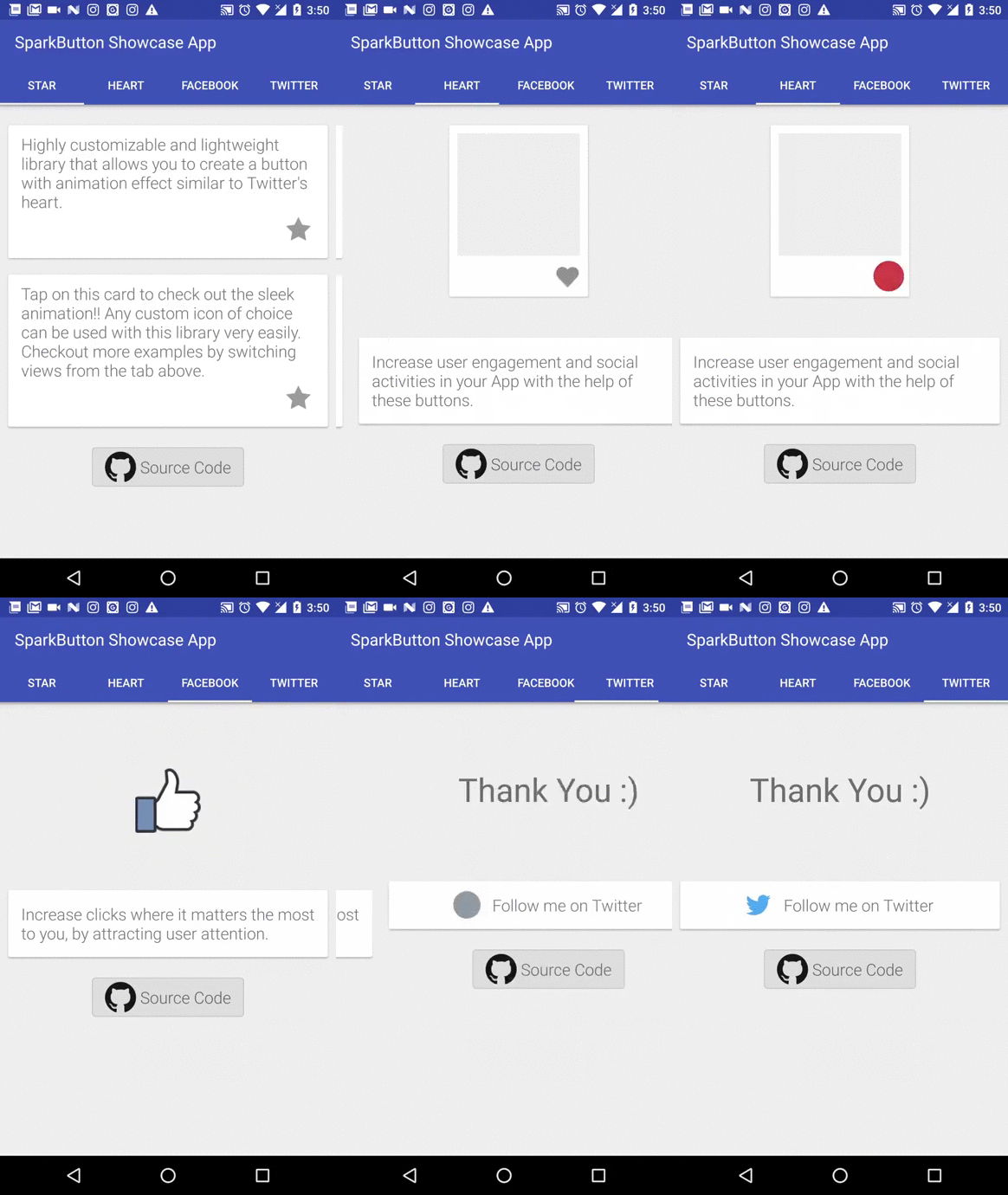
Highly customizable and lightweight library that allows you to create a button with animation effect similar to Twitter's heart animation.
Library supports API 19 and above.
Add it in your root build.gradle at the end of repositories:
allprojects {
	repositories {
		...
		maven { url "https://jitpack.io" }
	}
}
and then add dependency
dependencies {
	compile 'com.github.connyduck:sparkbutton:1.0.0'
}<at.connyduck.sparkbutton.SparkButton
android:id="@+id/spark_button"
android:layout_width="40dp"
android:layout_height="40dp"
app:sparkbutton_activeImage="@drawable/active_image"
app:sparkbutton_inActiveImage="@drawable/inactive_image"
app:sparkbutton_iconSize="40dp"
app:sparkbutton_primaryColor="@color/primary_color"
app:sparkbutton_secondaryColor="@color/secondary_color" />SparkButton button = new SparkButtonBuilder(context)
.setActiveImage(R.drawable.active_image)
.setInActiveImage(R.drawable.inactive_image)
.setDisabledImage(R.drawable.disabled_image)
.setImageSizePx(getResources().getDimensionPixelOffset(R.dimen.button_size))
.setPrimaryColor(ContextCompat.getColor(context, R.color.primary_color))
.setSecondaryColor(ContextCompat.getColor(context, R.color.secondary_color))
.build();<attr name="sparkbutton_iconSize" format="dimension|reference" />
<attr name="sparkbutton_activeImage" format="reference" />
<attr name="sparkbutton_disabledImage" format="reference" />
<attr name="sparkbutton_primaryColor" format="reference" />
<attr name="sparkbutton_secondaryColor" format="reference" />
<attr name="sparkbutton_animationSpeed" format="float" />To use SparkButton simply include XML script or build it using SparkButtonBuilder as stated above.
Various attributes that you can control are following:
You can specify both active and inactive image of the button. If only active image is specified SparkButton will behave as a normal button, otherwise as a switch.
SparkButton takes two colors primary and secondary. (It is recommended that primary color is lighter than secondary for better results).
app:sparkbutton_activeImage="@drawable/active_image"
app:sparkbutton_inActiveImage="@drawable/inactive_image"
app:sparkbutton_primaryColor="@color/primaryColor"
app:sparkbutton_secondaryColor="@color/secondaryColor"SparkButton button = new SparkButtonBuilder(context)
.setActiveImage(R.drawable.active_image)
.setInActiveImage(R.drawable.inactive_image)
.setPrimaryColor(ContextCompat.getColor(context, R.color.primary_color))
.setSecondaryColor(ContextCompat.getColor(context, R.color.secondary_color))
.build();You can specify the fraction by which the animation speed should increase/decrease.
app:sparkbutton_animationSpeed="1.5"sparkbutton.setAnimationSpeed(1.5f);If you are using the SparkButton as a switch, you can check/uncheck the button
sparkButton.setChecked(true);Simply call setEventListener to listen click events.
sparkButton.setEventListener(new SparkEventListener(){
		@Override
		void onEvent(ImageView button, boolean buttonState) {
			if (buttonState) {
				// Button is active
			} else {
				// Button is inactive
			}
		}
});If you want to play animation regardless of click event execute following function:
sparkButton.playAnimation();SparkButton is fork of SparkButton by @varunest. It is mainly intended for use in Tusky.
Licensed under [Apache 2.0] (LICENSE.md)
