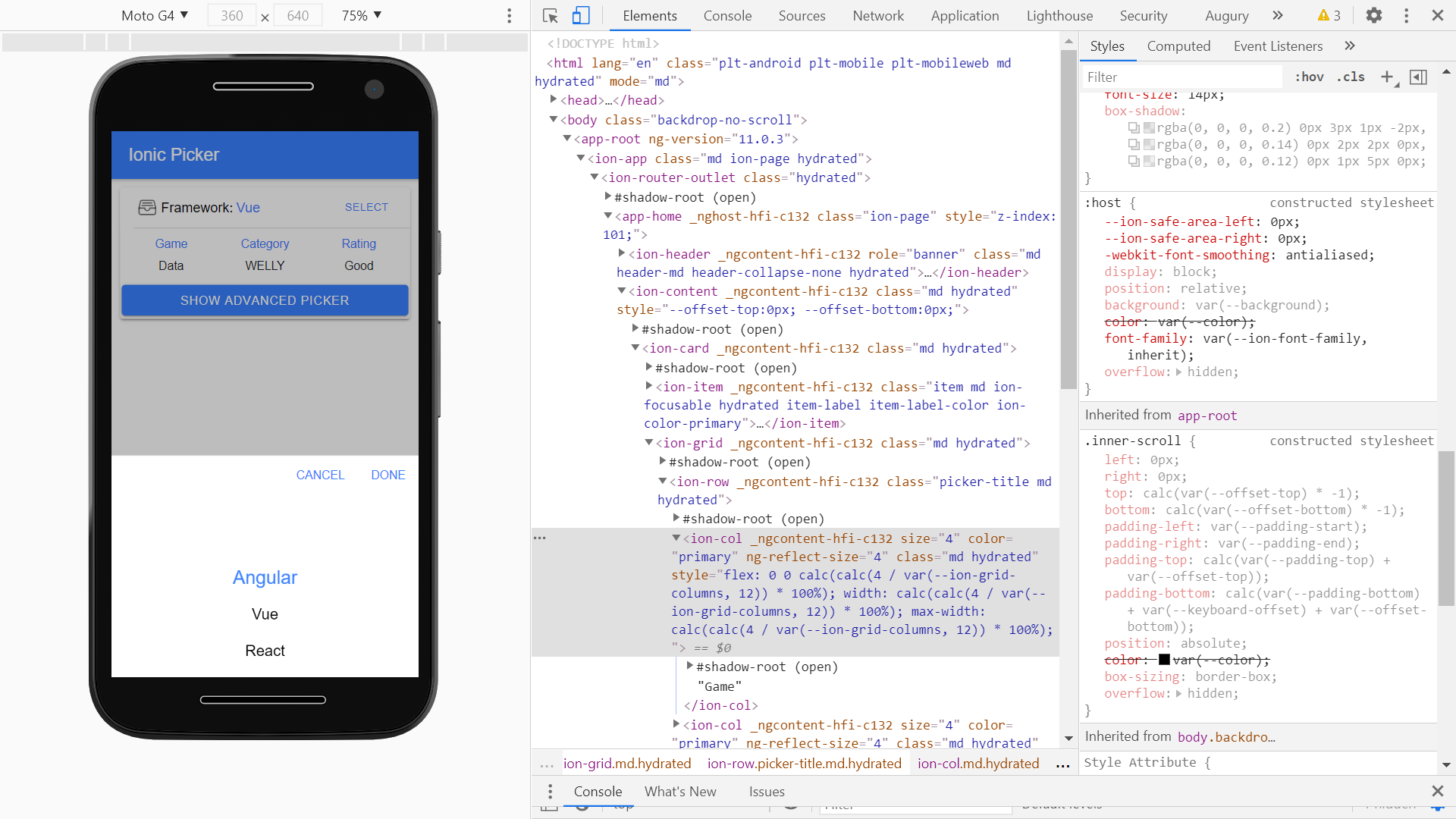
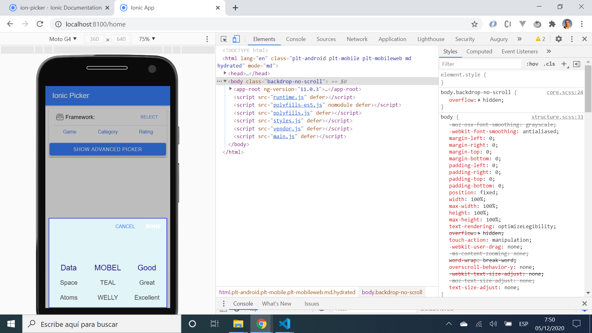
- App created using the Ionic framework to use the Ion-picker component.
- Tutorial code from the Ionic Academy with modifications - see 👏 Inspiration below.
- Note: to open web links in a new window use: ctrl+click on link
- Extract from the Ion-picker documentation: A Picker is a dialog that displays a row of buttons and columns underneath. It appears on top of the app's content, and at the bottom of the viewport.
- No extra imported dependencies; picker controller component is part of ionic/angular, picker options component is part of ionic/core. Note: picker buttons components was not used.
- Run
npm ito install dependencies - Run
ng lintto lint files. All files pass linting. - To start the server on localhost://8100 type:
ionic serve
- extract from
picker.interface.tsfile (reached by right-clicking on 'PickerOptions' inhome.page.tsand choosing 'go to definition'). Shows how to fill in Picker Column options.
export interface PickerOptions {
    columns: PickerColumn[];
    buttons?: PickerButton[];
    cssClass?: string | string[];
    backdropDismiss?: boolean;
    animated?: boolean;
    mode?: Mode;
    keyboardClose?: boolean;
    id?: string;
    enterAnimation?: AnimationBuilder;
    leaveAnimation?: AnimationBuilder;
}- single and multi-column pickers available.
- Picker CSS properties can be updated in
global.scssfile.
- Status: Working.
- To-do: try more of the functionality from the Ion-picker component.
- Project inspired by Simon Grimm´s Youtube video: How to Present a Picker Using the Ion Picker Component
- This project is licensed under the terms of the MIT license.
- Repo created by ABateman, email: gomezbateman@yahoo.com


