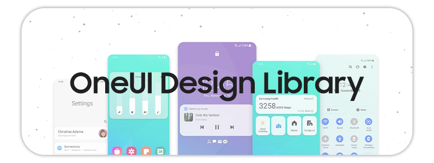
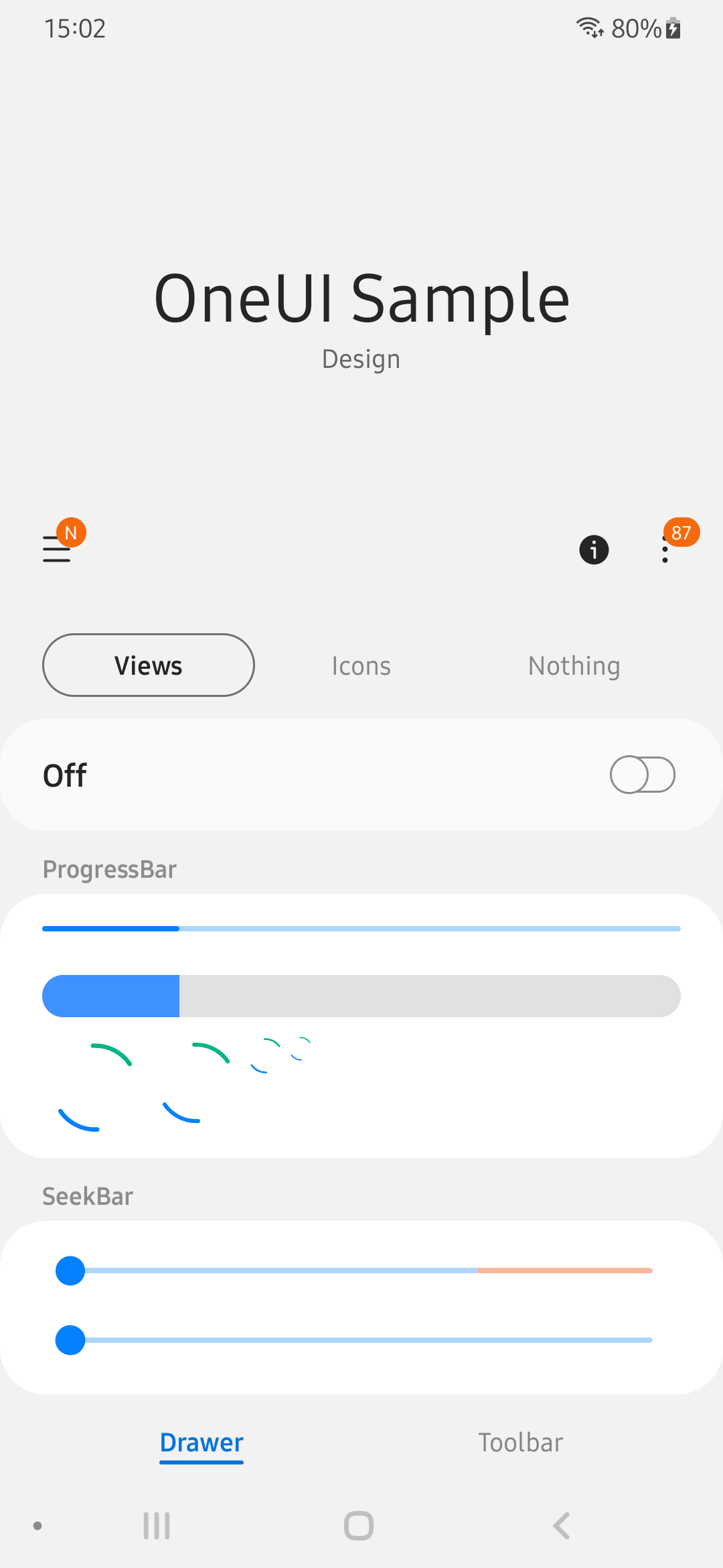
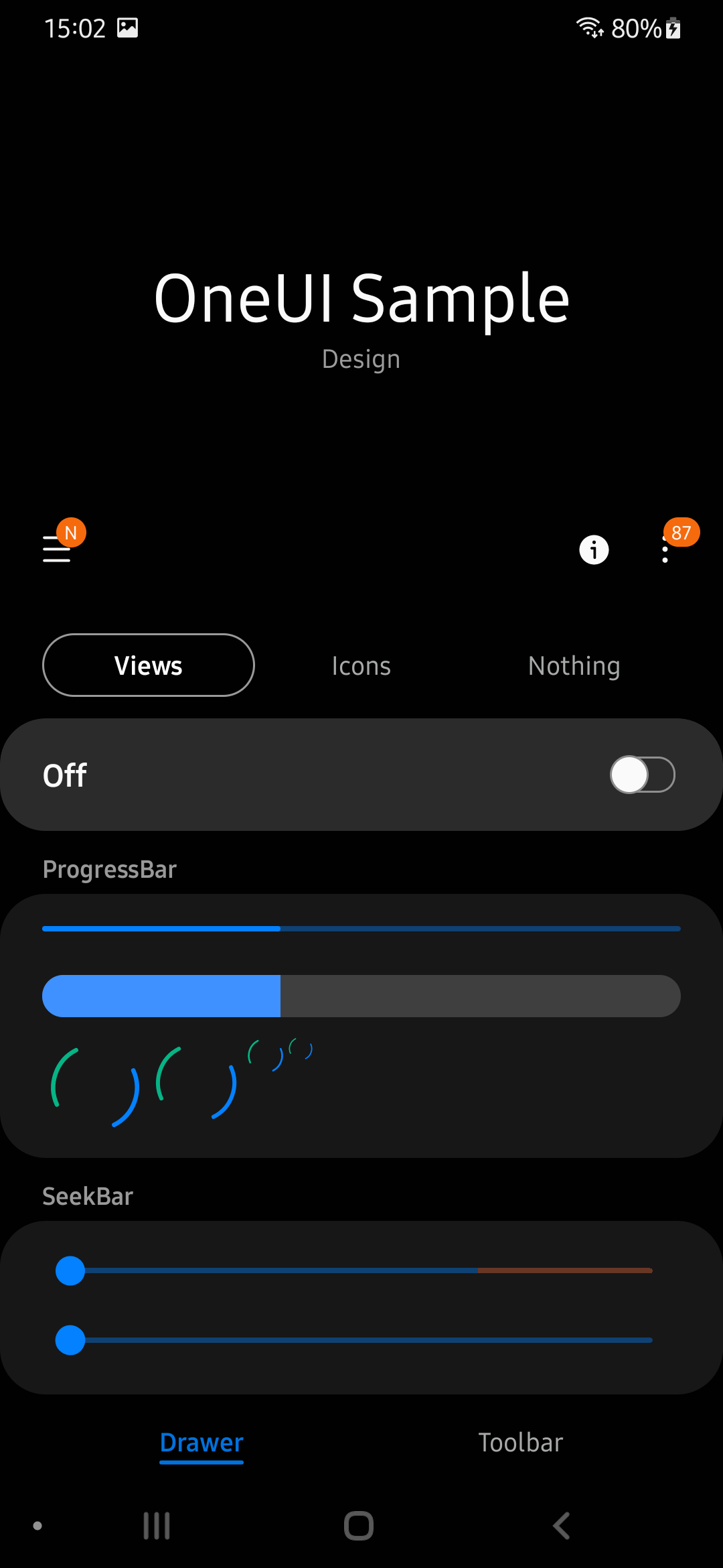
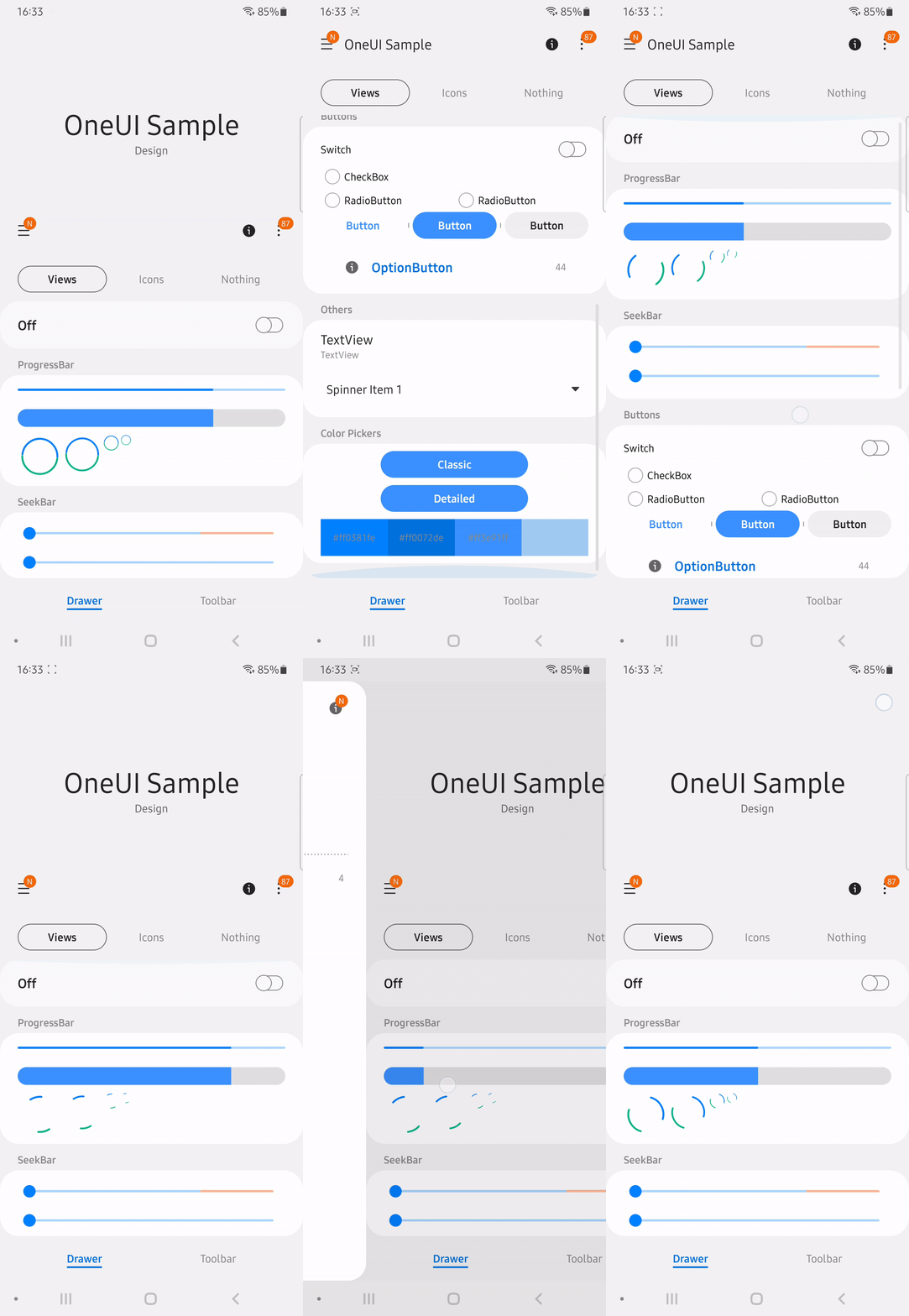
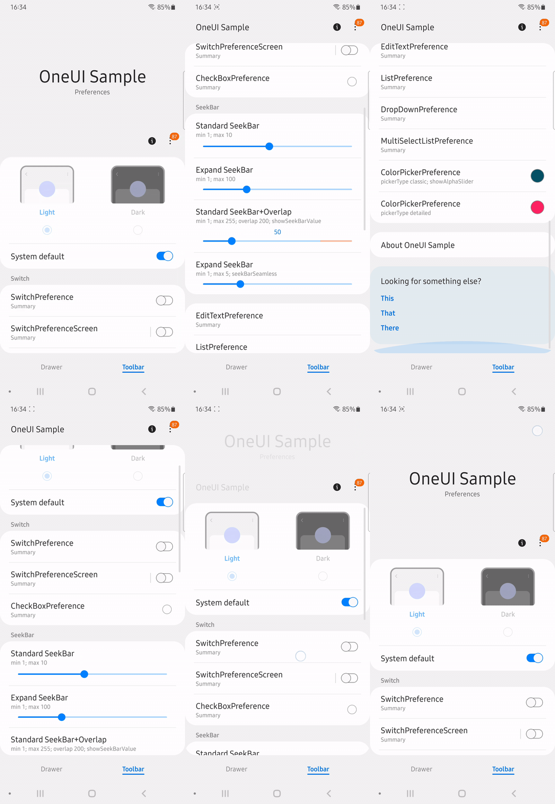
![]() A library for Android, useful for creating Samsung's OneUI styled apps. This library contains a theme which will apply for most views (see which) in your layout, and some custom OneUI views. The text which is in the custom views is translated to 90 languages, so you don't need to worry for these. Android 5.0 (api 21) and above are supported, the library also has Dark mode, Landscape, Tablet, DeX and RTL support. This library has been tested in Android Studio, but should work in other IDEs too. You can download and install the latest version of the sample app either in my own store or by downloading the apk here. Suggestions, improvements and help are always welcome.
A library for Android, useful for creating Samsung's OneUI styled apps. This library contains a theme which will apply for most views (see which) in your layout, and some custom OneUI views. The text which is in the custom views is translated to 90 languages, so you don't need to worry for these. Android 5.0 (api 21) and above are supported, the library also has Dark mode, Landscape, Tablet, DeX and RTL support. This library has been tested in Android Studio, but should work in other IDEs too. You can download and install the latest version of the sample app either in my own store or by downloading the apk here. Suggestions, improvements and help are always welcome.
Huge thanks to BlackMesa123 who has contributed a lot to this project.
Excuse my bad english, feel free to correct it. :)
v2.0.0 and future versions are (and only will be) available on mavenCentral. For older ones see below. (v1.3.0 was published to MavenCentral during development for testing purpose and should not be used as it's unstable and incomplete.)
- Add the dependency to build.gradle (Module: ...)
dependencies {
    implementation 'io.github.yanndroid:oneui:2.0.1'
    ...
}- Apply the main theme in AndroidManifest.xml
<application
    ...
    android:theme="@style/OneUITheme"
    >
    ...
</application>
If you're building apps specifically for Samsung devices, also check this out.
In order to enable even more UI elements, two flags can be used:
- In AndroidManifest.xml, add the following flags inside the "application" tag:
<application
    ...>
        <!-- enable Samsung UI elements -->
        <meta-data android:name="SamsungBasicInteraction" android:value="SEP10"/>
        <!-- disable icon squircle container -->
        <meta-data android:name="com.samsung.android.icon_container.has_icon_container" android:value="true"/>
        <!-- Samsung adaptive-icon (?) -->
        <meta-data android:name="com.samsung.android.icon_container.feature_appicon" android:value="ADAPTIVEICON_SHADOW"/>
        ...
</application>- This one requires decompiling your app manually with apktool; replace manually the parent in
Platform.V21.AppCompatandPlatform.V25.AppCompatthemes in the following files:
res/values/styles.xml
res/values-v25/styles.xml
...with Theme.DeviceDefault.NoActionBar.
older versions
with Jitpack:
- Add jitpack to build.gradle (Project: ...)
allprojects {
    repositories {
        ...
        maven { url 'https://jitpack.io' }
	}
}- Add the dependency to build.gradle (Module: ...)
dependencies {
    implementation 'com.github.Yanndroid:OneUI-Design-Library:1.3.0'
    ...
}- Apply the main theme in AndroidManifest.xml
<application
    ...
    android:theme="@style/SamsungTheme"
    >
    ...
</application>- Create a new token with
read:packagespermission. - Add the dependency to build.gradle (Module: ...)
repositories {
    maven {
        url = uri("https://maven.pkg.github.com/Yanndroid/OneUI-Design-Library")
            credentials {
                username = "your username"
                password = "your token"
            }
    }
}


dependencies {
    implementation 'de.dlyt.yanndroid:oneui:1.3.0'
    ...
}- Apply the main theme in AndroidManifest.xml
<application
    ...
    android:theme="@style/SamsungTheme"
    >
    ...
</application>In general, most of the views are styled automatically when you apply android:theme="@style/OneUITheme" in AndroidManifest.xml, the usage of the custom views in the library however is needed to achieve the best results.
- DrawerLayout
- ToolbarLayout
- SplashView
- AboutPage
- SwitchBarLayout
- CoordinatorLayout
- Round Layouts
- NestedScrollView
- RecyclerView
- Button
- SeekBar
- ProgressBar
- SwitchBar
- Spinner
- OptionButton
- OptionGroup
- RelatedCard
- BottomNavigationView
- TabLayout
- ViewPager
- AlertDialog
- ProgressDialog
- ClassicColorPickerDialog
- DetailedColorPickerDialog
- Preferences
- PopupMenu
- Tooltip
- Snackbar
- Advanced
- Icons
- Color theme
- App Icon
"Ready-to-go" DrawerLayout with included Samsung's AppBar.
<de.dlyt.yanndroid.oneui.layout.DrawerLayout
    android:layout_width="match_parent"
    android:layout_height="match_parent"
    android:layout="..."
    app:drawer_icon="..."
    app:toolbar_title="..."
    app:toolbar_subtitle="..."
    app:toolbar_expanded="...">

</de.dlyt.yanndroid.oneui.layout.DrawerLayout>
The children of this view can be at three different location: on the main screen, in the drawer or in the footer (useful for views like BottomNavigationView). To specify the location of each child you can set the attribute app:layout_location of the child to either main_content (default), drawer_panel or footer.
app:toolbar_title and app:toolbar_subtitle can be used to set the title and subtitle of the AppBar and Toolbar. The AppBar status is set to expanded by default, you can simply set app:toolbar_expanded to false if you want it to be collapsed. On small screens/dpi the toolbar will not expand.
The drawable in app:drawer_icon="..." is the little icon in the header of the drawer panel. There are already some stock OneUI icons included in the library you can use.
To make sure that AppBar scrolling behavior works correctly, the child set in main_content should either be RecyclerView or NestedScrollView with app:layout_behavior set to @string/sesl_appbar_scrolling_view_behavior. The stock RecyclerView and NestedScrollView might also work but probably won't behave correctly.
For further customization you can use android:layout to apply your own layout to this view, but keep in mind that you should add all the views and ids which are in the default layout, or your app might crash.
Return the ToolbarLayout.
public ToolbarLayout getToolbarLayout()Set the icon of the DrawerButton.
public void setDrawerButtonIcon(Drawable drawerIcon)OnClickListener for the DrawerButton (the icon in the top right corner of the drawer panel).
public void setDrawerButtonOnClickListener(OnClickListener listener)Set the Tooltip text of the DrawerButton.
public void setDrawerButtonTooltip(CharSequence tooltipText)Set the title of the AppBar/Toolbar.
public void setToolbarTitle(CharSequence title)
public void setToolbarTitle(CharSequence expandedTitle, CharSequence collapsedTitle)
Set the subtitle of the AppBar.
public void setToolbarSubtitle(String subtitle)Expand or collapse the AppBar with an optional animation.
public void setToolbarExpanded(boolean expanded, boolean animate)Show badges on the DrawerButton and NavigationIcon (use ToolbarLayout.N_BADGE and DrawerLayout.N_BADGE or either a number).
public void setButtonBadges(int navigationIcon, int drawerIcon)
public void setDrawerButtonBadge(int count) //only the drawerButton
Open/close the drawer panel with an optional animation.
public void setDrawerOpen(Boolean open, Boolean animate)See Advanced for even more methods.
"Ready-to-go" Samsung's AppBar.
<de.dlyt.yanndroid.oneui.layout.ToolbarLayout
    android:layout_width="match_parent"
    android:layout_height="match_parent"
    android:layout="..."
    app:title="..."
    app:subtitle="..."
    app:expandable="..."
    app:expanded="..."
    app:navigationIcon="...">

</de.dlyt.yanndroid.oneui.layout.ToolbarLayout>
The children of this view can be at two different location: on the main screen, or in the footer (useful for views like BottomNavigationView). To specify the location of each child you can set the attribute app:layout_location of the child to either main_content (default), or footer.
app:title and app:subtitle can be used to set the title and subtitle of the AppBar and Toolbar. The AppBar status is set to expanded by default, you can simply set app:toolbar_expanded to false if you want it to be collapsed. You can also disable totally the CollapsingToolbar by setting app:toolbar_expandable to false. On small screens/dpi the toolbar will not expand.
The drawable in app:navigationIcon="..." is the icon for the Toolbar Navigation Button. There are already some stock OneUI icons included in the library you can use.
To make sure that AppBar scrolling behavior works correctly, the child set in main_content should either be RecyclerView or NestedScrollView with app:layout_behavior set to @string/sesl_appbar_scrolling_view_behavior. The stock RecyclerView and NestedScrollView might also work but probably won't behave correctly.
For further customization you can use android:layout to apply your own layout to this view, but keep in mind that you should add all the views and ids which are in the default layout, or your app might crash.
Return the toolbar, useful for setSupportActionBar().
public MaterialToolbar getToolbar()Set the title of the AppBar/Toolbar.
public void setTitle(CharSequence title)
public void setTitle(CharSequence expandedTitle, CharSequence collapsedTitle)
Set the subtitle of the AppBar.
public void setSubtitle(CharSequence subtitle)Expand or collapse the AppBar with an optional animation.
public void setExpanded(boolean expanded, boolean animate)Set the image of the NavigationButton.
public void setNavigationButtonIcon(Drawable navigationIcon)OnClickListener for the NavigationButton.
public void setNavigationOnClickListener(OnClickListener listener)Set the Tooltip of the NavigationButton.
public void setNavigationButtonTooltip(CharSequence tooltipText)Show a badge on the NavigationButton (use ToolbarLayout.N_BADGE or a number).
public void setNavigationButtonBadge(int count)Show/hide the NavigationButton.
public void setNavigationButtonVisible(boolean visible)Due to the poor customization of Contextual Menu's, the layout also offers a custom implementation for Toolbar buttons in order to match the OneUI aesthetics. If you want to, use these methods for creating MenuItems:
// Button Icon resource id; Tooltip Text resource id; Button OnClickListener
public void addOverflowButton(int iconResId, int tooltipTextResId, View.OnClickListener listener)
// Use bigger button width; Button Icon resource id; Tooltip Text resource id; Button OnClickListener
public void addOverflowButton(boolean bigIcon, int iconResId, int tooltipTextResId, View.OnClickListener listener)
// get Button via view index (0: first one; 1: second one...)
public ToolbarImageButton getOverflowIcon(int index)
...and these to create the More Menu Button and its popup:
// Popup items list; Items list OnClickListener
public void setMoreMenuButton(LinkedHashMap<String, Integer> linkedHashMap, AdapterView.OnItemClickListener ocl)
// Show Popup programmatically
public void showMoreMenuPopupWindow()
// Dismiss Popup programmatically
public void dismissMoreMenuPopupWindow()
linkedHashMap is a list of name/badge pairs. Set the badge value to 0 if you don't want any, to ToolbarLayout.N_BADGE or to a number. You can find an example of it here.
See Advanced for even more methods.
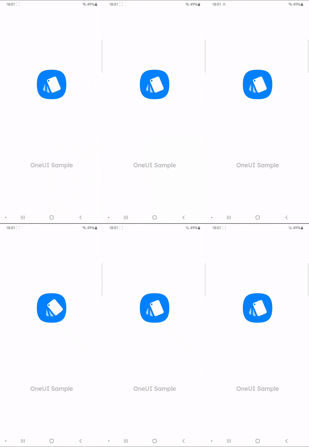
The activity you are gonna use for SplashView has a different style than the rest of the application, so you need to add this android:theme="@style/OneUISplashTheme" to your splash activity in AndroidManifest.
This view comes in two different configurations:
- An animated Splash Screen View like the one in the Galaxy Store.
<de.dlyt.yanndroid.oneui.layout.SplashView
    android:layout_width="match_parent"
    android:layout_height="match_parent"
    app:animated="true"
    app:text="..."
    app:background_image="..."
    app:foreground_image="..."
    app:animation="..." />
Set app:background_image to the background part of your icon and app:foreground_image to the foreground. The foreground image will have a customizable animation via the app:animation attr (default animation will be Galaxy Store one). app:text="..." is the text under the icon. It has a custom font to match the one on the Galaxy Store splash screen.
Sets the icon foreground and background
public void setImage(Drawable foreground, Drawable background)Sets the text of the Splash TextView
public void setText(String mText)Returns the text of the Splash TextView
public String getText()Starts the animation of the foreground
public void startSplashAnimation()Clears the animation
public void clearSplashAnimation()Listener for the Splash Animation
public void setSplashAnimationListener(Animation.AnimationListener listener)See Advanced for even more methods.
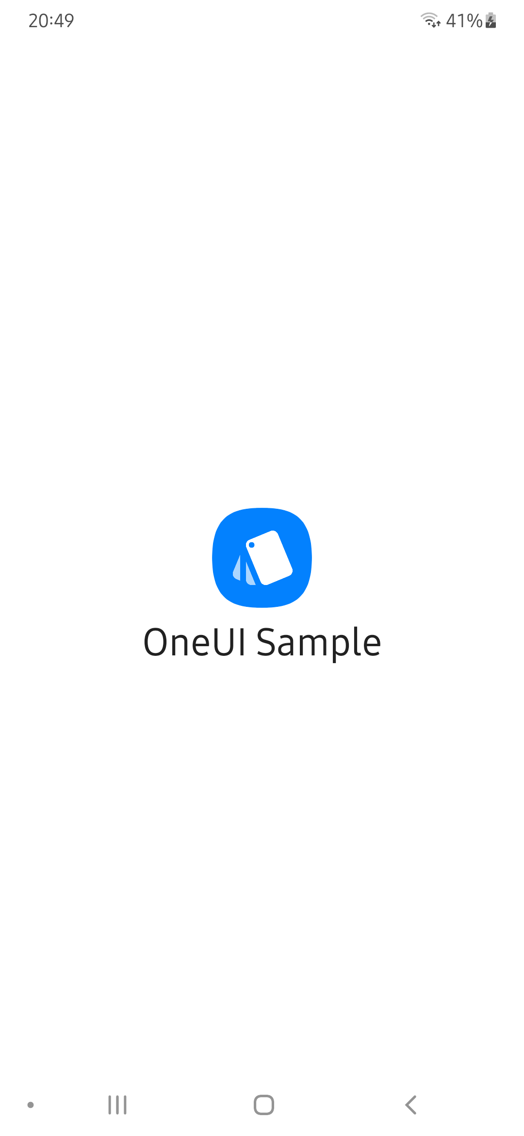
- A simple Splash View without animation. (Samsung apps use their own
com.samsung.android.startingwindow.LAYOUT_RESID_FOR_MASSflag in manifest)
<de.dlyt.yanndroid.oneui.layout.SplashView
    android:layout_width="match_parent"
    android:layout_height="match_parent"
    app:animated="false"
    app:text="..."
    app:image="..." />
Set the icon and text in app:image and app:text.
Sets the icon Drawable
public void setImage(Drawable mImage)Sets the text of the Splash TextView
public void setText(String mText)Returns the text of the Splash TextView
public String getText()See Advanced for even more methods.
A layout that looks like and has the same functions as the About Screen in any Samsung app. Like the SplashView, the activity you're gonna use has a different style than the rest of the application, so you need to add this android:theme="@style/OneUIAboutTheme" to your About Activity in AndroidManifest.
<de.dlyt.yanndroid.oneui.layout.AboutPage
    android:layout_width="match_parent"
    android:layout_height="match_parent"
    app:optional_text="..."
    app:update_state="...">

    <com.google.android.material.button.MaterialButton
        style="@style/AboutPageButtonStyle"
        android:text="..." />

    ...

</de.dlyt.yanndroid.oneui.layout.AboutPage>
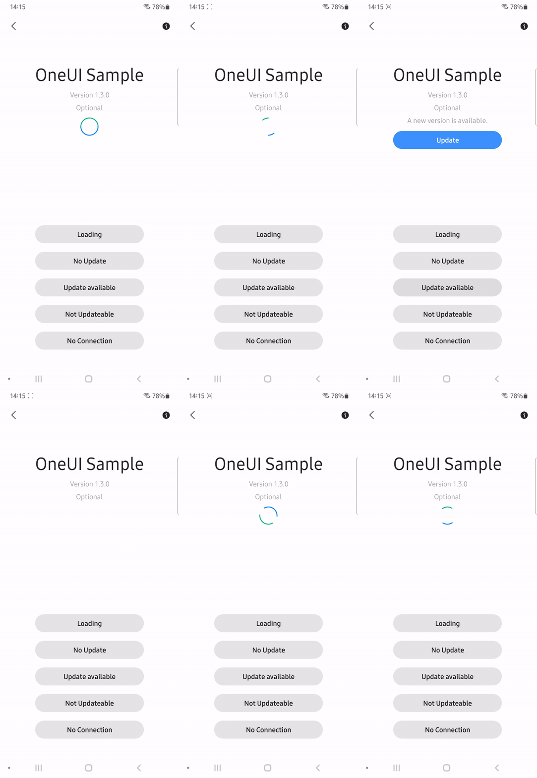
The App Name and Version are automatically added to the view. The Info Button at the top right will redirect the user to the App Info in System Settings. app:optional_text is the text that can be added between the version and the status text. The status text will change according to the state you have set to the view programmatically (see below) ,or in the layout with app:update_state.
You can use style="@style/AboutPageButtonStyle" for the buttons, which are shown at the bottom.
Set the update state of the view to either AboutPage.LOADING, AboutPage.NO_UPDATE, AboutPage.UPDATE_AVAILABLE, AboutPage.NOT_UPDATEABLE or AboutPage.NO_CONNECTION. This will change the visibility of certain views and the status text.
public void setUpdateState(@UpdateState int state)Set the optional text between the version and the status text.
public void setOptionalText(String text)OnClickListener for the update and retry button.
public void setUpdateButtonOnClickListener(OnClickListener listener)
public void setRetryButtonOnClickListener(OnClickListener listener)
See Advanced for even more methods.
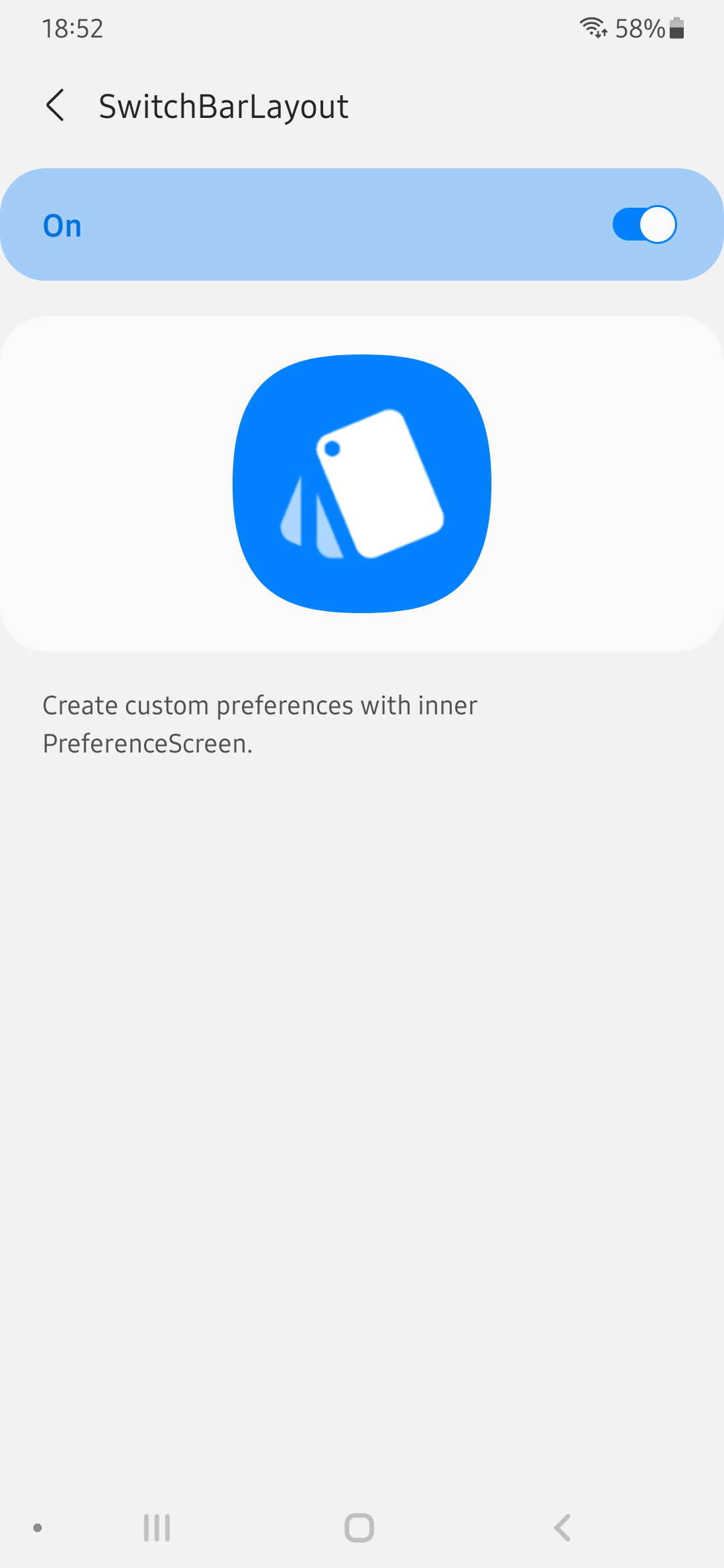
This is a extended ToolbarLayout with SwitchBar. Useful for creating inner preferences layouts in pair with SwitchPreferenceScreen.
<de.dlyt.yanndroid.oneui.layout.SwitchBarLayout
    android:layout_width="match_parent"
    android:layout_height="match_parent"
    android:layout="..."
    app:toolbar_title="..."
    app:toolbar_subtitle="..."
    app:toolbar_expanded="...">

</de.dlyt.yanndroid.oneui.layout.SwitchBarLayout>
Manage the Toolbar with app:toolbar_title, app:toolbar_subtitle and app:toolbar_expanded.
For further customization you can use android:layout to apply your own layout to this view, but keep in mind that you should add all the views and ids which are in the default layout, or your app might crash.
Return the SwitchBar.
public SwitchBar getSwitchBar()Set the Toolbar title and subtitle.
public void setToolbarTitle(CharSequence title)
public void setToolbarTitle(CharSequence expandedTitle, CharSequence collapsedTitle)
public void setToolbarSubtitle(String subtitle)
Expand or collapse the toolbar with an optional animation.
public void setToolbarExpanded(boolean expanded, boolean animate)See Advanced for even more methods.
Samsung's CoordinatorLayout
<de.dlyt.yanndroid.oneui.layout.CoordinatorLayout
    android:layout_width="match_parent"
    android:layout_height="match_parent">

</de.dlyt.yanndroid.oneui.layout.CoordinatorLayout>LinearLayout, FrameLayout and NestedScrollView with rounded corners. Usage is the same as their parents view.
<de.dlyt.yanndroid.oneui.layout.RoundLinearLayout
    android:layout_width="match_parent"
    android:layout_height="match_parent"
    app:roundedCorners="...">

</de.dlyt.yanndroid.oneui.layout.RoundLinearLayout>

<de.dlyt.yanndroid.oneui.layout.RoundFrameLayout
    android:layout_width="match_parent"
    android:layout_height="match_parent"
    app:roundedCorners="...">

</de.dlyt.yanndroid.oneui.layout.RoundFrameLayout>

<de.dlyt.yanndroid.oneui.view.RoundNestedScrollView
    android:layout_width="match_parent"
    android:layout_height="match_parent"
    app:roundedCorners="...">

</de.dlyt.yanndroid.oneui.view.RoundNestedScrollView>
To choose which corners are rounded use app:roundedCorners. Available are all (default), none, bottom_left, bottom_right, top_left and top_right (you can separate them with "|", to use multiple). Note that DrawerLayout, ToolbarLayout and SwitchBarLayout already have rounded corners on their main content.
Samsung's NestedScrollView, see Round Layouts for the rounded corner version.
<de.dlyt.yanndroid.oneui.view.NestedScrollView
    android:layout_width="match_parent"
    android:layout_height="match_parent">

</de.dlyt.yanndroid.oneui.view.NestedScrollView>
If you want to use this as child for DrawerLayout or ToolbarLayout, don't forget to add app:layout_behavior="@string/sesl_appbar_scrolling_view_behavior".
Samsung's RecyclerView, heavily used in their apps.
<de.dlyt.yanndroid.oneui.view.RecyclerView
    android:layout_width="match_parent"
    android:layout_height="match_parent">

</de.dlyt.yanndroid.oneui.view.RecyclerView>
Attributes and usage are the same as Google's RecyclerView.
Enable Samsung's FastScroller. ![]()
public void seslSetFastScrollerEnabled(boolean enabled)
public void seslSetFastScrollerEventListener(RecyclerView.SeslFastScrollerEventListener listener)
Enable Samsung's Go To Top button. ![]()
public void seslSetGoToTopEnabled(boolean enabled)
public void seslSetGoToTopBottomPadding(int padding)
public void seslSetOnGoToTopClickListener(RecyclerView.SeslOnGoToTopClickListener listener)
Round the corners of the last item.
public void seslSetLastRoundedCorner(boolean enabled)Fill the background at the bottom after the last item with the app background color.
public void seslSetFillBottomEnabled(boolean enabled)
public void seslSetFillBottomColor(int color)
Samsung also customized RecyclerView.ItemDecoration class by adding a call to onDispatchDraw method of the View. Overriding the seslOnDispatchDraw method lets you customize even more your list/grid view. You can find an example of it here.
The Button has three styles which you can use, depending on your needs.
@style/ButtonStyle.Transparent
@style/ButtonStyle.Invert
@style/ButtonStyle.Invert.Secondary
(There are also AboutPageButtonStyle and AboutPageButtonStyle.Update for the AboutPage, you can also use them.)
Samsung's SeekBar.
<de.dlyt.yanndroid.oneui.SeekBar
    android:layout_width="match_parent"
    android:layout_height="wrap_content"
    app:seslSeekBarMode="expand" />
With the app:seslSeekBarMode attribute, you can set the behavior of the SeekBar when pressed/tracking (suggested values are standard or expand).
Set a warning at progress i.
public void setOverlapPointForDualColor(int i)Other methods are the same as the default Seekbar.
@style/ProgressBarStyle.Horizontal
@style/ProgressBarStyle.Horizontal.Large
@style/ProgressBarStyle.Circle.Large
@style/ProgressBarStyle.Circle
@style/ProgressBarStyle.Circle.Small
@style/ProgressBarStyle.Circle.Title
Samsung's SwitchBar, same as the one you find in OneUI System Settings app.
<de.dlyt.yanndroid.oneui.SwitchBar
    android:layout_width="match_parent"
    android:layout_height="wrap_content" />
There is also the SwitchBarLayout if you need.
On and Off text resource id for the SwitchBar (default will be "On" and "Off").
public void setSwitchBarText(int i, int i2)Enable/disable the SwitchBar.
public void setEnabled(boolean z)Visibility of the ProgressBar in the SwitchBar.
public void setProgressBarVisible(boolean z)SwitchBar Listener.
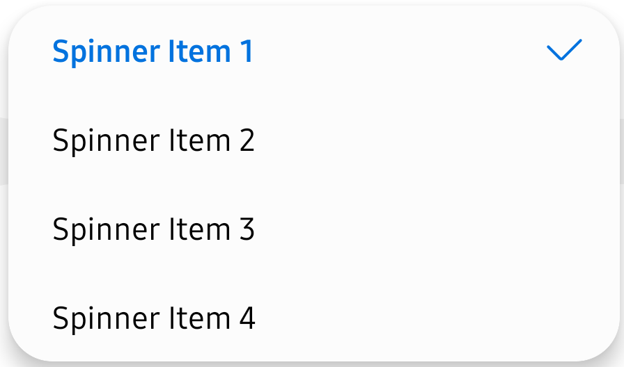
public void addOnSwitchChangeListener(OnSwitchChangeListener onSwitchChangeListener)Spinner with rounded corners and custom selector.
<androidx.appcompat.widget.SeslSpinner
    android:layout_width="match_parent"
    android:layout_height="wrap_content" />
Same usage as Spinner.
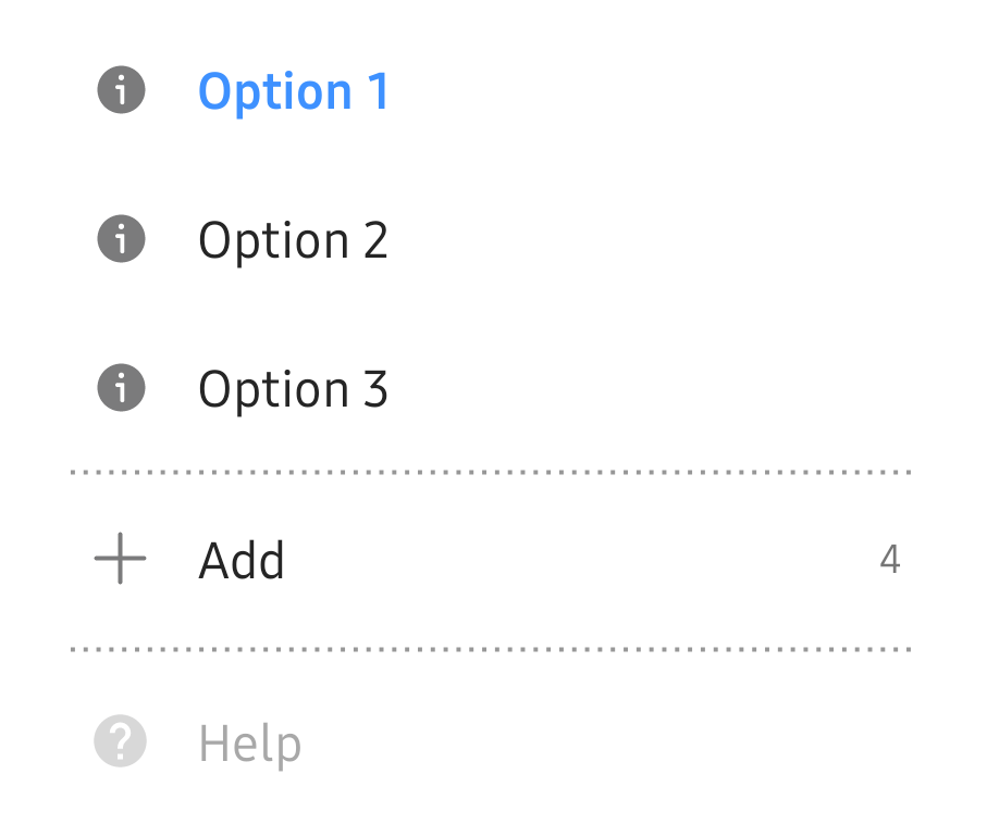
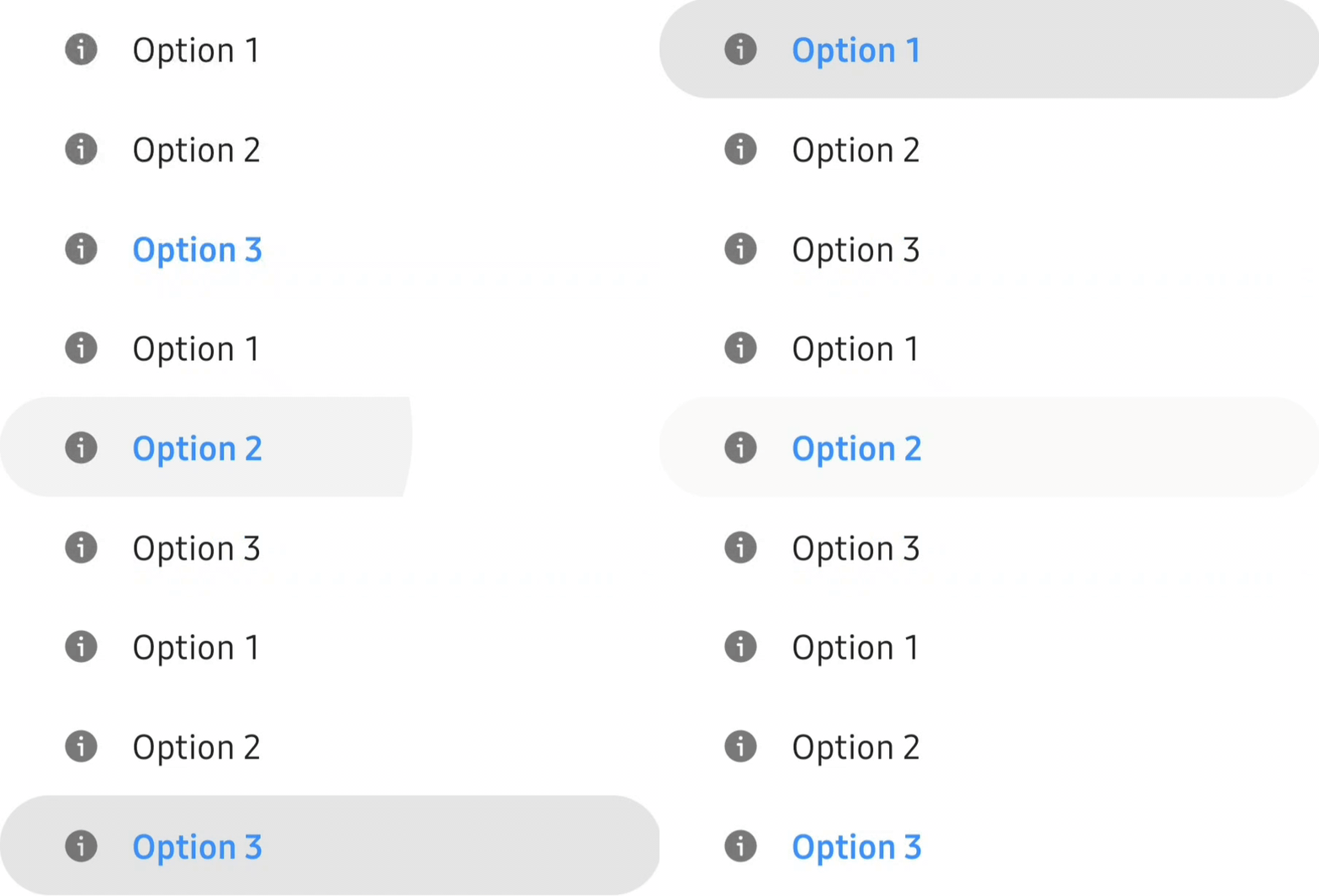
Create lists inside DrawerLayout without using RecyclerView with OptionButton.
<de.dlyt.yanndroid.oneui.drawer.OptionButton
    android:layout_width="match_parent"
    android:layout_height="wrap_content"
    app:icon="..."
    app:text="..."
    app:selected="..."
    app:counter="..."
    app:counterEnabled="..." />
app:icon="..." attribute is the button icon, and app:text="..." the text. app:selected="..." is to show the OptionButton as selected (colored and bold text), it's false by default. app:counterEnabled="..." and app:counter="..." can customize a counter at the end of the view, which is disabled by default. Make sure to enable the app:counterEnabled attribute or it won't show up.
Set/get the icon and text.
public void setIcon(Drawable icon)
public String getText()
public void setText(String text)
Manage the counter.
public Integer getCounter()
public void setCounter(Integer integer)
public void setCounterEnabled(Boolean enabled)
public void toggleCounterEnabled()
public Boolean isCounterEnabled()
Control the state (colored, bold text).
public void setButtonSelected(Boolean selected)
public void toggleButtonSelected()
public Boolean isButtonSelcted()
Enable/disable the OptionButton.
public void setButtonEnabled(Boolean enabled)OptionButton and OptionGroup are working together like RadioButton and RadioGroup. It will select an OptionButton on click.
<de.dlyt.yanndroid.oneui.drawer.OptionGroup
    android:layout_width="match_parent"
    android:layout_height="wrap_content"
    app:selectedOptionButton="...">

    <de.dlyt.yanndroid.oneui.drawer.OptionButton
        android:layout_width="match_parent"
        android:layout_height="wrap_content"
        app:icon="..."
        app:text="..." />

    ...

</de.dlyt.yanndroid.oneui.drawer.OptionGroup>
app:selectedOptionButton="..." will set the default selected OptionButton with this id. This view can also have other children, for example a divider:
<View style="@style/DrawerDividerStyle" />Select an OptionButton with either the view, id or position.
public void setSelectedOptionButton(OptionButton optionButton)
public void setSelectedOptionButton(Integer id)
public void setSelectedOptionButton(int position)
Get the currently selected OptionButton.
public OptionButton getSelectedOptionButton()Listener which will provide you view, id and position of the clicked OptionButton.
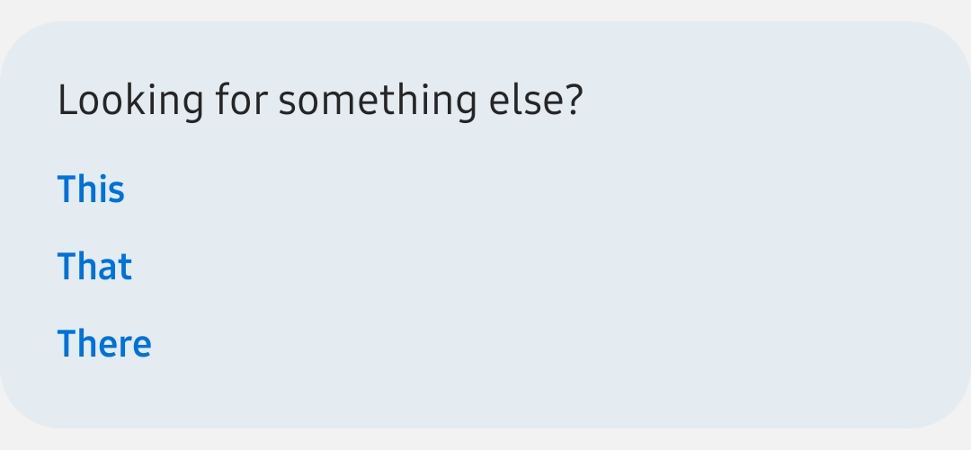
public void setOnOptionButtonClickListener(OnOptionButtonClickListener listener)Samsung's "Looking for something else?" Card you find in System Settings app.
(Depending on your screen right now you might not see it, but there's actually a light blue card around it.)
<de.dlyt.yanndroid.oneui.RelatedCard
    android:layout_width="match_parent"
    android:layout_height="wrap_content"
    app:title="...">

    <com.google.android.material.textview.MaterialTextView
        style="@style/RelatedButtonStyle"
        android:text="..." />


</de.dlyt.yanndroid.oneui.RelatedCard>
You can simply use style="@style/RelatedButtonStyle" for the child TextViews.
Get/set the title text.
public String getTitle()
public void setTitle(String title)Samsung's BottomNavigationView.
<de.dlyt.yanndroid.oneui.view.BottomNavigationView
    android:layout_width="match_parent"
    android:layout_height="wrap_content">

</de.dlyt.yanndroid.oneui.view.BottomNavigationView>
If you want to set it up with a ViewPager you'll have to use the ViewPager bundled in the library, the usage is the same as Google's TabLayout, but you'll have to call updateWidget(Activity activity) after you configurated it.
Add a custom ImageButton (like in Samsung's Gallery).
public void addTabCustomButton(Drawable icon, CustomButtonClickListener listener)Samsung's TabLayout.
<de.dlyt.yanndroid.oneui.view.TabLayout
    android:layout_width="match_parent"
    android:layout_height="wrap_content">

</de.dlyt.yanndroid.oneui.view.TabLayout>
If you want to set it up with a ViewPager you'll have to use the ViewPager bundled in the library, the usage is the same as Google's TabLayout, but you'll have to call updateWidget() after you configurated it.
ViewPager working with BottomNavigationView and TabLayout.
<androidx.viewpager.widget.SeslViewPager
    android:layout_width="match_parent"
    android:layout_height="match_parent">

</androidx.viewpager.widget.SeslViewPager>
The Adapter for this ViewPager has to extend androidx.fragment.app.FragmentPagerAdapter.
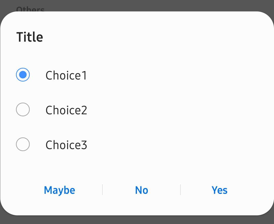
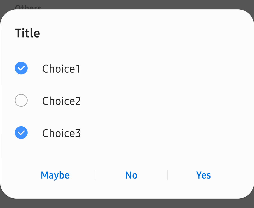
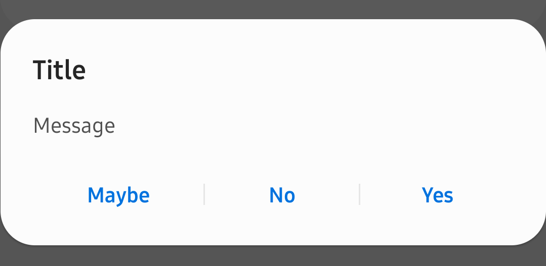
Samsung's AlertDialogs.
Usage is the same as the default AlertDialog, but you have to use de.dlyt.yanndroid.oneui.dialog.AlertDialog instead.
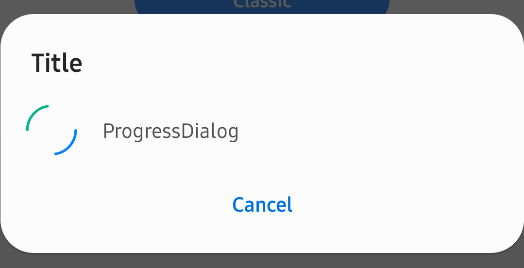
Samsung's Alert Dialog with Progress.
Usage is the same as AlertDialog but with additional methods.
Get/set the Progress drawables.
public void setProgressDrawable(Drawable d)
public void setIndeterminateDrawable(Drawable d)
Get/set Progress indeterminate status.
public boolean isIndeterminate()
public void setIndeterminate(boolean indeterminate)
Get/set Progress Style. Value can either be STYLE_SPINNER, STYLE_HORIZONTAL or STYLE_CIRCLE_ONLY.
public void setProgressStyle(int style)Get/set ProgressBar progress (in case you're using STYLE_HORIZONTAL).
public int getProgress()
public void setProgress(int value)
public int getSecondaryProgress()
public void setSecondaryProgress(int secondaryProgress)
public int getMax()
public void setMax(int max)
public void incrementProgressBy(int diff)
public void incrementSecondaryProgressBy(int diff)
public void setProgressNumberFormat(String format)
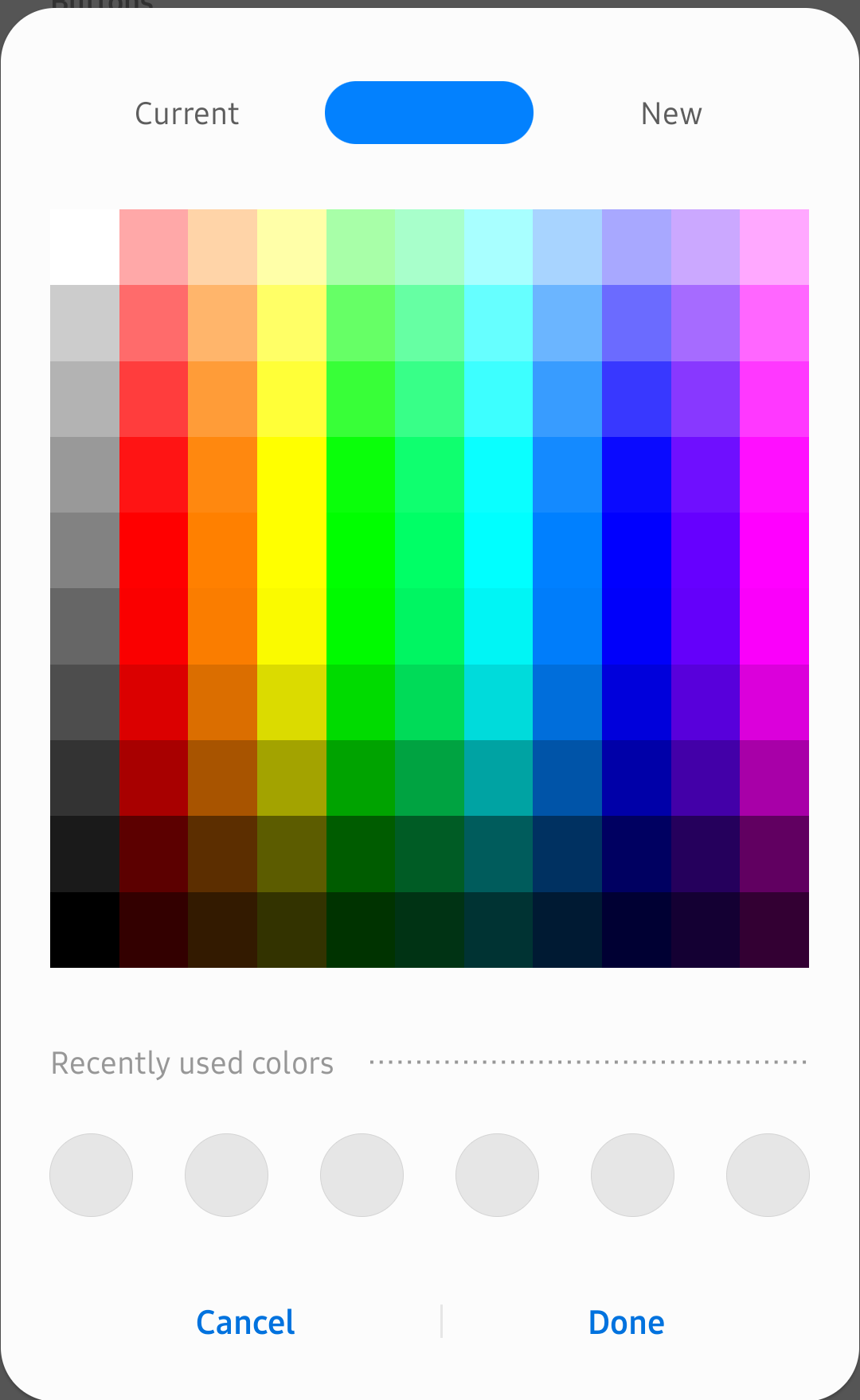
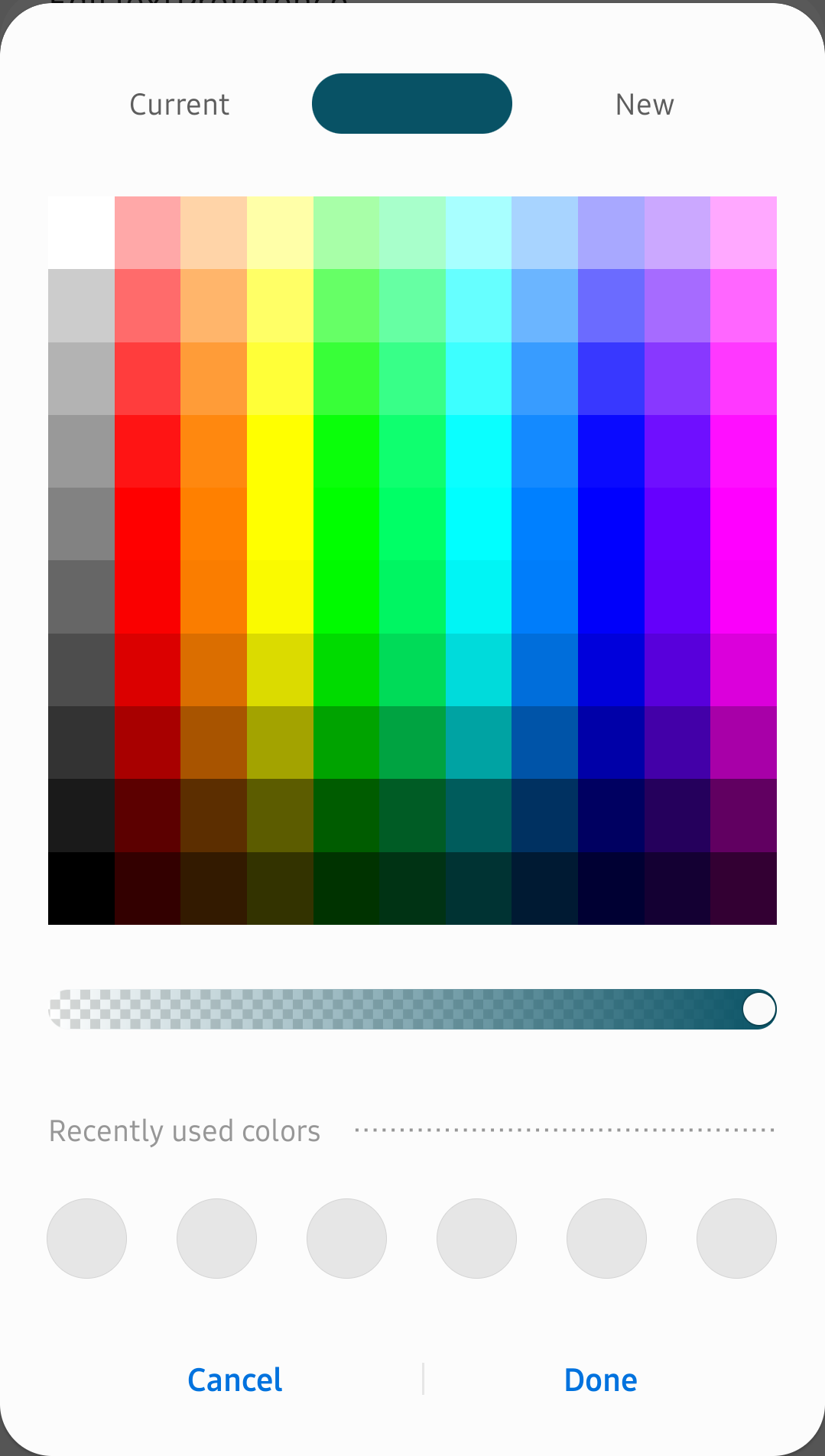
public void setProgressPercentFormat(NumberFormat format)Samsung's Sesl Color Picker Dialog.
Create the dialog with ColorPickerChangedListener, starting color, and recent colors.
public ClassicColorPickerDialog(Context context, ClassicColorPickerDialog.ColorPickerChangedListener listener)
public ClassicColorPickerDialog(Context context, ClassicColorPickerDialog.ColorPickerChangedListener listener, int currentColor)
public ClassicColorPickerDialog(Context context, ClassicColorPickerDialog.ColorPickerChangedListener listener, int currentColor, int[] recentColors)
public ClassicColorPickerDialog(Context context, ClassicColorPickerDialog.ColorPickerChangedListener listener, int[] recentColors)
Set the current color.
public void setNewColor(Integer color)Show/hide the color transparency SeekBar.
public void setTransparencyControlEnabled(boolean var1)Show the dialog.
public void show()Dismiss the dialog.
public void dismiss()Close the dialog.
public void close()Example:
ClassicColorPickerDialog mColorPickerDialog = new ClassicColorPickerDialog(this,
        new ClassicColorPickerDialog.ColorPickerChangedListener() {
            @Override
            public void onColorChanged(int i) {

            }
        },
        color);
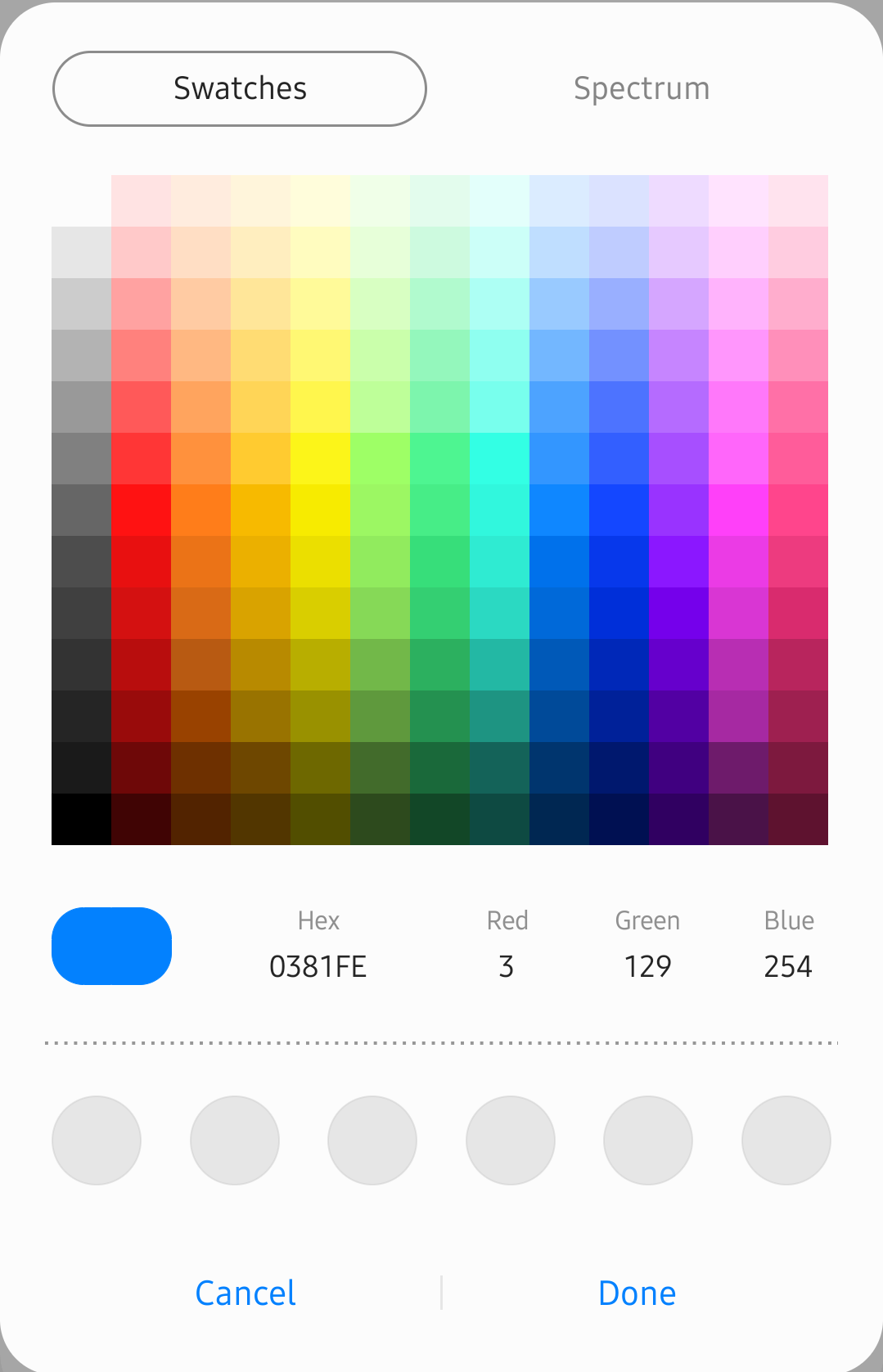
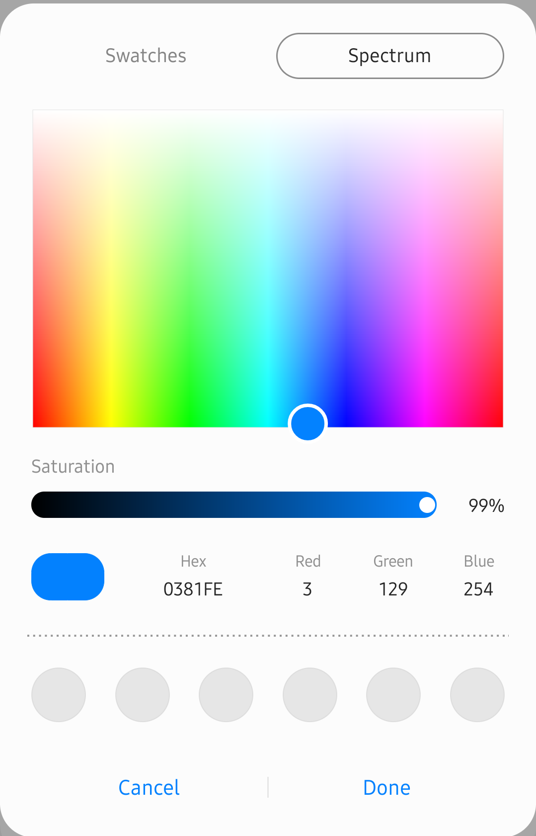
mColorPickerDialog.show();Samsung Notes app Color Picker Dialog, in case you need a more complete one.
Create the dialog with mode (1 = Spectrum, 2 = Swatches) and fArr (starting color).
public DetailedColorPickerDialog(Context context, int mode, float[] fArr)
public DetailedColorPickerDialog(Context context, float[] fArr)
Set the Color Change Listener.
public void setColorPickerChangeListener(ColorPickerChangedListener colorPickerChangedListener)Show the dialog.
public void show()Dismiss the dialog.
public void dismiss()Close the dialog.
public void close()Example:
float[] scolor = new float[3];
Color.colorToHSV(Color.parseColor("#0381fe5"), scolor);

DetailedColorPickerDialog mColorPickerDialog = new DetailedColorPickerDialog(this, scolor);
mColorPickerDialog.setColorPickerChangeListener(new DetailedColorPickerDialog.ColorPickerChangedListener() {
    @Override
    public void onColorChanged(int i, float[] fArr) {

    }

    @Override
    public void onViewModeChanged(int i) {

    }
});
mColorPickerDialog.show();Samsung's Preferences.
Attributes and usage are the same as Google's PreferenceFragmentCompat but you have to use de.dlyt.yanndroid.oneui.layout.PreferenceFragment instead. All the default preferences in androidx.preference are already included.
Enable/disable rounded corners.
public void seslSetRoundedCorner(boolean enabled)Create and add a RelatedCard to the bottom of the Preferences.
PreferencesRelatedCard relatedCard = createRelatedCard(context);
relatedCard.addButton("This", this)
            .addButton("That", this)
            .addButton("There", this)
.show(this);Clickable SwitchPreference used to contain inner preferences, can be used in combination with SwitchBarLayout.
<SwitchPreferenceScreen
    android:key="..."
    android:summary="..."
    android:title="..."/>
Both OnPreferenceClickListener and intent tag can be used to manage the behavior of the Preference when clicked.
<TipsCardViewPreference
    android:key="..."
    android:summary="..."
android:title="..." /><ColorPickerPreference
android:defaultValue="..."
android:key="..."
android:title="..."
app:pickerType="..."
app:showAlphaSlider="..." />android:defaultValue: default color string (ex. #FF2525)
app:pickerType: classic or detailed
app:showAlphaSlider: show transparency seekbar in classic picker type
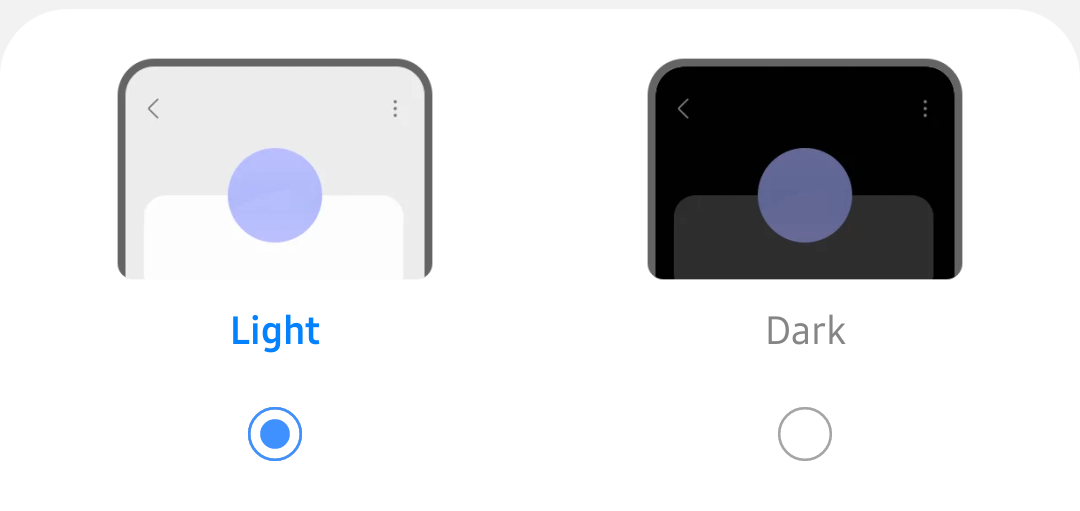
Samsung's Radio Preferences used in Light/Dark mode Settings and Resolution Settings.
<HorizontalRadioPreference
    android:key="..."
    android:title="..."
    app:entriesImage="..."
    app:entries="..."
    app:entriesSubtitle="..."
    app:entryValues="..."
app:viewType="..." />app:entriesImage: array with drawables (to be used only with image viewType)
app:entries: string array for the names
app:entriesSubtitle: string array for the subtitle (to be used only with noImage viewType)
app:entriesValues: string array for the values
app:viewType: image or noImage
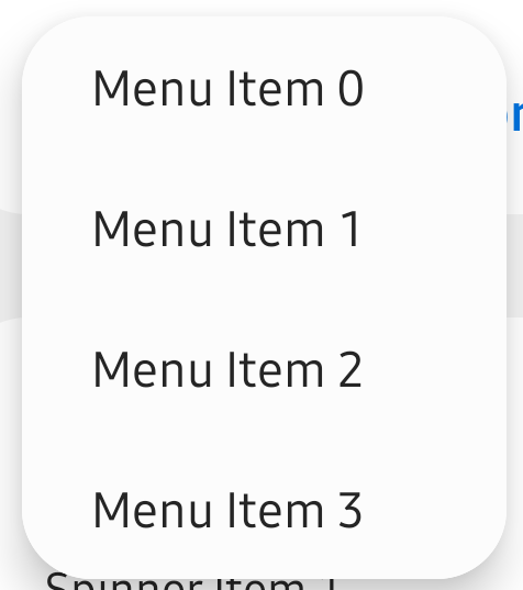
Create a PopupMenu.
//de.dlyt.yanndroid.oneui.view.PopupMenu
PopupMenu popupMenu = new PopupMenu(view);
Inflate a list of the items to show.
public void inflate(ArrayList<String> menu)Set the click listener.
public void setOnMenuItemClickListener(AdapterView.OnItemClickListener listener)Show and dismiss the popup.
public void show()
public void show(int xoff, int yoff) //with offset
public void dismiss()Samsung's Tooltip.
Usage is the same as TooltipCompat but with additional methods. Please note this won't show up on default views and has to be added manually instead of using view.setTooltipText(text):
Tooltip.setTooltipText(view, text);
SeslViewReflector.semSetHoverPopupType(view, 1 /* SemHoverPopupWindow.TYPE_TOOLTIP */);public static void seslSetTooltipForceActionBarPosX(boolean z)
public static void seslSetTooltipForceBelow(boolean z)
public static void seslSetTooltipNull(boolean z)
public static void seslSetTooltipPosition(int x, int y, int direction)
public void showPenPointEffect(MotionEvent event, boolean more)Samsung's Snackbar.
Same usage as the default Snackbar:
//de.dlyt.yanndroid.oneui.view.Snackbar

Snackbar.make(view, "Text label", Snackbar.LENGTH_SHORT).setAction("Action", new View.OnClickListener() {
    @Override
    public void onClick(View v) {
        //onClick
    }
}).show();This is for advanced usage only. I've added the method getView(int view) to some of the custom views to access the views inside it and change them directly. This can be helpful if you want to do something which isn't implemented in the custom views yet as I can't think of all possible uses. Currently this method is available in DrawerLayout, ToolbarLayout, SplashView, AboutPage and SwitchBarLayout.
There are also some of the stock icons you can find in Samsung apps included in this library, and we will add more over time. You can use them with @drawable/ic_samsung_... and R.drawable.ic_samsung_....
*not all icons are shown here because there are too much now (186). They are all listed with the name in the icon tab of the sample app.
The default color of the style is the same blue as Samsung (see Screenshots). But like Samsung has different colors for different apps, you too can use other colors which will apply on the entire App and even on the App Icon. In this library there are three different ways to do that and all three can be used simultaneously:
This methode will apply the color theme on the entire app and on the app icon. You need to add these three colors in your colors.xml :
<color name="primary_color">...</color>
<color name="secondary_color">...</color>
<color name="primary_dark_color">...</color>
These colors should have approximately the same color but with a different brightness. secondary_color the brightest, then primary_color and the darkest primary_dark_color.
Here are some presets (if you want I can make more):
Yellow like MyFiles App (also used in FreshHub):
<color name="primary_color">#fff3a425</color>
<color name="secondary_color">#ffffb949</color>
<color name="primary_dark_color">#ffbd7800</color><color name="primary_color">#ff008577</color>
<color name="secondary_color">#ff009e7c</color>
<color name="primary_dark_color">#ff00574b</color><color name="primary_color">#ff68b31a</color>
<color name="secondary_color">#ff7fa87f</color>
<color name="primary_dark_color">#ff569415</color><color name="primary_color">#ffff034a</color>
<color name="secondary_color">#ffff3d67</color>
<color name="primary_dark_color">#ffde0043</color>If you want to use different colors for a single (or multiple, but not all) activities, this is also possible. The difference here is that this will only apply for the activities you want. Add the three colors (see Entire App) in a theme in themes.xml:
<style name="ThemeName" parent="OneUITheme">
    <item name="colorPrimary">#fff3a425</item>
    <item name="colorSecondary">#ffffb949</item>
    <item name="colorPrimaryDark">#ffbd7800</item>
</style>
Then apply it on the activities you want with android:theme="@style/ThemeName" in AndroidManifest.xml.
This method allows you to change the color of your theme dynamically within your app. It's based on this idea. In your activity onCreate add this line at the top before super.onCreate(...):
new ThemeColor(this);This will apply the color theme at launch. If you want to change the color you can use these functions:
ThemeColor.setColor(Activity activity, int red, int green, int blue)
ThemeColor.setColor(Activity activity, float red, float green, float blue)
ThemeColor.setColor(Activity activity, float[] hsv)
The color you apply with these functions will apply on every activity with new ThemeColor(this) at the top. You can also enable/disable Dark theme programmatically:
// mode: DARK_MODE_AUTO; DARK_MODE_DISABLED; DARK_MODE_ENABLED
ThemeColor.setDarkMode(AppCompatActivity activity, int mode)The most app icons of Samsung apps are made of one solid color as background and a white icon as foreground. Sometimes there is even a little detail of the foreground with a similar color as the background.
I would suggest you to use @color/primary_color for the background color and either @color/launcher_foreground_detail_color , @color/secondary_color or @color/primary_dark_color for the foreground "detail" color, so your color theme applies for the app icon too.
My sample app icon for example:
- CardView
- CheckBox
- Button
- Switch
- RadioButton
- ProgressBar
- SeekBar
- SwitchBar
- RelatedCard
- ScrollBar & FastScroll
- PopupMenu
- Dialog
- TabLayout & ViewPager
- Preferences
- Tooltip
- BottomNavigationView
- About Screen
- Splash Screen
- AppBarLayout
- DrawerLayout
- Drawer Divider
- SnackBar
- Color Picker Dialog
- Spinner
- SearchView
- BottomSheet
*needs improvement
2.0.1
- fixed:
- scroll bevavior on clickable views
- aboutpage button font and ripple
- popupmenu going beyond screen
- drawerLayout back click closes drawer
- crash on small screens/dpi
- icons++
- Spinner
- BottomNavigationView improvements
2.0.0
- contributions from BlackMesa123:
- AppBarLayout (& friends)
- Preferences
- Classic Color Picker
- Dialogs
- Tooltip
- TabLayout
- BottomNavigationView
- Layouts rework
- NestedScrollView, RecyclerView, Round Layouts
- and much more (most of the stuff in this release)
- a lot of fixes and improvements
- support for api 21> (needs to be tested)
- Snackbar & PopupMenu
- more icons
- now available on mavencentral
1.3.0
- renamed library
- getView methode added
- splash screen display size fix
- minor changes
1.2.2
- Scrollbar
- AboutPage
- RelatedCard
- corner fix
- language update
- customizable splash animation
- expanded attribute for toolbar
- fixed landscape toolbar height
- improved orientation switching
- button text fix
- status & navigation bar dim on drawer slide
- added changelog to readme
1.2.1
- landscape support
- tablet support
- dex support
- expandable attribute for toolbar
- toolbar subtitle color
- added Header style
1.2.0
- colorPicker
- color Changer
- readme finished
- much more icons
- rtl support
- translated to 90 languages
1.1.3 - 1.0.0
- initial release/publish
- most of the stuff (I don't remember anymore...)
- BlackMesa123 for a lot of OneUI stuff, more compatibility and his experience.
- TenSeventy7 for some stuff and help.
- leonbcode for github actions, so this library is always up-to-date.
- AlirezaIvaz for translation correction (Persian) and issue reporting.
- nfauv2001 for helping me out with my english.
- Samsung for the OneUI Design.


