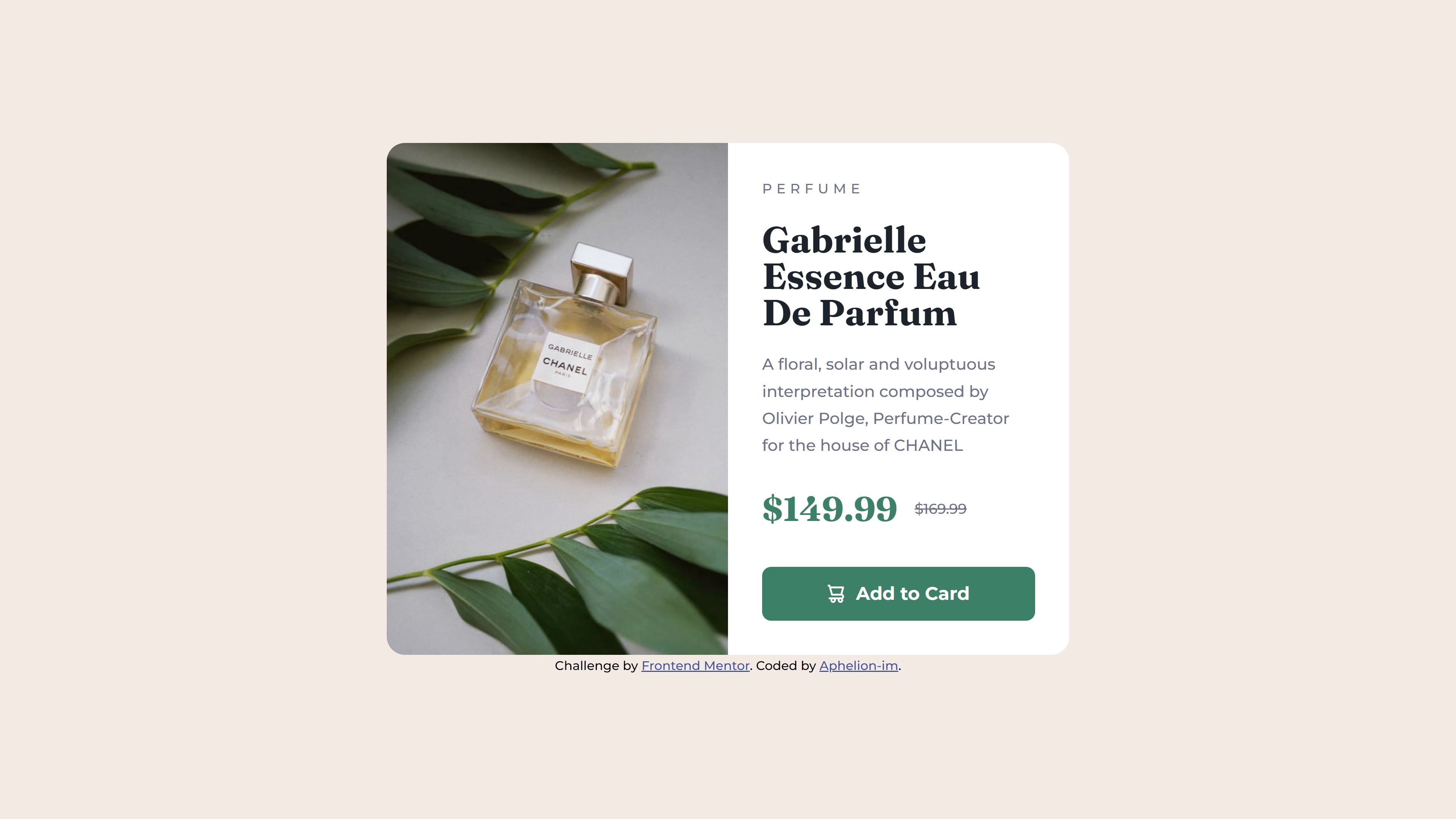
This is a solution to the Product preview card component challenge on Frontend Mentor. Frontend Mentor challenges help you improve your coding skills by building realistic projects.
Users should be able to:
- View the optimal layout depending on their device's screen size
- See hover and focus states for interactive elements
- Solution URL: Github repo
- Live Site URL: Live demo
- Semantic HTML5 markup
- Sass
- Flexbox
- Mobile-first workflow
- ViteJS
- The shopping-cart icon only appeared when using
display: inline-flex. I will have to study this further. - The
<picture>HTML element and the possibility to enter media queries. See code below. - Josh Comeau's CSS reset. Josh Comeau's CSS reset
- To start CSS/Sass color variables with: clr-
- To start CSS/Sass font-family with: ff-
- To start CSS/Sass font-weight with: fw-
- To use a custom data-* attribute to place an svg as an icon. See code below.
- That the vh unit is not ideal for mobile view. Kevin Powell, The problems with viewport units
- object-fit: contain; // contain works better on iPad
<picture>
    <source srcset="./assets/images/image-product-desktop.jpg" media="(min-width: 600px)">
    <img src="./assets/images/image-product-mobile.jpg" alt="Chanel Gabrielle">
</picture><button type="button" data-icon="shopping-cart">Add to Card</button>Code-wise I am not entirely satisfied.
- CSS writing style may be improved with the BEM method.
- On mobile, a part of the site is cut off.
- On iPad the card stretches vertically and the content gets too much whitespace.
- Kevin Powell: Taking on a Frontend Mentor challenge | Responsive Product Preview Card Component - Kevin Powell's take on this project
- Kevin Powell's Github repo of this specific project - Sometimes studied this repo to get some inspiration
- Firefox developer edition - Kevin Powell uses this browser during the project.
- Josh Comeau's CSS reset
- What length CSS unit should you use? (Kevin Powell)
- Frontend Mentor - @Aphelion-im
