A simple Slide to Unlock component for HarmonyOS, written in [Java].
Inspired from android library https://github.com/cortinico/slidetoact
Slide To Act is distributed through JCenter. To use it you need to add the following Gradle dependency to your harmony entry gradle file (NOT the root file):
dependencies {
   implementation "com.ncorti:slidetoact:0.9.0"
}
Or you can download the .AAR artifact directly from Bintray.
After setting up the Gradle dependency, you can use SlideToActView widgets inside your XML Layout files
<com.ncorti.slidetoact.SlideToActView
    ohos:id="$+id:example"
    ohos:height="match_content"
    ohos:width="match_parent"
    ohos:text="Example" />
And bind them inside your Java/Kotlin code:
SlideToActView slideToActView = (SlideToActView) findComponentById(ResourceTable.Id_example);- 100% Vectorial, no .png or other assets provided.
- Fancy animations! 🦄
- Easy to integrate (just a gradle compile line).
- Works out of the box, no customization needed.
- UX Friendly 🐣, button will bump to complete if it's over the 80% of the slider (see the following gif).
By the default, every SlideToActView widget fits to your app using the some default values and colors. You can customize your SlideToActView using the following custom attributes.
<com.ncorti.slidetoact.SlideToActView
    ohos:id="$+id:welcome_slider"
    ohos:height="match_content"
    ohos:width="match_parent"
    ohos:areaMargin="4vp"
    ohos:animationDuration="250"
    ohos:outerColor="#FF00FF00"
    ohos:innerColor="#FF222222"
    ohos:borderRadius="2vp"
    ohos:text="Testing all the custom attributes"
    ohos:textSize="12fp"
    ohos:sliderHeight="80vp"
    ohos:sliderLocked="false"
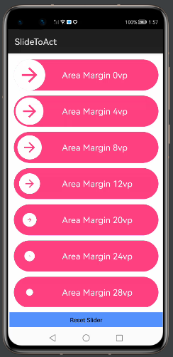
/>Use the areaMargin attribute to control the margin of the inner circular button from the outside area. If not set, this attribute defaults to 8vp.
The attribute iconMargin let you control the margin of the icon inside the circular button. This makes the icon bigger because can take up more space in the button.
This is especially useful when you want to make the height of the slider smaller (see sliderHeight). In this case, if you don't adjust the iconMargin the image can be too much tiny. By default, the iconMargin is set to 16vp.
In next image you can see how it looks like:
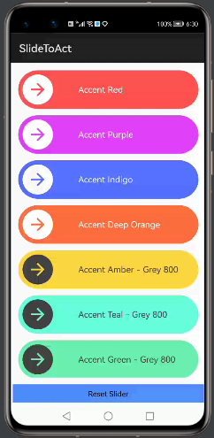
Use the outerColor attribute to control the color of the external area and the color of the arrow icon. If not set, this attribute defaults to
-
#FF4081.
Use the innerColor attribute to control the color of the inner circular button, the color of the tick icon and the color of the text. If not set, this attribute defaults to
-
#FFFFFF.
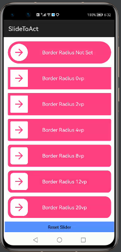
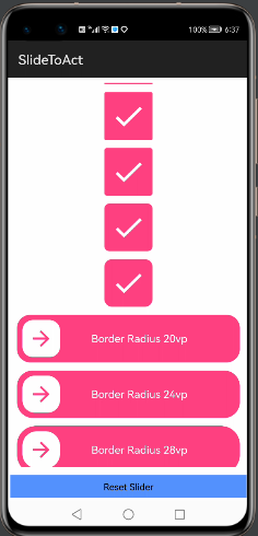
Use the borderRadius attribute to control the radius of the inner circular button and of the external area. A border_radius set to 0vp will result in a square slider. If not set, this attribute will render your slider as a circle (default behavior).
Use the text attribute to control the text of your slider. If not set, this attribute defaults to SlideToActView.
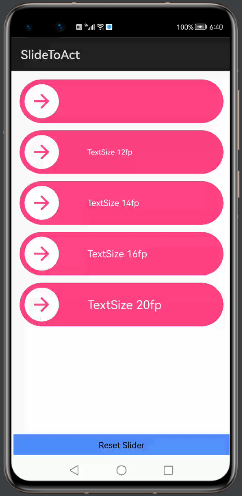
Use the textSize attribute to control the size of the text of your slider. A textSize set to 0fp will result in hiding the text. If not set, this attribute defaults to 16fp.
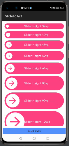
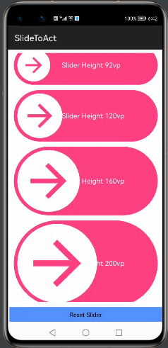
Use the sliderHeight attribute to control the desired height of the widget. If not set, the widget will try to render with 72vp of height.
Use the sliderLocked attribute to lock the slider (this is a boolean attribute). When a slider is locked, will always bump the button to the beginning (default is false).
You can also toggle this attribute programmatically with the provided setter.
SlideToActView sta = (SlideToActView) findComponentById(ResourceTable.Id_slider);
sta.setLocked(true);Use the animationDuration attribute to set the duration of the complete and reset animation (in milliseconds).
You can also set animation duration programmatically with the provided setter.
val sta = (SlideToActView) findComponentById(ResourceTable.Id_slider);
sta.setAnimationDuration(600);Use the sliderReversed attribute to reverse the slider (this is a boolean attribute). When a slider is reversed, the cursor will appear on the right and will progress to the left. (default is false).
You can also toggle this attribute programmatically with the provided setter.
SlideToActView sta = findComponentById(ResourceTable.Id_slider);
sta.setReversed(true);You can set a custom icon by setting the sliderIconattribute to a drawable resource.
ohos:sliderIcon="$graphic:custom_icon"You can also set a custom icon programmatically with the provided setter.
SlideToActView sta = findComponentById(ResourceTable.Id_slider);
sta.setSliderIcon(new VectorElement(getContext(), ResourceTable.Graphic_custom_icon));
You can also disable the rotation by setting the rotateIcon attribute to false.
You can set a custom complete icon by setting the completeIconattribute to a drawable resource.
app:complete_icon="$graphic:slidetoact_ic_check"You can also set a custom complete icon programmatically with the provided setter.
SlideToActView sta = findComponentById(ResourceTable.Id_slider);
slider.setCompleteIcon(new VectorElement(getContext(), ResourceTable.Graphic_slidetoact_ic_check));You can set a custom color for the icon by setting the sliderIconColor attribute.
This attribute defaults to the outerColor if set. If outerColor is not set, this attribute defaults to
-
#FF4081.
You can make the device vibrate when the cursor "bumps" to the end of the sliding path by setting the period of vibration through bumpVibration attribute in your layout XML (default is 0)
ohos:bumpVibration="200"Note that the period of vibration is in milliseconds
You can achieve the same programmatically using the setter:
SlideToActView sta = findComponentById(ResourceTable.Id_slider);
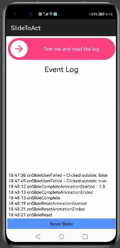
sta.setBumpVibration(200);You can use the OnSlideCompleteListener and the OnSlideResetListener to simply interact with the widget. If you need to perform operations during animations, you can provide an OnSlideToActAnimationEventListener. With the latter, you will be notified of every animation start/stop.
You can try the Event Callbacks in the Demo app to better understand where every callback is called.
- Adding Elevation support.
- Adding clipChildren support to obtain this behavior:
- Adding Text style and custom text feature.
Once you're able to build successfully, you can run Junit test cases locally.
Make sure your tests are all green ✅ locally before submitting PRs.
Looking for contributors! Don't be shy. 😁 Feel free to open issues/pull requests to help me improve this project.
- When reporting a new Issue, make sure to attach Screenshots, Videos or GIFs of the problem you are reporting.
- When submitting a new PR, make sure tests are all green. Write new tests if necessary.
- flutter-slide-to-act - A porting of this widget for Flutter
This project is licensed under the MIT License - see the License file for details


