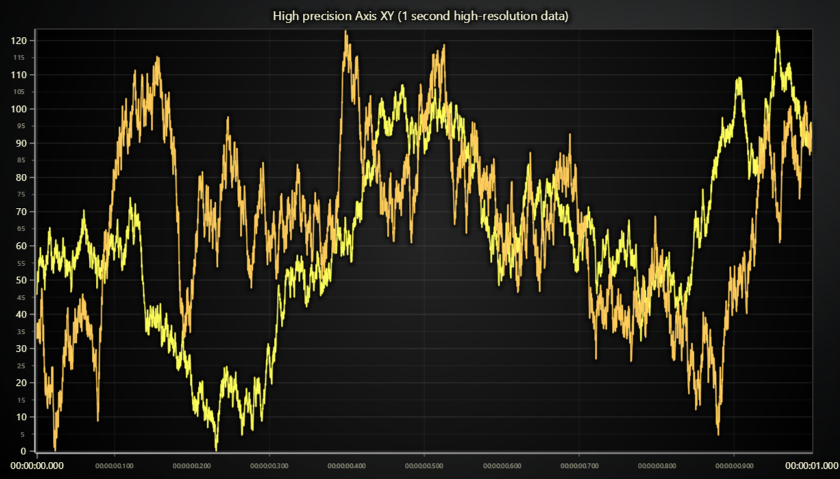
This demo application belongs to the set of examples for LightningChart JS, data visualization library for JavaScript.
LightningChart JS is entirely GPU accelerated and performance optimized charting library for presenting massive amounts of data. It offers an easy way of creating sophisticated and interactive charts and adding them to your website or web application.
The demo can be used as an example or a seed project. Local execution requires the following steps:
-
Make sure that relevant version of Node.js is installed
-
Open the project folder in a terminal:
npm install # fetches dependencies npm start # builds an application and starts the development server -
The application is available at http://localhost:8080 in your browser, webpack-dev-server provides hot reload functionality.
This example showcases the High Precision Axis XY feature.
An XY Axis can be marked with high precision mode when it is created, similarly how logarithmic axes are created. This example shows how it is done for default X Axis.
const chart = lightningChart().ChartXY({
    // Default Axis types can only be defined when chart is created.
    defaultAxisX: {
        type: 'linear-highPrecision',
    },
})
High precision Axis behaves just like a normal linear Axis, but with two technical differences:
-
There is a performance drop for all attached series. This is mostly an increase on GPU usage, which shows on low end devices the most, for example laptops with integrated GPUs.
-
The Axis zoom range is significantly improved (read more below).
High Precision Axis XY currently supports all XY series types except Heatmap Series.
LightningChart JS is easily the market leader in zooming interactions and visualization resolution, and contrary to most chart libraries, we are open about axis zooming limits.
The fact of the matter is that every kind of chart library has some limit to how small differences it can visualize. Ultimately the limits are dictated by the used technology (for us this is WebGL).
All veteran chart library developers have come across the issue sooner or later, when an user collides against this limit and the question is asked - how can we get higher precision? Usually this ends in decimating the end users data with tricks and gimmicks, which can lead to a working result but with the expense of user experience.
High Precision Axis XY feature is our reaction to a proper improvement to these limitations - it handles all the annoying stuff that users had to previously do in their application code and gives even better benefits;
Here are reference tables to the achievable zoom range with normal Axis vs High Precision Axis XY
(achievable zoom range depends on the magnitude of Axis interval start).
| Axis interval start | Min interval | Max interval |
|---|---|---|
0 |
1e-4 |
1e+16 |
100 |
1e-2 |
1e+16 |
10 000 |
1.00 |
1e+16 |
1 000 000 |
100 |
1e+16 |
Date.now() (UNIX) |
73600000 |
1e+16 |
| Axis interval start | Min interval | Max interval |
|---|---|---|
0 |
1e-12 |
1e+30 |
100 |
1e-10 |
1e+30 |
10 000 |
1e-8 |
1e+30 |
1 000 000 |
1e-6 |
1e+30 |
Date.now() (UNIX) |
1.00 |
1e+30 |
- Lightning Chart
- Automatic axis ticks options
- Solid fill style
- Color factory RGBA
- Chart XY
- Axis XY
- Line Series XY
- Legend Box
If you notice an error in the example code, please open an issue on GitHub repository of the entire example.
Official API documentation can be found on LightningChart website.
If the docs and other materials do not solve your problem as well as implementation help is needed, ask on StackOverflow (tagged lightningchart).
If you think you found a bug in the LightningChart JavaScript library, please contact sales@lightningchart.com.
Direct developer email support can be purchased through a Support Plan or by contacting sales@lightningchart.com.
© LightningChart Ltd 2009-2022. All rights reserved.
