This is a practice repo for flexbox and exercises based on it
A good guide for flex box is the css tricks flexbox snippets
We can use an emmet shortcut to do this
.container>.box.box1*10
- We are using
normailize.csswhich resets the default browser settings to make our code have the same look across browsers - without flexbox the elements i.e. div tags are stacked on top of each other
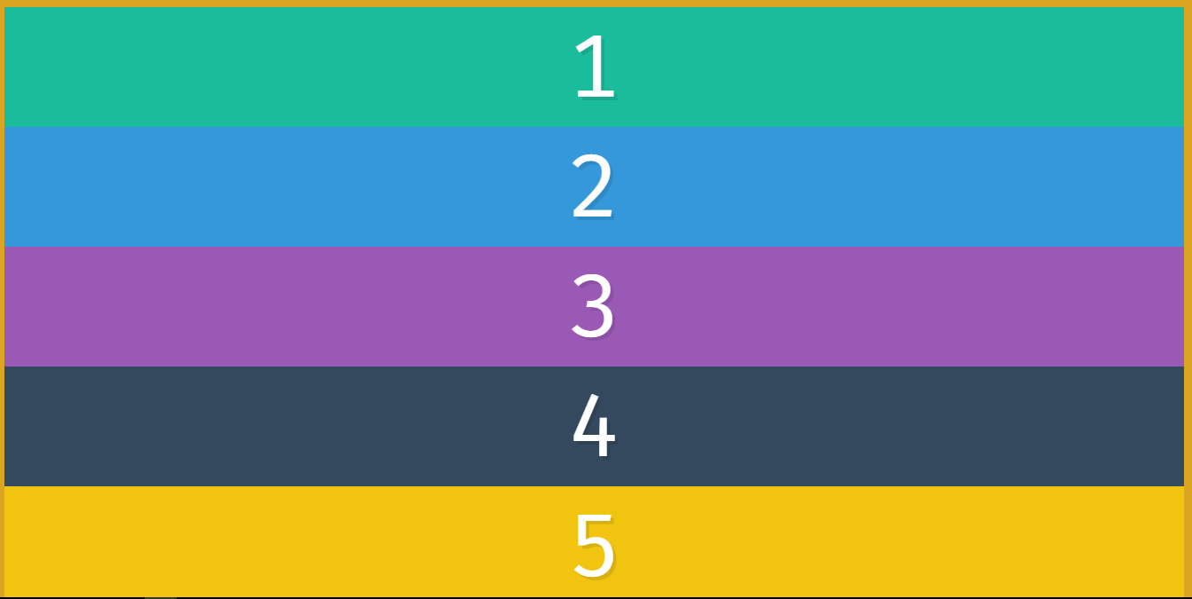
- To start using flexbox we simply have to write
display:flexon the parent container using flex we get and our flex container goes all the way across inline-flex will just wrap around the content

- The parent container is called the flex container and the immediate children are called flex items and we dont explicitly need to define display flex on the children
- In flexbox we have main and cross axis
flex-direction:rowis the default value and it goes from left to rightflex-direction:columnstacks from top to bottom- The min-height property in CSS is used to set the minimum height of a specified element. The min-height property always overrides both height and max-height
- When we use flex-direction we get two axises : main axis and cross axis
Below is the depiction for main and cross axis when using
flex-direction:row
- flex-wrap is put on the flex-container(parent) and not flex-item(immediate children)
- It's default value is
flex-wrap:nowrap - default flex items take the height of the element .and strtches to fit it
- To divide the screen into equal space for divs to avoid whitespace we can use
100/3 viz 33.3333%or just use calc()width:calc(100% / 3); - if we put
flex-direction:columnand have a 100vh and wrap is set, it wraps the elements within the screen space - If we set height to min-height it will wrap cause min-height is set and height is not fixed
without min-height and with in-height:
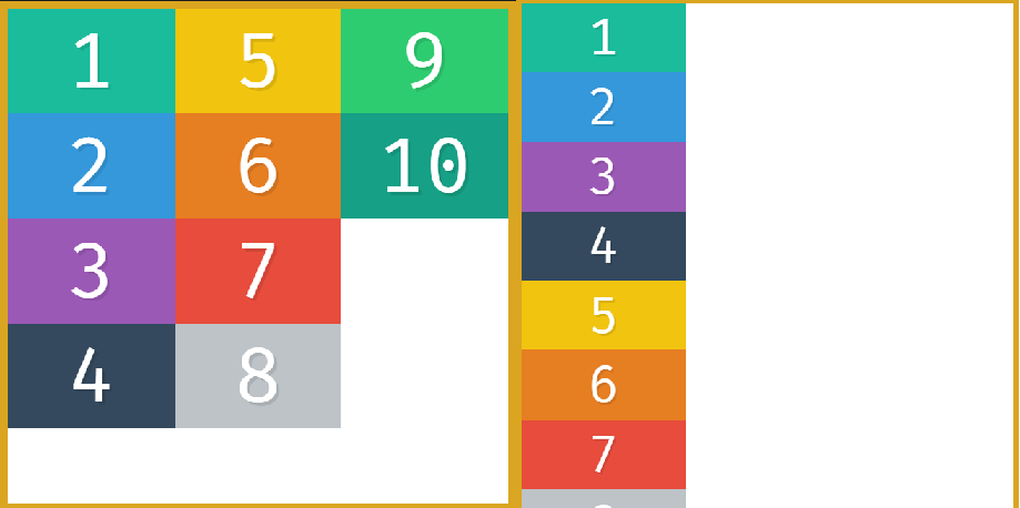
if we want to add margin then we can do
width:calc(33.3333% - 20px); 20px cause 10px on either side left & right

flex:1;takes the width and evenly spreads it- We can set it on the
flex-items,by default all are set to zero.box{order:0}and when we do.box{order:2}it sets it at the end of last element withorder:0
Also works with negative values .box3{order:-1}

- not to be used to copy texts but only to order certain elements
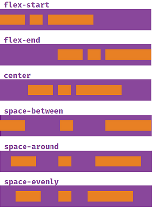
justify contentis used to describe how the items are aligned on the main axis
below is for flex-direction:column with main axis running from top to bottom

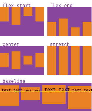
- for align items we are more concerned about the cross axis which is from top to bottom
- align items are set to stretch by default
align-items:stretch - baseline aligns items according to their text baseline

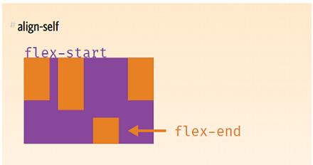
- This allows the default alignment to be overridden by invidual flex items
- Note that float, clear and vertical-align have no effect on a flex item.
- the
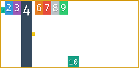
flex itemshave flex asauto - so when we say
flex:1it takes up the remaining space and distributes the space evenly for all
The beauty of flex items is being “flexible.” ####Flex-grow and Flex-shrink Flex-grow and flex-shrink allow us to play around this even more
- The flex-grow and flex-shrink properties control how much a flex-item should “grow” (extend) if there are extra spaces, or “shrink” if there are no extra spaces.
- They may take up any values ranging from 0 to any positive number. 0 || positive number
- By default, the flex-grow property is set to 0. By implication, the flex-item does NOT grow to fit the entire space available.
- By default, the shrink property is set to 1. Which means the flex-shrink switch is also turned on!
- when we set
flex:1its a shorthand forflex-grow:1andflex-shrink:1 - The flex-basis property specifies the initial size of a flex-item. Before the flex-grow or flex-shrink properties adjust it's size to fit the container or not.
- The default value is
flex-basis: auto. Flex-basis can take on any valuespercentages || ems || rems || pixels etc
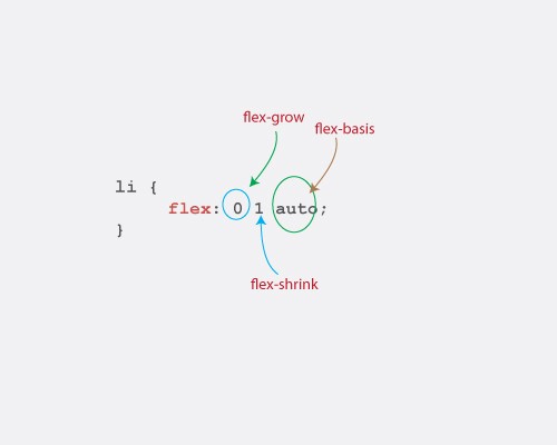
- The flex shorthand allows you set the flex-grow, flex-shrink and flex-basis properties all at once.
li { flex: 0 1 auto; }

