Starter kit for modern web applications!
This project (a GitHub template) is an opinionated setup for modern web applications. It's a combination of essential (and minimal) libraries/components/utils/dev-tools/etc., which developers usually need during the process of making modern React applications.
Almost all projects need to have a router, a UI framework, store integration, theming, error handling, base file/folder structure, a builder, some developer tools (eslint, prettier, etc), tests and many more. In this starter kit, we tried to put together the best options available from the above-mentioned fields. Out of the box, it provides a modern production-ready setup created by developers for developers 💚
- ✅ Vite
v5🔥
- ✅ React
v18🔥
- ✅ TypeScript
- ✅ UI-framework
MUI v5
- ✅ Router
React Router v6
- ✅ Store
Recoil
- ✅ Notifications
- ✅ Theme
- ✅ Base file/folder structure
- ✅ PWA
- ✅ Performance
- ✅ Hotkeys
- ✅ Error Handling
- ✅ Pages
- ✅ Tests 🚀
- unit tests -
Vitest - e2e tests -
Playwright
- unit tests -
- ✅ GitHub Actions
- ✅ Environmental variables
- ✅ EsLint
- ✅ Prettier
- ✅ Husky
- ✅ Lint staged
- ✅ https localhost
Vite is a blazingly fast build tool based on native ES modules, rollup, and esbuild. It provides a great developer experience and super fast builds.
The latest version (v18) is used here. All dependencies support React v18 and the v2 is refactored according to the latest changes and requirements of React v18.
"Not using TypeScript is like driving without a seatbelt" - Matt Howard.
For those who are not familiar with TypeScript - don't worry, you will love it, as we all did. TypeScript is a superset of JavaScript; it should be very easy to work with if you know JavaScript.
React Router v6 is used here. You can find routing in the src/routes folder.
MUI v5 is used here. MUI is a fully-loaded component library, super customizable, and easy to use.
As a store management tool Recoil is used. Check the src/store folder for more information.
Out of the box you have a notification system. To show a simple notification you can use useNotification hook:
import { useNotifications } from '@/store/notifications';

function MyCoolComponent() {
  const [notifications, actions] = useNotification();

  function showNotification() {
    actions.push({ message: 'Բարև, կարմի՛ր արև' });
  }

  return (
    ...
  );
}The theme system is based on MUI Theme. To get the current theme mode or to change it you can use useTheme hook:
...
import { useTheme } from '@/store/theme';

function MyCoolComponent() {
  const [theme, actions] = useTheme();

  // check the current theme mode
  console.log(theme);

  // if you want to change the theme, call an appropriate action
  function toggleTheme() {
    actions.toggle();
  }

  ...
}
You have access to theme object via sx prop and styled-components:
import Box from '@mui/material/Box';
import Button from '@mui/material/Button';
import { styled } from '@mui/material/styles';

// styled-components
const MyCoolButton = styled(Button)(({ theme }) => ({
  marginRight: theme.spacing(1),
  color: theme.palette.text.disabled,
}));

// sx prop
function MyCoolComponent() {
  return <Box sx={{ borderRadius: theme.shape.borderRadius }}>...</Box>;
}
Also, you can redefine the theme in the theme configuration file. Check the src/theme/themes.ts file for more information.
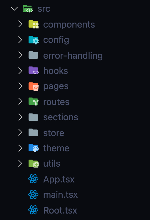
Here how the base file/folder structure looks like:
Special attention deserves pages/, sections/ and components/. These are the main building blocks of the application and here is the difference between them:
components- usually (but not necessarily), incomponents/we keep dummy, stateless components, that are being used in different parts of the application, and they don't belong to the particular page/section, likeButton,List,Table,Loading,Divider,Flex,Dialog, etc.sections- sections are complete parts of the application, that have their own logic, likeNavigation,Sidebar,Notifications, etc.pages- pages represent the root routes, like/profilerenders theProfilepage,/loginrendersLoginpage. Pages are made of sections (no need to have [Page]/sections/ folder). If a section is used on multiple pages it should be moved to/root/sections.- in some project you may see
/featuresinstead of/sections
- in some project you may see
Another important mention is any component's folder structure. It should look like this:
- [Component]
  - index.ts
  - [Component].tsx
  - types.ts
  - styled.ts
  - utils.tsx
  - etc.
It's a good practice to keep all related files in one folder. It makes it easier to find and maintain them. Only the first two files are required. You may or may not have component-related types, styles, utils, etc. But if you have them, keep them in the same folder and separate files. Let's see what each file is responsible for:
index.ts- this is the entry file for the component. Itexport defaults the "original" version of the component. It may also export other variations of the component, likememo(),lazy(),withSomething()(any HOC),loading/errorSuspensewrapper if you useReactcuncarrent mode[Component].tsx- this should contain only the component in its pure form, no HOCs, no other wrappers, no types, no styles, no utilities, etc.types.ts- contains any type definitions related to the componentstyled.ts- contains styled-components (that's why it's styled.ts no styles.ts), may contain also other style-related properties, like constants (DIALOG_MAX_WIDTH or something), etc. Check this example
Out of the box, it's a Progressive Web Application. It can be installed on mobile and desktop devices 🙂, it can work offline, and many more. Check more about PWAs here
Your users will also be informed about the new version of your app:
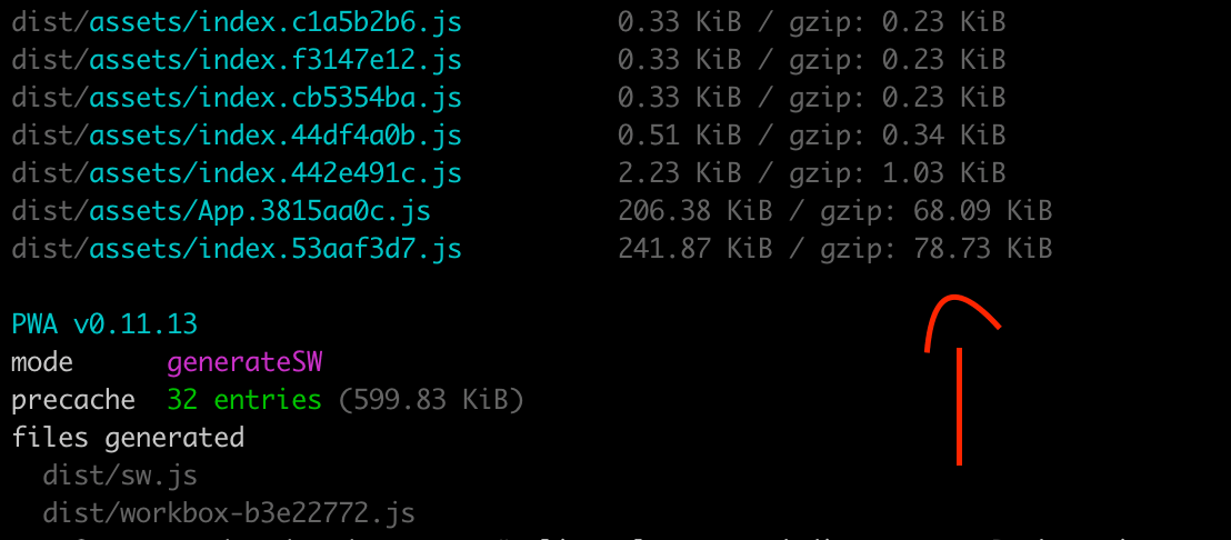
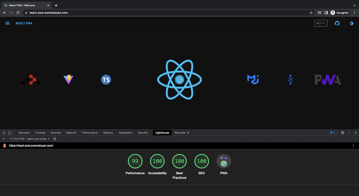
After all these integrations the biggest bundle size is ~79KB. It means even the first load will be pretty fast (in my case it's 1.1s), further loads (already cached by service worker and workbox) will take ~0.25s.
NOTE: The performance is not 100 because it's running on demo server.
A basic implementation of hotkeys is demonstrated here. Check the src/sections/HotKeys for more information.
Currently, you can use the following hotkeys:
Alt+s - to toggle the theme mode
Alt+t - to toggle the sidebar
Alt+/ - to open the hotkeys dialog
Nobody likes white screens and crashes without any notes. In src/error-handling you can find the error handling implementation. Here you can find withErrorHandler high order component. You can wrap any component by this HOC and it will catch all errors and show a default or your custom fallback. Currently, the main APP component is wrapped by withErrorHandler HOC.
From a layout point of view the application consists of 3 main parts:
- Header
- Sidebar
- Pages
The last one is a router-based switcher. All routes are defined in src/routes. By default, pages are being loaded asynchronously via asyncComponentLoader. You can use it to asynchronously load any React component you want. It uses React.Suspense and React.lazy with some magic 🧙♂️
Tests are a vital part of any project. Sometimes they are boring, sometimes they are hard to write, but they are very important. This setup tries to make the testing process as easy as possible. It contains:
- unit tests
- e2e tests
Vitest is used here for unit tests. Check src/insertIf/insertIf.spec.ts for an example. You can run unit tests by running:
npm run test:unit # or yarn test:unitPlaywright is used for e2e tests. Check e2e/ folder to see examples. You can run e2e tests by running:
npm run test:e2e # or yarn test:e2eIf you want to run e2e tests in UI mode, run:
npm run test:e2e:ui # or yarn test:e2e:uiplaywright.config.ts contains the configuration for e2e tests. Currently, it's configured to run tests in chromium, firefox and webkit browsers. You can add more browsers if you want.
There are 2 GitHub Actions workflows:
- analyses.yml - runs
prettier,eslint,tschecks and unit tests on every push and pull request tomain/masterbranch. - tests:e2e.yml - runs e2e tests on every push and pull request to
main/masterbranch.
Put your environmental variables in the .env file (they should be prefixed with VITE_) and use them in your code via import.meta.env.[variable_name] syntax. .env file is not committed to the repository (it's under .gitignore), but env/.shared is. You can use it as a template. Usually, you will have different .env files for different environments (dev, staging, production, etc.), like:
env/.shared- shared variablesenv/.dev- dev variablesenv/.staging- staging variablesenv/.production- production variables
Copy the content of env/.[template_name] to .env file and fill it with your variables. Note: env/.shared is being copied to .env file automatically after npm install.
The latest version of eslint with the latest recommended collection of eslint rules is available out of the box. It contains:
- eslint:recommended
- react/recommended
- @typescript-eslint/recommended
Check the .eslintrc.json file for more information.
prettier - stop fighting about styling in code reviews; save your time and energy - configure it once and let the machine format/correct your code.
Check the .prettierrc.json file for more information.
There is an additional configuration for your import statements. They will be automatically ordered and grouped by the given rules (check the .prettierrc.js) - one more topic for debates in code reviews :)
You can use husky to lint your commit messages, run tests, lint code, etc.
Currently, only pre-commit hook is set up. Every time you try to do a commit it will run prettier and eslint to be sure that everything is according to the rules.
lint-staged helps to run eslint and prettier only on staged files - it makes the linting process super fast and sensible.
https localhost is a simple way to run your application on localhost with https.
Just run:
npm run https-preview # or yarn https-previewafter:
npm run build # or yarn buildand check https://localhost in your browser.
NOTE: the first time it will ask you about installing localhost certificate. For more info check this
You can use this template by just pressing Use this template.
Or you can fork/clone it.
Install dependencies:
npm install # or yarnIn order to run it in development, run:
npm run dev # or yarn devIn order to do a production build, run:
npm run build # yarn buildThere are other scripts as well:
prettier:check- check if all files are formatted according to the rules.lint:check- check if all files are linted according to the rules.ts:check- check if all files are typed according to the rules.test:unit- run unit tests.test:e2e- run e2e tests.test:e2e:ui- run e2e tests in UI mode.preview- boot up local static web server that serves the files fromdistfolder. It's an easy way to check if the production build looks OK in your local environment.https-preview- is the same aspreview, but with HTTPS. It's handy for testing your PWA capabilities in your local environment.prepare- installhuskyand copy the defaultenv/.sharedfile to.envfile. This script is being run automatically afternpm installoryarn.
