This project was generated with angular-cli version 1.0.0 and uses Angular 4 & Material Design ^2.0.0-beta.2.
The code in this repository is available under the MIT License.
To get started, you will need node & npm installed. Type the following:
npm install && npm start
This will install all the necessary node packages and start the server on port 4200
You should be able to see the app running at http://localhost:4200
The following article (and graphics) were originally produced for [Net Magazine] (http://www.creativebloq.com/net-magazine). It is now available online. It has a Creative Commons License, and may be used for Non-Commercial use with attribution.
Daniel Zen
W: zen.digital
T: @danielzen
Job: Chief Instruction Officer
area of expertise: Agile JavaScript Training
Angular Material (material.angular.io) is UI Component framework which implements Google’s Material Design Specification for the latest version of Angular. Although still in beta, Angular Material provides a set of reusable and accessible UI components based on Material Design.
Angular itself has many new technologies in the most recent version. At the JavaScript level we have the additional syntax of EcmaScript 2015 (ES6), typing and interface support from TypeScript, along with Decorators an experimental JavaScript feature implemented in TypeScript. It also uses and supports Observables from the Reactive Extensions Library (RxJS) to manage sequences of events in a functional programming way. It uses Zones to encapsulate and intercept asynchronous activity and provide a form of thread-local storage. This allows Angular to auto-magically respond to data changes in asynchronous events to maintain data bindings. Finally, module loading is handled by WebPack.
In this tutorial we are going to use Angular to create a simple to-do app with some signature Material Design elements.
Setting up an initial environment can be difficult. There were efforts to create a seed or starter. However, there is something even better. With the Angular CLI you can configure your Angular project with a single command.
Not only will it take care of all of setup for all of the technologies mentioned above (via Node & npm), it will also add in scaffolding for Jasmine Unit Testing, Protractor end-to-end testing, plus TSLint. And Codelyzer for static code analysis and additional linting for best practices in your Angular Project. Although you don’t have to use all these, you definitely should. It's so simple to setup, you will wonder how you ever got along without it.
Angular CLI is available as an npm package, so you will need to have Node and npm installed on your machine. Remember to install the angular-cli globally with the -g option: npm install -g @angular/cli. Now create a new Angular app with ng new material-todo.
You are going to have to wait a little bit because after it generates the necessary files, it initializes a Git repo and does an npm install to download all the necessary modules into node_modules/. Take a look at the tree structure and package.json file. Get familiar with the modules and scripts there.
You have now created a new Angular application that follows the official Style Guidelines.
The default app knows nothing about Material Design (an oversight I’m sure). So we have to add it ourselves. You’ll find the full instructions at (https://github.com/angular/material2/blob/master/guides/getting-started.md).
There are many Angular Material Design components and features in the @angular/material library. Let's install it:
npm install --save @angular/material
To use it in our project in src/app/app.module.ts add the MaterialModule:
import { MaterialModule } from '@angular/material';
// other imports
@NgModule({
  imports: [MaterialModule],
  ...
})
export class AppModule { }Angular Material comes prepackaged with several pre-built theme css files. These theme files also include all of the styles for core (styles common to all components), so you only have to include a single css file for Angular Material in your app. This is as simple as including one line in your src\styles.css file:
@import '~@angular/material/core/theming/prebuilt/deeppurple-amber.css';We want to use Material Design icons, so let's load the Material Design font in src/index.html. Any font can work, but we are using the standard Material Design icons. Add the following to the <head>:
<link href="https://fonts.googleapis.com/icon?family=Material+Icons" rel="stylesheet">Now we can work with Material Design in our Angular app.
One of the components available in Angular Material Design is a Dialog. However, we are going to create our own! It will give more insite by easily composing this new Component using the Material Design Components md-card and md-toolbar, as well as an input and couple of buttons with Material Design directives to give them the proper look and feel. Make sure you are in the src/app folder of your repo and do the following from your command line:
ng generate component dialog
This has generated a new DialogComponent in the src/app/dialog folder. It has also updated our app.module.ts to include the new component in the default NgModule of our application.
If you look at the generated dialog.component.ts file, you will see the first line is:
import { Component, OnInit } from '@angular/core';Component is one of the main building blocks of Angular, and OnInit is one of the interfaces that it implements. However, In order to have access to Component Communication between nested components, as well as the Material Design components mentioned above, we will need to import Input, Output & EventEmitter from @angular/core.
We then declare a number of @Input variables (okText, cancelText, etc.) that allow us to define the contents of the DialogComponent, and one @Output emitter, that allows us to trigger a function in the parent component with a value when the dialog is closed.
Now we can replace the generated constructor in dialog.component.ts with the following code:
constructor() {
 this.okText = 'OK';
 this.cancelText = 'Cancel';
}

emitValue(value) {
 this.valueEmitted.emit(value);
}
We will use the @Input variables inside our DialogComponent in the dialog.component.html template. The Material Design md-input-container component, along with the mdInput directive, styles the standard html input which allows us to accept input from the user:
  <md-input-container class="full-width">
    <input mdInput [placeholder]="placeholder"
            [(ngModel)]="value"
            (keyup.enter)="emitValue(value)"
            (keyup.escape)="emitValue(null)"/>
  </md-input-container>
Users can also click buttons "OK" or "Cancel", which can be relabeled by changing okText or cancelText:
<button md-button (click)="emitValue(null)" color="primary">
  {{cancelText}}
</button>
<button md-raised-button (click)="emitValue(value)" color="primary">
  {{okText}}
</button>
Notice the keyup event handlers which take care of thinks when the enter or escape key is pressed. These handlers are identical to the click event handlers for cancelText and okText. Escape does the same thing as cancel (emitValue(null)), and typing enter will do the same thing as clicking OK (emitValue(value)). This allows us to prompt the user for a value via an input and receive emitted output.
We also added some CSS in dialog.component.css, in order to achieve the layout we desire – you can view the full code in the accompanying GitHub repo.
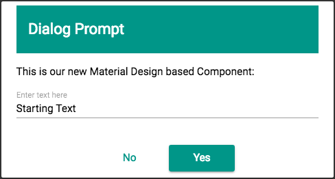
Now let’s add this DialogComponent to our AppComponent to see what it looks like. Replace the contents of src/app/app.component.html with:
<app-dialog [title]="'Dialog Prompt'"
            [template]="'This is our new Material Design based Component:'"
            [placeholder]="'Enter text here'"
            [okText]="'Yes'"
            [cancelText]="'No'"
            [value]="'Starting Text'"
            (valueEmitted)="log($event)"
            [showPrompt]="true">
</app-dialog>
Notice, we have literal strings for all of the @Input's. When we use the square bracket syntax [title] we are required to use both single and double quotes, otherwise Angular interprets the contents as a JavaScript variable in the DialogComponent scope. In addition, we have the valueEmitted @Output. The DialogComponent is simple, and extremely configurable. Most of the Inputs would have defaulted to empty strings if omitted.
Now, let’s modify AppComponent, replace the contents of the class:
export class AppComponent {
  log(text) {
    console.log(text);
  }
}
Let’s take a look at our handiwork. If you are working off the repo, you can switch to the dialog branch first git checkout dialog. You can serve up the app (the default port is 4200) by running:
npm run-script start # which in turn runs ng serve
You should see the following:
If you open up the console, you can what is logged: The contents of the input is emitted when you click “Yes”, and null is emitted when you click “No”.
We are now ready to use this new DialogComponent to create our MaterialTodo app.
We are going to finish up our app by using the following Material Design Components for the main app: toolbar, list, list-item, checkbox, button, and icon.
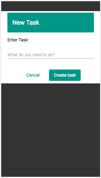
We are going to leverage our DialogComponent, adding in enough logic for a simple ToDo application. The two main functions todoDialog & updateTodo deal with opening and closing the dialog.
The todoDialog gets called to open our dialog either with the task to edit (todo), or null if we are creating a new task. We set up the defaults variables for a new task, but change them if accordingly if we are instead editing a task.
We then show the DialogComponent by setting the showDialog variable to true:
  todoDialog(todo = null) {
    this.okButtonText = 'Create task';
    this.fieldValue = '';
    this.editingTodo = todo;
    if (todo) {
      this.fieldValue = todo.title;
      this.okButtonText = 'Edit task';
    }
    this.showDialog = true;
  }
The updateTodo function will get called when we wish to close it. And the other functions, editTodo, addTodo, & hideDialog are helper methods for updateTodo.
  updateTodo(title) {
    if (title) {
      title = title.trim();
      if (this.editingTodo) {
        this.editTodo(title);
      } else {
        this.addTodo(title);
      }
    }
    this.hideDialog();
  }
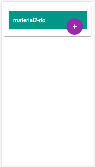
In app.component.html we've given our application a md-toolbar where we have put the title, and an md-icon called 'add', which looks like a plus-sign (+) for our floating action button (FAB) which allows us to create a new task:
    <button md-fab class="fab-add" (click)="todoDialog()">
      <md-icon>add</md-icon>
    </button>
We use md-card-content to hold an md-list. And, an *ngFor to iterate through, and display, our todoList array as md-list-item's:
<md-list-item *ngFor="let todo of todoList; let index=index">We use an md-checkbox to allow us to tick off items on our list. And we have two md-mini-fab buttons, using md-icons 'delete_forever' & 'mode_edit', that we can use to delete and edit our task:
<button md-mini-fab (click)="remove(index)" color="primary">
  <md-icon>delete_forever</md-icon>
</button>

<button md-mini-fab (click)="todoDialog(todo)" color="primary"
        [disabled]="todo.completed">
  <md-icon>mode_edit</md-icon>
</button>
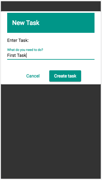
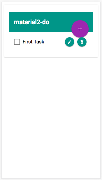
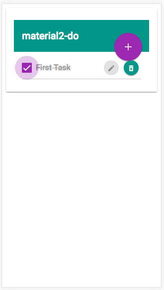
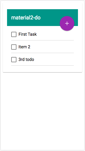
They remain hidden until you rollover (or click on mobile) with a little CSS, which you can view in the repo. Check out some images of the the app in action:
Keep in mind that Angular Material is still in beta, but there will likely be no more breaking changes to the API. It is very much functioning and lives up to the claim of having a straightforward API that doesn't confuse developers. It was easy to leverage for the creation of a great looking app. Thanks go out to Jeremy Elbourn, Kara Erickson, Andrew Seguin, Paul Gschwendtner, Kristiyan Kostadinov, and all of the other contributors for their efforts.
