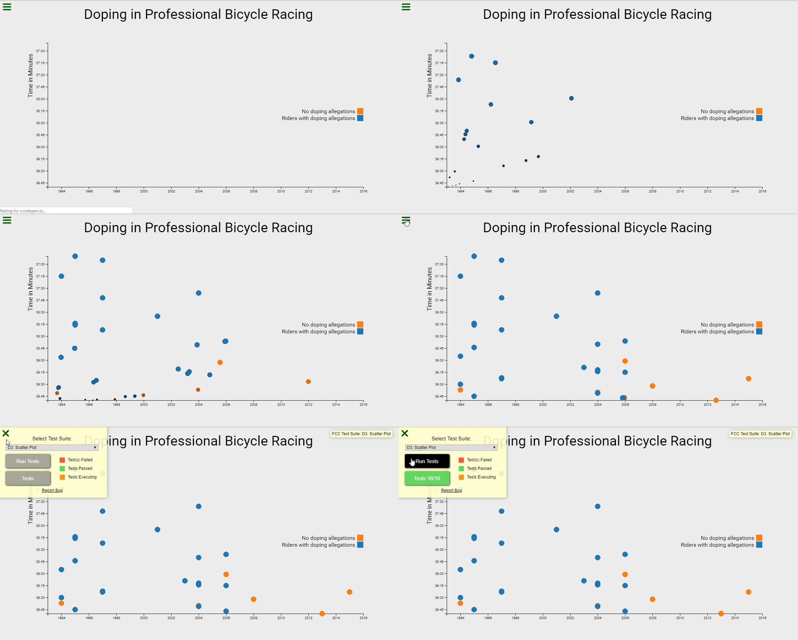
it's a freecodecamp project in the "Data Visualization Projects" module, you have to Visualize Data with a Scatterplot Graph.
Front-end: D3
https://codepen.io/B-Tarik/full/ZPLaaq
- I can see a title element that has a corresponding
id="title". - I can see an
x-axisthat has a correspondingid="x-axis". - I can see a y-axis that has a corresponding
id="y-axis". - I can see dots, that each have a class of dot, which represent the data being plotted.
- Each dot should have the properties
data-xvalueanddata-yvaluecontaining their correspondingxandyvalues. - The
data-xvalueanddata-yvalueof each dot should be within the range of the actual data and in the correct data format. Fordata-xvalue, integers (full years) or Date objects are acceptable for test evaluation. Fordata-yvalue(minutes), use Date objects. - The
data-xvalueand its corresponding dot should align with the corresponding point/value on thex-axis. - The data-yvalue and its corresponding dot should align with the corresponding point/value on the
y-axis. - I can see multiple tick labels on the
y-axiswith%M:%Stime format. - I can see multiple tick labels on the
x-axisthat show the year. - I can see that the range of the
x-axislabels are within the range of the actualx-axisdata. - I can see that the range of the
y-axislabels are within the range of the actualy-axisdata. - I can see a legend containing descriptive text that has
id="legend". - I can mouse over an area and see a tooltip with a corresponding
id="tooltip"which displays more information about the area. - My tooltip should have a
data-yearproperty that corresponds to thedata-xvalueof the active area.
