This project is a static website for a fictitious Custom PC Building company, called Hard Drivers.
Hard Driver
hɑːd ˈdraɪvə | Noun
A CompTIA A+ certified computer magician, who has an abundance of love and pride for making your dream computer become a reality.
Hard Drivers is a customer budget based Custom PC Building Company. Customers can obtain a “no obligation” free specification for a custom build PC based on a budget of their choosing. Customers can also choose to include additional service packages to their specification, and request additional peripherals (i.e Monitor, Keyboard, Mouse, etc) to be paired perfectly with their brand-new tailor-made computer.
The project is developed primarily using HTML and CSS, with a small amount of JavaScript implemented for additional functionality.
What are some of your most important considerations when using a company to buy a custom build computer?
“I don’t want to have to keep adding parts to see the costs skyrocket, then have to start removing things I think I need or want, in order to keep it within a budget”.
“I want someone to recommend exactly what I need”.
“I want to be able to contact the company straight away”.
PC Specialist: A huge amount of options from the outset, with quite significant price ranges. Onus is on the customer to know what they want/need.
Box: A less specific focus on builds, with immediate attention drawn to peripherals rather than computer.
Chillblast: Not very user-friendly, a lot of information, a lot of options, and high selling point is pre-built next day PCs.
Psychological Factors
- Evoke a positive emotional response from the branding of Hard Drivers.
- Make the branding strong, bold, and stand out.
- Make the branding unique, and aesthetically pleasing.
- Apply the branding consistently throughout the website.
- Align the style and design of the pages to match the branding.
- Minimalistic design approach, so as to not overwhelm the user.
- Appeal to the user by personalising the service.
- Address the user directly by repeatedly using the term "You" and "Your".
- Make it clear that each user is unique, and each computer will be built specifically for their needs.
Pricing
- Be transparent with cost.
- The user decides the cost of the computer.
- No hidden costs.
- Upsell as a separate entity.
- Peripherals and Service packages are not included in initial budget.
- The user is not required to spend any more than their budget.
Buyer Making Decision
- Offer a "No Obligation" quote/specification.
- The user will therefore not need to justify engaging with the company/website.
- As such, they do not need to plan to engage with the company/website, other than stating a budget.
- Communicate that the hard work is taken away from the user.
- This suggests the user only needs to put in a small amount of effort to receive a full service in return.
Product Considerations and Content Strategy
- Minimalistic design, so as to draw attention, avoid overwhelming the user, and encourage engagement.
- The product is the service provided by Hard Drivers, therefore strong colours, images, and headlines to engage with user.
- Thin content where necessary, providing only the most important information from the outset.
- Provide fuller content in sections of the website where the user specifically wants further information.
- Every page has multiple "Enquire" buttons, to allow a user to immediately engage when they want to.
- This "Enquire" button should ultimately be a "Fast Track" service to allow a user to go from making the decision to enquire, to having made the enquiry, in as few interactions as possible.
As a visitor to the website, I want to know what your company does.As a potential customer, I want to know what services you provide.As an interested customer, I want to know how much the service costs.As a convinced customer, I want to be able to easily make an enquiry.
Encourage and Allow User Engagement
- Every page must allow a user to engage with the business.
- The ability to engage is clear and stands out from other interactive aspects of the site.
- Engagement is done through completing a simple and intuitive Enquire Form.
Convey Ethos/Purpose
- Outline key services on "Home" page.
- Present further details on key services on separate page.
- Make sure the details provided are important, sellable, and merit being detailed in isolation.
- Make the descriptions bite sized and easy to digest.
Instil User Confidence
- The branding is clear, distinguishable, and recognisable.
- Relate to and refer to the user.
- The website is minimalistic where necessary, intuitive, and user-friendly.
Present Cost Approach
- Communicate that the computer is user budget based.
- Be transparent about cost of additional services and peripherals.
- Provide detailed yet convincing breakdown of cost of service.
- Provides a full breakdown of the company, its ethos, and its purpose.
- Grabs user's attention, engages, and encourages user to make an enquiry.
- User Goal:
- Simple to interact with.
- Explains business purpose.
- Allows and encourages easy engagement.
- Business Goal:
- Interest the user.
- Engage the user.
- Sustain the user.
- Convey Company ethos and purpose.
- Explains how cost works.
- Instils trust by selling the brand and the service.
- Explains ethos and purpose.
- User Goals:
- Obtain information about the company.
- Understand how the cost works.
- Understand how to use the service.
- Business Goals:
- Convey company ethos.
- Sell the brand.
- Convince user to engage with company.
- Be transparent about cost, services, and purpose.
- Allows user to submit enquiry by providing a small amount of information.
- Offers a simple and intuitive method of enquiring.
- Uses a user-friendly interface.
- The feeling of achieving a lot from a small amount of input from the user.
- User Goals:
- A simple an intuitive form of communication.
- Feel like little information needed to instigate engagement.
- A positive user experience during form filling.
- Business Goals:
- Instigate engagement.
- Obtain user information to proceed with service.
A Discussion on Informational Architecture
As a Business, Hard Drivers would profit most from the additional services provided on top of the custom-built computers. As such, an additional page was initially planned called "Packages", which provided the user with a detailed breakdown of the additional services they could purchase in conjunction with their new computer. This can be seen from the original wireframe designs.
After considering the implementation of this page, it was decided that separating this information into an individual page would result in an empty and isolated page. In addition to this, it would be entirely possible for a user to visit the "Home" page, engage with the site immediately, and forgo this page entirely.
Given this information is integral to the business, consideration needed to be made as to where this content could be added. Having this information appear on the "Home" page would divert from its intention, and minimalistic design, and could potentially feel abrasive to a user. Considering the intention, context, and grouping of information on the "About" page, it was decided that the "Packages" information in its entirety would overload this page with information.From a business perspective, this information needed to be accessible and hard to miss. However, as a user, you would not want to be over-burdened with aggressive overselling. The positioning of this information needed to be relevant, compliment the flow and structure of the other pages, along with their respective features and content, and needed to fulfil its business purpose of being a mandatory part of the selling process, without being intrusive.
The solution to this was to remove the "Packages" page entirely, and implement references to the packages in the "About" page and "Enquire" page. In the "About" page, under Cost, the packages can be referenced, linking to a modal whereby the content initially planned for the "Packages" page is displayed. In doing this, the services can be subtly referenced, without being intrusive, and can provide the user with the additional information if they request it. Furthermore, in the "Enquire" page, on large viewports, this table will be fully visible on the page, with a link to the aforementioned modal on smaller viewports. Under the "Packages" section of the "Enquire" page, the decision has been made to ensure no package is pre-selected. In doing so, the user must engage with this aspect of the sales process, fulfilling the business need, and fulfilling the user requirement of not being overwhelmed with information unnecessarily.
Due to the resolution of the wireframe documents, it is recommended that these PDFs are downloaded to be viewed in the browser, rather than using GitHub's native PDF viewer.
- Header/Footer Wireframe: Version 1 | Version 2
- Home (Index) Page Wireframe: Version 1
- About Page Wireframe: Version 1 | Version 2
- Packages Wireframe: Version 1 | Version 2
- Enquire Wireframe: Version 1 | Version 2
The project's aesthetic design is aligned with the ethos and branding of Hard Drivers; simple, effective, and powerful.
The project's 'surface' design commenced with mockups of the Logo. Colours, Fonts, Spacing, and Imagery was experimented with in order to achieve a colour scheme and overall theme which was relevant to the context of the project. This theme was subsequently applied to the project. The mockups were designed personally in Gimp.
The Logo was ultimately implemented in HTML/CSS for a more dynamic and responsive user experience, rather than being presented with a static image on the website's header.
The primary colour scheme chosen to implement into the project was a combination of Black, White, and Red. This combination of colours is both modern, yet classic, and while powerfully aposematic, is relevant to the content of the website due to the RGB Culture of PC Gaming.
On initial design, the three primary colours were:
- Black: #000000 (Background Colour)
- Semi-Transparent Red: rgba(228, 22, 22, 0.75) (Contrasting Title Colour)
- Off-White: #FAFAFA (Contrasting Title Colour and Body Text Colour)
The Red colour was implemented with an alpha value due to its intended interaction with the background imagery implemented into the Navbar and Footer. The semi-transparent colour also interacted well with the black background to produce a deeper, more vibrant tone of red.
The WCAG 2.0 minimum contrast ratio (AA) for accessibility purposes is 4.5:1 for normal text, and 3:0 for large text. The colour scheme chosen was assessed for contrast ratio via Contrast-Ratio, and the following results were obtained:
- Off White (
#FAFAFA) against Black Background:20.11:1(AAA Standard) - Semi-Transparent Red (
rgba(228, 22, 22, 0.75)) against Black Background:2.81:1(Failed WCAG 2.0)

Whilst the Semi-Transparent Red was primarily intended to be for Large Text and Headings within the project, adjustments needed to be made in order to adhere to the minimum requirements for contrast ratio (especially given the Enhanced (AAA) requirement for
large text is 4.5:1). Therefore, the second tone of red implemented was a block colour of #EC0000. The contrast checker confirmed that this colour produced a AAA standard enhanced contrast ratio of 4.56:1. However, in practice, this produced an excessively vibrant
result, diminished the intended effect of the blended background for the header and footer, and significantly impacted the aesthetic feel of the project.

After researching the myths of colour contrast accessibility, I concluded that this acted as more 'guidance' than explicit requirements, and that the practical application of such guidance can in some circumstances hinder the design direction or produce ill results. As such, I settled on a 'middle ground' colour for my choice of red; I reverted to a subtle alpha value, and slightly darker shade of red:
- Semi-Transparent Red (
rgba(228, 30, 30, 0.90)) against Black Background:3.77:1(AA Standard)

This final colour combination allowed the intended blending interaction with the Navbar and Footer's background image, and retained the original aesthetic feel of the project, whilst adhering to the Minimum (AA) WCAG 2.0 standard for colour contrast. Using this colour combination, the project was also tested for colour-blind-friendliness through Toptal's Colorfilter, which produced acceptable and practical results.
This colour combination was utilised in all aspects of the project, and all content within the body of each page was inherited from the style and design choices implemented within the pages' Logo. From text colouring, border colouring, colour ordering, and visual effects; the combined application of the colour scheme produced a cohesive and powerful design effect.
Staatliches was chosen as the font for the Page "logo". This font is sharp, loud, and powerful. Initially, this font was intended to be used on all headings, however the appearance of this font being repeated across the page produced quite an intense result, and it was decided that a softer font should be used for the page's subsequent headings and body text. This also isolated the main logo branding, separating it with the content of the page.
Montserrat was chosen as the font for the page's sub-headings and body text. The font is much softer than the heading, described above, and is easy to read.
The images used in this project were selected from Unsplash. The pictures were specifically selected due to their contextual relevance and colour schemes; all images relate to computers, and contain the primary colour scheme incorporated into the project.
The Navbar and Footer's background image is filtered through a radial gradient, and is intended to provide a subtle yet effective "electrical" effect, with a colour scheme consistent with the rest of the site. The Navbar's radial gradient starts from the top of the page, and produces a semi-circle effect protrudes downwards towards the page content. The Footer's gradient starts from the bottom of the page, and produces a semi-circle effect which protrudes upwards towards the page content. This combined effect produces an "enclosed" aesthetic, and assists the overall intended aesthetic impact of the design.
Each link offers a mild yet stimulating visual effect when either engaged with or hovered over with a mouse. This applies to all links within the navbar, and the Enquire/Submit button within the footer. This 'growing' effect was adapted from Hover.css. For links within the Navbar, the user's location is depicted by a change of colour (Red = Active, White = Not Active). When the user hovers over or engages with the link, the colour is changed from white to red. These effects are subtle, yet incorporate a degree of interactivity with the user, producing a responsive effect.
Given the Enquire/Submit button contained in the footer (regardless of whether it states Enquire or Submit) is the most important link on every page, an additional effect has been applied to this button. A continuous pulsing glowing effect has been applied to it, which draws the user's attention, encouraging engagement and interaction regardless of the user's location on the site.
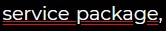
The Package Table link available on the "About" page, and on smaller viewports in the "Enquire" page, was initially designed with a red wavy underline text decoration style.
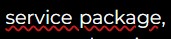
User feedback suggested this had "spelling mistake" connotations, and that while it produced the intended effect of wanting a user to interact with it, it produced overall negative emotional responses from users. As such, the text decoration was amended to a double underline. This retained the powerful aesthetic design without the negative connotations that came with the wavy red underline decoration.
Each page has a sticky navbar at the top. This consistent, simple, and intuitive navigation system contributes to instilling user trust, and allows users to reach all aspects of the website. The navbar retains its layout and structure as the user navigates through the site. The logo is always centred, and is always the most prominent header on each page. On large devices, the navbar has a second row which highlights the active page the user is on. On mobile devices, the navigation links are hidden, and activated with a "sandwich" (which is a server icon), drawing the links between the page logo and the current page's sub-heading.
Each page has a sticky footer at the bottom. This provides links GitHub, a second and more aesthetically stimulating link to the "Enquire" page, and links to socials. The same background effect is used on the footer, but with the gradient reversed, to provide an 'enclosed' look. Once again, this effect is subtle yet effective, and intends to produce a strong positive emotional response in order to instil trust in the user. The Enquire button is designed to grab the user’s attention, with a continuous glowing effect. This effect encourages the user to interact with the link, and therefore engage with the website. On mobile devices, the footer is similar in layout, with the only significant change being font size and positioning of the social links for a more user-friendly interface.
On the "Enquire" page, the 'Enquire' link within the footer has been converted into a "Submit" button. It was considered that this may obfuscate both the user and the intention of the button, as it may not initially be clear that its usage had changed. However, the alternative was to retain a recursive "Enquire" link at the bottom of the "Enquire" page, and to have a separate "Submit" button of the Enquire Form. It was decided that the best solution to this was to replace the "Enquire" button with the "Submit" button so as to implement a function which is relevant and fits the contextual flow of the page; this also works best for the mobile layout.
A Package Table is available on multiple pages of the site. It provides the user with a full breakdown of the different tiers of service packages they can opt into when requesting a quote for their computer. The cost and benefits of these packages are explicitly clear. Each tier benefit contains a tooltip to provide additional information on the service included. These tooltips are also available in screen reader-only descriptions, which explain each benefit, which package they are included in, and their associated costs. On Modals, the tooltips are on the text of the benefits themselves, while on the Desktop "Enquire" page, small self-descriptive icons sit at the end of each benefit that provide this tooltip.
The Enquire Form allows the user to provide a small amount of personal details, and information regarding their requirements, in order to engage with the company and to receive a specification in response. The colour scheme, structure, and layout of the Enquire Form is consistent with theme of the project.
Each field is categorised and grouped into the relevant field set, with each individual field being clearly separated and labelled. Out of 8 fields, 6 are required, and 2 are optional. The user must supply their name, email address, and phone number. They must then decide what type of computer they want, and their budget. The "Budget" field contains a tooltip which confirms the budget stated excludes the cost of the service package requested, and any potential optional peripherals to be quoted. The user can at this stage decide to opt in to be quoted for an optional peripheral to be paired with their computer. The user must then select a package tier, and then optionally provide more information regarding their requirements if they should wish to do so.
Initially, a colour picker was implemented into the form, however this resulted in quite an arduous addition; considering this aspect of the engagement is essentially just a request for an initial quote, this would have added nothing to the initial enquiry and added an unnecessary step towards requesting a quote, and was therefore removed. It was also found on mobile devices that the colour picker was limited, and therefore could have easily frustrated the user.
Modals are implemented into the site to provide an additional degree of interactivity. They layer content where necessary, so as to not compress too much information into a single location. The modals either contain the Package Table, or a Thank You message once the user has completed and submitted the Enquire Form.
Where possible, the pages content is contained within the user's viewport. Where this is not possible, for example on very small mobile devices, an intuitive navigation system has been implemented to allow for only the content of the page (not the headings) to be scrollable. By presenting all information on the screen at once, due to having a minimalistic design, this should produce a powerful emotional response from the user, as if the content had been designed for their specific needs, and would ensure that no information is missed.
Using Flexbox, the site is designed to be fluid, dynamic, and responsive to all screen sizes and resolutions. While certain breakpoints have been implemented to change the structure of the content, the priority was to focus on fully flexible and responsive layout
than specific targeted device sizes. Each page is split into sections which expand or shrink to equal sizes responsively to a device's height and width. Where appropriate, the spacing between each section is dynamic, and equally distributed.
When changing the size of the viewport, it was important that images filled their respective container and therefore scaled appropriately; the challenge was to avoid the images overflowing or expanding their respective containers,
while retaining their position, in order maintain each page's structural integrity and layout. While the solution resulted in fully responsive images, it resorted to using <div> containers with a background image, therefore alt-text could not be implemented.
The best solution to this was to implement sr-only text for these elements. Given the images were being hosted internally (as opposed to being hosted on external CDNs), it was unlikely the links would be broken, and therefore the "alt text" was unlikely to be utilised.
This meant that the images displayed as intended, were unlikely to be disrupted by broken links, and had accessibility.
Currently, on submission of the Enquire Form, the user is presented with a Thank You Modal and the form is subsequently cleared; the information input into the form is not processed. With additional experience of Python and SQL, the information input into this form could be processed and inserted into a database, before being assigned to a Hard driver to prepare a specification.
Given the information input into the Enquire Form is classified as 'personal data', if the data is to be processed and stored as per the above future feature implementation, a GDPR/Privacy Policy tick box would be required for the user to agree to in order for this personal information to be collected and the form to be stored.
Once the Form Processing has been implemented, consideration needs to be given to how to prevent form submission being abused by bots. There are many intuitive ways this could be implemented, such as CAPTCHA, Human Tests, and bot-only form fields.
A user may want to make an enquiry with the business prior to making a request for a specification. A Live Chat Service could be implemented to provide instant answers to user specific questions. This could be implemented with an initial "smart" FAQ, such as a Chat Bot, whereby the user asks a question and using Natural Language Processing an appropriate answer is given to their question; if the query cannot be answered this way, the user can be passed to a Hard Driver via Live Web Chat for additional assistance. The Live Chat box could be potentially incorporated into the footer, and could be engaged with on any page.
An optional Smart Specification could be implemented on the "Enquire" Page. A user can choose to initiate an initial Smart Specification, whereby a specification can be pre-generated prior to submission. This could be implemented in Python using hardware information stored in a database, such as prices and compatibility, and based on a few simple questions can generate a 'quick specification' for the Hard Drivers to work off. This could work if the user knew from the outset a specific piece of hardware they wanted, along with a budget, and a script could be implemented which matches the requested piece of hardware with other compatible pieces of hardware, and could even inform the user if their budget is too low for the specific hardware selected. From a business perspective, this could reduce the amount of work the customer facing Hard Drivers face, and could also reduce the amount of 'non-customers' who engage with the business with little to no intention of paying for the service.
- The project was primarily written in HTML and CSS. Small snippets of JavaScript were used to enhance user experience.
- The project was written and tested in the Gitpod IDE.
- The project was debugged using Google Chrome Dev Tools.
- The project uses GitHub for hosting source code, for utilising git version control, and for hosting the site on GitHub pages.
- The project's template was generated from Code Institute's Gitpod Template.
- The project uses Boostrap v4.5.3, a 'Mobile First' HTML/CSS Framework for simple and intuitive responsive web design.
- The project uses jQuery v3.5.1, a JavaScript library, for certain Bootstrap elements, and for form validation.
- The project uses Popper.js v1.16.1, a Tooltip and Popover Positioning Engine, for Tooltips and dropdowns.
- The project uses jsDelivr as a Content Delivery Network for Bootstrap and Popper.
- The project uses FontAwesome v5.15.1, a free icon-set/toolkit for web development.
- The project uses Google Fonts for typography.
- The project's images were compressed via tinyjpg to be appropriately sized for web content.
- The project's accessibility was assesed via WebAim's W.A.V.E and Google Chrome's Lighthouse.
- The project's screen-reader accessibility was tested using Screen Reader for Google Chrome.
- The project used Toptal's Colorfilter to assess how colour-blind-friendly the site was.
- The project's colour contrast ratio was assessed using Contract-Ratio
- The project's cross-browser compatibility was enhanced using Autoprefixer.io.
- The project's HTML was validated using W3C HTML Markup Validator.
- The project's CSS was validated using W3C Jigsaw CSS Validator.
- The project's wireframes were designed in Balsamiq.
- The images used in the project's README and TESTING documentation were hosted and served through Cloudinary.
Testing documentation, processes, and outcomes can be found under TESTING.md.
This project was deployed to GitHub pages via the following steps:
- Log into GitHub.
- From the list of Repositories, select BAK2K3/hard-drivers.
- From the Repositories sub-headings, select "Settings".
- Under "Options", the first category of settings, scroll down to the GitHub Pages section.
- From the dropdown list under the "Source" heading, select "master".
- A second drop-down menu that appears should remain as the default value, "/root".
- Press Save.
- On Page refresh, scroll back down to the GitHub Pages section, and the link to the deployed site will be available in a green sub-section with a tick icon next to it.
As this project was developed on the master branch, all changes made to the repository are immediately reflected in the deployed project.
- Install the Google Chrome or Firefox browser.
- Install the applicable GitPod Browser Extensions for your chosen browser.
- Create a GitHub account.
- Log in to Gitpod using your GitHub account.
- Visit Hard Driver's GitHub Repository.
- Open the repository in Gitpod:
- Click the green "Gitpod" icon at the top of the Repository, or
- Click this link.
- A new workspace will open with the current state of the master branch. Any changes made to the master branch after this point will not be automatically updated in your Gitpod Workspace.
- Visit Hard Driver's GitHub Repository.
- Click the "Code" dropdown box above the repository's file explorer.
- Under the "Clone" heading, click the "HTTPS" sub-heading.
- Click the clipboard icon, or manually copy the text presented:
https://GitHub.com/BAK2K3/hard-drivers.git - Open your preferred IDE (VSCode, Atom, PyCharm, etc).
- Ensure your IDE has support for Git, or has the relevant Git extension.
- Open the terminal, and create a directory where you would like the Repository to be stored.
- Type
git cloneand paste the previously copied text (https://GitHub.com/BAK2K3/hard-drivers.git) and press enter. - The Repository will then be cloned to your selected directory.
- Visit Hard Driver's GitHub Repository.
- Click the "Code" dropdown box above the repository's file explorer.
- Click the "Download ZIP" option; this will download a copy of the selected branch's repository as a zip file.
- Locate the ZIP file downloaded to your computer, and extract the ZIP to a designated folder which you would like the repository to be stored.
- Open your preferred IDE (VSCode, Atom, PyCharm, etc).
- Navigate to the chosen directory where the Repository was Cloned/Extracted.
- You will now have offline access to the contents of the project.
- All text used throughout the site was written by me.
- All business ideas and general development concepts were devised by me.
- All Photographs were sourced from Unsplash.
- Hero-image.jpg is by Photography Account.
- Computer.jpg is by Christian Wiediger.
- Experts.jpg is by Sean Do.
- processor.jpg is by Zii Miller.
- The Header and Footer banner background was created in Gimp, using the Lava Generation effect.
- The Favicon was also created in Gimp, and converted to appropriate format using favicon.io.
- The conceptual Logo mock-ups were also created in Gimp.
- HTML/CSS: Implementation and utilisation of Flexbox was assisted by CSS-Tricks.
- HTML: Code Snippet taken from StackOverflow and modified to utilise D-flex and Flex Column to create two rows for the Navbar.
- HTML: Code Snippet taken from StackOverflow and implemented into "Enquire" page's header to prevent auto-zooming on mobile devices.
- HTML/CSS: Inspiration for pricing table was taken from Codeply and heavily modified.
- HTML/CSS: Guidance on Bootstrap, Tooltips, Modals and general Bootstrap integration and usage was obtained from the Bootstrap Documentation.
- HTML/CSS: Guidance on general HTML/CSS usage was obtained from Mozilla's Web Documentation.
- JavaScript: Code Snipper taken from StackOverflow and modified to force a HTML5 Form Validation prior to form submission/modal pop up.
- CSS: An understanding of radial gradients was obtained from Quirksmode.
- CSS: Guidance on removing additional spacing around Span elements was obtained from StackOverflow.
- CSS: Code snippet taken from CodePen and modified to obtain a "glow button" effect.
- CSS: Code snippet taken from CSS-Tricks and modified to obtain a "double shadow" effect on "glow button" effect.
- CSS: Code snippet taken from Hover.css for Hover Grow effect on links.
- CSS: Guidance on fixing Flex compatibility on IE11 obtained from StackOverflow.
- CSS: Guidance on changing placeholder text colour obtained from W3Schools.
- CSS: Code snippet taken from StackOverflow and modified for the 50% border on table cells.
- CSS: Guidance on fixing cell-padding collision with 50% border effect taken from StackOverflow.
- CSS: Code snipper taken from StackOverflow and modified to obtain a fluid Nav dropdown transition.
- The concept for this project was devised from my own deep-rooted passion for technology, computers, gaming, and through my own personal experience building computers and using third party companies to do so in the past.
- Thank you to my mentor, Dick Vlaanderen, who provided a huge amount of support for the concept behind this project from the get-go, and who provided me with a wealth of moral support.
- Thank you to Jim Morel, the current Slack Channel Lead for the User Centric Frontend Development, for his instant responses, his fresh set of eyes on the project, and for his incredibly useful sessions on preparation for MS1.
- Thank you to the active Slack users who take part in the regular group calls.
This website is for educational purposes only.