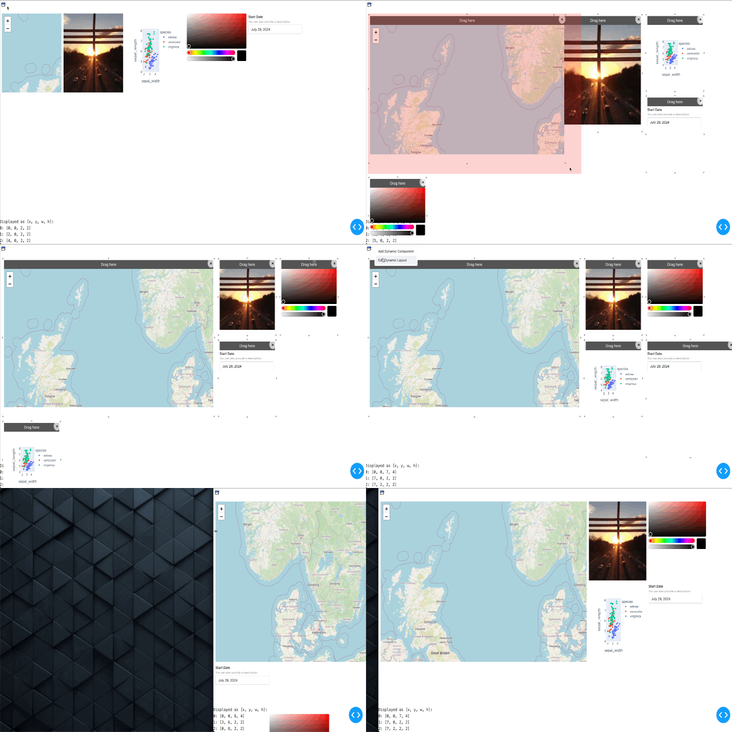
Dash Dynamic Grid Layout is a Dash component library that provides a flexible grid layout system for arranging and moving components within a Dash application.
Special thanks to  BSd3v for contributing the improvements and bug fixes making this a much more polished project.
- Drag-and-drop functionality for rearranging components
- Resizable grid items
- Customizable layout with responsive breakpoints
- Option to add or remove items dynamically
- Customizable drag handles for each item
- Persistence of component state
- Local, memory, or session storage for persistence
pip install dash-dynamic-grid-layoutHere's a basic example of how to use the DashGridLayout component:
import dash_dynamic_grid_layout as dgl
from dash import Dash, html, dcc
import plotly.express as px

app = Dash(__name__)

df = px.data.iris()

app.layout = html.Div([
    dgl.DashGridLayout(
        id='grid-layout',
        children=[
            dgl.DraggableWrapper(
                children=[
                    html.Div('Drag me!', style={'height': '100%', 'display': 'flex', 'alignItems': 'center', 'justifyContent': 'center', 'border': '1px solid #ddd', 'borderRadius': '5px'})
                ],
                handleText='Move'
            ),
            dgl.DraggableWrapper(
                children=[
                    dcc.Graph(
                        figure=px.scatter(df, x="sepal_width", y="sepal_length", color="species"),
                        style={'height': '100%'}
                    )
                ],
                handleText='Move Graph'
            )
        ],
        rowHeight=150,
        cols={'lg': 12, 'md': 10, 'sm': 6, 'xs': 4, 'xxs': 2},
        style={'height': '600px'},
    )
])

if __name__ == '__main__':
app.run_server(debug=True)DashGridLayout is a flexible grid layout system for arranging and moving components within a Dash application. These are the properties available for the DashGridLayout component:
| Property | Type | Default | Description |
|---|---|---|---|
| id | string | - | The ID used to identify this component in Dash callbacks. |
| className | string | 'layout' | CSS class name for the grid layout. |
| rowHeight | number | 100 | The height of a single row in pixels. |
| cols | object | {lg: 12, md: 10, sm: 6, xs: 4, xxs: 2} | An object containing breakpoints and column numbers. |
| style | object | - | Inline styles for the grid layout. |
| itemCount | number | - | The number of items in the grid. |
| itemToRemove | any | '' | The item in the grid that should be removed when triggered. |
| compactType | string | 'vertical' | Compaction type. Can be 'vertical', 'horizontal', or null. |
| showRemoveButton | boolean | true | Whether to show remove buttons for grid items. |
| showResizeHandles | boolean | true | Whether to show resize handles for grid items. |
| persistence | boolean | - | Whether to persist the component's state. |
| persisted_props | array | ['itemLayout'] | List of props to persist. |
| persistence_type | string | 'local' | Type of persistence. Can be 'local', 'memory', or 'session'. |
| items | array | [] | List of items to be rendered in the grid. |
| itemLayout | array | [] | Layout configuration for each item. Each item should be an object with shape {i: string, x: number, y: number, w: number, h: number}. |
| currentLayout | array | [] | The current layout of the grid items. Each item should be an object with shape {i: string, x: number, y: number, w: number, h: number}. |
| breakpoints | object | {lg: 1200, md: 996, sm: 768, xs: 480, xxs: 0} | Breakpoints for responsive layout. |
| breakpointData | object | - | Data about the current breakpoint and columns. Shape: {newBreakpoint: string, newCols: number}. |
| Property | Description |
|---|---|
| setProps | Callback function to update Dash props. |
DraggableWrapper is a component that wraps other components and makes them draggable. These are the properties available for the DraggableWrapper component:
| Property | Type | Default | Description |
|---|---|---|---|
| children | node | - | The content to be wrapped and made draggable |
| handleBackground | string | "rgb(85,85,85)" | Background color of the drag handle |
| handleColor | string | "white" | Text color of the drag handle |
| handleText | string | "Drag here" | Text to display in the drag handle |
Contributions are welcome! Please feel free to submit a Pull Request.
This project is licensed under the MIT License.
