


FormVuelar is a set of predefined vue form components which are designed to automatically display errors coming back from your backend. It works out of the box with the error message bag that is returned by Laravel when submitting an ajax form.
Give it a try!- Works out of the box with Laravel
- Axios integration
- Select with search
- File upload support including process indicator
- Dropzone with image preview (inspired by FilePond)
- Display validation error messages from error response
npm install formvuelar --saveThe following components are shipped with FormVuelar:
| Name | Description | Import Name |
|---|---|---|
<fvl-form /> |
Form wrapper element | import { FvlForm } from 'formvuelar' |
<fvl-input /> |
Input field | import { FvlInput } from 'formvuelar' |
<fvl-textarea /> |
Text area field | import { FvlTextarea } from 'formvuelar' |
<fvl-radio /> |
Radio input field | import { FvlRadio } from 'formvuelar' |
<fvl-checkbox /> |
Check box input field | import { FvlCheckbox } from 'formvuelar' |
<fvl-select /> |
Select input field | import { FvlSelect } from 'formvuelar' |
<fvl-search-select /> |
Select with search | import { FvlSearchSelect } from 'formvuelar' |
<fvl-file /> |
File input field | import { FvlFile } from 'formvuelar' |
<fvl-multi-file /> |
Multi file input field | import { FvlMultiFile } from 'formvuelar' |
<fvl-dropzone /> |
Dropzone field | import { FvlDropzone } from 'formvuelar' |
<fvl-submit /> |
Submit button | import { FvlSubmit } from 'formvuelar' |
| Name | Prop/Event | Type | Default | Possible values | Notes |
|---|---|---|---|---|---|
| fvl-form | :method | String | 'post' | get|post|put|patch|delete |
|
| :data | Object | {} | {} | ||
| :url | String | null | |||
| :multipart | Boolean | false | true|false |
||
| :headers | Object | {} | {'your-header': 'your header value'} |
||
| @success | Function | axios response | |||
| @error | Function | axios error response | |||
| @upload-progress | Function | 0-100 | |||
| fvl-input | :value.sync | Data | '' | form.name |
|
| :id | String | null | |||
| :name | String | '' | |||
| :label | String | null | |||
| :type | String | 'text' | |||
| :placeholder | String | null | |||
| :autocomplete | String | null | |||
| :field-class | String | null | |||
| :min | Number | null | |||
| :max | Number | null | |||
| :size | Number | null | |||
| :step | Number | null | |||
| :required | Boolean | false | true|false |
||
| :readonly | Boolean | false | true|false |
||
| :disabled | Boolean | false | true|false |
||
| :pattern | String | null | regex | ||
| fvl-textarea | :value.sync | Data | '' | form.about |
|
| :id | String | null | |||
| :name | String | '' | |||
| :label | String | null | |||
| :placeholder | String | null | |||
| :autocomplete | String | null | |||
| :field-class | String | null | |||
| :cols | Number | null | |||
| :maxlength | Number | null | |||
| :rows | Number | null | |||
| :wrap | Boolean | null | hard|soft |
||
| :required | Boolean | false | true|false |
||
| :readonly | Boolean | false | true|false |
||
| :disabled | Boolean | false | true|false |
||
| :pattern | String | null | regex | ||
| fvl-select | :selected.sync | Data | null | form.favoriteColor |
|
| :options | Object | {} | {'key': 'value', ...} |
||
| :id | String | null | |||
| :name | String | '' | |||
| :label | String | null | |||
| :allow-empty | Boolean | false | true|false |
||
| :placeholder | String | null | |||
| :autocomplete | String | null | |||
| :required | Boolean | false | true|false |
||
| :readonly | Boolean | false | true|false |
||
| :disabled | Boolean | false | true|false |
||
| fvl-search-select | :selected.sync | Data | null | form.user |
|
| :options | Object | {} | {'key': 'value', ...} |
||
| :options-url | String | null | https://api.yourdomain.com/users |
||
| :options-response-path | String | null | data.users |
||
| :option-key | String | null | id |
||
| :options-value | String | null | name |
||
| :search-keys | Array | [] | ['name'] |
||
| :search-remote | Boolean | false | true|false |
||
| :lazy-load | Boolean | false | true|false |
||
| :id | String | null | |||
| :name | String | '' | |||
| :label | String | null | |||
| :placeholder | String | null | |||
| :autocomplete | String | null | |||
| :required | Boolean | false | true|false |
||
| :readonly | Boolean | false | true|false |
||
| :disabled | Boolean | false | true|false |
||
| fvl-radio | :checked.sync | Data | null | form.newsletter |
|
| :options | Object | {} | {'key': 'value', ...} |
||
| :id | String | null | |||
| :name | String | '' | |||
| :label | String | null | |||
| :required | Boolean | false | true|false |
||
| :readonly | Boolean | false | true|false |
||
| :disabled | Boolean | false | true|false |
||
| fvl-checkbox | :checked.sync | Data | null | form.terms |
|
| :id | String | null | |||
| :name | String | '' | |||
| :label | String | null | |||
| :required | Boolean | false | true|false |
||
| :readonly | Boolean | false | true|false |
||
| :disabled | Boolean | false | true|false |
||
| fvl-file | :file | Data | null | form.avatar |
|
| :id | String | null | |||
| :name | String | '' | |||
| :label | String | null | |||
| :required | Boolean | false | true|false |
||
| :readonly | Boolean | false | true|false |
||
| :disabled | Boolean | false | true|false |
||
| fvl-multi-file | :files | Data | null | form.gallery |
|
| :id | String | null | |||
| :name | String | '' | |||
| :label | String | null | |||
| :required | Boolean | false | true|false |
||
| :readonly | Boolean | false | true|false |
||
| :disabled | Boolean | false | true|false |
||
| fvl-dropzone | :files | Data | null | form.media |
|
| :id | String | null | |||
| :name | String | '' | |||
| :label | String | null | |||
| :required | Boolean | false | true|false |
||
| :readonly | Boolean | false | true|false |
||
| :disabled | Boolean | false | true|false |
||
| fvl-submit | :loader | Boolean | false | true|false |
|
| :disabled | Boolean | false | true|false |
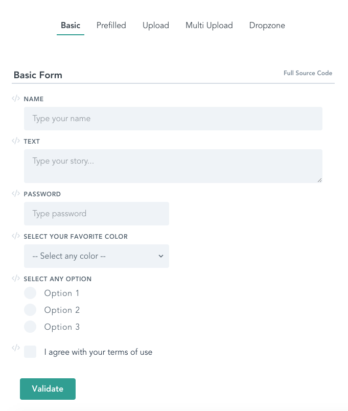
Create a form and sent it via post request to your server.
<!-- form wrapper -->
<fvl-form method="post" :data="form" url="/create">
  <!-- Text input component -->
  <fvl-input :value.sync="form.fullname" label="Full Name" name="fullname" />

  <!-- Textarea component -->
  <fvl-textarea :value.sync="form.bio" label="Bio" name="bio" />

  <!-- Radio component with options -->
  <fvl-radio :checked.sync="form.pet" :options="{'cat': 'Cat', 'dog': 'Dog'}" label="Favorite pet" name="pet" />

  <!-- Submit button -->
  <fvl-submit>Validate</fvl-submit>
</fvl-form>
The form object you pass into the form component above would look like this:
import { FvlForm, FvlInput, FvlTextarea, FvlRadio, FvlSubmit } from 'formvuelar'
//...
    components: {
        FvlForm,
        FvlInput,
        FvlTextarea,
        FvlRadio,
        FvlSubmit,
    },
    data() {
        return {
            form: {
                fullname: '',
                bio: '',
                pet: ''
            },
//...You might want to change some defaults globally for all your forms, to do this you just can overwrite them as a global property before registering your main vue instance:
/* Register optional global FormVuelar config */
Vue.prototype.$formvuelar = {
  noResultsText: 'No results found!',
  pleaseWaitText: 'Please wait...',
  addFileText: 'Add File',
  addFilesText: 'Add Files',
  filesSelectedText: 'Files Selected',
  dropFilesHereText: 'Drop files here or click to upload.',
  filesSelectedAndSizeText: 'files selected with a combined size of',
  headers: '{}'
}The response from your Backend should contain a Json error object and have a status of 422 in order to show the error messages below the input fields. This response format is default for Laravel and will work out of the box.
{
  "message": "The given data was invalid.",
  "errors": {
    "field-1": [
      "Error 1",
      "Error 2"
    ],
    "field-2": [
      "Error 1",
      "Error 2"
    ]
  }
}You can still use the default HTML5 validation rules for all input fields like 'accept' and 'required' for file inputs:
<fvl-file label="Avatar" name="avatar" :file.sync="form.avatar" accept="image/*" required />The styling is totally up to you. All components have their own classes so you have full control over the look and feel of every component.
Every component is wrapped with a div and the corresponding class .fvl-{type}-wrapper. Labels have a class name of .fvl-{type}-label. The field itself has a class name of .fvl-{type}
.fvl-input-wrapper {
    @apply p-2;
}
.fvl-input-label {
    @apply block uppercase tracking-wide text-grey-darker text-xs font-bold mb-2;
}
.fvl-input {
    @apply appearance-none block w-full bg-grey-lighter text-grey-darkest border border-grey-lighter rounded py-3 px-4 leading-tight;
}
I'm using Tailwind CSS for the examples. Feel free to use the predefined css component classes for your own projects.
- Tags component
- Test coverage
Released under the MIT License.