You may find some extra info there in this link
Find more advanced examples in Show & Tell
Installation via HACS
- Search for
Plotly Graph Card.
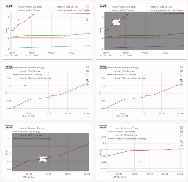
New Visual Config editor available for Basic Configs (*)
type: custom:plotly-graph
entities:
  - sensor.monthly_internet_energy
  - sensor.monthly_teig_energy
  - sensor.monthly_office_energy
  - sensor.monthly_waschtrockner_energy
hours_to_show: 24
refresh_interval: 10
(*) I'm reusing the editor of the standard History Card. Cheap, yes, but it works fine. Use yaml for advanced functionality
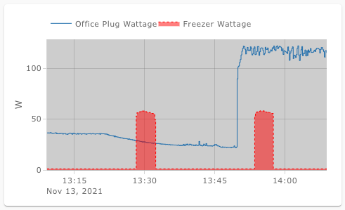
type: custom:plotly-graph
entities:
  - entity: sensor.office_plug_wattage
  # see examples: https://plotly.com/javascript/line-and-scatter/
  # see full API: https://plotly.com/javascript/reference/scatter/#scatter
  - entity: sensor.freezer_plug_power
    fill: tozeroy
    line:
      color: red
      dash: dot
      width: 1

layout:
  plot_bgcolor: lightgray
  height: 400
config:
  scrollZoom: false

hours_to_show: 1
refresh_interval: 10 # in secondstype: custom:plotly-graph
entities:
- entity: sensor.temperature
refresh_interval: 10
hours_to_show: 12
layout:
xaxis:
rangeselector:
# see examples: https://plotly.com/javascript/range-slider/
# see API: https://plotly.com/javascript/reference/layout/xaxis/#layout-xaxis-rangeselector
"y": 1.2
buttons:
- count: 1
step: minute
- count: 1
step: hour
- count: 12
step: hour
- count: 1
step: day
- count: 7
step: day- Anything you can do with scatter and barcharts in plotly
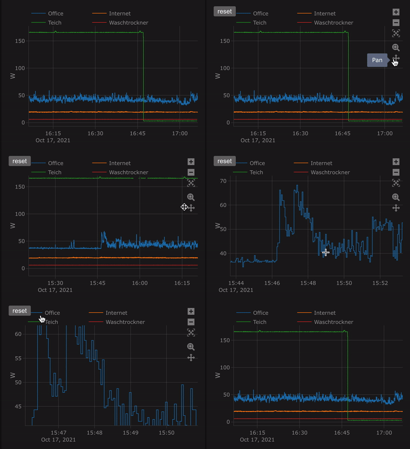
- Zoom / Pan, etc.
- Data is loaded in the background
- Axes are automatically configured based on the units of each trace
- Configuration compatible with the History Card
For now only the only allowed chart types are:
- Bar charts https://plotly.com/javascript/bar-charts/#basic-bar-chart
- Line and scatter https://plotly.com/javascript/line-and-scatter/
-
entitiestranslates to thedataargument in PlotlyJS- each
entitywill be translated to a trace inside the data array.x(states) andy(timestamps of stored states)- you can add any attribute that works in a plotly trace
- see https://plotly.com/javascript/reference/scatter/#scatter-line for more
- each
type: custom:plotly-graph
entities:
  - entity: sensor.temperature
  - entity: sensor.humidity
Alternatively:
type: custom:plotly-graph
entities:
  - sensor.temperature
- sensor.humidityChanges default line colors. See more here: https://github.com/dbuezas/lovelace-plotly-graph-card/blob/master/src/color-schemes.ts
type: custom:plotly-graph
entities:
  - sensor.temperature1
  - sensor.temperature2
color_scheme: dutch_field
# or use numbers instead 0 to 24 available:
# color_scheme: 1
# or pass your color scheme
# color_scheme: ["#1b9e77","#d95f02","#7570b3","#e7298a","#66a61e","#e6ab02","#a6761d","red"]Plot the attributes of an entity
type: custom:plotly-graph
entities:
  - entity: climate.living
    attribute: temperature
  - entity: climate.kitchen
attribute: temperatureFetch and plot long-term statistics of an entity
type: custom:plotly-graph
entities:
  - entity: sensor.temperature
    statistic: max # `min`, `mean`, `max` or `sum`
    period: 5minute # `5minute`, `hour`, `day`, `month`
Note that 5minute period statistics are limited in time as normal recorder history is, contrary to other periods which keep data for years.
type: custom:plotly-graph
entities:
  - entity: sensor.temperature_in_celsius
    name: living temperature in Farenheit # Overrides the entity name
    lambda: |- # Transforms the data
      (ys) => ys.map(y => (y × 9/5) + 32)
    unit_of_measurement: °F # Overrides the unit
    show_value: # shows the last value with 40% right margin
      right_margin: 40
    texttemplate: >- # custom format for show_value
      <b>%{y}</b>%{customdata.unit_of_measurement}<br>
      %{customdata.name}
      # to show only 2 decimals: "%{y:.2f}"
      # see more here: https://plotly.com/javascript/reference/pie/#pie-texttemplate

    hovertemplate: >- # custom format for tooltip
      <b>%{customdata.name}</b><br><i>%{x}</i><br>
      %{y}%{customdata.unit_of_measurement}
<extra></extra>lambda takes a js function (as a string) to pre process the data before plotting it. Here you can do things like normalisation, integration. For example:
type: custom:plotly-graph
entities:
  - entity: sensor.my_sensor
    lambda: |-
(ys) => ys.map(y => y/ys[ys.length-1])- entity: sensor.my_sensor
lambda: |-
(ys) => ys.map(y => y/ys[0])note: ys[0] represents the first "known" value, which is the value furthest to the past among the downloaded data. This value will change if you scroll, zoom out, change the hours_to_show, or just let time pass.
- entity: sensor.my_sensor
  unit_of_measurement: "total pulses"
  lambda: |-
    (ys) => {
      let accumulator = 0;
      return ys.map(y => accumulator + y)
}- entity: sensor.my_sensor
unit_of_measurement: "pulses / second"
lambda: |-
(ys, xs) => {
let last = {
x: new Date(),
y: 0,
}
return ys.map((y, index) => {
const x = xs[index];
const dateDelta = x - last.x;
const yDelta = (y - last.y) / dateDelta;
last = { x, y };
return yDelta;
})
}- entity: sensor.my_sensor
unit_of_measurement: "kWh"
lambda: |-
(ys, xs) => {
let accumulator = 0;
let last = {
x: new Date(),
y: 0,
}
return ys.map((y, index) => {
const x = xs[index]
const dateDelta = x - last.x;
accumulator += last.y * dateDelta;
last = { x, y };
return accumulator;
})
}- entity: climate.wintergarten_floor
attribute: valve
unit_of_measurement: °C
lambda: |-
(ys, xs, entity) =>
entity.map(({attributes}) =>
return +attributes.temperature - (+attributes.valve / 100) * 2
)- entity: climate.wintergarten_floor
unit_of_measurement: °C
lambda: |-
(ys, xs, entity) => ({
x: xs.map(x => -x),
y: ys.map(y => y / 2),
})default configurations for all entities and all yaxes (e.g yaxis, yaxis2, yaxis3, etc).
type: custom:plotly-graph
entities:
  - sensor.temperature1
  - sensor.temperature2
defaults:
  entity:
    fill: tozeroy
    line:
      width: 2
  yaxes:
fixedrange: true # disables vertical zoom & scrollTo define layout aspects, like margins, title, axes names, ... Anything from https://plotly.com/javascript/reference/layout/.
Use this if you want to use plotly default layout instead. Very useful for heavy customization while following pure plotly examples.
type: custom:plotly-graph
entities:
  - entity: sensor.temperature_in_celsius
no_default_layout: truetype: custom:plotly-graph
entities:
- entity: sensor.temperature_in_celsius
no_theme: trueTo define general configurations like enabling scroll to zoom, disabling the modebar, etc. Anything from https://plotly.com/javascript/configuration-options/.
When true, will tell HA to only fetch datapoints with a different state as the one before.
More here: https://developers.home-assistant.io/docs/api/rest/ under /api/history/period/<timestamp>
Caveats:
- zana-37 repoorts that
minimal_response: falseneeds to be set to get all non-significant datapoints here. - This configuration will be ignored (will be true) while fetching Attribute Values.
significant_changes_only: true # defaults to falseWhen true, tell HA to only return last_changed and state for states other than the first and last state (much faster).
More here: https://developers.home-assistant.io/docs/api/rest/ under /api/history/period/<timestamp>
Caveats:
- This configuration will be ignored (will be true) while fetching Attribute Values.
minimal_response: false # defaults to trueUpdate data every refresh_interval seconds. Use 0 or delete the line to disable updates
How many hours are shown.
Exactly the same as the history card, except decimal values (e.g 0.1) do actually work
Update data every refresh_interval seconds. Use 0 or delete the line to disable updates
- Clone the repo
- run
npm i - run
npm start - From a dashboard in edit mode, go to
Manage resourcesand addhttp://127.0.0.1:8000/plotly-graph-card.jsas url with resource type JavaScript - ATTENTION: The development card is
type: custom:plotly-graph-dev - Either use Safari or Disbale chrome://flags/#block-insecure-private-network-requests: Chrome doesn't allow public network resources from requesting private-network resources - unless the public-network resource is secure (HTTPS) and the private-network resource provides appropriate (yet-undefined) CORS headers. More here
npm run build
npm version minor- git push
- click on releases/new draft from tag in github
Automated release pending.


