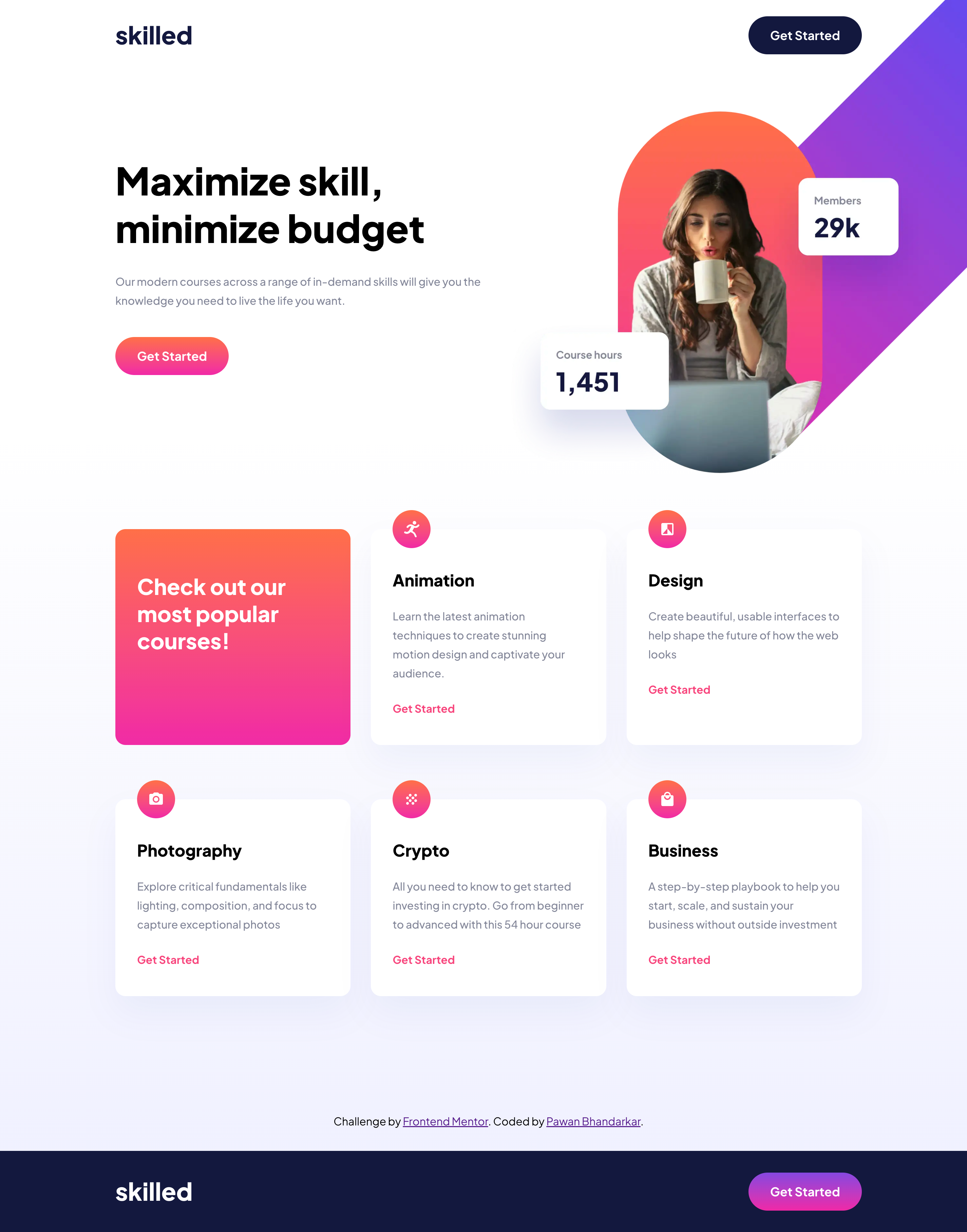
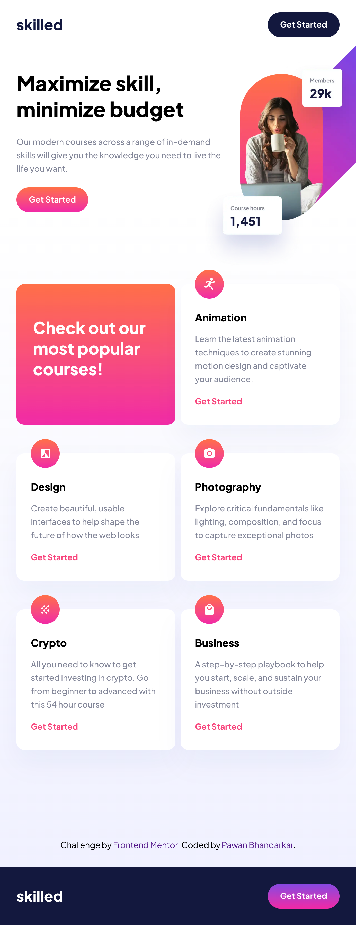
This is a solution to the Skilled e-learning landing page challenge on Frontend Mentor. Frontend Mentor challenges help you improve your coding skills by building realistic projects.
My goal in this project was to practice the CSS I had recently leanred in an online course, in the context of React and Styled Components. This felt like a logical next step from my last project, which was built purely using HTML and CSS.
Users should be able to:
- View the optimal layout depending on their device's screen size
- See hover states for interactive elements
- Solution URL: Add solution URL here
- Live Site URL: Add live site URL here
- Semantic HTML5 markup
- CSS custom properties
- Flexbox
- CSS Grid
- Desktop-first workflow
- React - JS library
- Styled Components - For styles
The biggest challenege I faced was learning how to make the image responsive on all screen sizes, while also avoiding overlap with the header. I ended up using the <picture> component with sources that get resolved based on the screen size.
This code can be found in Image.js
I am always looking for feedback on how to improve~
- Changing Image src based on window size - This helped me avoid using multiple
imgtags. At first, I was usingdisplay:noneanddisplay:blockbased on the media queries. This helped me simplify things.
- LinkedIn - P Pawan Bhandarkar
- Frontend Mentor - @BhandarkarPawan
- Twitter - @BhandarkarPawan


