{frex} stands for “FRench hEXagons”.
The goal of this package is to provide several layers of information for metropolitan France, particularly useful for analyzing agricultural systems.
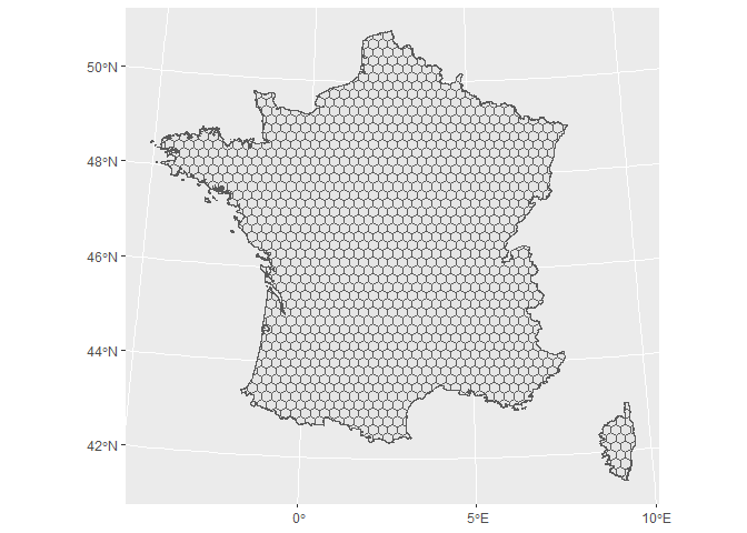
The basis of this package is a gridded map of France in hexagons of about 450 km2. For each hexagon, different information can be added using the package function, such as the surface area occupied by different types of crop, the nature of the soil or climatic data.
The data is not included in the package itself, but is called up via URL. It therefore requires an Internet connection to operate.
Package data can be used to illustrate the diversity of French farming systems. They can also be used to enrich other datasets for multivariate analysis (e.g. to add pedoclimatic characteristics to studied agricultural plots), as we did in this article.
The package may be downloaded from GitHub. It may also be downloaded directly from R with the following command:
# Installation directly with R (to use only once):
# devtools::install_github("BjnNowak/frex")

# Once installed, you may load it into your R session
library(frex)

# Two other packages will be useful to process the data: {tidyverse} and {sf}
library(tidyverse)
library(sf)
The package is based on a hexagonal grid of metropolitan france, to which data layers can be added. This grid may be loaded as follows, using the get_map() function:
hex<-get_map() # No argument

# Plot hexagonal grid
ggplot(hex)+
  geom_sf()
This base map can be enhanced by adding several layers of data.
Static data layer (not updated from year to year) may be added with the get_static_layer() function.
Different type of data may be added this way:
- “soil” for soil feature;
- “crops” for main crops distribution (conventional or organic);
- “organic” for organic crops distribution;
- “herds” for farm animal density (aggregated from departmental scale);
- “herds_municipality” for farm animal density (aggregated from municipality scale);
- “human” for human population density.
The distribution of crops and animals can vary over time, but an initial analysis showed that these distributions were very stable from one year to the next. As a first approximation, they were therefore considered as “stable” layers.
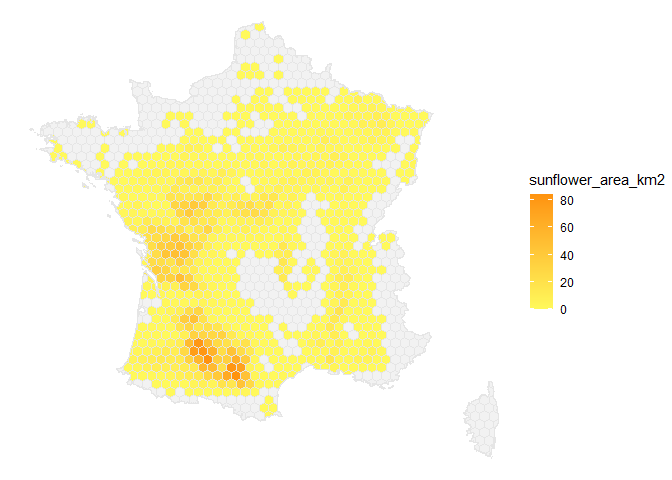
Below an example to get the distribution of sunflower crops in France.
hex<-get_map()%>%
  # Join static layer with the hexagonal grid
  left_join(get_static_layer(layer="crops"))

ggplot(hex)+
  geom_sf(
    aes(fill=sunflower_area_km2),
    color="grey90"
  )+
  scale_fill_gradient(
    low="#fff95b",high="#ff930f",
    na.value = "grey95")+
  theme_void()
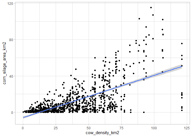
But we can also conduct analyses without using the base map to plot data, simply by confronting two data layers.
# Start with farm animal density
data<-get_static_layer(layer="herds")%>%
  # Join static layer with crops distribution
  left_join(get_static_layer(layer="crops"))

# Compare the two data
ggplot(data,aes(x=cow_density_km2,y=corn_silage_area_km2))+
  geom_point()+
  geom_smooth(method='lm')+
  theme_light()
As expected, there is a positive correlation between the number of cows per km2 and the corn silage area, as it is one of the fodders given to animals.
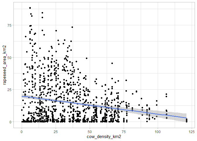
This is not the case when comparing cow density with rapeseed area, a crop more traditionally associated with farms without livestock:
ggplot(data,aes(x=cow_density_km2,y=rapeseed_area_km2))+
  geom_point()+
  geom_smooth(method='lm')+
  theme_light()
for all these examples, table joins are based on the “hex_id” column (which identifies the hexagon to which the data is associated), so it’s best not to change the name of this column.
Adding time series layers works in the same way as adding “static” layers, except that the get_time_layer() function has two additional arguments (from and to) to delimit the years bordering the selection.
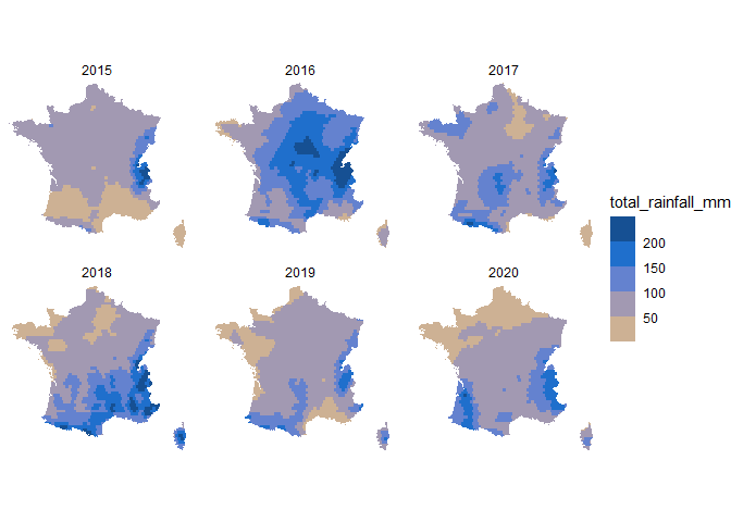
Let’s use this function to compare the total rainfall in May for the last years available in the dataset:
data<-get_map()%>%
  left_join(get_time_layer(layer="rainfall",from=2015,to=2020))

ggplot(data%>%filter(month==5))+
  geom_sf(
    aes(fill=total_rainfall_mm),
    color=NA
  )+
  scale_fill_steps2(
    low = "#F8CF6A",
    mid = "#2178dd",
    high = "#0F3A6B",
    midpoint = 150,
    breaks=seq(50,200,50)
  )+
  facet_wrap(.~year)+
  theme_void()
As shown above, May 2016 was a particularly wet month.
I’ll be adding more data layers over time.
- Soil features from SoilGrids
- Crop distribution from the Land-Parcel Identification System (Registre Parcellaire Graphique in France) of the European Common Agricultural Policy
- Organic crop distribution from Agence Bio
- Herd density from Agreste
- Human population density from Global Human Settlement Layer
- Climate data from ERA5 (Copernicus Climate Change Service)
