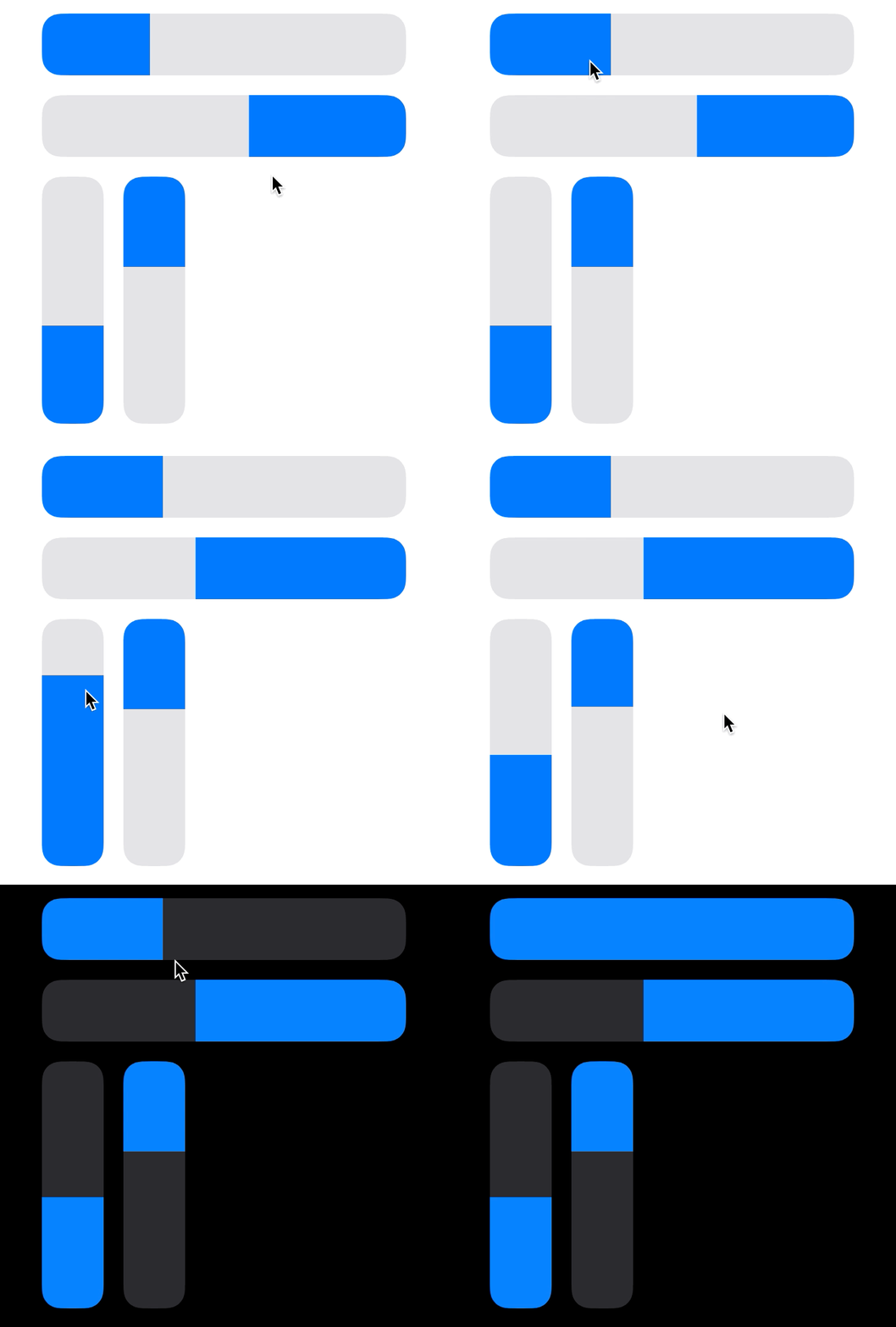
TactileSlider
A slider control designed to be easy to grab and use because it can be dragged or tapped from anywhere along its track, similar to the sliders in Control Center and HomeKit. Because this type of slider graphically represents direct manipulation of a value, it should be used for live adjustment of values whose changes can be directly observed in real time (such as audio volume or the brightness of a light).
Features
- Can be dragged or (optionally) tapped to set a value
- Supports horizontal and vertical orientation in either direction
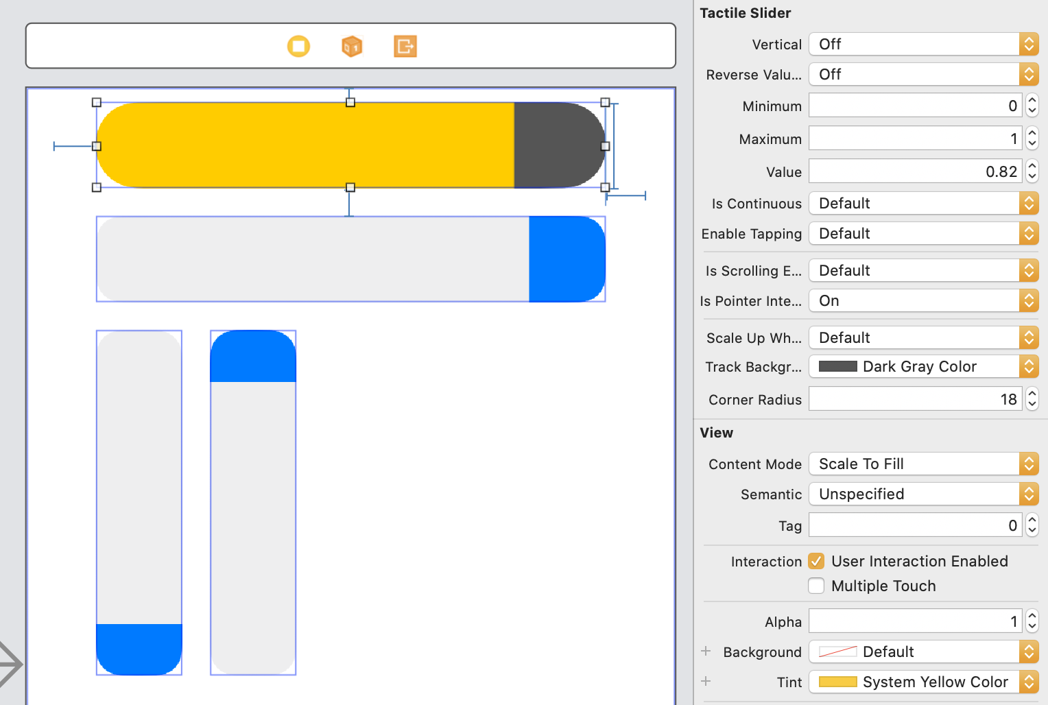
- IBDesignable – colors, values, rounded corners, and behavior can be customized in Interface Builder or programatically
- Supports light & dark appearance using semantic system colors with borders that can automatically appear in low contrast situations (iOS 13+)
- Adjustable haptic feedback (iOS 10+)
- VoiceOver support
- Supports pointer (e.g. trackpad or mouse) based scrolling on iPadOS (iOS 13.4+)
Example
To run the example project, clone the repo, and run pod install from the Example directory first.
Requirements
iOS 9.0+
- iOS 10.0+ required for haptic feedback
- iPadOS 13.4+ required for pointer use
Installation
TactileSlider is available as a Swift package or through CocoaPods.
To install it using CocoaPods, simply add the following line to your Podfile:
pod 'TactileSlider'Usage
For the full documentation using Xcode 13 or later, add TactileSlider as a dependency or download a local copy, then choose Product > Build Documentation. In previous versions of Xcode, symbol documentation will appear in Quick Help.
let slider = TactileSlider(frame: someRect)

slider.minimumValue = 1
slider.maximumValue = 10

slider.setValue(3.8, animated: true)
Setting orientation and direction
slider.vertical = true
slider.reverseValueAxis = true
Adjusting behavior
slider.isContinuous = false // send events only at end of gesture vs continuously
slider.enableTapping = false // allow or disallow tapping anywhere on the slider track to instantly set a value
slider.feedbackStyle = .medium // customize haptic feedback when the slider reaches the end
slider.isScrollingEnabled = false // allow or disallow scrolling to adjust the slider using a connected pointing device on iPadOS
slider.precisionRampUpDistance = 10 // enable finer adjustment when moving the slider by amounts smaller than this distance (in screen points)
Changing colors and appearance
slider.trackBackground = UIColor.black.withAlpha(0.8) // use translucent black for the slider track
slider.tintColor = UIColor.systemGreen // use dynamic green for the slider thumb

slider.outlineColor = UIColor.gray // color of outline around slider and thumb (if unset, will be determined automatically based on contrast between tintColor and current system appearance)
slider.outlineColorProvider = { slider, suggestedColor -> UIColor? in … } // provide your own closure to set the outline color dynamically
slider.outlineSize = 2 // set thickness of outline

slider.cornerRadius = 12 // size of corner radius; defaults to automatic based on the slider's bounds

slider.isPointerInteractionEnabled = true // display a hover effect when under the pointer on iPadOS
Fine tuning accessibility
By default, the accessibility increment and decrement gestures change the value by 10% of the slider's range, matching the behavior of UISlider. This can be adjusted:
slider.steppingMode = .percentage(5) // specify a percentage to increment/decrement the slider's value byslider.steppingMode = .stepValue(0.1) // specify a fixed value to increment/decrement the slider's value byInterface Builder
Author
Dale Price (@dale_price@mastodon.technology)
License
TactileSlider is available under the MIT license. See the LICENSE file for more info.


