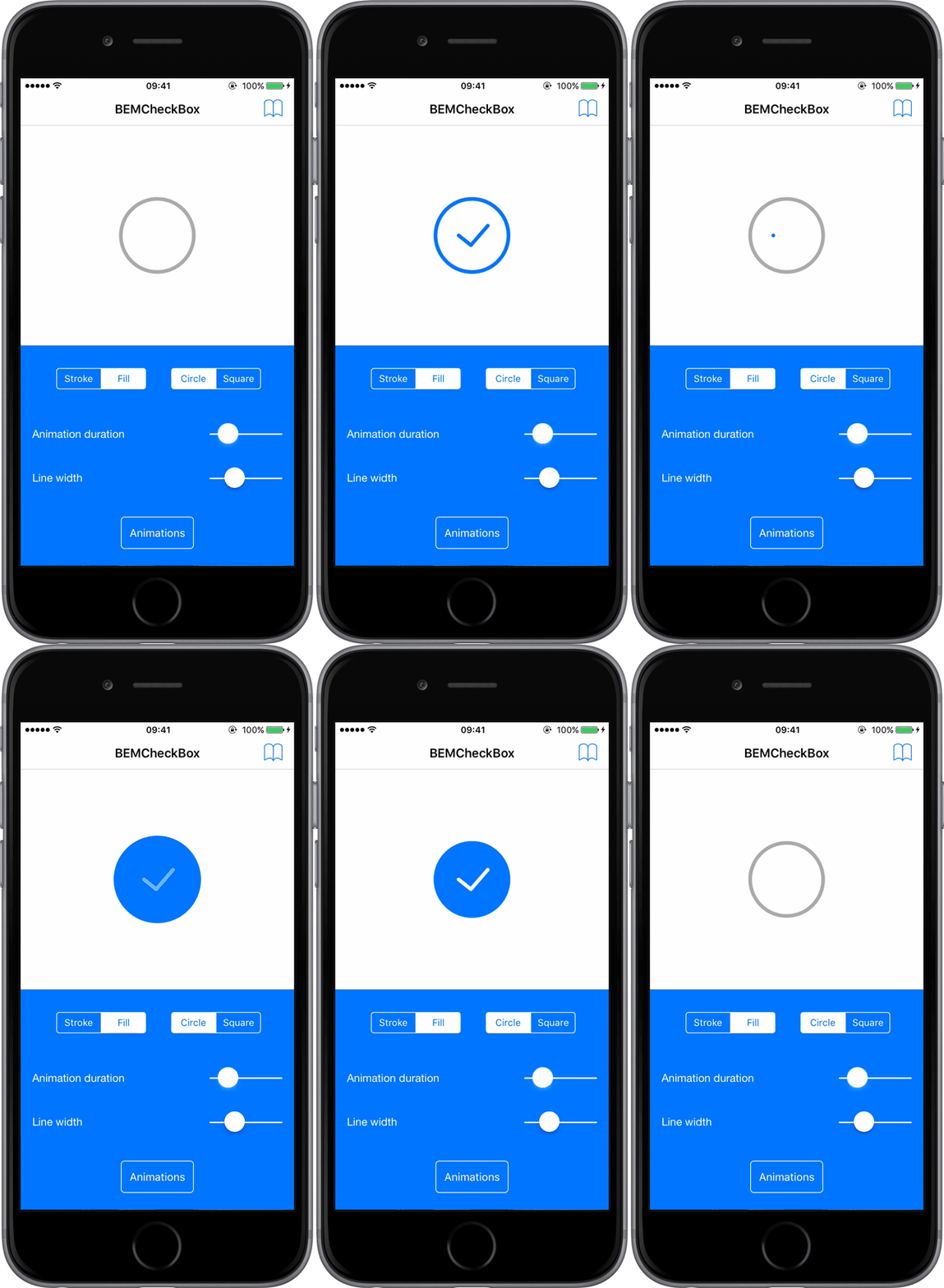
BEMCheckBox is an open source library making it easy to create beautiful, highly customizable, animated checkboxes for iOS.
Learn more about the BEMCheckBox project, licensing, support etc.
- Requires iOS 7 or later. The sample project is optimized for iOS 9.
- Requires Automatic Reference Counting (ARC).
- Optimized for ARM64 Architecture.
See the License. You are free to make changes and use this in either personal or commercial projects. Attribution is not required, but highly appreciated. A little "Thanks!" (or something to that affect) is always welcome. If you use BEMCheckBox in your app, please let us know!
Join us on Gitter if you need any help or want to talk about the project.
The iOS Sample App included with this project demonstrates one way to correctly setup and use BEMCheckBox. It also offers the possibility to customize the checkbox within the app.
BEMCheckBox can be used with React Native: React-Native-BEMCheckBox
BEMCheckBox can be used with NativeScript: NativeScript-BEMCheckBox
BEMCheckBox can also be used with Xamarin: XPlugins.iOS.BEMCheckBox
It only takes a few simple steps to install and setup BEMCheckBox to your project.
Add https://github.com/Boris-Em/BEMCheckBox as a dependency to your Package.swift file or select File -> Swift Packages -> Add Package Dependency... in Xcode.
The easiest way to install BEMCheckBox is to use CocoaPods. To do so, simply add the following line to your Podfile:
pod 'BEMCheckBox'Carthage is a decentralized dependency manager that builds your dependencies and provides you with binary frameworks.
Run carthage update after adding BEMCheckBox to your Cartfile to build the framework. Drag the built BEMCheckBox.framework into your Xcode project.
Finally, you can install BEMCheckBox manually. Simply drag and drop the Classes folder into your Xcode project. When you do so, make sure to check the "Copy items into destination group's folder" box.
Setting up BEMCheckBox to your project couldn't be more simple. It is modeled after UISwitch. In fact, you could just replace instances of UISwitch by BEMCheckBox in your project!
Here are the steps to follow to get everything up and running:
- Import
"BEMCheckBox.h"to the header of your view controller:
#import "BEMCheckBox.h"- BEMCheckBox can either be initialized programatically (through code) or with Interface Builder (Storyboard file). Use the method that makes the most sense for your project.
Programmatical Initialization
Just add the following code to your implementation (usually in the viewDidLoad method of your View Controller).
BEMCheckBox *myCheckBox = [[BEMCheckBox alloc] initWithFrame:CGRectMake(0, 0, 50, 50)];
[self.view addSubview:myCheckBox];
Interface Builder Initialization
1 - Drag a UIView to your UIViewController.
2 - Change the class of the new UIView to BEMCheckBox.
3 - Select the BEMCheckBox and open the Attributes Inspector. Most of the customizable properties can easily be set from the Attributes Inspector. The Sample App demonstrates this capability.
All of the methods and properties available for BEMCheckBox are documented below.
Just like UISwitch, BEMCheckBox provides the boolean property on that allows you to retrieve and set (without animation) a value determining wether the BEMCheckBox object is on or off. Defaults to NO.
Example usage:
self.myCheckBox.on = YES;Just like UISwitch, BEMCheckBox provides an instance method setOn:animated: that sets the state of the checkbox to On or Off, optionally animating the transition.
Example usage:
[self.myCheckBox setOn:YES animated:YES];The instance method reload lets you redraw the entire checkbox, keeping the current on value.
Example usage:
[self.myCheckBox reload]BEMCheckBoxes can easily be grouped together to form radio button functionality. This will automatically manage the state of each checkbox in the group, so that only one is selected at a time, and can optionally require that the group has a selection at all times.
self.group = [BEMCheckBoxGroup groupWithCheckBoxes:@[self.checkBox1, self.checkBox2, self.checkBox3]];
self.group.selectedCheckBox = self.checkBox2; // Optionally set which checkbox is pre-selected
self.group.mustHaveSelection = YES; // Define if the group must always have a selection
To see which checkbox is selected in that group, just ask for it:
BEMCheckBox *selection = self.group.selectedCheckBox;To manually update the selection for a group, just set it:
self.group.selectedCheckBox = self.checkBox1;BEMCheckBox uses a delegate to receive check box events. The delegate object must conform to the BEMCheckBoxDelegate protocol, which is composed of two optional methods:
-
didTapCheckBox:
Sent to the delegate every time the check box gets tapped, after its properties are updated (on), but before the animations are completed. -
animationDidStopForCheckBox:
Sent to the delegate every time the check box finishes being animated.
BEMCheckBox is exclusively customizable though properties.
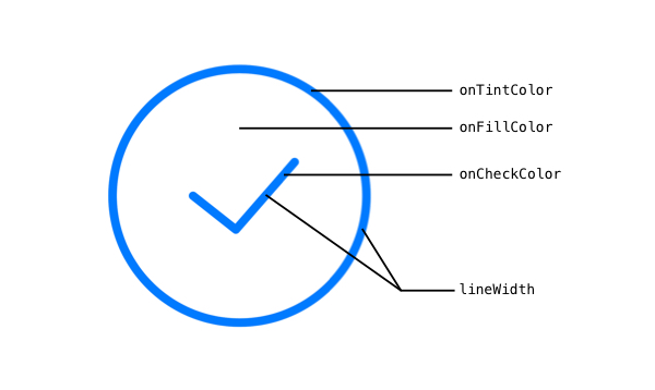
The following diagram provides a good overview:
lineWidth - CGFloat
The width of the lines of the check mark and box. Defaults to 2.0.
hideBox - BOOL
BOOL to control if the box should be hidden or not. Setting this property to YES will essentially turn the checkbox into a check mark. Defaults to NO.
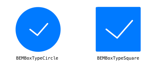
boxType - BEMBoxType
The type of box to use. See BEMBoxType for possible values. Defaults to BEMBoxTypeCircle.
tintColor - UIColor
The color of the box when the checkbox is Off.
onCheckColor - UIColor
The color of the check mark when it is On.
onFillColor - UIColor
The color of the inside of the box when it is On.
onTintColor - UIColor
The color of the line around the box when it is On.
animationDuration - CGFloat
The duration in seconds of the animations. Defaults to 0.5.
onAnimationType - BEMAnimationType
The type of animation to use when the checkbox gets checked. Defaults to BEMAnimationTypeStroke. See BEMAnimationType bellow for possible values.
offAnimationType - BEMAnimationType
The type of animation to use when the checkbox gets unchecked. Defaults to BEMAnimationTypeStroke. See BEMAnimationType bellow for possible values.
BEMAnimationType
The possible values for onAnimationType and offAnimationType.
BEMAnimationTypeStroke
BEMAnimationTypeFill
BEMAnimationTypeBounce
BEMAnimationTypeFlat
BEMAnimationTypeOneStroke
BEMAnimationTypeFade


