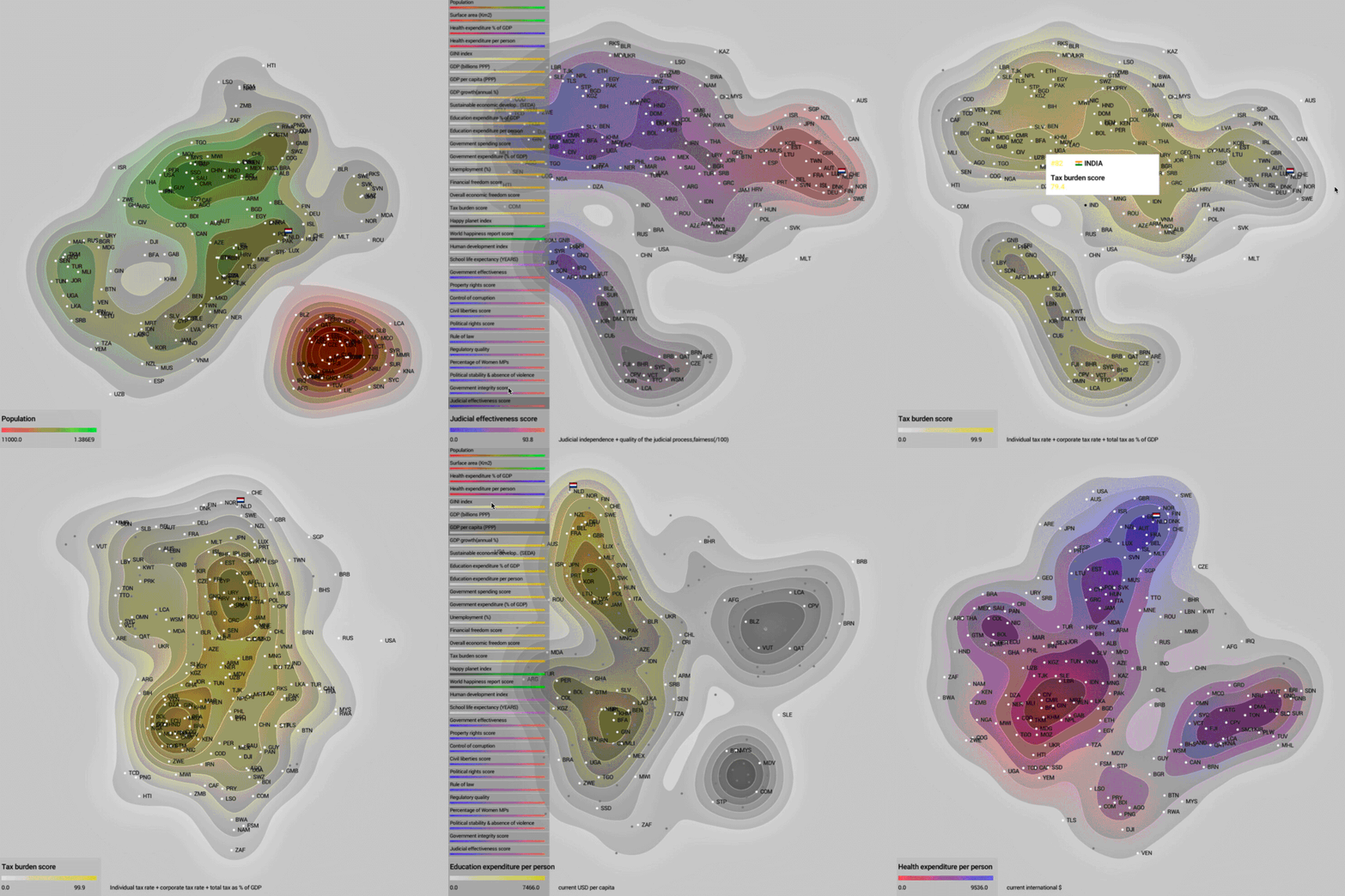
Tool to inspect the indicators that might make a good government.
In this tool, the countries will re-arrange according to inter-country similarity of the selected indicators. The indicators are grouped in 6 main categories (for example Health, Happiness, etc) with subcategories and can be coloured along 32 themes.
The closer countries are to each other, the more similarities. In order to be able to focus on factors that determine what might make a good government, the indicators Population size and Surface area can be deselected.
macOS App : Download
If you have trouble running the app, follow these instructions.
For generating the maps we used t-Distributed Stochastic Neighbor Embedding (t-SNE) algorithms. Special thanks go to lejon for his Barnes Hut Java implementation. https://github.com/lejon/T-SNE-Java
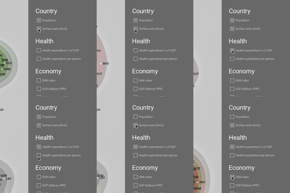 Prioritize Prioritize |
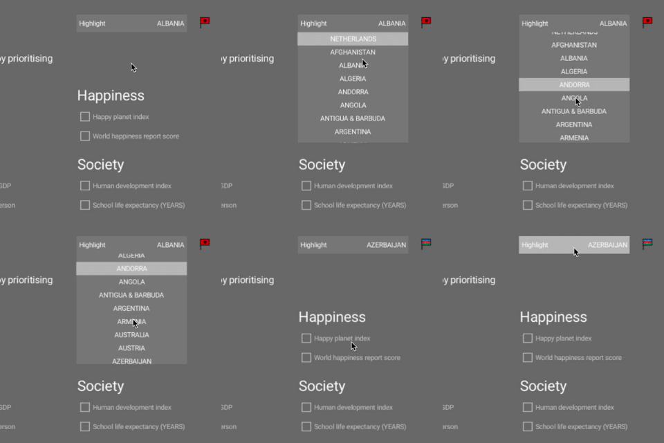 Highlight Highlight |
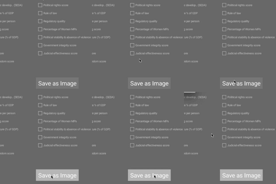 Save to file Save to file |
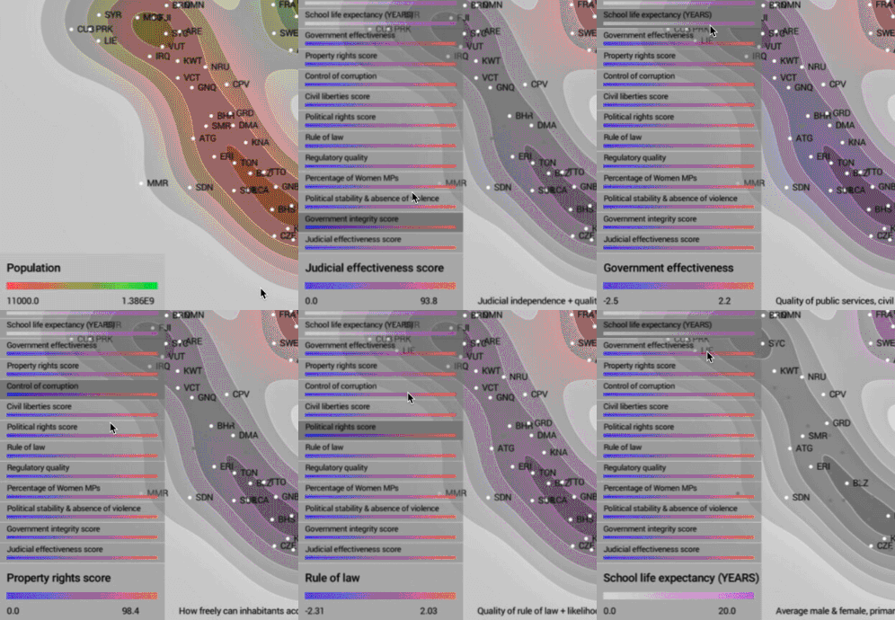 Theme Theme |
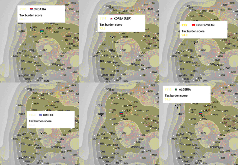 Focus Focus |
This project takes part in the World Data Visualization Prize https://wdvp.worldgovernmentsummit.org/
Data provided by WDVP https://docs.google.com/spreadsheets/d/11LhOlwsloUuA495r-04IDwciMqNrLwWGpveqpF61WXU/edit#gid=0
