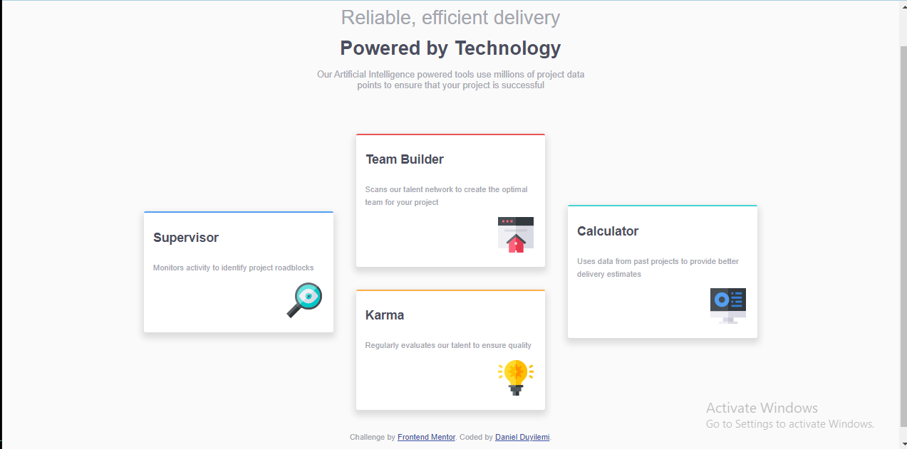
This is a solution to the Intro section with dropdown navigation challenge on Frontend Mentor. Frontend Mentor challenges help you improve your coding skills by building realistic projects.
Note: Delete this note and update the table of contents based on what sections you keep.
Users should be able to:
- View the relevant dropdown menus on desktop and mobile when interacting with the navigation links
- View the optimal layout for the content depending on their device's screen size
- See hover states for all interactive elements on the page
- Solution URL: [https://github.com/Catalyst497/four-card-section]
- Live Site URL: [https://catalyst497.github.io/four-card-section/]
- Semantic HTML5 markup
- Flexbox
- CSS Grid
- Mobile-first workflow
To practice more than I have ever done before.
- Grid Layout
- Flexbox
- Javascript
- React
- Website - Daniel Duyilemi
- Frontend Mentor - Daniel
- Twitter - @Daniel43603607
Note: Delete this note and add/remove/edit lines above based on what links you'd like to share.
This is me saying thank you to frontend mentor and everyone that works there for this awesome project. It involved a little bit of thinking but I thank God, I was able to solve it.

