Frontend Mentor ⇒ Huddle landing page
Summary
This is a solution to the Frontend Mentor challenge to recreate the Huddle landing page. Frontend Mentor challenges help you improve your coding skills by building realistic projects.
I built this project to get more practice with React and React Styled Components.
Table of contents
Overview
The challenge
Users should be able to:
- View the optimal layout for each page depending on their device's screen size
- Mobile @ 375px
- Tablet @ 768px
- Desktop @ 1275px
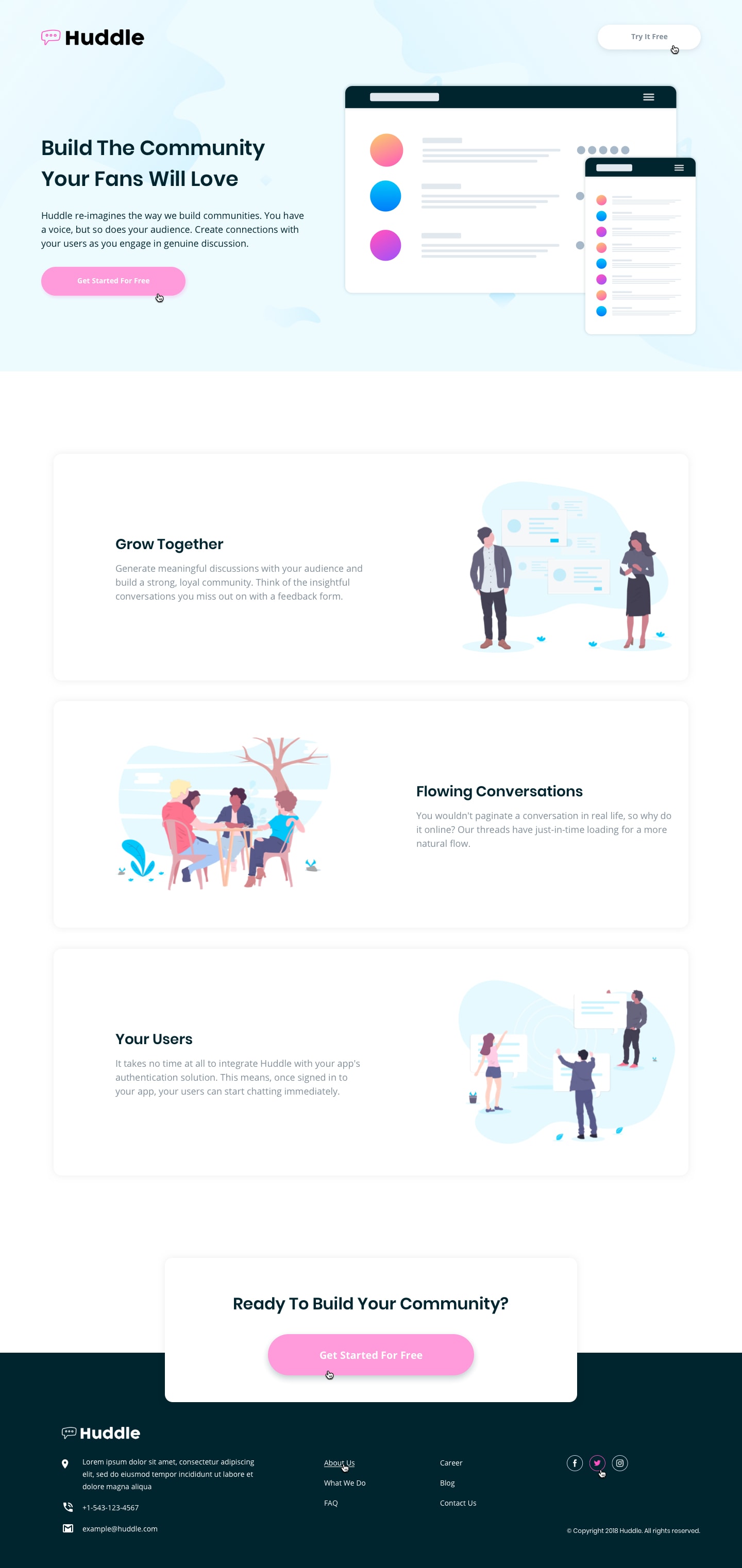
- See hover states for all interactive elements throughout the site
- Button
background-colorandtransformupdates on hover - Links
colorupdates on hover
- Button
Screenshots
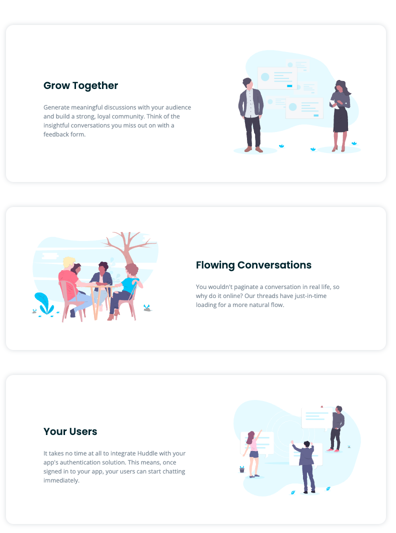
Mobile @ 375px
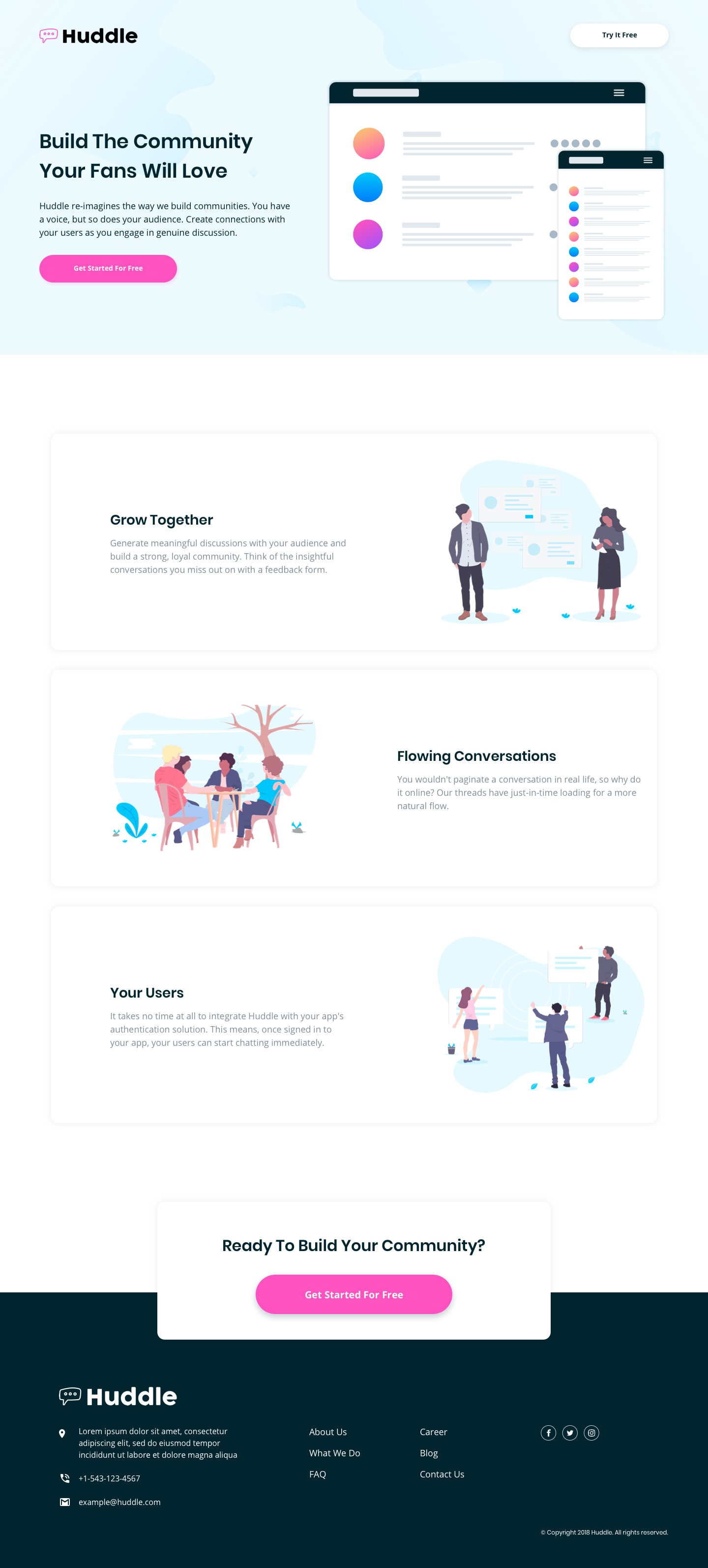
Desktop @ 1275px
Hover States
Links
Solution URL: View Solution here
Live Site URL: View Live Site here
My process
Built with
- React - JavaScript Framework
- React Styled Components - For styles
- Semantic HTML5 markup
- Sass
- CSS custom properties
- Flexbox
- Mobile-first workflow
- Mobile breakpoint @ 375px
- Tablet beakpoint @ 768px
- Desktop breakpoint @ 1275px
What I learned
-
The main motivation for completing this project was to get more practice with React Styled Components. I feel very comfortable with React Styled Components at this point, it's a great way to organize CSS styling within React.
-
An interesting snippet of code from this project is the code that I used to dynamically render the
<Card/>content. In Mobile view theimagewithin the<Card/>is rendered on the top and thetextis rendered underneath. BUT on the Desktop view theimageand thetextare rendered on the same line, and alternate left/right positions within each<Card/>- So in
Card.styled.jsI used
@media (min-width: ${({ theme }) => theme.tablet}) { flex-direction: ${({ layout }) => layout || "row-reverse"}; ... }- and in
<Card/>I alternated theflex-directionbased on the cardidusing
<StyledCard layout={id % 2 === 0 && "row"}>- To get this

- So in
Continued development
- Add components for all of the links
-
<TryPage/>which would link from the"Try for Free" and "Get Started for free" buttons -
<About/>which would link from theAbout link in the footer -
<WhatWeDo/>which would link from the What We Do link in the footer -
<FAQ/>which would link from the FAQ link in the footer -
<Career/>which would link from the Career link in the footer -
<Blog/>which would link from the Blog link in the footer -
<Contact/>which would link from the Contact link in the footer
-
- Use Jest testing framework to add a few tests for the React code
Author
- Frontend Mentor - @Chanda-Abdul
- Website - Chanda Codes
- GitHub - github.com/Chanda-Abdul


