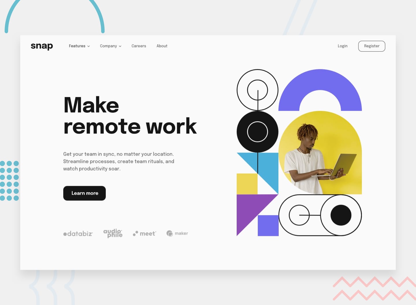
This is a solution to the Intro section with dropdown navigation challenge on Frontend Mentor. Frontend Mentor challenges help you improve your coding skills by building realistic projects.
Your challenge is to build out this intro section with dropdown navigation and get it looking as close to the design as possible.
Users should be able to:
- View the relevant dropdown menus on desktop and mobile when interacting with the navigation links
- View the optimal layout for the content depending on their device's screen size
- See hover states for all interactive elements on the page
- Solution Live Site URL: live site
- React - JavaScript Framework
- React Hooks
- React Styled Components
- For CSS Styles
- Mobile-first workflow
- Mobile breakpoint: 375px
- Tablet beakpoint: 600px
- Desktop breakpoint: 900px
This dropdown menu project was fun a fun learning experience.
One of my primary considerations while building this project was to figure out how to handle the "burger" dropdown menu on mobile viewports, and the "header" menu on desktop viewports.
I decided that the best way for me approach this would be to create two separate components <MobileDropdownMenu/> and <DesktopMenuBar/> that could be conditionally rendered with a listener and a useEffect hook, in the <Header/> based on viewport size.
useStateanduseEffecthooks
const [windowWidth, setWindowWidth] = useState(window.innerWidth);
  const [isMobile, setIsMobile] = useState(windowWidth >= 650 ? false : true);

  useEffect(() => {
    const handleWindowResize = () => {
      setWindowWidth(window.innerWidth);
      setIsMobile(windowWidth >= 900 ? false : true);
    };

    window.addEventListener('resize', handleWindowResize);

    return () => {
      window.removeEventListener('resize', handleWindowResize);
    };
}, [windowWidth]);- conditional render of
<MobileDropdownMenu/>and<DesktopMenuBar/>
    return (
      <>
        <StyledHeader>
          <div className='navigation'>
            <Logo src='./images/logo.svg' alt='header-logo' />
            <Nav>{isMobile ? <MobileDropDownMenu /> : <DesktopMenuBar />}</Nav>
          </div>
        </StyledHeader>
      </>
);- I also learned how to add an overlay to the all elements on the page EXCECT the mobile dropdown menu while the menu is open. This was a bit tricky, but I've noticed that this is a common frontend pattern and I see it everywhere now.
    .container::before {
      content: '';
      display: block;
      position: fixed;
      top: 0;
      right: 0;
      margin: 0;
      padding: 0;
      height: 100%;
      width: 100%;
      z-index: 2;
      background-color: rgba(0, 0, 0, 0.75);
      animation: transitionIn .75s;
}- I thought that this project would be a good opportunity to practice my animation skills, to add some polish to my project. I considered using React Spring, but I decided to save that for another project and I used CSS Animations instead.
- add animations
- add pages for menu links
- make menu links dynamic, not hard coded
-
ariaattributes and accessiblility
- Responsive Background Images Using React Hooks🍍 To responsively render images based on the current device breakpoint.
- CSS Overlay Techniques To add overlay to all other content while the mobile dropdown menu is open
- Frontend Mentor - @Chanda-Abdul
- Website - Chanda Codes
- GitHub - github.com/Chanda-Abdul


