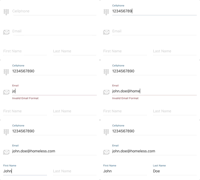
RYFlotingInput, inspired by "Floating Label Pattern" and implemented with RxSwift & mvvm pattern, provides a fully-customizable textfield input control along with a painless input text validation.
- Float label pattern
- Customization support: theme, color, icon
- Straightforward text input validation and callbacks
Available on CocoaPods. Simply add the following to your project Podfile, and you're good to go.
pod 'RYFloatingInput'- Drag a UIView instance into your UIViewController/UIView
- Change the class of the UIView instance to
RYFloatingInput. - Change the module of the UIView instance to
RYFloatingInput. - Link to the IBOutlet instance of your UIViewController/UIView.
Create an RYFloatingInput instance and add to superview
let floatingInput = RYFloatingInput(frame: frame)
self.view.addSubview(floatingInput)- Setting Builder
- Input Text Validation
- Theme & Color Customization
- Divider Height
- Icon / Placeholder / Secure Text
RYFloatingInputSetting is required for RYFloatingInput to work properly, which concise all the settings and customizations together into one single builder function. Here are the steps:
- Initialize
RYFloatingInputSettinginstance by usingRYFloatingInputSetting.Builder - Add features & customizations
- Setup
RYFloatingInputby createdRYFloatingInputSettinginstance
Example:
let setting = RYFloatingInputSetting.Builder.instance()
    .theme(.dark)
    .iconImage(UIImage(named: "image_name")!)
    .placeholer("I AM PLACEHOLDER")
    .secure(true)
    .build()

floatingInput.setup(setting: setting)Setting up text validation is totally painless in RYFloatingInput by simply adding .maxLength or .inputType implementation in setting builder and it's done. You can also customize warning message along with a callback event triggered at any invalid input occurrence. Complex delegation is not needed.
2 options for input Type validation:
.number- only accept numeric input..regex(pattern: String)- check input text with regular expression you want.
Example:
RYFloatingInputSetting.Builder.instance()
    .theme(.standard)
    .maxLength(8, onViolated: (message: "Exceed max length", callback: {
        print("Exceed max length")
    }))
    .inputType(.number, onViolated: (message: "Invalid input, number only", callback: {
        print("Invalid input, number only")
    }))
    .build()
Color Customization is implemented for almost every component in RYFloatingInput, such as background, divider, placeholer, divider, warning label, and input cursor.
Here are the color customization options provided:
RYFloatingInputSetting.Builder.instance()
    .backgroundColor(.clear)
    .textColor(.darkText)
    .placeholderColor(.lightGray)
    .dividerColor(.lightGray)
    .cursorColor(.blue)
    .accentColor(.cyan)
    .warningColor(.red)
    .build()
Normally, divider and floating label are displayed as accent color while highlighted, and will turn into warning color once invalid text input has entered.
Theme is a easier way to customize colors which covers all color options described above. 3 theme options are definded in RYFloatingInput.Theme:
.standard- default.light.dark
RYFloatingInputSetting.Builder.instance()
    .theme(.light)
    .build()
Please note that if theme and color customization, e.g. textColor, are both setup in builder, the text color from theme will be ignored.
3 divider height options are provided: .thin, .regular, .bold. Defaults to .regular.
RYFloatingInputSetting.Builder.instance()
    .dividerWeight(.thin)
.build()Setting input icon, placeholder, secure text options.
RYFloatingInputSetting.Builder.instance()
    .iconImage(UIImage(named: "image_name")!)
    .placeholer("I AM PLACEHOLDER")
    .secure(true)
.build()- Customizable divider height - v0.1.2
- Support customized font
- Multiple text validation conditions
- Activity indicator & asyncronous task completion event
RxSwift - Reactive Programming in Swift
RYFloatingInput is available under the MIT license. See the LICENSE file for more info.
Ray ChengJui YU - ray.cj.yu@gmail.com


