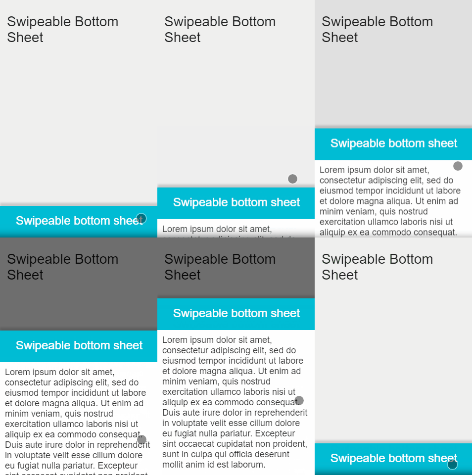
Swipeable Bottom Sheet
A swipeable material's bottom sheet implementation, that uses react-swipeable-views. This can be used to reproduce Material Design's Bottom Sheet guidelines
Installation
npm i -S react-swipeable-bottom-sheet
Demo & Examples
Usage
import SwipeableBottomSheet from 'react-swipeable-bottom-sheet';

<SwipeableBottomSheet overflowHeight={64}>
	<div style={{ height: '240px' }}>
		Here goes the content of your bottom sheet
	</div>
</SwipeableBottomSheet>
The bottom sheet's height (when open) scales automatically with its content. If it exceeds the window height, content become scrollable.
Props
| Name | Type | Default | Description |
|---|---|---|---|
| overflowHeight | number | 0 | The height (in px) of the sheet when closed. |
| open | bool | Use this property to enable controlled mode. If true, it will open the sheet. |
|
| defaultOpen | bool | false | If true, the sheet is open at component mount. |
| onChange | function(isOpen) | The callback that fires after sheet opens or closes. | |
| onTransitionEnd | function() | The callback that fires after opening or closing animation. | |
| fullScreen | bool | false | If true, the sheet takes the full height of the window when open. |
| marginTop | number | 0 | The top margin applied to the top of the sheet when open. Use this prop to prevent navbar overflow. |
| shadowTip | bool | true | If true, a box shadow is displayed at sheet bottom when closed. This is used to show that content is hidden below. |
| topShadow | bool | true | If true, a box shadow is displayed at sheet top border. |
| overlay | bool | true | If true, an overlay is displayed behind sheet when open. A click on the overlay closes the sheet. |
| scrollTopAtClose | bool | true | If true, the content is scrolled to the top when sheet closes. |
| swipeableViewsProps | object | {} |
Props passed to SwipeableViews component (see documentation). |
| style | object | {} |
Style applied on the root (non-swiped) component. |
| bodyStyle | object | {} |
Style applied on the body of the bottom sheet. |
| overlayStyle | object | {} |
Style applied on the overlay. |
Development (src, lib and the build process)
NOTE: The source code for the component is in src. A transpiled CommonJS version (generated with Babel) is available in lib for use with node.js, browserify and webpack. A UMD bundle is also built to dist, which can be included without the need for any build system.
To build the examples locally, run:
npm install
npm start
Then open localhost:8000 in a browser.
To build, watch and serve the examples (which will also watch the component source), run npm start. If you just want to watch changes to src and rebuild lib, run npm run watch (this is useful if you are working with npm link).
License
MIT
