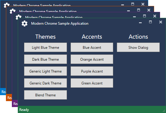
Modern Chrome is a library for .NET WPF applications that provides a custom ModernWindow base class for windows that mimics the look of Visual Studio 2017 with a custom chrome and glowing borders. The library does NOT (at least not yet...) provide styles and control templates for general controls and only styles the base window and its chrome.
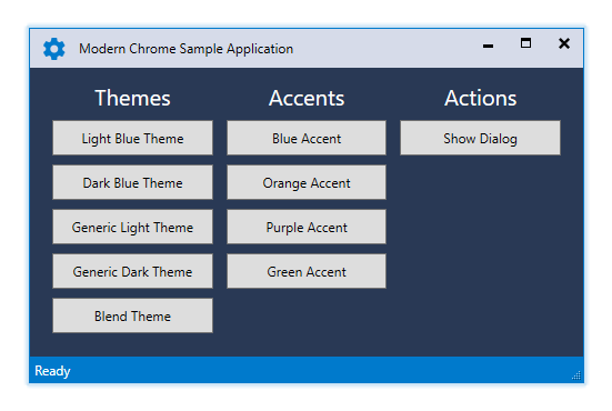
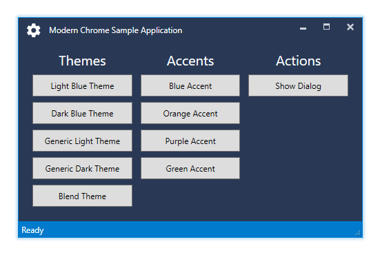
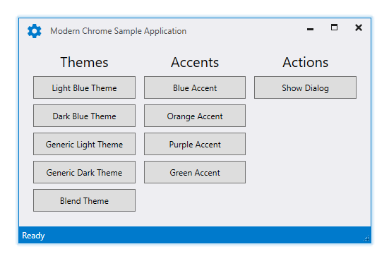
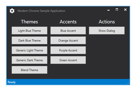
The library currently supports the five themes LightBlue, DarkBlue, Light, Dark and Blend.
The following screenshot displays the predefined accent colors which can be customized:
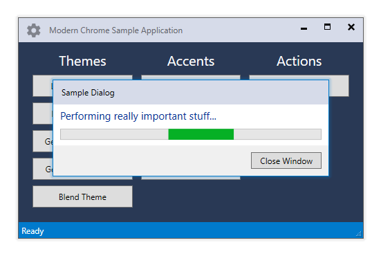
The following screenshot shows a sample dialog and how the main window in the background loses its colored border as well as having the icon and text appear in a disabled state:
Follow this short guide on getting started quickly - it is HIGHLY suggested to browse the sample application for further customization and usage.
- Download the source from the repository or download the NuGet package via the package manager.
- In your
App.xamlof your main application you have to add one of the available themeResourceDictionarieswith the following snippet while picking one of the available themes (IntelliSense will provide support for selecting a theme and you can either selectLightBlue.xaml,DarkBlue.xaml,Light.xaml,Dark.xamlorBlend.xaml):
<ResourceDictionary>
    <ResourceDictionary.MergedDictionaries>
        <ResourceDictionary Source="pack://application:,,,/ModernChrome;component/Themes/LightBlue.xaml" />
    </ResourceDictionary.MergedDictionaries>
</ResourceDictionary>- In your
MainWindow.xamlyou have to reference the ModernChrome namespace and change the window class toModernWindowin the XAML file (and yourMainWindow.xaml.csif you happen to redudantly explicitly inherit from the previousWindow):
<modern:ModernWindow x:Class="ModernChrome.Sample.MainWindow"
                     xmlns="http://schemas.microsoft.com/winfx/2006/xaml/presentation"
                     xmlns:x="http://schemas.microsoft.com/winfx/2006/xaml"
                     xmlns:modern="clr-namespace:ModernChrome;assembly=ModernChrome"
                     Title="Modern Chrome Sample Application" Height="350" Width="500">
    <!-- ... -->
</modern:ModernWindow>
namespace ModernChrome.Sample
{
public partial class MainWindow : ModernWindow // this can be dropped anyways
{
public MainWindow()
{
InitializeComponent();
}
}
}- Since this library is dependendant on the Microsoft.Expression.Interactions library from the Expression Blend SDK you might get a bunch of localization folders in your project output. I suggest going into your project properties under Build Events and adding the following post-build event command line to be executed On successful build (adjust as necessary if you happen to have either more or less folders):
RMDIR "$(TargetDir)en/" /S /Q
RMDIR "$(TargetDir)es/" /S /Q
RMDIR "$(TargetDir)fr/" /S /Q
RMDIR "$(TargetDir)it/" /S /Q
RMDIR "$(TargetDir)ja/" /S /Q
RMDIR "$(TargetDir)ko/" /S /Q
RMDIR "$(TargetDir)ru/" /S /Q
RMDIR "$(TargetDir)zh-Hans/" /S /Q
RMDIR "$(TargetDir)zh-Hant/" /S /Q
- Currently the library is dependent on alpha builds of MahApps.Metro and you will most likely get the following NuGet warning:
NU1602 MahApps.Metro 1.6.0-alpha0XXX does not provide an inclusive lower bound for dependency ControlzEx (> 3.0.2 && < 4.0.0). An approximate best match of ControlzEx 3.X.X.X was resolved.
Until this gets fixed by the developer of MahApps.Metro you can supress this warning by going to your project properties and adding NU1602 under Build and Suppress warnings.
The application theme can be selected via the ResourceDictionary imported in the App.xaml or during runtime by calling
ModernChrome.ThemeManager.ChangeTheme(Application.Current, theme);where theme is a string to an available theme. Currently you can select LightBlue, DarkBlue, Light, Dark or Blend. Previously loaded themes are automatically removed from the Application.Resources.MergedDictionaries and the new theme is injected automatically.
Furthermore you can track theme changes during runtime through the exposed ModernChrome.ThemeManager.ThemeChanged event which provides a ThemeChangedEventArgs holding the name of the newly loaded theme. Listening to the event is showed in the sample application:
ModernChrome.ThemeManager.ThemeChanged += (sender, args) =>
{
    if (args.Theme != "Light")
    {
        ThemeText.Foreground = Brushes.White;
        AccentText.Foreground = Brushes.White;
        ActionText.Foreground = Brushes.White;
    }
    else
    {
        ThemeText.Foreground = Brushes.Black;
        AccentText.Foreground = Brushes.Black;
        ActionText.Foreground = Brushes.Black;
    }
};
Although the themes do provide a Background color for ModernWindows you can define your custom color if necessary, it won't be overwritten.
ModernWindow provides a default status bar if you don't disable it manually via the ModernWindow.ShowStatusBar dependency property. Both the status bar color and the glowing border are bound to the ModernWindow.BorderBrush property.
If you opt-in to use the default status bar that comes with the library you can add controls to it via the ModernWindow.StatusBar dependency property:
<modern:ModernWindow.StatusBar>
    <TextBlock VerticalAlignment="Center">Ready</TextBlock>
</modern:ModernWindow.StatusBar>
The ContentPresenter that displays your custom content stores the current suggested Foreground via TextBlock.Foreground="{DynamicResource StatusBarTextBrushKey}" and thus making sure that TextBlock controls always inherit a color that will be readable IF you use default BorderBrush colors. Otherwise you have to adjust the colors yourself.
Once again the themes do provide a default BorderBrush color for ModernWindows but you can define your custom color if necessary, it won't be overwritten.
The window icon, internally refered to as caption icon, can be hidden using the ModernWindow.ShowCaptionIcon property which is useful for dialog windows. The window title bar will adjust accordingly depending on the value of the property.
A custom caption icon is automatically displayed with the dimensions 20 x 20 and it is recommended to use a Path control for scalable icons. Similiar to the status bar you can define your icon as follows:
<modern:ModernWindow.CaptionIcon>
    <Path UseLayoutRounding="True" SnapsToDevicePixels="True" Stretch="UniformToFill"
          Fill="{Binding Path=(TextBlock.Foreground), RelativeSource={RelativeSource AncestorType={x:Type ContentPresenter}}}"
          Data="..." />
</modern:ModernWindow.CaptionIcon>
You might wonder about the Fill="{Binding Path=(TextBlock.Foreground), RelativeSource={RelativeSource AncestorType={x:Type ContentPresenter}}}". The different themes used in the library have different colors depending on the Window.IsActive value. E.g. with the LightBlue theme my icon will generally appear in blue unless the window has lost focus which turns the icon gray. It is suggested to bind against this color in order to visually highlight when the window has lost focus.
Usually a window enables or disables those buttons depending on the value of Window.ResizeMode however ModernWindow handles this slightly different, since it does not only disable those buttons, it removes them entirely. Furthermore it provides the ModernWindow.ShowCloseButton property to hide the close button as well for convenience which would usually need P/Invoke calls. Keep in mind though, that Alt + F4 will most likely still work and you have to intercept the Closing event and abort it if necessary.
The library does not reinvent the wheel, it only combines and strips the functionality of the following available packages:
It is highly recommended to switch the default package management format of NuGet to PackageReference in order to reduce clutter and collisions with other projects.
MetroChrome reuses the BorderlessWindowBehavior and a customized GlowWindowBehavior from the MahApps.Metro library to provide a window that can be easily resized and handled using AeroSnap and has a glowing border.
Neither I nor the ModernChrome library are affiliated with, sponsored by, endorsed or approved by Microsoft. This project only mimics the style of Visual Studio and provides resources for custom applications.
Visual Studio and its logo are registered trademarks of the Microsoft Corporation.
This project is licensed under the MIT License.


