GuidedTour Extension for Qlik Sense Client
[Version History] [Found a bug?] [License]
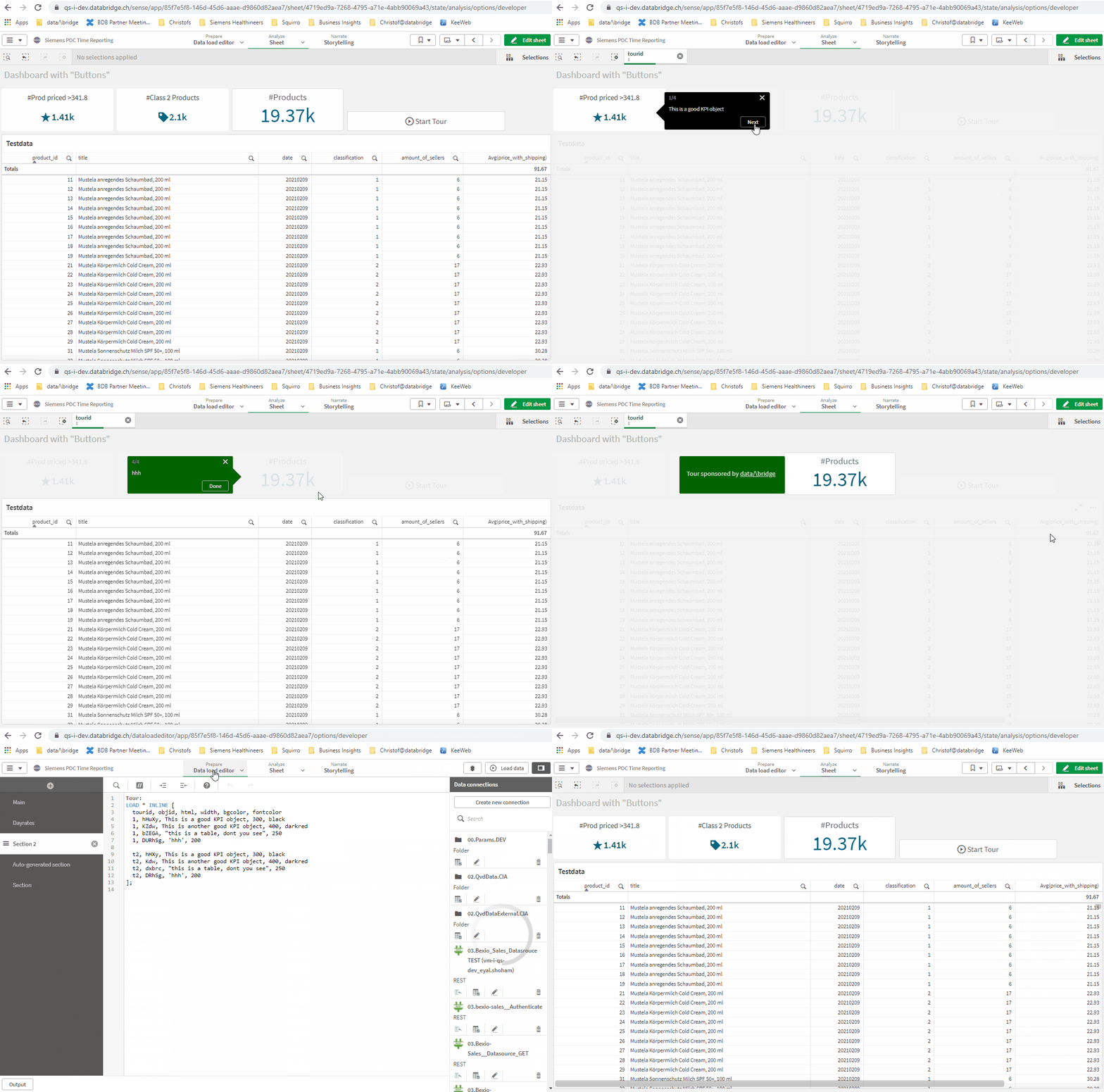
This extension allows to make a tour of styleable tooltips (text bubbles) which highlight certain objects on a worksheet.
Getting started
To render, it requires a data table loaded by data manager or load script with at least 2 colums:
- Qlik objectId (or a css selector found on that page)
- Text for tooltip (can contain html tags, good for formatting or hyperlinks)
Note: Supported are up to 4 columns. So you can add up to 2 more columns (see Advanced Use of attributes)
Click on the Sense objects to create a tour
Press the button "Select Objects for tour" in the Extension Settings. When you click this, every object will get a "PICK" button and the Tour Extension gets a "DONE" button. Click on the PICK buttons in the sequence you want to write help text for them, finally click on DONE and copy/paste the IDs to your source table of the tooltip help.
Qlik Container objects are taken care of separately, each tab of a container can be chosen as a target for the tooltip. When the tour plays, it also opens the respective tab in the container.
Advanced users can also use all CSS selectors to position the tooltip (#id, .class, tag-selectors, ...) next to an element in the DOM of the Sense Client page. You may want to use the browser's development tools (F12) for that and you should have experience with css selectors.
Choose the mode of operation
If it is the first time, go for the default "Click to run tour". That is license-free and simply runs the tooltips from the first to the last.
There are 4 more modes (some are premium features and need a license) with advanced behaviours
- Move mouse over objects (premium)
- Auto-launch tour always (standard)
- Auto-launch tour once (premium)
- Auto-launch tooltips once (premium)
Select the right tour if you have multiple
If you have multiple tours in the application, also introduce a tour-id column in the data table and group those tooltips that belong together with the same id, eg Tour1, Tour2, Tour3 .... Under the settings "Select A Specific Tour" you can specify which tour belongs to the current tour button.
Basic styling of button and tooltips
To style the tour button itself there is a section "Button Text & Color". Also, you may adopt the texts for "Start Tour", "Next" and "Done" links.
To style the tooltips there is a section "Tooltips Texts & Colors", where you can set the default font color and background color and more css styles. However, you can also deliver styles per tooltip (so you have altering colors per tooltip) with the following steps:
Advanced styling per tooltip
- Add another column called something like "attributes" to the data table. This field has to be in JSON format where you can define further layout for a tooltip, e.g.
{"css":"color:#0a0b1c;background-color:rgb(45,45,45);width:400px;"} - Reload the app and add the new attribute column to the "Dimensions" part of the extension settings
- Go to the properties section "Tooltips Texts & Colors" and in the dropdown "More attributes in dimension" choose the dimension you just added.
Those tooltip attributes will overrule the default settings in the "Tooltips Texts & Colors" if provided.
Support of Multi-language
Like any other object, the dimension could be dynamically be calculated. That allows for example the text of the tooltip in different languages, based on a formula with a
variable. E.g. the 2nd dimension is =tooltip.$(vLanguage) and the variable vLanguage has values like "en" or "fr", it picks a different fields tooltip.en or tooltip.fr
Licensed Version
The licensed version gives you support, removes the ad ("sponsored by data/\bridge") at the end of a tour, and enables the advanced modes.
Read more here
Known limitations
- In small-device mode of the Sense Client, the tooltips do not render nicely.
- Hover-mode doesn't work in /single integration
- Currently Internet Explorer is not supported
