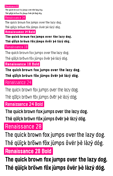
A (mostly) metrically compatible replacement for Raster Gothic Condensed in Pebble font format.
Please see the wiki for more information.
Renaissance needs to be mostly metrically compatible. This means that the
entire basic ASCII set & symbols should have the same advance number and the
same baseline/x-height/etc. However, some Latin-extended characters, such as
those with certain diacritics, may be slightly different.
In order to improve legibility, Renaissance 9 explicitly does not follow the goal of metrical compatibility.
I'm by no means a type designer. If you'd like to raise any concern about the font (especially concerning diacritics), please let me know!
Here are some guidelines for Renaissance's design:
- No stroke modulation (all strokes in a glyph should be the same width)
- Except diacritics & certain characters like @, especially in small sizes.
- Grotesque-ish style
- Comparatively short ascenders/descenders (1/3 to 1/2 x-height.)
- Legibility is just as important as consistency.
- When a diacritic can't be centered over a character, move it right.
- Except characters like g where it might interfere (e.g. double-story lowercase g)
- All characters should be available in all fonts (some fonts are
missing the
×character)- Exception: Renaissance 9 needn't contain all diacritics because they may be hard to tell apart at that size.
- Carons must always be distinguishable from breves. (NB: Breves don't exist in 09.)
- Renaissance aims for friendlier-looking lowercase letters like
bin large sizes, meaning that the curvature of the bowl should be the same on both sides.
To my best understanding, only outline fonts are protected by US intellectual property law. Nevertheless, Renaissance is a from-scratch remake of Gothic Condensed—not a simple copy of it. Either way, most characters will look similar, and others will even be the exact same: there simply aren't infinite ways to represent a given character within a given bitmap.
