🚀 Deployed Frontend Site
💻 Deployed API
🔗 API Repo
- Paws&Snaps
Paws & Snaps is a dedicated platform for pet lovers and enthusiasts, offering a vibrant space to share stories, tips, and experiences related to our furry friends. Inspired by the unconditional love and joy that pets bring to our lives, Paws & Snaps aims to foster a supportive community where pet owners can connect, learn, and celebrate the bond with their beloved companions.
Key Features:
- Blogging Platform: Share your pet-related stories, adventures, and insights through engaging blog posts enriched with photos.
- Interactive Community: Connect with fellow pet lovers through likes, comments, and sharing posts, creating a dynamic and interactive environment.
- Search and Discovery: Explore a wide range of pet-related topics, from training tips to heartwarming rescue stories, using intuitive search and discovery tools.
- Personalized Profiles: Customize your profile to showcase your pets, interests, and contributions to the community, fostering connections with like-minded individuals.
The five planes of Website Design were followed in the creation of this project.
Our strategy is to develop a blogging website tailored for pet lovers and enthusiasts, providing a platform where they can share their experiences, stories, and insights related to their beloved pets. With a focus on fostering a sense of community and connection among pet owners, Paws & Snaps aims to be a go-to destination for all things pets.
Key Features:
-
Pet-Centric Blogging: Users can create and share blog posts centered around their pets, including stories, tips, advice, and humorous anecdotes, creating a vibrant and diverse collection of content.
-
Interactive Features: To encourage engagement, users have the option to include photos, videos, and interactive elements in their blog posts, making the content more visually appealing and immersive.
-
Search and Discovery: Users can easily search for blog posts by pet type, topic, or author, allowing them to discover new and relevant content that aligns with their interests and preferences.
-
User Profiles: Each user has a personalized profile where they can showcase their pets, manage their blog posts, and connect with other pet owners through comments.
By focusing on these key features, Paws & Snaps aims to create a vibrant and inclusive online community where pet lovers can come together to share their passion, experiences, and knowledge, ultimately enriching the lives of both pets and their owners.
For more details on the user stories go to the projects KANBAN board
First Sprint
Create an account & Login
- Landing Page
- Navbar
- Create Account
- Log in
- Log out
- Remain logged in
Second Sprint
Creating Articles
- Create Article
- View Article
- Update a Article
- Delete Article
- Search Article
Third Sprint
Profile pages
- Edit Profile
- Change Password
- User Profiles
Fourth Sprint
Comment on a Article
- View comments
- Edit a Comment
- Delete a Comment
General
- Responsive site.
- Simple user navigation.
- 404 page.
- Purpose:
Paws & Snaps aims to serve as a comprehensive blogging platform catering specifically to the needs and interests of pet owners and enthusiasts. The platform provides a space where users can share their pet-related experiences, stories, and insights, fostering a sense of community and connection among pet lovers worldwide.
- Target Audience:
The primary target audience for Paws & Snaps includes:
Pet owners: Individuals who own pets and are passionate about sharing their experiences, tips, and advice related to pet care, training, health, and lifestyle. Pet enthusiasts: People who have a keen interest in pets and enjoy reading and engaging with pet-related content, even if they do not currently own a pet themselves. Animal lovers: Individuals who are passionate about animals and enjoy learning about different types of pets, breeds, and animal welfare issues.
- Core Functionalities:
User Registration and Profile Creation: Users can register on the platform and create personalized profiles, including information about themselves and their pets. Blog Post Creation and Publishing: Users can create and publish blog posts centered around their pets, including text, images, videos, and interactive elements. Commenting and Engagement: Users can engage with other users' blog posts through comments, likes, and follows, fostering interaction and community building. Search and Discovery: Users can easily search for pet-related content by keyword, category, or author, allowing for seamless content discovery and exploration.
For the database schema visit the Backend API Repo
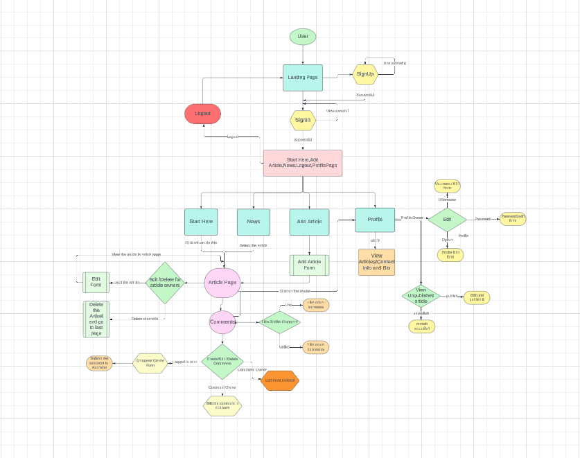 The sitemap was made using Lucid Chart
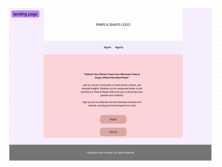
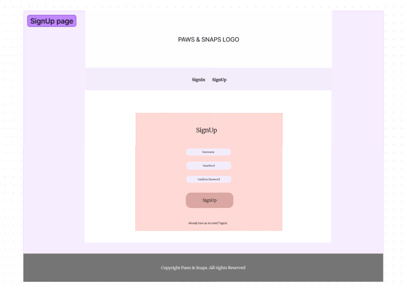
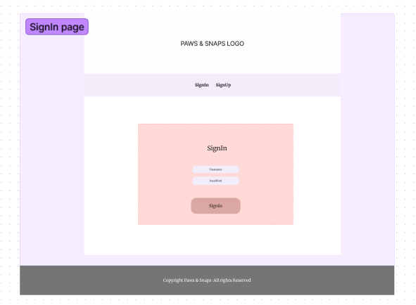
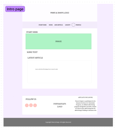
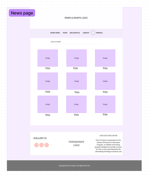
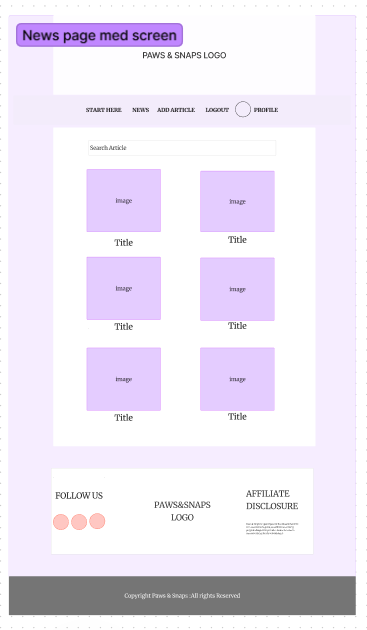
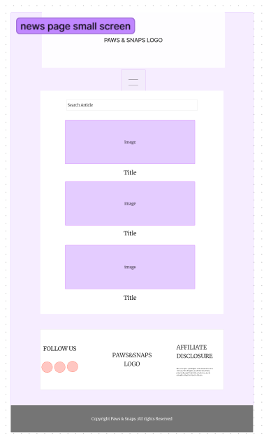
Figma was used to create the wireframes.
Color and themes for Paws & Snaps were carefully selected to evoke a sense of warmth, playfulness, and love for pets. The primary colors used in the theme are black and pink, with accents of white to provide contrast and balance. The theme revolves around a prominent paw print design with a heart inside it, symbolizing the deep bond between pets and their owners.
 The color palette for Paws & Snaps includes the following colors:
Black (#000000): Represents elegance, sophistication, and the timeless bond between humans and animals. Pink (#FF69B4): Symbolizes love, affection, and the joy that pets bring into our lives. White (#FFFFFF): Provides contrast and balance, creating a clean and modern aesthetic.
Fonts play a crucial role in shaping the visual identity of Paws & Snaps, reflecting the platform's personality and values. For Paws & Snaps, two distinct fonts were selected to create a harmonious and engaging user experience.
Oswald:
Purpose: Oswald is utilized for headings, titles, and other prominent text elements throughout the platform. Its bold and modern appearance conveys a sense of strength, reliability, and professionalism. Characteristics: Oswald is a sans-serif font with clean lines and geometric shapes, making it highly legible and suitable for display purposes. Attributes: Its condensed letterforms and ample spacing provide visual impact and readability, ensuring that important information stands out effectively.
Anek Devnagri:
Purpose: Anek Devnagri is employed for body text, paragraphs, and other smaller text elements, offering a balanced and cohesive typographic hierarchy. Characteristics: Anek Devnagri is a versatile Devanagari script font that combines traditional elements with modern design sensibilities. It reflects the cultural richness and diversity associated with pet ownership. Attributes: With its clear and legible letterforms, Anek Devnagri enhances readability across various devices and screen sizes, fostering a seamless reading experience for users who prefer Devanagari script. By integrating Oswald and Anek Devnagri into the design of Paws & Snaps, the platform achieves a harmonious blend of contemporary aesthetics and cultural inclusivity. These fonts contribute to a visually appealing and accessible interface that resonates with the diverse audience of pet lovers and enthusiasts.
This component has 2 uses and has been used a number of times throughout the site.
- Display a loading icon when fetching data from the API
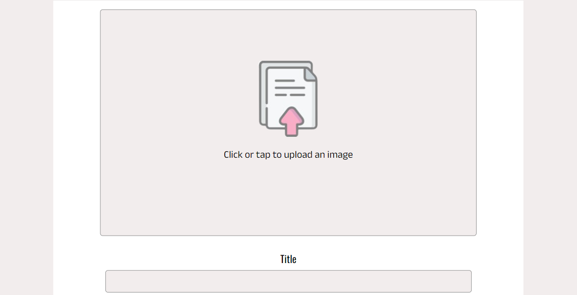
- Display an image with text, this was used on the create a highlight form for the upload image, when there are no highlights to display on the highlights page
The props are:
- spinner: if passed in a loading animation will be displayed
- src: url for an image
- message: text to go with the image
The avatar component is used throughout the site for users avatar and their username. It take the following props:
- src: a link to the image url
- height: default set to 45px
- text: Text displayed in the image is not shown. Default is set to avatar
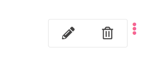
The components are shown as 3 dots when a user is able to make changed to something, like an article, comment or their profile. Clicking on the dots will show a dropdown menu with options for the user.
MoreDropdown options:
- Edit an Article
- Delete an Article
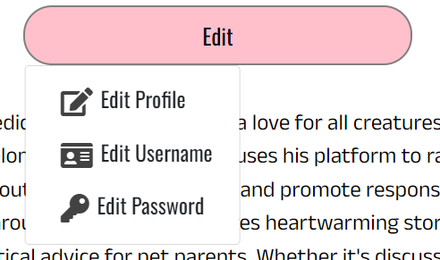
ProfileEditDropdown
- Edit profile
- Edit username
- Change password
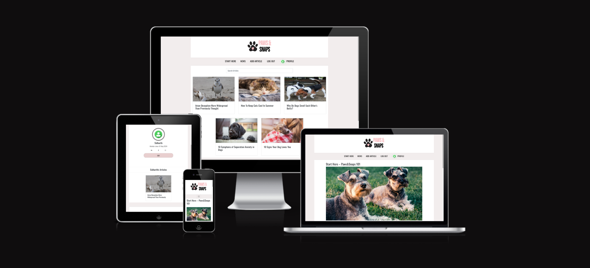
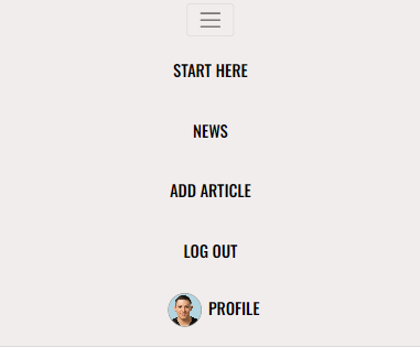
The navbar is displayed on every page on the site, but will show different options for a logged in user to a non logged in user as well as on mobile and desktop devices.
Desktop - signed in
A signed in user will see the options to:
- Start here to visit the home page
- News to see all the Articles
- Add an Article
- Sign out
- Visit their profile via the avatar
Desktop - signed out
A user who is not signed in will see the following options:
- Sign in
- Sign up
Mobile - signed in
Users on a mobile device will have the same options but via a hamburger menu
Mobile - signed out
The signed in user will be able to see a footer component containing social media icons, logo and affiliate disclosure. It will be displayed in a column on small screen.

The copyright container is displayed throughout the website to all users.
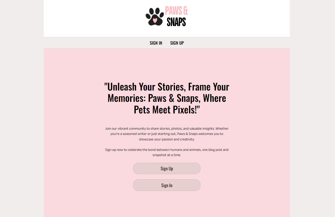
The first page a user sees when navigating to the site is the landing page with:
- Information on the site
- Links to sign up sign in for users who are not logged in
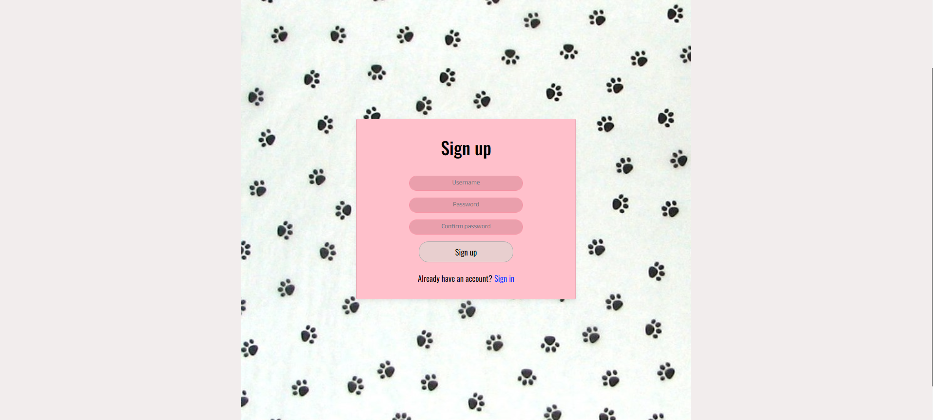
This page is accessible for non signed in users via the navbar. For all user it displays:
- A sign up form at the center
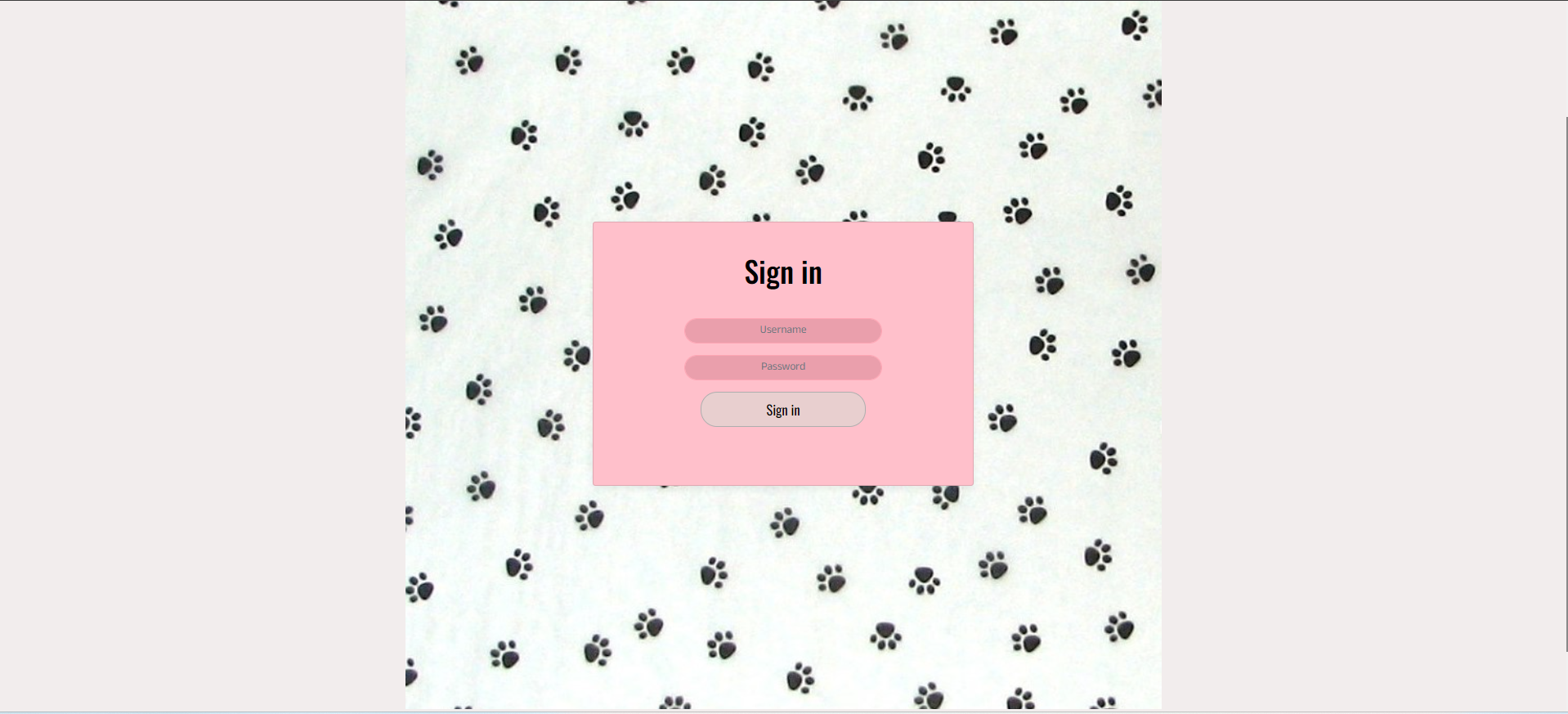
This page is accessible for non signed in users via the navbar. For all users it displays:
- A sign in form at the center
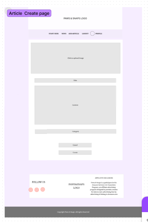
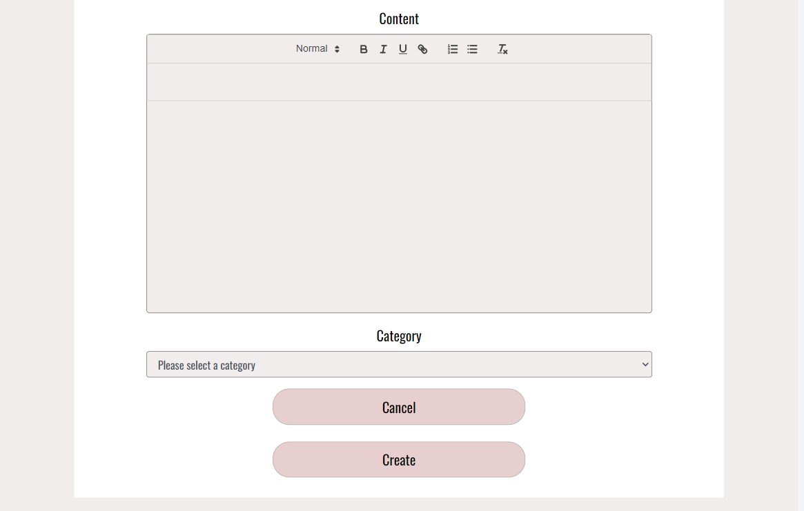
A logged in user will be able to create an article from the navbar and will be taken to a form with the options to add the following things to their article:
- Image: add an image from the users device
- Title
- Content
- Category: a dropdown list of predefined categories
The date and Time will be automatically added.
React Quill Editor is used to enter the article which provides the ability to add headings of different sizes, use font styles like Bold, Italics and Underlined , Bullet points and numbers and attach links to words.
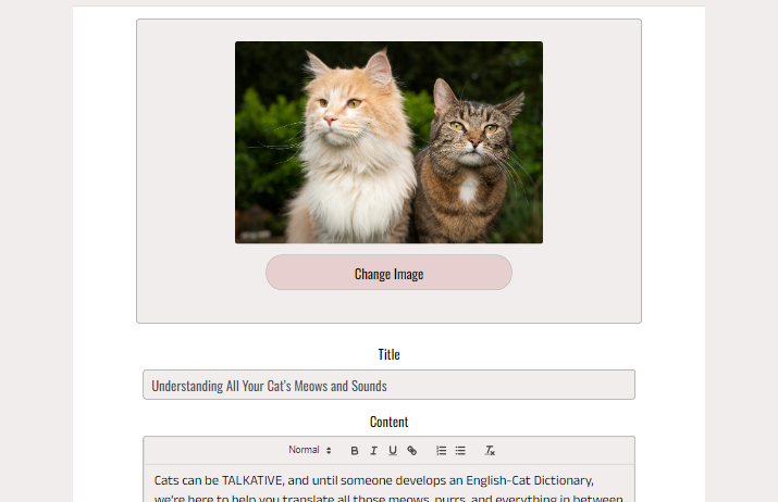
A user can edit one of their highlights via the dropdown menu in the article page. They are taken to a pre-populated article form containing the details of the highlight that can be modified.
From the dropdown menu on a users Article they also have the option to delete the Article. Clicking on this will remove it from the site and the database then redirect the user to their last page.
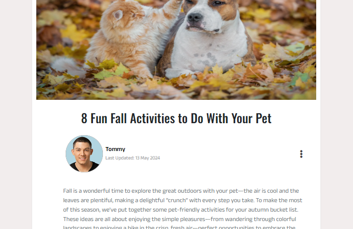
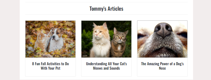
Once an Article has been created it will show up on the news page and profile page. From those pages the image will take a user to a page for the article containing more details and any comments.
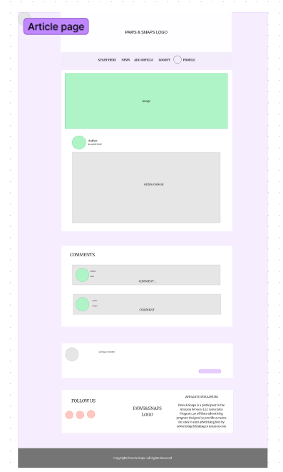
The Article page will show the following information:
- Author
- Date
- Title
- Image
- Content
- Comments
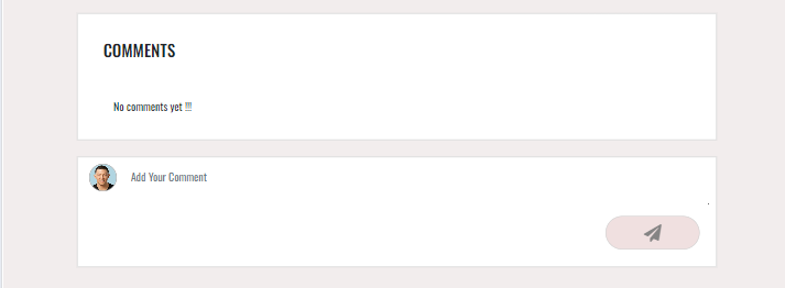
A signed in user can add a comment to an article from the Article detail page. The comment will be displayed under the Article and can be edited or deleted by the author via the dropdown menu. Comments are displayed newest to oldest from top to bottom and have an infinite scroll component so users don't have to click to a new page to view more comments. The owner of the article cannot comment on his own article.
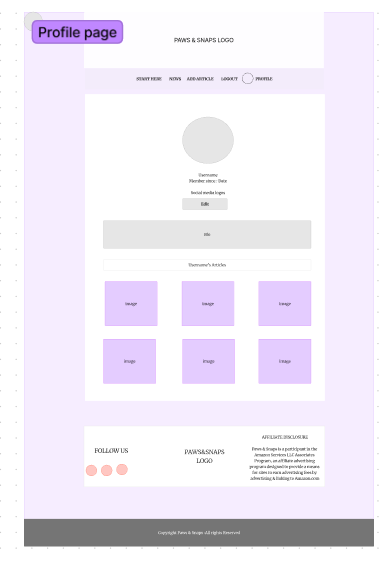
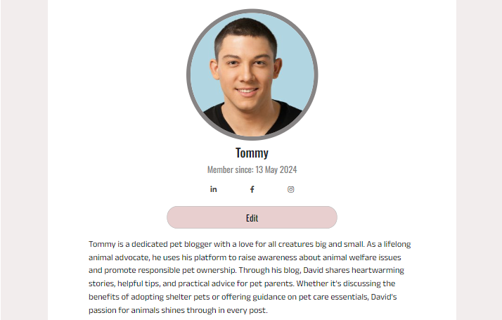
Each user has a profile page that they can access from the navbar, accessing a different users profile can be done by clicking on their avatar from one of their articles or comments. The users profile contains the following information:
- Username
- Profile image
- A bio
- Links to their facebook, Instagram and Linked-in
- Their Articles
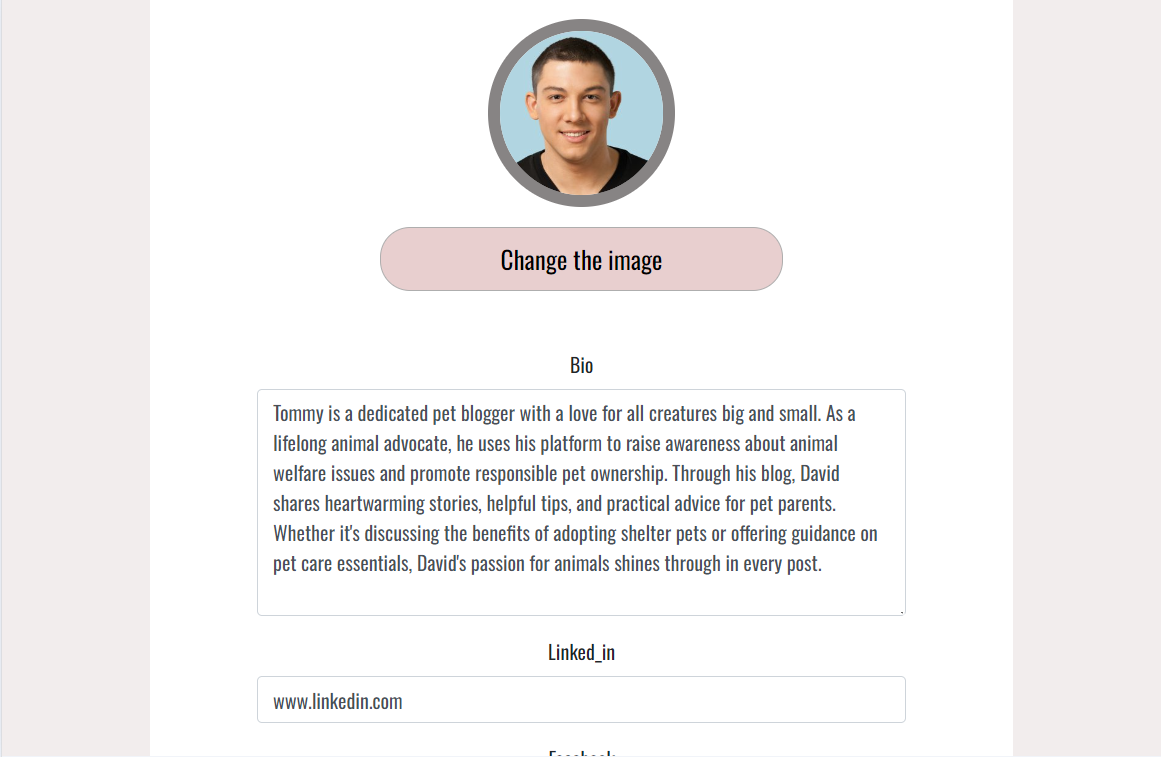
A user can edit their own profile by clicking on the edit button at the top of their profile. The following things can be added or changed:
- Username
- Bio
- Links to social media accounts
- Profile image
- Password
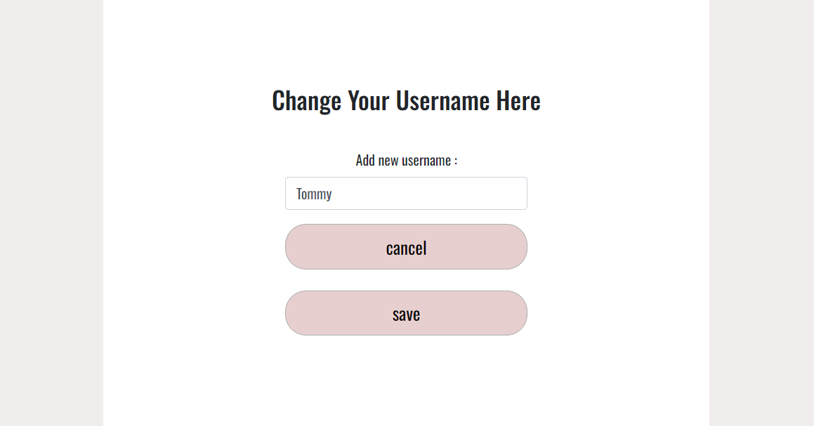
Change Username
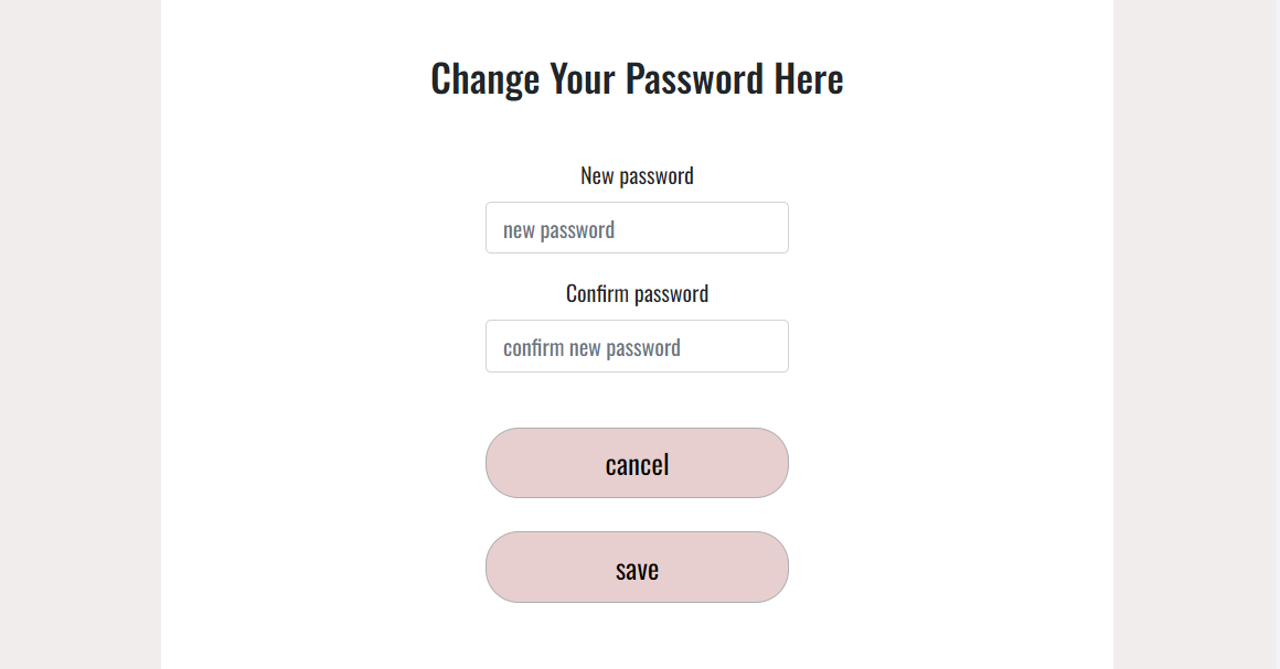
Change Password
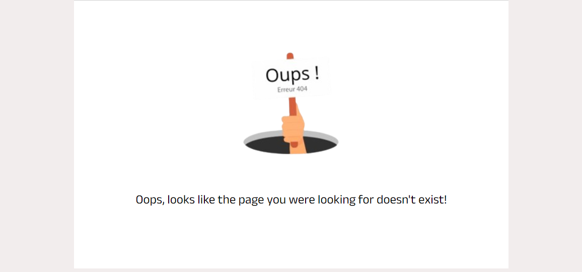
If a user navigated to an invalid url a custom 404 page will be displayed
 If the user searches for a user or article which does not exists a no result found page will be displayed.
If a user has no article in their profile an empty folder page will be displayed
- HTML
- CSS
- JavaScript
- Django Rest Framework - Backend API
- React - Library for JS
- React Bootstrap - CSS libraby
- Canva - Wire-frame and design
- GitPod - Virtual IDE
- GitHub - Repo hosting
- Heroku - Deployment
- Font Awesome - Icons
- Google Fonts - Fonts
- LucidChart - Development of flowchart
- Chrome Dev Tools - Development and bug fixing
- Favicon.io - Favicon conversion
- React Router - Dynamic routing
- React Quill-for editing the article.
- React Infinite Scroll - for instant loading and infinite scrolling
- Axios - Promise-based HTTP requests
- Adobe Color - Color Palette
- Am I Responsive? - Multi-device mockup
Validation:
- WC3 Validator - validate the html
- Jigsaw W3 Validator - validate the css
- ESLint - validate JS code
- Lighthouse - validate performance, accessibility, best practice and SEO
- Code Institute Moments walkthrough
- React Bootstrap Docs
- Stack Overflow
- Slack Community
For details on testing and validation view the dedicated testing.md file.
-
Create a new repository in GitHub.
-
Create new workspace by clicking
Gitpodbutton. -
Once workspace has loaded, run terminal command to create React app.
npx create-react-app . --use-npm
- To install Bootstrap, run terminal command
npm install react-bootstrap@1.6.3 bootstrap@4.6.0
- To run the app type the command
nvm install 16 && use 16
then
npm start
- Once the app is installed, run terminal command npm start to check app is working. Browser should open with the spinning React logo on a dark blue background.
- Go to
Settingsand ensure that heroku/nodejs buildpack is present. If it is not, click onAdd Buildpack, selectnodejsand save changes. - Click on the
Deploytab and go toDeployment Method. Click onGitHub. - Go to
App connected to GitHuband search for the relevant repository. Select that repository and clickConnect. - Go to
Manual Deploysection and clickDeploy Branch. Click onbuild logsto monitor build and ensure deployment is successful. Build is complete when log statesBuild succeeded!. - Click
Open Appbutton to view newly deployed app.
- Go to the GitHub repository
- Click on
Forkbutton in top right corner - You will then have a copy of the repository in your own GitHub account.
- Go to the GitHub repository
- Click the
Codebutton above the list of files - Highlight the
HTTPSbutton to clone with HTTPS and copy the link - Open the command line interface on your local computer
- Change the current working directory to the one where you want the cloned directory
- Type git clone and paste the URL from the clipboard
git clone https://github.com/sari-rahul/Pawfect-Pics
- Press Enter to create your local clone
The article were taken from different online blogs like Puppy leeks and Pet Blog.
The design of this website was inspired from two website namely PuppyLeaks and PetBook
This project was inspired by the Code Institute moments walkthrough project. I have added the code for the front-end to fit functionality and the backend modules have been changed as per needs.
- My Mentor Jubril Akolade for his advice and guidance throughout the project.
- Mimmi Stokkvinnan for testing this project.
- Tutors at Code institute for their support.
