PureSwiftUI is a Swift package designed to enhance the experience of writing SwiftUI code. An additional goal is to make these changes as intuitive as possible, requiring little to no experience with the package to begin using its advantages in ernest.
- Motivation
- TL;DR
- Intention Focused Modifiers
- Simplified Common Usage
- Navigating Coordinate Spaces
- Conditional Modifiers
- Conditional Rendering
- SF Symbols
- Preview Extensions
- PureSwiftUIDesign
- Caveats
- Installation
- Versioning
- Version History
- Licensing
- Contact
We all love SwiftUI, and what the engineers at Apple have achieved is nothing short of ground-breaking. Often, however, a View can become cluttered with argument labels, type coercion, and various other aspects of day-to-day View creation that tend to get in the way of the design. With SwiftUI being a design language as much as anything else, PureSwiftUI was created to remove as much code external to intent as possible while retaining the expressiveness of the base API. As someone who exclusively writes views in code, a secondary consideration was to reduce the amount of typing as much as possible.
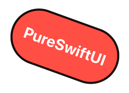
To demonstrate some of the advantages, let's say you want to generate the following label:
The code below shows how you would generate this label, including a small offset, comparing the native SwiftUI code to that of PureSwiftUI.
//...

private let width: CGFloat = 200
private let height: CGFloat = 100
private let xOffset: CGFloat = 10
private let yOffset: CGFloat = 10
private let rotation: CGFloat = 20
private let scale: CGFloat = 1.1
private let opacity: Double = 0.9

//...

// native SwiftUI

Text("PureSwiftUI")
    .font(Font.title.bold())
    .foregroundColor(.white)
    .frame(width: width, height: height)
    .background(Color.red)
    .clipShape(Capsule())
    .overlay(Capsule().stroke(Color.black, lineWidth: 4))
    .rotationEffect(.degrees(rotation))
    .offset(x: xOffset, y: yOffset)
    .scaleEffect(scale)
    .opacity(opacity)

// with PureSwiftUI

TitleText("PureSwiftUI", .white, .bold)
    .frame(width, height)
    .clipCapsuleWithStroke(.black, lineWidth: 4, fill: Color.red)
    .rotate(rotation.degrees)
    .offset(xOffset, yOffset)
    .scale(scale)
    .opacity(opacity)
As you can see the difference is dramatic, favouring design over implementation boiler-plate.
As shown in the previous example, by removing many of the explicit argument labels, the clarity of the code is increased. In most cases the modifier name is expressive enough to document the code without needing argument labels. Including them, in my opinion, only reduces readability.
Since these modifiers are used frequently by even casual coders, it's reasonable to assume that familiarity with how they behave is more than enough to bridge any reduction in auto-documentation.
For example, if you only want to set the width and offset something horizontally you would do this in SwiftUI natively:
.frame(width: 100)
.offset(x: 50)
With argument labels, about a third of this code could be considered noise. In addition, you're calling the frame modifier, but you only want to set the width. PureSwiftUI tackles this in the following way:
.width(100)
.xOffset(50)
Another area that is improved is for components that don't expand to fill all available space by default; Text is a good example of this. Ordinarily you would achieve this like so:
Text("Some expanding text")
    .frame(maxWidth: .infinity, maxHeight: .infinity)
This is accomplished in the following way in PureSwiftUI:
Text("Some expanding text")
    .greedyFrame() // or .greedyWidth / .greedyHeight
which I believe is a clearer expression of the intent.
When using images we almost always set the image to resizable, then we set the scaling aspect ratio followed by the frame size. PureSwiftUI packages this into one simple yet descriptive modifier:
// native SwiftUI
Image("my-image")
    .resizable()
    .scaledToFill() // or scaledToFit
    .frame(width: 200, height: 100)

// with PureSwiftUI
Image("my-image")
.resizedToFill(200, 100) // or resizedToFitNow I realise that clipping a shape is no great hardship. However, providing dedicated modifiers for each shape also allows for the content to be matched to that shape. In other words by using a specific clip shape modifier you don't need to restrain the content in a separate step (This can be set to unconstrained if required).
So the following code achieves the same result:
// native SwiftUI
.clipShape(RoundedRectangle(cornerRadius: 10))
.contentShape(RoundedRectangle(cornerRadius: 10))

// with PureSwiftUI
.clipRoundedRectangle(10)
Going further, stroking and filling shapes is a regular operation that results in rather obfuscated code once again detracting from the intent: to create a stroked shape. Going back to the example from the tl;dr section, if you ignore the transformative modifiers and just look at the styling, you can see what a difference it can make:
... properties

// native SwiftUI
Text("PureSwiftUI")
    .font(Font.title.bold())
    .foregroundColor(.white)
    .frame(width: CGFloat(width), height: CGFloat(height))
    .background(Color.red)
    .clipShape(Capsule())
    .overlay(Capsule().stroke(Color.black, lineWidth: 4))

// with PureSwiftUI
TitleText("PureSwiftUI", .white, .bold)
    .frame(width, height)
    .clipCapsuleWithStroke(.black, lineWidth: 4, fill: Color.red)
Not only is the code more understandable, but it's also a lot quicker to write!
Frame is a concept in PureSwiftUI that embodies a region of a certain size. Oftentimes we find ourselves writing some styling code for a simple RoundedRectangle with a blue background color in one variation of the following:
// native SwiftUI
Color.blue
    .frame(width: 100, height: 60)
    .cornerRadius(10)

RoundedRectangle(10)
    .fillColor(.blue)
    .frame(width: 100, height: 60)

Spacer()
    .frame(width: 100, height: 60)
    .background(Color.blue)
    .cornerRadius(10)
So far so normal. But all we want is a frame of a certain size, and this inconsistency betrays the intention. Is it a Rectangle? A Color? A Spacer? No, it's just a frame, so for this kind of scenario - and it comes up a lot - you can simply use Frame like so:
Frame(100, 60, .blue)
    .cornerRadius(10)
The same argument types can be passed to Frame that can be passed to the frame modifier extensions so it's extremely flexible, descriptive, and concise.
A common issue when using GeometryReader is that it is a view that will grab all available space in the parent, much like Color. This means when we wrap a View or element that takes up less space than is offered by the parent in a GeometryReader we essentially change the layout which of course is undesirable.
The PureSwiftUI answer to this problem is the geometryReader modifier that calls back with the same GeometryProxy object that can be probed for sizing or location information specifically for the view in question without affecting the layout, like so:
Text("What's my size?")
    .geometryReader {(geo: GeometryProxy) in
        //geo.size
        //geo.localMidX
        //geo.localCenter
        //geo.globalMinX
        //etc
    }
As an aside, there are numerous GeometryProxy extensions in PureSwiftUI giving access to the various local or global frames for convenience.
The ability to constrain GeometryReader in this way is utilised to provide some powerful modifiers.
While you can of course position elements to your heart's desire, this will fundamentally change the layout of the View in question. On top of that, you cannot conditionally place something, since the position modifier requires a default value to fall back on, which would be the original position of the View. You can obtain this using the geometryReader, but there's a problem. By manually setting the position, the origin changes!
To combat this problem, PureSwiftUI offers the offsetToPosition modifier allowing you to set the position of a View to an absolute position within any coordinate space without the need to know anything about the current position or size of the View you're offsetting. There are of course extensions for conditional flavours of this modifier as well as restricting the movement to the x or y axis.
Additionally you are able to specify an anchor to which to apply the positional offset. If I wanted to conditionally place the bottom trailing corner of my View to the origin of a namespace called "outer" I would only have to do the following:
MyView()
    .offsetToPositionIf(condition, 0, 0, in: "outer", anchor: .bottomTrailing)
In this example, I'm conditionally offsetting the position of the dialer buttons to the position of the phone toggle button:
You can find a gist for this here but the important bit is:
DialerButton()
...
.offsetToPositionIfNot(showingDialer, phoneButtonPosition)
Since there's no need to perform any offset calculations, I can simply arrange the dialer buttons how I would do normally, and offset them when required.
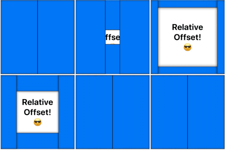
Another helpful extension is the relativeOffset modifier and the various related signatures. This facilitates offsetting Views based on the size of the View being offset. So you specify a fraction, and the appropriate offset is applied.
In the following example, I'm offsetting each of the four blue rectangles by 80% of their respective widths of heights:
The gist is here but the relevant code is as follows:
Frame(boxSize / 2, boxSize, .blue)
...
    .relativeXOffsetIf(self.open, 0.8)
These modifiers remove the need to externalize any offset vs positional calculations keeping the intent of the code clean and free from distraction.
With liberal use of the ternary operator it is of course possible to conditionally style components based on the current state, but oftentimes the default value of the modifier is used as the off state. In other words, keeping the default value as part of the display logic only serves to distract from the intent.
Consider the following example that sets the opacity of a component depending on whether or not it is disabled:
@State private var disabled = false

//...

.opacity(disabled ? 0.4 : 1)
Standard right? However, since the enabled state reverts to the default value for opacity this code explicitly includes a redundant else clause and is the semantic equivalent to the following:
if disabled {
    opacity = 0.4
} else {
    // do nothing
}
This isn't something we would reasonably do in non-SwiftUI code, and obscures the important part: that opacity is only modified in the disabled state. PureSwiftUI avoids this predicament by providing conditional modifiers, so the previous code-block would be written in this way:
@State private var disabled = false

//...

.opacityIf(disabled, 0.4)
We therefore avoid unnecessary references to default values and reduce friction to understanding the purpose of the code. It is also fully animatable, so you don't lose anything but baggage. In addition, since the ! operator can be easy to miss, modifiers are provided for the negative case, like so:
@State private var enabled = false

//...

.opacityIfNot(enabled, 0.4)

// vs natively
.opacity(!enabled ? 0.4 : 1)

//or
.opacity(enabled ? 1 : 0.4)
There are a number of conditional modifiers to explore; just type .if and see what comes up.
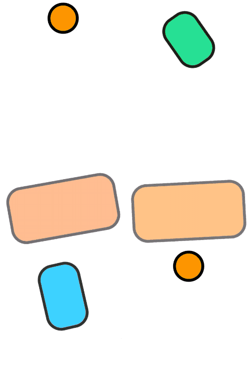
An example here can show how PureSwiftUI can have a huge impact on both code-clarity and efficiency. Imagine we wanted to produce the following rather contrived example:
The code for doing that is shown below in both native SwiftUI and PureSwiftUI styles:
// native SwiftUI
Rectangle()
    .fill(Color.orange)
    .frame(width: modified ? 200 : 50, height: modified ? 100 : 50)
    .clipShape(RoundedRectangle(25))
    .overlay(RoundedRectangle(25).stroke(Color.black, lineWidth: 5))
    .rotationEffect(.degrees(modified ? 180 : 0))
    .offset(y: modified ? 100 : 0)
    .hueRotation(.degrees(modified ? 360 : 0))
    .opacity(modified ? 0.5 : 1)

// with PureSwiftUI
Color.orange
    .frameIf(modified, 200, 100)
    .frameIfNot(modified, 50)
    .clipRoundedRectangleWithStroke(25, .black, lineWidth: 5)
    .rotateIf(modified, 180.degrees)
    .yOffsetIf(modified, 100)
    .hueRotationIf(modified, 360.degrees)
    .opacityIf(modified, 0.5)
In my opinion, the latter version is significantly more declarative and therefore readable.
SwiftUI of course allow you to render components using conditional logic, and that's fine. Nevertheless this also involves the use of a Group that isn't relevant to the purpose since we are forced to adhere to the opaque return type of body:
@State private var toggle = false

//...

// native SwiftUI
var body: some View {
    Group {
        if toggle {
            Text("It's true")
        } else {
            SFSymbol(.nosign)
        }
    }
}
The Group is not part of the design, but it has to be there - assuming we're not type-erasing our components. RenderIf on the other hand is a View, so we can simply return it directly achieving the same result, like so:
@State private var toggle = false

//...

// using RenderIf
var body: some View {
    RenderIf(toggle) {
        Text("It's true")
    }.elseRender {
        SFSymbol(.nosign)
    }
}
Furthermore, since RenderIf is a View, modifiers can be applied directly to it and will affect whichever View is ultimately resolved. RenderIf can be used without the else clause if required, however at this point there is no support for else if clauses.
While SF symbols are a fantastic addition to the framework, none of us likes a stringly typed API, amirite? The process of finding the appropriate symbol using the SF Symbols app and copying the appropriate string into your code is laborious, error-prone, and does not of course provide any type checking. There is also no way - just from looking at the code - of knowing which symbols are restricted in their usage without referring back to the SF Symbols app, or checking out the SF Symbols Reference guide.
Is the following symbol name correct, or restricted in any way?
Image(systemName: "pencil.circle")Maybe; I'd have to check the documentation. Whereas with PureSwiftUI the first question is moot, and the answer to the second question is clear:
SFSymbol(.pencil_circle)
SFSymbol(.🍏pencil_tip)

// or using an Image directly
Image(sfSymbol: .pencil_circle)
Image(sfSymbol: .🍏pencil_tip)
Since all SF symbols are available as constants, there is also the option of using fuzzy searching to find a symbol you like the look of in the preview without the need to leave Xcode.
Yet another advantage, is that the symbol constants defined in PureSwiftUI are aware of deprecation so if a symbol you're using has been superseded by a new symbol name, you will get a warning including a suggestion of what to use instead, assuming one exists.
As with SF Symbols, this is once again a stringly typed interface that PureSwiftUI does away with. Rather than guessing which device strings are accepted, you can pass in a constant to the previewDevice modifier like so:
MyView.previewDevice(.iPhone_8_Plus)This has the added benefit of naming the previews based on the device specified, unless you want to override it with your own name of course.
You can also conditionally (or not) set dark mode for a preview device without the need to use the \.colorScheme keypath by using the following:
MyView.envDarkMode()

// or conditionally
MyView.envDarkModeIf(condition) // or envDarkModeIfNotPureSwiftUI also brings layout guides and a huge collection of extensions to Path that make the process of creating shapes in SwiftUI a truly enjoyabale one. They are part of a package that is also available stand-alone called PureSwifUIDesign.
From version 3.0.0 onwards, angles will be following the native definitions for what it means to be zero degrees. In other words, zero degrees moving forwards will be pointing to the right, just like the native implementation.
This is a breaking change from version 2 so be careful to ensure that all calls involving the below are modified to take this into account
This affects the AngularGradient initialisers as well as the calls to arc on Path.
angleTo on CGPoint will now report the angle in accordance to the new angle orientation.
calcOffset(radius:angle:), calcXOffset(radius:angle:), and calcYOffset(radius:angle:) will also calculate the offset assuming the angle is relative to 0 degrees being to the right.
There are various function overloads and properties that make this transition easier and you can even continue to work with the current orientation if you find it easier to reason like this (although this will require a change to existing code to take advantage of it):
fromTop on Angle will convert the angle to being relative to the top, so you can pass 90.degrees.fromTop for example as an argument to AngularGradient or arc on Path. If doing this, however, do not use the startAngleFromTop for variants.
In addition to this, AngularGradient and arc on Path are defined with appropriate startAngleFromTop or angleFromTop arguments which do what they say.
The semantic constants top, bottom, topTrailing etc defined on Angle now represent the angles based on the native orientation. So bottom is defined as 90.degrees for example. These constants can therefor be passed in to the aforementioned startAngle arguments (not the fromTop variants) and will result in the expected behaviour.
The pure-swift-ui package can be found at:
https://github.com/CodeSlicing/pure-swift-ui.git
Instructions for installing swift packages can be found here.
This project adheres to a semantic versioning paradigm, so breaking changes will be reserved for major version updates.
- 1.0.0 Commit initial code
- 1.1.0 Update SFSymbols to latest version (1.1 (16))
- 1.2.0 Add constants for preview device names and add support for SFSymbolName to UIImage
- 1.3.0 Add deprecated SFSymbols with availability
- 1.4.0 Add alignment to greedy modifiers and Image specific modifiers to SFSymbol
- 1.5.0 Add numerous modifiers and conditional modifiers including hueRotation, GeometryProxy extensions, Shape specific modifiers, UIScreen and more
- 1.6.0 Add image processing modifiers and associated conditionals - add convenience modifiers to Image and SFSymbol to perform resizing and aspect ratio modifiers in one step
- 1.7.0 Add constructor function for SFSymbols and all font types. Alignment parameter for all frame modifiers. Overloads for all font type modifiers on Text. Conditional animation modifier. Align modifier for Text.
- 1.8.0 Add various clip shape modifiers - extensions for stroking with fill - fill styles - default corner style to circular for RoundedRectangle - conditional background modifiers
- 1.9.0 Add conditionals for overlays and borders - add iPhone 11 preview devices - add shadow modifier overloads
- 1.10.0 Add Frame concept, color name overloads, env and preview modifiers for convenience
- 1.11.0 Add geometryFrame modifier as well as relativeOffset and offsetToPosition modifiers
- 1.12.0 Add font modifiers for all font styles to Text and View as well as associated constructor functions
- 1.13.0 Add a multitude of extensions to types related to drawing paths as well as layout guides to facilitate easy
Pathconstruction - 1.13.1 Add extension to CGPoint to allow transition to other points by a scale factor for animating paths. Add CG versions of colors to Color.
- 1.13.2 Internalized
LayoutGuideconstructor andLayoutCoordinatorprotocol until the internal API finalizes - 1.14.0 Add transforms to layout guides for scaling, rotating and offsetting. Add factors to various scaling functions on convenience extensions to support animatable data in shapes.
- 1.14.1 Add convenience constructors for
CGPointandLinearGradientand standardize various API calls. - 1.14.2 Add static constructor for
CGPointand convenience constructor forLinearGradientspecifying angle with further standardization of API. - 1.15.0 Fix for segmentation fault in Xcode 11.4 and Cocoapods support
- 1.15.1 Fix for build failure in XCode 11.5-beta-01
- 1.16.0 Add convenience extensions for gradients and Colors
- 1.16.1 Add static initialiser explicitly for 8 bit
Color: rgb8 - 1.20.0 Add SFSymbols for Swift 2 and new preview devices in Xcode 12
- 1.20.1 Add static initialiser explicitly for 8 bit
Color: rgb8 - 2.0.0 Refactor for build and runtime performance. Remove
UINumericTypeand remove all deprecated code. This is a breaking change; be aware! - 2.0.1 Add static initialiser explicitly for 8 bit
Color: rgb8 - 2.0.2 Add extensions for drawing circles on
Path - 2.0.3 Updated logic for showing control points so paths display well for closed sub-paths when either stroked or filled
- 2.0.4 Resolve ambiguity with native offset modifier on shape
- 2.0.5 Fix
shadowIfNotwhen using explicity y-offset - 2.0.6 Add static initialisers and convenience functions to
CGRectandGeometryProxy - 2.1.0 Add relative coordinate functionality to layout guides
- 2.1.1 Add eoFill to Shape and add overloads for strokeColor to accept style argument
- 2.1.2 Add
cyclesas a first class angle type with conversion functions and properties supporting it - 2.1.3 Add
GeometryReaderStackand lines and shapes extensions toPathas well asabsproperty to major numerical types - 2.1.4 Update clamping API and associated tests
- 2.1.5 Fix
GeometryReaderStackalignment where contents extend beyond frame - 2.3.0 Update for SF Symbols 3, update preview devices, and add multi-platform support
- 3.0.0 Separate design elements into PureSwifUIDesign package. Change orientation of angles to match native
- 3.1.0 Add SF Symbols 3.1
- 4.0.0 Add SF Symbols 4.0 - Improve build performance of SFSymbolName by using computed property for allCases rather than a constant resulting in close to 10x improvement
- 5.0.0 Add SF Symbols 5.0
- 5.0.0 Add SF Symbols 5.1
This project is licensed under the MIT License - see here for details.
You can contact me on Twitter @CodeSlice. Happy to hear suggestions for improving the package, or feature requests. I've probably made a few boo boos along the way, so I'm open to course correction. I won't be open-sourcing the project for the moment since I simply don't have time to administer PRs at this point, though I do intend to do so in the future if there's enough interest.


