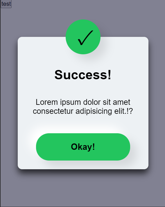
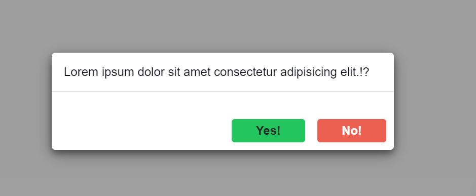
NonnyAlertJs is an easy-to-use JavaScript library for alerting users on the frontend. It provides warning alerts, success alerts, and danger alerts based on specific actions. It is especially useful for scenarios such as when a user enters the wrong password, clicks the wrong button, successfully registers, or makes a successful payment.
This library is lightweight, well-tested, and designed to minimize the impact on your application's load time. It accepts several arguments: time (in milliseconds) to wait before the alert auto-hides, position for positioning the alerts, textColor for the alert text color, and backgroundColor for the confirmation box's background color.
To use NonnyAlertJs, follow these steps:
- Include the
NonnyAlertJslibrary in your project using CDN.
<script src="https://coding-nonny.github.io/alert-notify/dist/alertify.js"></script>- Create an instance of
AlertNotifyby providing the appropriate arguments:
const message = new AlertNotify(time, position);The arguments time, position are optional. If not provided, default values will be used.
The time and position only works when you are using positioned-modal.
- Call the
alert_messagemethod to display an alert message:
message.alert_message(messageText, messageType,alertType);The messageText parameter represents the text to be displayed in the alert message, and messageType (optional) represents the type of alert (e.g., "warning", "success", "danger","info").
The alertType determines the type of alert-box you want to use e.g Postioned-modal or fixed-modal. Using the fixed-modal requires that you include alert-box.css from the style folder for proper functionality. Default alertType is fixed-modal.
- (Optional) Use the shouldAutoHide method to control whether the alert message should auto-hide:
message.shouldAutoHide(autoHide);The autoHide parameter is a boolean value (default is true). When set to true, the alert message will auto-hide. When set to false, the alert message will remain visible until the user clicks on it.
-
Note
TheautoHide()only works when you are usingpositioned-modal. -
(Optional) Use the alert_Confirm method to display a confirmation message:
document.querySelector(".click").onclick =  async () => {
if (await message.alert_Confirm("Do You Think This Is Good?")) {
  message.alert_message("You clicked Yes", "success");
} else {
  message.alert_message("You clicked No", "warning");
}
message.shouldAutoHide(true);
};NonnyAlertJs provides several positioning options for the alerts. You can use the following values for the position argument:
| Position | Description |
|---|---|
| center | Center of the screen |
| bottom-center | Bottom center of the screen |
| bottom-right | Bottom right of the screen |
| bottom-left | Bottom left of the screen |
| top-center | Top center of the screen |
| top-left | Top left of the screen |
| top-right | Top right of the screen |
NonnyAlertJs can also be used in React. To use it in a React component, follow these steps:
- Install the NonnyAlertJs package using a package manager like npm:
npm install nonnyalertjs- Import the necessary dependencies:
import React from 'react';
import AlertNotify from 'nonnyalertjs';
import 'nonnyalertjs/style/alert-box.css'; // Import the CSS file- Create an instance of AlertNotify and use it in your React component:
const MyComponent = () => {
const message = new AlertNotify(time, position, textColor, backgroundColor);

const handleConfirmation = async () => {

if (await message.alert_Confirm("Do You Think This Is Good?")) {
  message.alert_message("You clicked Yes", "success");
} else {
  message.alert_message("You clicked No", "warning");
}
message.shouldAutoHide(true);
};

return (
<div>
<button onClick={handleConfirmation}>Click Me</button>
</div>
);
};

export default MyComponent;
or use my already made component notify.jsx located in component folder
Make sure to import the CSS file provided by NonnyAlertJs to ensure the styles are applied correctly.
With these steps, you can now use NonnyAlertJs in your React components and take advantage of its alerting and confirmation features.
Note:
Remember to replace time and position with the desired values when creating the AlertNotify instance.


