- This repository is designed to be your first exposure into the world of ReactJS. You will be given 2 days to complete the 2 assignments in this repository. Day 1 is all about implementing a Social Card in ReactJS. On Day 2 you'll be implementing a Calculator. We've given you the file structure and have gone ahead and added all the files you'll need to be set up for success for each project.
- This project was put together using
create-react-app(CRA). You will not need to install CRA in order to make this project work - Each project has it's own
package.jsonfile in it, we'll chat more about this later. So it's already set up for you to install some dependencies that are needed for you to be able to work within the React Ecosystem. - To start the
Social Cardproject, you'll need to cd intoDay-1-Social-Cardand then intosocial-cardand runyarn installto retrieve all the dependencies. - Inside of
../../social-cardyou'll then need to runyarn startto open up a React Development Server that can take your.jsfiles as components and bundle them up to work in your new environment. - You'll repeat this last two steps for the calculator project, but you'll need to make sure that you're inside of
../../calculatordirectory to make this work.
- Over the next two days you'll be working on two different projects in this repo.
- The first day you'll work on the project found in
Day-I-Social-Card. - The second day you'll work on the project found in
Day-II-Calculator.
- The first day you'll work on the project found in
- Use the design files to build out your User Interfaces.
- All components can be built out using the provided html files found in their respective directories.
- Each file has been set up to work within a
react.jsenvironment. Pay attention to the notes found within each project. - Don't forget about
classNamevsclasson yourJSX elements!!
- We're going to break down this assignment in terms of how you should be starting to think in react. Remember that everything is a component.
- All the files you'll need for this project are found in
Day-I-Social-Card/social-card/src/components. You can find all the component files you should need in their respective directory. i.e. inside of theHeaderComponentsdirectory you should see a few.jsfiles and a.cssfile. - Feel free to add any files for any extra components you may feel the need to build.
- Any of the styles you write in your respective
.cssfile should be available for your the components where the.cssfile is being imported. - We have drawn boxes around possible areas that could be components.
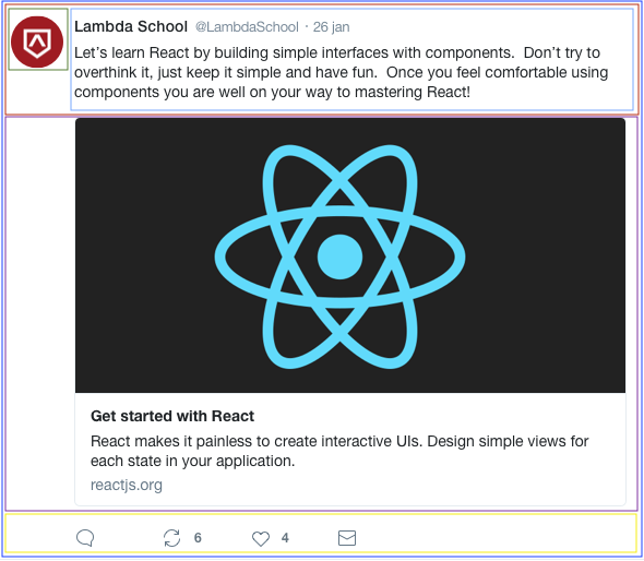
- The outer box will represent the
App.jsfile. - The red box around the header could represent the
headerdirectory with a few nested components inside, the thumbnail image and the header content. - You could go so far as to break down the header content into a header and body component.
- The next box around the social card represents the React Banner image and some copy found underneath.
- And then of course the footer (Stretch Problem 1) which contains your icons, could be a container for all of your icon components.
- The outer box will represent the
-
Create a
<HeaderContainer />container component that will hold your header components.- Create an
<ImageThumbnail />component using this image url https://ibin.co/3whrpKSBbZ81.png as it's img src. - Create a
<HeaderTitle />component that displays the Lambda School header text, @LambdaSchool handle and timestamp. - Create a
<HeaderContent />component that displays the copy provided in the headers content.
- Create an
-
Create a
<CardContainer/ >container component that will hold your card components.- Create a
<CardBanner />component that will display this image as it's background: https://ibin.co/3wnC6SgIOJud.png - Create a
<CardContent />component that displays the card copy provided. - The entire
<CardContainer />should take a user tohttps://www.reactjs.orgwhen clicked.
- Create a
- Create a
<Footer/>component that pulls in the icons and displays them properly.- Build out the functionality so that a user can click on the icons and have them react to events.
- Ensure that your product is as pixel perfect as possible using any tools that you were introduced to in previous weeks.
- Look up the
moment.jslibrary and figure out how to format yourtime-stampin your header to be today's date.
- For this project you're not going to be given any tips on how to break down the image file into components. Now that you've had some practice with the social card, this should be something you can start doing on your own. Just think about the image, and what potentially looks like a component.
- For the MVP the calculator just needs to be displayed properly. Functionality will be a part of the stretch requirement.
- All the files you'll need for this project are found in
Day-II-Calculator/calculator/src/components. You can find all the component files you should need in their respective directory. i.e. inside of theButtonComponentsdirectory you should see a couple.jsfiles and a.cssfile. - Feel free to add any files for any extra components you may feel the need to build.
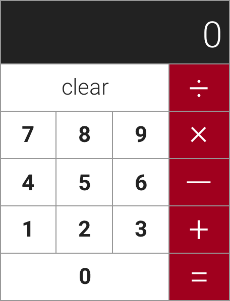
- Here is what your calculator should look like:
- BEFORE YOU DO ANYTHING ELSE READ This
- This is the time to stop and break down this image in terms of components. Each container on the screen should give you an idea of what your components should be. You're now about to begin your journey into learning how to think in React.
- Create a
<NumberButton />component that can acceptpropsand display any number/symbol passed down astext.- Example your component should be able to render a dynamic prop called text:
- Your button button should also be able to accept dynamic props
buttonStylefor styling
<button className={props.buttonStyle}>{props.text}</button>- Create an
<ActionButton />component that will be used for thezerocharacter and theclearbutton. - Create a
<CalculatorDisplay />component that will be used as thecalculator display
-
Re-factor your
App.jsfile to be a classical component that can hold state on it's constructor. (There is some documentation in training kit on how this works).- On your state object be sure to include a property for the
totalthat can be passed down to your<CalculatorDisplay />component.
- On your state object be sure to include a property for the
-
Create some
handler functionsthat can take in some information from an,onClickand use that information to update thetotalon the App state.this.setStatewill be your best friend here :)
GOOD LUCK!

